I hope you are strapped in and have secured all loose items. In this blog we are off for a rocket trip into space, we are going to have a bit of a chat with Einstein and Darwin, we are going to meet some aliens – when we return, avoiding crashing into those castles in the clouds, we will have learnt how to avoid getting eaten by a lion, recognise a pirate, will have dry feet and will know that something lost can often mean something found. However, we are going to be riding those ragged edges of disaster throughout. So, if you are sure that you are ready…..5…..4……3…..2….1……

Our senses have evolved to filter out and ignore the majority of information around us. Evolution is a very efficient thing; it doesn’t tend to waste energy developing anything that’s not essential to an organism. From a Darwinian perspective we only need enough information to find food and water and avoid predation long enough to identify a mate and then pass on our genes.
Considering our eyes, they only see a very narrow part of the electromagnetic spectrum, which runs from radio waves at one end, through the infra-red, through visible light (the familiar red to violet) and then through ultraviolet on to X-rays and Gamma rays at the other end. The only reason we see the small range of frequencies that we do is because that is where the peak of the radiation output from our sun is (a red dwarf) – if we met some aliens in orbit around the star Betelgeuse (a red supergiant), which is the constellation Orion’s top left shoulder, they would have vision centred on the infra-red.
As such, our eyes leave out many times more information than they pass on into our brains. Similarly, they are not perfect in operation, as anyone who wears glasses knows, and also, some information in the visible part of the electromagnetic spectrum might be missing – the light level might be low, it might be misty or something might be partially obscured. Luckily, 2 things come to our aid in these situations. The first is evolution again – whilst it might not have given us senses that can perfectly observe all the information that’s available, it has given us a brain that is particularly adept at recognising patterns, learns from experience and can remember. The human brain is very well adapted to fill in any gaps in the information.
The second is an intuitive understanding of what Albert Einstein called the Equivalence Principle, which states that the Laws of Physics are the same everywhere in the Universe. For us as humans this means if we observe something with particular patterns and movements that we have seen before, it is very likely that it is going to behave the same way that we observed last time. A good way of thinking of these two points is to imagine walking at twilight through the grasslands of the African Savannah – that partially hidden shape looks a bit like a cat’s ear, I think I heard a twig snap with a heavy weight put on it, can I smell a bit of a musty animal odour?…………It’s a lion, run away!! Similarly, that lump of water that’s slowly approaching the beach, getting taller and steeper is probably a wave that’s going to break, rush towards us and get our feet wet if we don’t move up the beach now. Indeed, not only is our brain good at remembering patterns, it actually enjoys doing it – we’ve probably all experienced the joy from playing that game looking for castles and monsters in those bubbling summer clouds.
So, what does that mean for us as artists? The natural inclination for the human brain to enjoy extrapolating information to fill in gaps and create previously seen patterns gives us a great tool to make our work less literal and more engaging for the viewer. There are various ways you can achieve this but the subject of this blog is the technique of “lost and (sometimes) found lines. Let’s have a bit of an explore around what they are and some ways that lost and found lines can be used to add value to your work.
What are Lost and Found Lines?
Lost and Found lines are when an artist plays games with the strength of their edges (ragged or not) to achieve an artistic aim. In a nutshell, a lost and found line is a technique where, as an artist, you take the hard edge of an object and soften it to the point where it disappears. At some point further on you unsoften it and bring the edge back. A viewer’s brain will see the gap where the line disappears and enjoy filling it in.
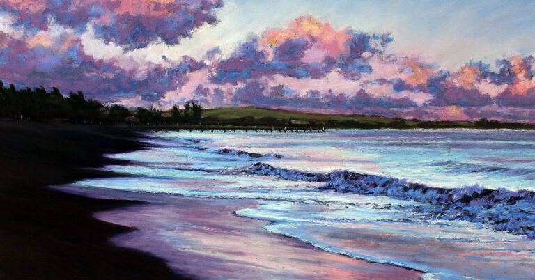
Of course, depending on the effect you are looking for, it isn’t always necessary to bring the line back – a purely lost line is just as useful in some circumstances and if you think about it a lost line is just as equally a found line if your eyes go the other way……. Lost and found lines are most often a tonal effect where you blend two adjacent tones to a soft transition or occasionally can be a colour effect where you blend away the transition between two colours of similar tone. Below is a small part of a larger piece with some lost edges in the clouds clearly marked. If you consider the cloud edge in its entirety you can see how your brain fills in the gaps in the lost and found edges.

If you consider the sky in “Splendour” above (near the start of the blog) and follow the edges within the clouds you will see many instances where the edge seems to disappear and then reappear – your brain is quite happy to fill in the gaps. Whilst there are some colour changes most of the edge loss and recovery in this piece is tonal in nature.
If you consider the lost and found lines in “Silent Poetry” below, whilst there are still some tonal effects, I’ve used colour changes a lot more.

Having seen some lost and found lines, let’s now have a look at some ways that they can be useful to an artist.
Lost and Found Lines to add interest
Lost and found lines are a great tool to add depth, atmosphere and interest to a piece.
In Hayle Bay the lost and found lines in the sky are designed to add some movement and interest. Similarly, your brain is invited to fill in the part of the horizon that fades to obscurity and also where the light catches the water’s edge here and there on the left.

In the piece “Privateer” an impression of mist and thus depth is generated on the left-hand side of the pirate ship. The shape of the keel is obvious on the right-hand side, fades to nothing bottom left before reappearing again top left. Your pattern forming brain readily fills in the missing parts of the ship and you’d probably have enough information to decide to flee for your life in this situation.

The next level – Introducing ambiguity
As with many techniques in art you can turn up and down the strength of an effect. Indeed, with lost and found lines you are quite at liberty to introduce some ambiguity and give the viewer unresolved choices to titillate their brains even more.
In “Escape”, there are lots and lots of lost and found lines. The piece comprises many tones of the same colour and I’ve deliberately left the resolution of the lines slightly unclear, ie which lost lines relate to which found ones. The intention is to slowly pull you into the vortex until you land on the bird and eventual resolution of the piece in line with the title.

In “Age of tin” the lost and found lines in the waves are pretty obvious but if you start at the cliff top left (just below the tin mine and the obvious lost and found lines where the light spills through) the cliff drops away into the spray from the wave and may or may not appear below the light caught spray (it could be a rock). I’ve then carried on the effect horizontally through the next wave to a set of rocks that again may or may not be linked to the first. The viewer’s brain has the choice between one continuous stretch of granite, two separate elements or even three.

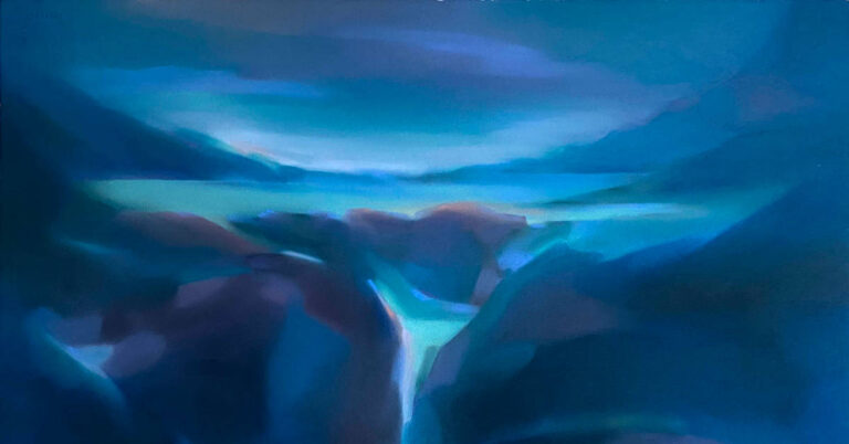
Similarly, in “Mountain River” (another purely tonal piece) the lost and found effect in the river itself is easy to spot but in the rest of the picture the soft transitions between hills, clouds, tree lines etc are very ambiguous and interchangeable. Every viewer is likely to interpret this piece slightly differently.

Lost and Found Lines to lead the eye
Lost and found lines are a great tool to lead your viewer around a piece. In “Wanderer” your gaze can land just about anywhere in the sky and the lost and found lines in the clouds will gently lead you back and forth to eventually disappear and deposit you at the yacht (the focal point).

In concept “Journeyman” is quite similar to “Wanderer”. However, I’ve not only used the lost and found lines to point towards the focal point, I’ve gone a step further also used key shapes and transitions between the harder and softer elements to line up with the focal point. I’ve illustrated these lines in the second picture.


Lost and Found Lines to augment a focal point
As we saw in the last section you can use lost and found edges as a mechanism to lead the viewer’s eye. Paradoxically, you can use them in the opposite way to the same effect.
In “Winter Light” there’s a nice lost and found section at the water’s edge to take your eye into the piece. However, along the horizon line there’s much more of an opposite “found and lost line”. The horizon starts from nothing on the left, slowly hardens for the headland and where the light catches the water and then slowly softens again and disappears. This completely the opposite technique to that used in “Wanderer” above.

I’ve used a both techniques in “The light at Lanes End”. If you consider the dark toned tree line at the bottom of the piece and transition from right to left, you’ll see that the edge softens and hardens along its length and as it slopes down it tends to carry your eye towards the house. If you consider the same line just to the left of the house, I’ve blended the purple away to nothing and the now blue grey edge might be a tree further back or possibly even a cloud. The net effect of this soft ambiguity is to strongly pull your eye back to the light in the house.

Lost and Found Lines as a gateway
We’ve seen already how you can use lost and found lines to lead the eye around a piece. They are also a great technique to generate a gateway or pathway for the passage of light or similar. Again, you can vary the strength of this effect.
In “Moonlit Ocean” the gateway between light source and moonlit ocean generated by the tonally generated lost and found lines in the clouds is obvious.

In the next piece, whilst there are lost and found lines everywhere in the sky and the river, I’ve tried to be slightly more subtle with the gateway. In “The battle for the Souls of Man” if you look closely just above and to the left of the church spire, you’ll see a definite channel leading up and to the left towards the light.

The level of subtlety of the gateway in “Echoes of the Hanover” is again slightly higher. The Hanover was a ship full of gold bullion lost off the North Cornish Coast in the 1800s. If you find the (almost hidden) tilted masts of the stricken ship slightly to the left of dark rock on the right you will then hopefully see how I’ve subtly softened the edges of the foreground waves to provide a pathway for the viewer to the ship and I’ve also left a pathway for the moonlight from the moon to the ship.

Lost and Found Lines in still life and portraiture
Lost and found lines are in no way limited to landscape work, they are equally at home in adding an extra dimension to still life and portraiture.
In “A Fading Bouquet” I wanted to make a statement about the impermanence of all things rather than just the obviously fragile blooms. I’ve firstly faded and lost the edge of the vase into shadow on the left which augments it as a three-dimensional object and then, in order to achieve the artistic effect that I wanted, I’ve completely lost the edges at the bottom of the vase into a grey nothingness.

In “Self Portrait” the whole of the left hand of the face is lost to shadow; all lines are lost between the chin and the edge of the hair on the left. Your brain still happily imagines them and turns this piece into a three-dimensional representation of a slightly dour looking artist.

Summary
If we are all still together at this point, it means we have landed safely back on Earth. We’ve had a brief look at the strength of our brains in generating recognisable patterns from partial information. We’ve explored how this pattern making capacity can be used by an artist as a tool to add interest and engage with a viewer in landscape, still life and portraiture. In a future blog we’ll have a look at some techniques to remove information and create these “lost and found lines” but in the mean time I hope I manged to pique your interest enough to experiment and I hope you have fun exploring the technique.


10 Responses
What an interesting and fascinating description and timely for me as I’m working with clouds today – your insights will help me be both more free and more intentional at the same time. Thank you!
Thank you Tania – hope your cloud piece turns out great 🙂
One of the best lessons in lost and found edges! Thank you
Thank you Lorraine 🙂
At last! Lost and found lines explained well.
Thank you George – I hope some readers will find it useful.
Wow, what a lot of though has gone into writing this article. It has been very interesting The choice of pastel are lovely and the home made paper you can see the difference to other papers. I am also working on some clouds like Tania. I will try and apply some lost and found edges. Thanks Stephen. Thanks also Unison for letting artist put these articles on your website. I do have one complaint the choice of colours is so over whelming. which colour. I have looked at the pastels for days thinking this one and then I see some pastel that would be better . The colours are beautiful. Help.
Thank you Pamela – if you have a look at my other blog for unison colour – “Pastel Zen” there is a small part about reducing your colour palette that might be useful. For you.
Very informative blog. Striking paintings. Thank you so much for the work that went into this blog!
Thank you Kathy for your kind comment.