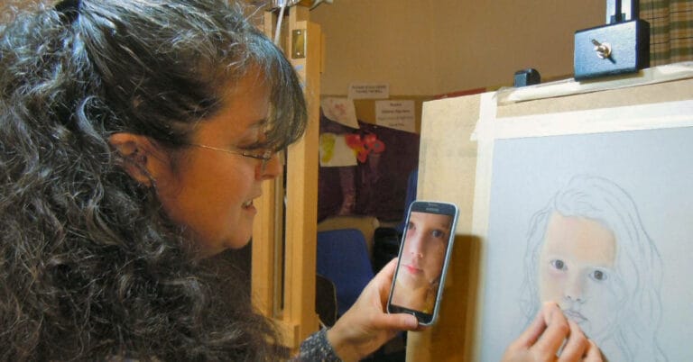
Unison Colour are pleased to share a new blog series “Interview with an Associate Artist”. Over the next few months Stephen Fuller will be conducting virtual interviews with a number of fellow Unison Colour Associate Artists. Exploring their motivations, working methods and broader views on art we hope to offer an insight into some of the best pastel artists and users of Unison Colour.
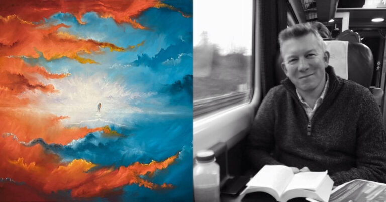
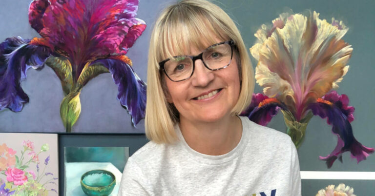
In the first “Interview with an Associate Artist” Steve will be chatting to Lyn Asselta. Based in Maine, US, Lyn is particularly known for her evocative, textural landscapes. She is a Pastel Society of America Master Pastelist and has achieved Eminent Pastelist status with The International Association of Pastel Societies. Exhibiting and delivering workshops globally she has also had her works featured in numerous art books and magazines and has self-published a book of her own which is currently out of print. She writes a weekly newsletter and is working on a second book.

Steve: Lyn, thank you for taking time for today’s interview, could you tell us a little about your journey into the art world and how you found pastels?
Lyn: Thank you so much for choosing to interview me, Stephen!
I feel as though art, in some form or other, has always been a part of my life. After doing many other things – teaching art to children, calligraphy, some drafting, gourd crafting and basketry – I discovered a small box of pastels left over from college art classes and decided to give them a try again. I learned that there was now such a thing as sanded papers, so I ordered some to try them out. The second I made a mark, I was hooked.
Steve: You are particularly known in pastel for your atmospheric landscapes, what is it about this genre that attracts you? As an artist does your work have a message for the world or is there something you particularly want to achieve through art?
Lyn: I think my attraction to atmospheric landscapes began when I was living in Florida and I realized, after trying to portray that landscape in bold, bright colors, that I was approaching that hot, humid landscape incorrectly. “Hot” didn’t always translate into intense colors, and “humid” meant that I was basically looking through moisture in the air, so, edges needed to be softer. At that point, I began thinking more and more about portraying the landscape in relationship to what was happening with the air and light surrounding it. I especially want people to see my work and feel as though they’re experiencing a particular place in a way that is intimate and personal, as if they are alone in that place, quiet and observant, noticing the way they feel even as much as noticing what they see. I believe art is transportive and I want people to feel transported by my work to places where they can draw strength from their surroundings, or where they can find ways to experience quiet or peace, or even to simply make someone stop and notice…really notice…a place.
Steve: Is there a particular project that you are working on at the moment or have planned?
Lyn: Yes. When Covid arrived, I began writing a series of weekly newsletters each Saturday as a way to keep in contact with students and friends during isolation. It has continued on now into a third year. I write about nature and life, both prose and poetry, and then I try to also write about some sort of art principle that connects to what I’ve written. I pair all of this with a current painting. My goal is to set aside some time to put these all together into a book during the coming year.
Steve: How has your style changed in any way as you’ve developed as an artist and do you see your work going in any particular direction in the near future?
Lyn: I think my style evolves constantly, to be honest. Every time I learn something new, I see a slight change in my work. I don’t hold myself to any particular style, but I feel more confident these days when it comes to exploring color and composing a painting. I’m interested in the times I feel restless or repetitive when I paint…this generally signals the start of a time of growth for me and I’ll find myself experimenting more, letting my memory play into the image more, or allowing my mark-making to be more free. It’s hard to know what direction my work will go in the future. I tend to wait till my process leads me somewhere new.
Steve: What is your greatest artistic triumph/achievement?
Lyn: I could answer that question by listing some wonderful awards that my work has received, but I feel that my greatest achievement is to have reached a point with my art that allows me to call this a full-time career, especially since I came into this part of my career late in life. That I can combine my love of painting and landscapes with my love of teaching and writing is a dream come true for me. I am quite proud of that.
Steve: Which other artists do you particularly admire and what is it about their work you are drawn to?
Lyn: This is a tough question for me, as I tend to find so many artists and their work are inspirational. I could name dozens who I have leaned toward and learned from along the way, both historical and contemporary. I have always been a huge fan of Georgia O’Keeffe, for her brave lifestyle as well as her paintings. Living in Maine, I am naturally drawn to Andrew Wyeth and Winslow Homer. I love Rothko, Fairfield Porter, John Marin, Joan Eardley. I could go on and on…. I favor landscapes that are unrestrained in some way, whether by use of color or atmosphere or abstraction of forms and I gravitate to artists who explore the landscape in bold ways.
Steve: Why Unison Colour pastels? Do you have a particular favorite from the range?
Lyn: Unison Colour’s landscape set was the very first set I ever purchased. They have since become the workhorses of my studio boxes, the backbone of my collection of pastels. For me, they respond well to my hand. They are not too soft, not too hard, and they are capable of making the sort of marks I like to make. They can slide over the surface of a piece of sanded paper and leave just a whisper of a mark, or they can make a big, bold swath of color. Some of my favorite Unison colors are the Additional colors and the blue-violets.
Steve: What is it like being a Unison Colour Associate Artist?
Lyn: I enjoy knowing I can tell my students without hesitation that I recommend and use Unison soft pastels, that this is a brand I have relied on since the very beginning of my pastel journey. To me, it’s an honor to represent a company that takes pride in making such a high quality, versatile pastel for all of us who care deeply about the products we use.
Steve: If you were to offer one tip and one thing to avoid for a beginner to pastels, what would they be?
Lyn: For the beginner, I would say that one should always have darks and lights in all different colors in your studio boxes, completing the value range from lightest light to darkest dark, with several values between.
Something for beginners to avoid? Carrying too much out into the field if you’re taking your pastels out plein air painting. Pastels are made to be blended and scrubbed over one another, creating much more sophisticated and interesting colors. So take less and learn to blend and layer colors more often. A light, dark, and three mid values in each color will serve you just fine.
You’ll be happier and more likely to get outside to paint if you’re not carrying too much weight.
Steve: Are there any tools or particular pieces of equipment that you use with your pastels that you wouldn’t want to be without?
Lyn: Black masking tape and white artist’s tape! Depending on the color of the backing board I’m using, I like to use either black or white tape around the edges of my painting as I’m working to allow me to see the edges of the piece clearly, almost like placing a mat around it. Knowing the perimeters of the surface I’m painting on allows me to better see the relationship of shapes and colors and the proportions of each within the painting.
Steve: Which papers do you prefer working on and why?
Lyn: My two most-used surfaces are UART400 (mounted) and Ampersand Pastelbord.
I prefer a rigid surface, so I mount the UART to acid free foam core or museum board for smaller works. For large paintings, I choose Ampersand Pastelbord.
Steve: Do you think that social media adds to or detracts from the world of art? Same question but linked to the development of an artist?
Lyn: Obviously, there are good and bad aspects of social media. The frustrating part of it, to me, is that images of posted artwork are never as interesting as they are in person. Especially with pastel, the color and mark-marking can never compare to seeing the real thing. Regular visits to museums and galleries should be part of every artists ongoing personal education and, although I enjoy being able to scroll through art and discover artists via social media, I also don’t ever want to let it become a substitute for those in-person learning opportunities. There is also the sense that artists, especially those just starting out, can easily get caught up in comparing their work to others, or worse, taking to heart every comment that is made once they’ve posted something. It can be tough, and one sometimes doesn’t know the qualifications of someone who makes a comment.
That said, there are many very good aspects of social media. For me, it was a fantastic way to build my career, to get my work out there in front of viewers I never would have imagined, and to interact with other artists and groups that I would have never had the opportunity to communicate with before. It gives me a window into other things happening in the larger art world, since I live in a place that is fairly remote in some ways. Social media allows me to keep up with my students, as well. If used the right way, it can be a huge catalyst for new ideas and opportunities.
Steve: Do you enter competitions and curated shows – if so, are there any tips you can share in getting your work accepted – if you don’t enter, why don’t you do this?
Lyn: Yes, I’ve always entered shows and competitions. For me, it is a good way to gauge where my work fits in amongst the work of artists I admire and respect. It is important to me to know that my work “measures up” in terms of being interesting and technically good, but also that it has the ability to speak for itself in a competitive field. One thing to emphasize, though, is that I’ve never, ever taken a rejection personally. It happens to everyone, and it can happen at any time. One must learn to be objective about their own paintings and abilities, and to understand that there are many factors that play into a judge or juror’s decisions. It’s important to be realistic about your work and to continually strive to move forward with your own personal vision. Having been both a juror and awards judge, I can say that there are a few simple things to remember about entering competitions. My list would include submitting high quality images of your work, cropped cleanly, set to the parameters that the show specifies. Be sure your images are clear! Send new work…preferably work that hasn’t been seen before. New work shows that you’ve been in the studio creating and exploring. Try not to take the advice of too many people when it comes to what you send. Let the competitions acknowledge your work but not define your work.
If accepted, frame your work well and simply in a frame that doesn’t detract from the painting. Wire it correctly. Be professional at all times and be sure your work is presented professionally.
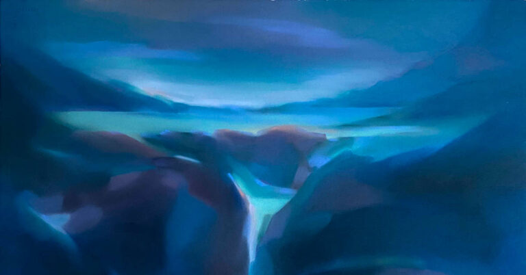
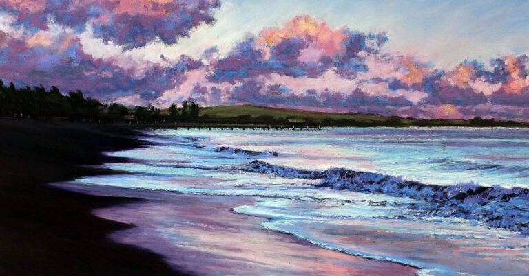
Steve: We’re going to finish by having an in-depth look at one of your pieces. The piece you’ve chosen is “Turbulence”, 22” x 2” on UART 400, mounted to museum board. Please talk us through it.
Lyn:


My hope throughout was that the feel of the day and the sound of the ocean would prevail in this painting. Knowing my intent from the beginning of a piece allows me to stay focused on every aspect of the process as it unfolds.
Steve: Lyn, thank you so much for the insight into your work and into you as an artist, as well as the invaluable tips. For those who wish to see more of your work, where can you be found?
Lyn: Thank you so much for allowing me to share my thoughts and my art with you!
I’m so very pleased to be one of Unison’s Associate Artists. You can find my work at www.lynasselta.com


5 Responses
Lyn Asselta’s work is evocatiive and moving, and often graphic and dramatic, and she is able to articulate what is important as she conceives and works on a painting. I enjoyed reading about how she thinks about her work. I was about to unsubscribe, but will stay with it a little longer and hope you will continue to offer higher-value content like this.
Lyn is a very talented artist and it was great to be able to interview her (virtually). It’s good news that you’ve decided to stay with the blogs. I’m sure the Unison team try and add material in the blogs that will appeal to a wide range of people – I’m also sure they would wish to try and facilitate anything that you (and probably others) would find particularly engaging as they have a great talent pool of associate artists to draw on.
Having attended 2 workshops with Lyn, I can say that not only is she a gifted artist and instructor, but is also a truly wonderful person. She is supportive and encouraging while pushing students beyond their comfort zone. Thank you Stephen for featuring Lyn.
Thank you Tracey – I really enjoyed reading Lynn’s answers too.
We have very similar pastel subjects, I live by the ocean and have a sailboat, so I paint a lot of sailboat races.