
Inspired by a poem by Alfred Lord Tennyson in 1832.
These are my thoughts on inspiration and painting from real life and your own reference photographs.
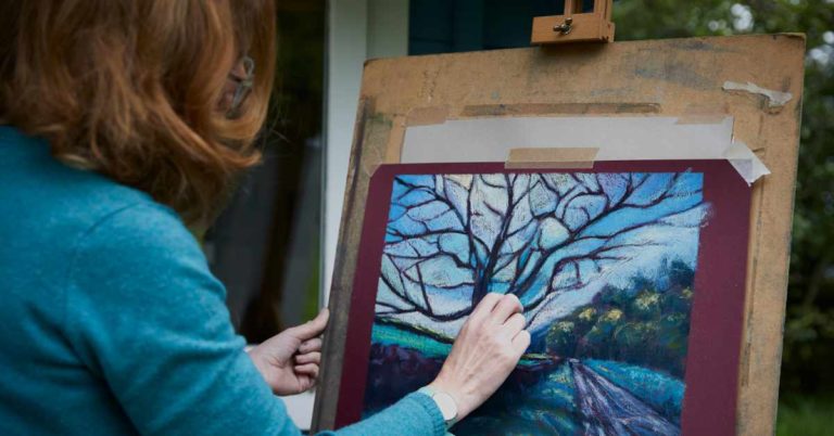
First of all though, just to clarify, painting, yes you might wonder whether pastels are paintings or drawings. Back in Degas’s time pastels were quite often the preparatory smaller sketches for a bigger oil painting and consequently not taken so seriously. There is a speed quality to pastels that mixing oils couldn’t replicate.
But Paula Rego used pastels in her much larger finished pieces and they are considered by many experts as a significant body of work. Both mediums of oil and pastel use the same layering effect, building up colour, thinking about values, colours, tone and composition in the same way as a painter. So as a Pastellist I consider my work to be painting not drawing.
We all need inspiration to work, something that captivates us and sets off fireworks in our soul. For me it will be nature, clouds, skies, reflections, which are all my daily recharge. I am also very much inspired by the Pre Raphaelites, often reflecting tragedy and love. Extremes of emotion can generate big feelings. I like to think of it as a fire, the embers sit there glowing, but feeling fires those embers up into flames. Some 50 years after Tennyson wrote the Lady of Shalott, Waterhouse was inspired to paint it. Whatever fires up your creative fire, I would say be authentic with it. If you can, use your own image, its half of the work and quite significant. It’s all about perception, we can all see the same subject but have a different perception about it.
Last year I was inspired to recreate a modern-day version of this painting.
Some of the joy of painting begins way before you even set pastel to paper. It’s in the imagining, the planning, the anticipation, the collecting of props. In this case finding the right model, arranging a boat, picking the flowers, thinking of what each object represents, the meaning.
I used my daughter in law as the model and put her in my old wedding dress from the 80’s which was an antique Edwardian dress and quite worn.
Below are some pictures of the shoot. Alex had never been in a scull before, they aren’t the steadiest of vessels. With good humour and bravery we set up the pose.

I used a piece of original William Morris willow fabric to echo the trees behind, champagne of course, my first teddy from 1960 was propped up on the antique candlesticks. We were so lucky to have curious swans sail in to see what we were up to. Do swans sail? Maybe they glide.


The reflection wasn’t quite right, I wanted a strong reflection in the still river so we pushed the boat up the small outlet nearer the willow trees.
This was nearly how I had envisaged it, but I wanted Alex’ profile, it felt more wistful and more a mirror of the feelings that were coming out of Waterhouse’ work.

This was almost the pose we settled on. I made sure to take close ups for future reference and I also made sketches in my sketchbook of compositions, tonal values. It’s always good to make a note of possible colour next to sketches too. In the final reference, the swans were in the background, lost on an old laptop.

Once home, I stretched my Giant Hoxton watercolour paper onto my studio wall, it really is giant! 5 ft x 4 ft. I stuck on some white tissue paper, it adds texture to some places that I felt needed it. I gave it a wash of Payne’s grey, to tone it down as I was working with a lot of dark colours in the background and I wanted the whites to stand out. I find it helpful to grid up the reference photo first and scale up.
We tend to start with the part that interests us the most, it maybe the eyes or hands or a certain object, in this case it was the figure, I knew that the background was going to be quite challenging in terms of it capturing my interest, more a technical representation than a creative freedom.
Here is a photo of my studio wall with the painting begun. Not a very appealing wall, but hey. It’s a working wall.

Already I was feeling uneasy about the swan on the left, it seemed to detract from the white of the dress. And I felt the eye was moving away from the figure. But we continued. It took about 40 hours work to get to the next point. I like to catch a painting by surprise, leave it a few days, then catch a glimpse of it. This is a really good way to see the glaring mistakes.

This was the piece that went to the framers. I don’t know why I was reluctant to let go of the swan. I like to frame rather than fix with fixative, it dulls the vibrancy of such natural pastels. What is good about Unison is the colour range, the solidness of the pastel takes a huge battering, you can’t have a pastel that crumbles at a critical point, I trust after 25+ years of using them that they don’t.
I had a sleepless night, something wasn’t right. I went back to the framers to collect and had a few days musing on it.
I deleted the left side swan and added a box behind the figure for interest. The box was open and in a moment of instinct added some coloured smoke. Pandoras box releasing hope into the world. I called this painting Hope. It made pre-selection in the Pastel Society, but didn’t go all the way.

So what did I learn, every piece is a learning curve for the next one.
I think trusting your instincts is key, be authentic, use your own images, be creative, be curious. I would say don’t just be a technician, be a tactician. Be both. We need our technical ability to make but our tactical, creative side is what takes it up to another level.


31 Responses
What a beautiful painting. Loved it!
I really enjoyed the account of how you arranged the set for your fabulous painting. Did you have any mishaps with the boat and the beautiful white dress! Roll on those warm summer days again! Since I studied that poem for o level almost 60 years ago it transported me back to very different times. When life was full of hope and adventures.
Thank you Eileen .
Best wishes Val
Ha! Yes, it did get wet as it dangled in the water but that was fine. I’m pleased it reminded you of happier times.
Thank you Eileen.
Looking at all various stages that you went through before the final piece was inspiring. I have a great love of the original work, and now this one too, inspiring.
Thank you Sue, I love seeing how other artists work too.
Such an interesting process and I thoroughly enjoyed this article. The painting is magnificent!!
Very kind.
hi , It was the pastel society’s loss!
and thank you for sharing..now where did I put my 70’s wedding dress!
best wishes Carolyn King
I like entering pieces for these things, its always worth a try.
Fantastic, what a great idea recreating past masters work with your own modern interpretation. Love it.
Helpful how you planned and set it al up with your thoughts at each stage.
great article and photos.
Thanks Paul, I’ve done quite a few. Narcissus, Chatterton, the Crucifixion, Ophelia
Katy, I really enjoyed reading your article. Well after all the thought and planning you put into this painting you have achieved a masterpiece. It’s absolutely beautiful and I think leaving that swan on the left out, that you were right. Thank you for sharing this, I’ve learnt a lot from your technique. My very best wishes and a Happy New Year.
Eileen xxx
I’m glad you enjoyed it, I hope you found it helpful.
I love the painting and think the box was positively inspirational. For me it balanced the whole painting.
Yes, trusting your instinct is important
Excelente!! Si bien tengo preferencia por el trabajo más espontáneo, también se apreciar estos trabajos más elaborados. Saludos y buen comienzo de año!!!
Many thanks Mark
Love this! Thanks for sharing.
Thank you Cory.
What a great project to envision! I loved reading about this, and it is inspiring to step outside the regular reference material and really commit to something of your own. I especially liked how large the piece was, that is definitely commitment!
Yes it’s not as scary as you think working large.
Beautiful Katy! Can I ask what type of paper you used?
Its Giant Hoxton watercolour paper , 5 ft x 4 ft. Its very forgiving.
Thanks so much for sharing the steps you took to create this wonderful and beautiful painting. I learned so much from your descriptions! It is obvious to the audience that you loved what you were doing. Your thought processes were a huge inspiration for me personally!
Thank you Jean, that’s really kind. Painting is a joyful experience, an endless journey of discovery.
What a wonderfully informative blog. I trained and worked briefly as a theatre designer and so often make models and props or play in the studio with mirrors and lighting before embarking on a final work. (Paula Rego is the master of such an approach and well worth investigating) But you have taken this further as though creating a film set. Some of the stills are beautiful and as on period drama sets in between takes theres always that little anachronism that gives the game away, in your case the blue logo “Sepura” on the skull!
What good fortune to have willing extras, the swans. I was particularly interested in your decision to remove one of the swans. The eliminated swan was beautiful, so how easy it would have been to have remained precious and keep it there, but not only does it distract from the white dress and primary subject of the work but the symmetry was too perfect, too balanced, remove it and the asymmetry gives a whole different energy and quite a different journey for the eye across the composition. The box releasing hope is a beautiful notion adding to the narrative but also what is particularily interesting is how the rust red of the dust from the box creates a synergy and balance between the other warm colours enhancing a similar colour on the oar and front of boat.
I agree totally. If one aspires to producing good art its not enough to perfect virtuosity by being technically brilliant. Its not enough to be an awe inspiring copyist from photographs, I would argue such skills come under craftmanship not art. My quote of the day “…….. don’t just be a technician, be a tactician” Im going to use that, Brilliant!
I love that , yes I agree with you, it’s craftsmanship , something different altogether.
Thank you so much for your comments , it drives me forward to produce more
Katy
This painting is stunning. Love the composition, and your journey to the final version. Your explanation of your paper you used is fascinating to me. May I ask what you fixed the tissue paper onto the watercolour paper with please ? And finally an answer to whether pastel work is a painting – YES !!!!! Wonderfully inspiring. xxx
Hi
I used pva glue and also I painted the under paint over it to fix , thank you for your lovely comments
Katy
Hello Katy, a lovely painting. May I ask if the photo shoot was in South Cerney Gloucestershire?
My wife and I watched as the same scene was set up and wondered if it was you.
Many thanks for your blog.