In the Beginning
I am delighted to have this opportunity to talk to fellow Unison users about the wonderful world of pastel.
I have only come to pastel painting in the last two years, being a watercolour painter and teacher for almost a quarter of a century prior to that. Although obviously being aware of the medium, it was only when I was asked to write some articles for the ‘Artist’ magazine in 2019 that I actually tried my hand at putting pastel to paper. I had agreed to produce two articles that compared painting the same landscape in different mediums, only to realise that, when it came to pastels, I had no personal experience whatsoever of using them.
I asked around the few pastel painters that I knew as to where to start and, immediately, the name ’Unison’ was being recommended to me, so I bought what I thought were a few sensible landscape colours from my local art shop and off I went. The resultant picture below was what emerged after a few false starts and scribbles but, from then on, I was ‘hooked‘ by the medium.

This picture proved to be the start of my journey into Pastel and, in this first blog, I want to share with you a few of the things that I have learnt along the way:-
Follow the Money
This is a bit of home spun philosophy but what I am really saying is that, if you want to make progress and be successful in life, then do what successful people who have gone before you have done. Look at the work of artists that you admire and whose work you would like to emulate and study their methods and working practices. I am not suggesting you should try to paint exactly like other painters, this is wrong and you will never achieve this anyway, but aim to learn from them. We all need heroes to look up to and, when I first started in watercolour, mine were people like Edward Wesson, John Yardley and Edward Seago and, although my style of painting is unique to me, you will detect the influence of these great painters in my work. The same is true for other painting mediums and the pastel works of the established Unison Associate artists Tony Allain and the American artist Tara Wills are both well worth studying.
Pilgrim’s Progress
Looking back at my first picture of ‘Autumn Lane near Dedham’, I now feel that, although generally well designed and technically correct, this picture lacked the dynamism and exploitation of colour that the medium has to offer. During the recent lockdown, in the spring of 2020, I worked on a further sixty pastel paintings and on various surfaces, emerging at the other end with a better understanding of the medium and an improved personal skill set. By trial and error I also learnt some of the secrets which make the medium of pastel both dynamic and exciting.
The Wheel of Fortune
It is often rightly said that there is nothing new in art and this certainly applies to the simple six segment colour wheel. Adjacent colours display harmony whilst opposite colours offer contrast.
What I had not realised was that, in pastel painting, these well-known factors can contribute to exciting and colourful pictures when worked in unison – no pun intended. Pairs of either opposite or adjacent colours from the colour wheel can be used together as a dominant duo in a pastel picture to enhance overall impact.
Opposites Attract
One of the saving graces of my picture ‘Autumn Lane near Dedham’ was that, although the picture was not particularly dynamic, it was saved by good tonal contrasts and a combination of red/browns and greens – opposites on the colour wheel which sparked off each other.
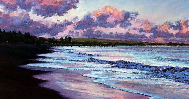
From my lockdown experiences I also learnt that painting on sanded surfaces certainly ‘upped the ante’ when it came to colour. When I combined this with my observations regarding the colour wheel I realised that these two factors would considerably enhance my pastel work. The picture ‘Buttermere’ illustrates the combination of two opposite sides of the colour wheel – yellow and purple on black 400 grade sanded paper. There are of course other colours, such as the blues in the sky and water, but the yellow and purple dominate and ‘spark off’ each other.

Complementaries come together
For the picture ‘Autumn Field’ I have used the adjacent complementary colours of yellow and red as opposed to opposites on the colour wheel and, like the picture of Buttermere, they work together to bring energy and life. Thinking back to painting in watercolour, it is not too dissimilar to the idea of working in a limited palette in order to create impact.

Popping the Lights
Finally, something else that I have learnt along the way. Pastel paintings can be considerably enhanced when small marks of light colour are added to the overall composition. In the old days, artists would use the term ‘putting on the half crowns’. What they meant was that, by adding those final touches of light, the picture would be enhanced and brought to life, making it more likely to attract a buyer and produce financial reward for the artist. The same is true of pastels, where the term ‘popping’ or ‘making the picture pop’, is used.
The picture ‘Dappled Light’ is a typical example of popping, the dappled light in the foreground lending itself particularly well to this technique.

My last picture, ‘Jungle Book’, is also an example of popping but slightly more abstract, the background foliage being built up of small diagonal strokes of various pale colours.

In fact, if any two colours are allowed to work together as dominant hues in a pastel picture this seems to have the same effect
I hope you have enjoyed sharing with me some of my initial ventures into the world of Unison pastel. Like all painting, it is a never ending journey, but one that brings joy at every step, if not a measure of frustration as well.
Happy painting
Steve Hall
For further works and details of my art courses I can be contacted at:-
Email: info@stevehallartist.co.uk
Telephone: 01225 868086
Web Site: www.stevehallartist.co.uk
Or
Visit my town centre gallery at:
Bradford Gallery, 15 Station Approach, Bradford on Avon, BA15 1FQ
Email: art@bradfordgallery.co.uk
Telephone: 01225 309332
Web Site: www.bradfordgallery.co.uk


8 Responses
Замечательный художник Стив! Прекрасные пейзажи! Хочется их разглядывать, пространство создаёт объем и гармонию. Блики света действительно дают ощущение притяжения. Взгляд радуют сочетание контрастных цветов, оранжевый и фиолетовый усиливают впечатление и динамизм
Brilliant article by Steve Hall. I too have turned to pastels as my main medium in the last couple of years and am really enjoying. His example pictures in this article are my kind of subject and I think they are stunning. Thanks for the tips Steve. Regards Cliff
I really love your work specially the lighting, the freehand. Beautiful colors.
Thanks Steve. Inspiring stuff and an enjoyable read too. I shall certainly look forward to seeing more of your work.
Your article is one that I shall be reading over and over again, as I find your work utterly inspiring. I love your loose style and intuitive and well crafted use of colour. Thank you for all the advice and tips.
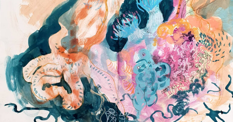
Love your work – so inspiring. I took up pastel painting during the lockdown and by using the lovely colours that Unison offer have managed a few decent paintings. There is still a lot to learn and your article re the use of the colour wheel to bring a picture to life and make it stand out is most interesting and one to refer back to. Love your elephant – so subtly coloured but the background/foreground makes it zing. Fantastic and inspirational work.
Excellent blog. It expresses succinctly the same elements that I have found during my pastel journey but I would have struggled to explain them so clearly. Many thanks for helping to get it all clearer in my head!
Love the article. I’ve had it up on a separate tab for months. (Psst. It’s not “up the anti”, it’s “up the ante”. Thought you’d like to now.)