
My heart leaps up when I behold a rainbow in the sky.
William Wordsworth
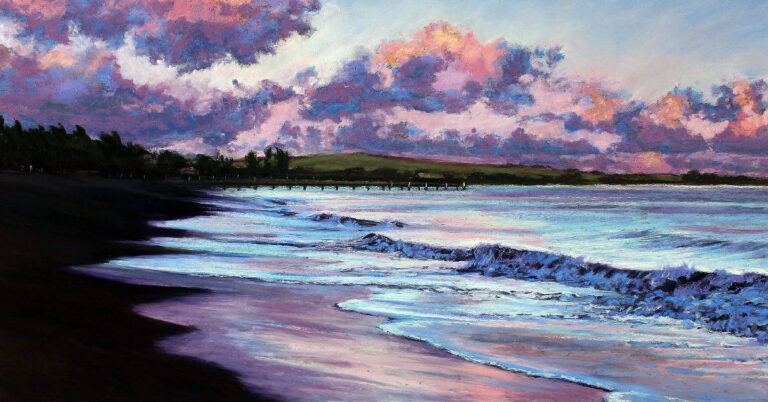
There is nothing more magical in the sky than a rainbow and this poem by William Wordsworth really captures that feeling we all get when we witness one. For the artists among us it is an extra special subject which is usually too fleeting to be able to paint en plein air. So we take lots of photos thinking we might try a painting of it some day.
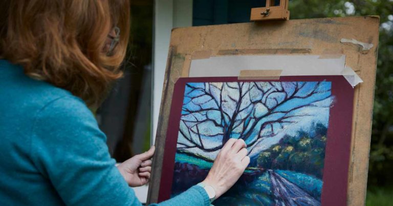
The first difficulty in depicting a rainbow in pastel is not the rainbow itself but rather the treatment of the pastel dust in the underlying layers so that the beauty of the rainbow’s colours sit resplendent on top without merging with any previously used pastels. At the same time because the rainbow appears to be in front of the sky then there is often a lot of colour and movement that needs to be put in place underneath it.

The second difficulty is making the image of the rainbow realistic without being childlike or too graphic. Of course, no two rainbows will ever be the same, so exactly the same treatment of them will be irrelevant. However I have tried a few techniques using a variety of my favourite papers which will help identify how to avoid making mud in place of iridescent rainbow colours.

Some basic observations are necessary for this subject, for example the outer edge of the arc will be red and if there is a second rainbow then it’s inner edge is most likely to be red too as it is a mirror image of the colours of the first, however faint either of them may appear. When you are drawing the arc it’s useful to imagine it being just a section of a complete circle, this will enable you to get a convincing angle. Also it is very rare to see the distinction between each colour, often they merge into each other creating a fantastic iridescent glow which shines bright from hot to cool. Parts of the rainbow might not be visible or just very softly apparent. Paintings of rainbows, just like all sky scapes need land or sea to give them context and so your rainbow sky will require more than half the composition and ideally three quarters. A square makes a very successful format for this subject because of that stunning arc which will provide such striking movement.

Remember always when working from your own photos that your memory of what you saw is filled with the emotion of that moment and include that expression where possible. When I witnessed this particular rainbow I can remember being so mesmerised by the deep blue sky which was in total contrast to the bright peach sunset behind me.
Experiment 1


In the first experiment I indented the surface of Maize coloured Clairefontaine Pastelmat with a golf tee in order to create a useful channel for the rainbow which escapes the pastel when working the sky across the first layer. Next I concentrated on the sky including all the movement necessary to make it exciting. I then made sure the rainbow channels were clean with a careful stroke of my putty rubber before adding my chosen rainbow colours. It takes practice to get a good curve with this technique although you could use a plate perhaps as a template. Avoid adding too many rainbow colours as it is very easy to make it too intense and heavy.
Experiment 2


For the 2nd experiment I used sennelier pastel card in antique white. I worked the sky across the paper first as desired and then used a craft knife to scrape away a channel for the rainbow. I scraped away as much pastel dust as I could to reveal the original paper colour. You have to be careful not to scratch through the paper surface because if you get through as far as the white card backing it is shiny and will not take any pastel dust at all. When you are ready, add your pastel colours for your rainbow. This particular paper is perfect for blending if that’s a technique you enjoy with your pastels. This method of scratching would also work well for both Fisher400 sanded and Uart sanded papers.
Experiment 3


With experiment 3 I decided to use Fisher400 sanded paper for the alcohol technique in order to fix the first layer of pastel into the grain of the paper thus avoiding rainbow contamination! So I painted alcohol over a very basic initial composition of pastel and left it to dry completely. I left the two areas for the rainbow channels and put pastel colours on the sky everywhere else and blended with a little spatula. I then worked on the rainbow colours. This method does require more consideration for where your sky colours go so it doesn’t allow for such an expressive depiction of the sky.
Whenever you start a project like this one it will help you to try a variety of experimental techniques on different papers to build your knowledge. Play with ideas before starting your final painting and above all have fun with it.


3 Responses
(Translated)Beautiful job!!
Right now I am in Chilean Patagonia, Futaleufú and it is amazing to see a rainbow often!!
I have taken many photographs that I treasure for when I return to the city to work on it.
Excellent step by step of your work!!
Greetings from 🇨🇱 Chile.
(Original)Hermoso trabajo!!
Ahorita me encuentro en la Patagonia Chilena, Futaleufú y es sorprendente ver a menudo un arcoiris!!
He tomado muchas fotografías que atesoro para cuando regrese a la ciudad y trabajar en ello.
Excelente paso a paso de tu trabajo!!
Un saludo desde 🇨🇱 Chile.
Hello Ninoscka
Thank you for your kind comments. It is wonderful that you see plenty of rainbows and have photos of them to paint from. They are just so magical and bring out the excited child within all of us. Here in Wiltshire we have big open skies so the rainbows are often spectacular. Enjoy painting your rainbows.
Best wishes
Cathy
Thank you Cathy,
A lovely blog and very informative. I also saw your beautiful pastels in White Chalk Gallery Friday.