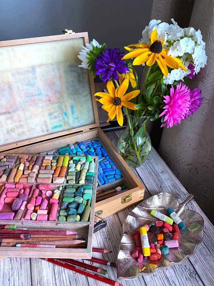
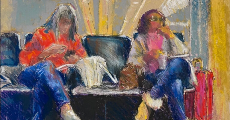
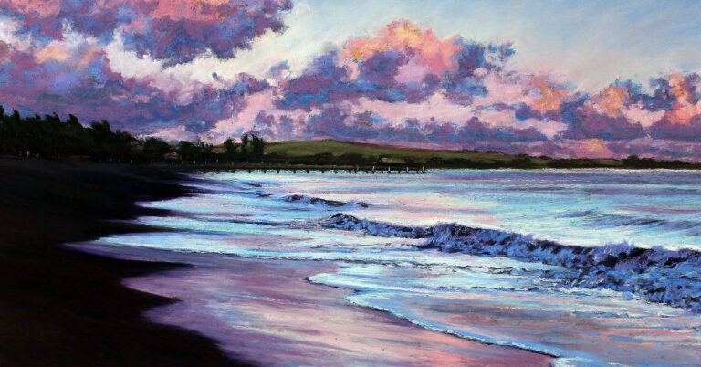
Each artist has their own colour palette and color preferences. Those who are familiar with my art style know that I do like incorporating bright vibrant colours into my artworks.
In this article I’ll share 6 pastel colours that I use actively and that make my artworks pop up!
And the curtain comes down…here they are.

Let’s go in order.
My favourite #1 is Unison Colour A15.
Absolutely gorgeous bright pure red pigment that in combination with dark red colors makes beautiful light.
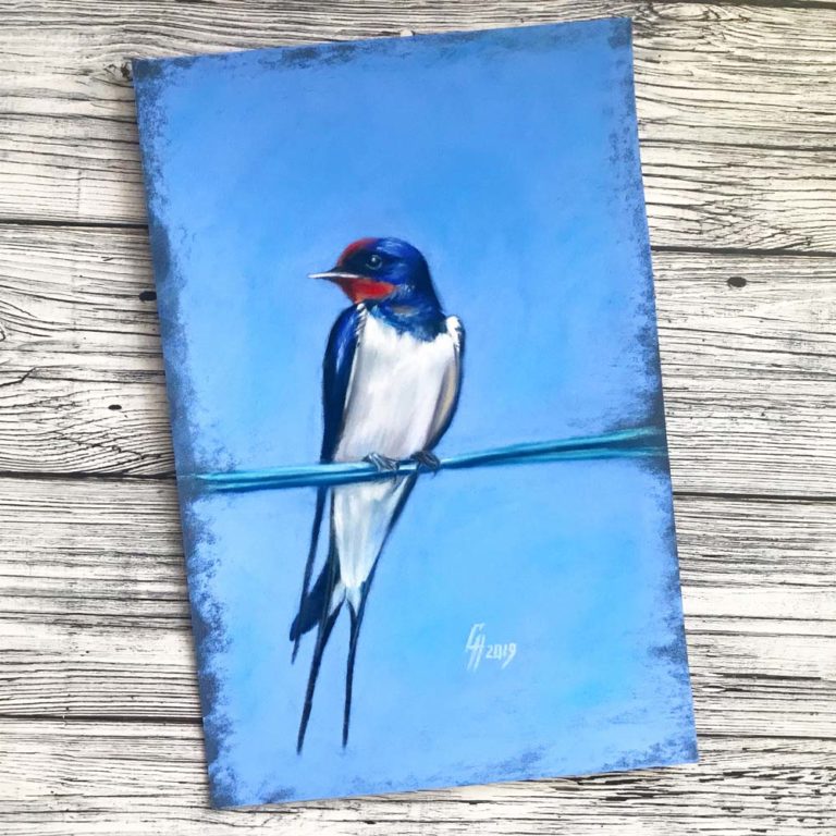
Actively use it whenever it comes to red berries, red glossy objects, etc.

Next let’s move on to orange shades.
2 more beautiful pastels colours that I have in my palette: Unison Colour Orange 4 and A14.
2 bright orange pigments that will add a nice juicy mood into paintings.
Love and use these actively whenever it comes to fresh drinks, fruits, etc.
So we have 3 more to go.

Next comes yellow Unison Colour A11 – pure sunshine in a stick!
Perfect to highlights and adding shiny parts into glass objects, fruits. Often add it at the very final stage of painting.

And the last but not the least: 2 shades of green, Unison Colour Green 28 and Green 30.
So yummy and vibrant, but at the same time absolutely natural colors! Like pure color of summer green apples placed at a sunny place.

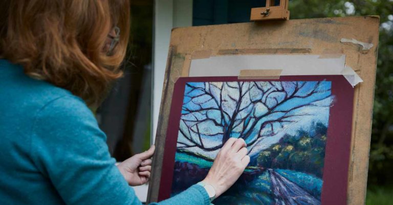
For sure that is not the full list of my favorites, but one of its most yummy parts! Happy drawing!


12 Responses
Thank you Natalia! They look wonderful!
Thank you, Carole!
I love all the picks…..BG14 is my go to for a color pop. Its a turquoise that never fails to “bring it home”. Thank you Natalia for sharing. Your paintings are always spectacular.
Thank you so much, dear Julia! Noted BG14 🙂
Hi I am ashok from india n I have art matiral showroom so I am interested in your prodect please sand your catalog n price list
Thank you
Hi Ashok. You’ll find all our products here on the website, and we actually have a stockist in India. Take a look at the following link for details…
http://www.unisoncolour.com/stockists/india-stockists
(Translated)Hello!
What beautiful and powerful colors!
Too bad that here in Chile the sale of Fine Arts products is so poor.
What luck of those who can acquire them!
Greetings from Santiago de Chile.
(Original)Hola!
Qué hermosos y potentes colores!
Lástima que aquí en Chile la venta de productos de Bellas Artes sea tan pobre.
Qué suerte de aquellos que pueden adquirirlos!
Un saludo desde Santiago de Chile.
Fabulous colours. I love using bright colour – and these certainly fit the bill!
Nice post to show dramatic effects of color thank you
love your images, and thank you for your colour choices. They all look stunning particularly the red and orange choices.
All pastels not in my starter, dark or Lynn Howarth sets.
Glorious tones, I love following your vibrant pieces on Insta xxx