
As pastelists you may have come across the misguided thought that pastel paintings are more fragile, yet when prepared and framed properly they are as enduring as any other medium if not more so, provided artists have used quality pastels and materials. Pastel works are known to still look the same after 300 years without the foxing or cracking that can appear with other mediums, but as with all paintings after framing, they should be hung away from direct sunlight and out of damp locations to safeguard the artwork.
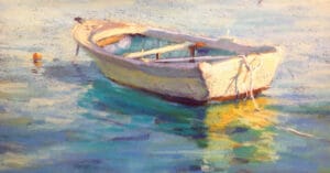
Whether you do your own framing, like I do, or you take it to a framer, it’s essential that you prepare your pastel work properly before handing it over to them. It doesn’t take very long, but it will avoid any potential problems for you or a purchaser down the track. I’ve had the odd painting of mine fall face down in it’s frame yet no pastel was dislodged or visible on the mount board when inspected. It actually happened not long ago to the boat painting I’m using here as my example in this blog. I had been was asked to bring it along to a pastel meeting of the society I belong to due to it winning an award in a major show, after which I leaned it against a wall on the floor. During pack up time, someone came and told me it had fallen over face down. Thankfully it sustained no damage whatsoever — and I hadn’t use fixative on it either.
Although for most of you, it’s probably obvious why and how we frame pastel work, let me share some thoughts I have about that. We frame pastels for preservation and aesthetics. An undamaged, well framed work will make it easier to sell, whereas one poorly framed will hinder it. Framing also plays a part in work that is being judged, so try not to skimp on that by buying cheap frames and forcing your painting to fit. If necessary buy a good frame or have them pre-made by your framer and paint to put a painting in it. I work to standard sizes as much as possible. By using even mount board widths on all sides, this displays your work beautifully, whereas a frame with narrower sides and wider top and bottom areas, to me, make the work feel squashed in. I wonder if you might feel the same? Traditionally, works on paper have been mounted with even top and sides with an extra 3/4″ (2cm) at the bottom. This was done because often paintings were hung very high and the view is therefore more balanced and easier on the eyes. If you’re like me and want to be able to swap paintings out occasionally, this traditional method won’t allow you to swap between a landscape and portrait format. So, depending on the size of the artwork, I’ve learnt that by giving a painting a wider mount board of at least 3 1/2″ – 4″ (8-10 cm) on all sides, sometimes even wider, I’m able to swap over any painting regardless of format, and still feel that it looks good. A wider mount board also gives the artwork what I call “elbow room” which often flows into the frame itself if it’s of similar colour to the mount board. These days paintings are generally not hung as high in homes or exhibitions, except perhaps at national galleries or museums.
I feel it’s equally important to avoid a frame that continually takes your eye away from the artwork. If in doubt, I have a simple way you can check this. When at the framer you usually place mount board and frame corners around the work to see what you like. When you think you have what suits, if you can, place it all on the floor or a lower table and stand near it hovering your hands over the left and right corners of your selected mount/s and frame. Then squint a little making a judgement whether your eyes are drawn more to the frame or the artwork. If it’s the frame that your eyes keep going to and especially if they linger…change your selection. A frame should never overpower the artwork, therefore keep things simple, especially if a body of work needs to hang well together in an exhibition. Have you ever noticed how a painting with dark mount board or an overpowering frame is usually hung away from the rest in a less desirable spot, as they clash or don’t work in cohesively with the rest being displayed in a group exhibition?
When you start a new pastel painting, a consideration I recommend, is to allow a minimum of one inch (2-3cm) or more to remain as a paper edge around all sides of the painting. Artworks on paper are often hung in homes where the temperature and moisture in the air may cause the paper to contract or expand. When we mount close to the edge of a painting, it can happen that the edge slips out from under the mount board which won’t go back. By leaving a wider border around your painting, you’re able to avoid any possibility of this. I know that many pastel papers are made to certain standard sizes, hence the temptation is high to paint right to the edge, but consider then framing it without a mount board. This way, it can be more securely placed and tacked within the frame with a spacer to keep it from moving or touching the glass.
I personally, almost always use a full large sheet, even when painting a half-sheet size. I started this when I first began to demonstrate and I don’t see it as being wasteful but rather it assists me. I mark and outline my chosen standard painting size with charcoal to one side of my sheet allowing for my border, which then also gives me room on the side or below, to test a colour before applying it. It further gives me space to try out a technique or test the size and shape of something, such as a bird or other object I’m contemplating to include at the last minute. On the odd occasion, it’s also allowed me to extend a painting over to one side for a slightly better composition or balance. The advantages of working this way, to me, outweighs the cost of the unused paper, but even then the off-cut can be useful for a small thinner horizontal or vertical painting.
The following now is what I do when my painting is ready for a frame, although I usually like to have a painting sitting in the studio for a week or two to be sure I’m totally happy with it. Firstly, I like to dislodge any loose pastel, so I tap or flick with my fingers all over the back of the painting; lightly if the support is thin like Canson Mi-Tientes paper and more heavily if it’s on a thicker sanded paper or board. Perhaps do this outside or in an area where you already have pastel dust. This encourages any pastel that could fall, to fall off. Next, I lay the painting on a table or the floor and cover it fully with a sheet of paper such as a large newspaper page; brown wrapping paper that your pastel paper purchase may have come wrapped in, or even a sheet of glassine paper. It doesn’t really matter what paper it is so long as it doesn’t have big creases in it that can gouge the painting surface. Avoid moving the paper once its on the painting, and either press all over it with your flat hand or a screen print roller. This pushes in any pastel that might still want to fall, leaving a minimal impression on the paper once you take it off, but you won’t notice a change in the artwork.

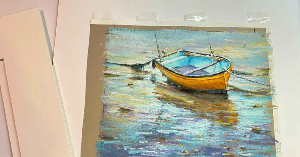
How do you then let your framer know how much of the painting edge they should cover? Please don’t rely on a verbal conversation. Sometimes they crop off more than you’d like which may alter the composition. In the image below you’ll see that I have used charcoal to mark the mount board cropping points in the corners. This way there can be no mistake, and you’ll have a comeback to have it reframed if a framer deviates from your marks.

What about fixative you might ask? This is a very personal choice and also depends on what you are trying to achieve with your artwork. I generally DON’T use fixative on my work, especially not when finished; not even one touted to prevent a pastel work from darkening. I’ve found they all do in one form or another; some colours more by one brand, and less by another, but they still all do — especially the light values. Should you be positive that the one you use, doesn’t, I’d love to hear from you. Yet, if you DO want to darken an area of your work or want to be able to add more layers that don’t blend with what’s underneath, fixative is another tool a pastelist can use. I did this in the portrait shown here, as I wanted to darken the hands to keep the attention more at the face, plus the dark pastel background tended to drop and show pastel more easily, so therefore I ended up framing this portrait without mount board. It’s extremely important to also tell your framer, NOT to spray your work with fixative when you give it to them. It’s been known to happen without the framer checking with you, with disastrous results as they like to spray heavily.

Lastly, when you take your work to a framer, always hand it over with a cover of glassine paper as temporary protection and clipped it to a board, or better still, between two layers of old matt board, cardboard or other sturdy board with a glassine sheet still over the artwork. It’s easy to pick the board up when you collect your framed painting.

I hope my method and thoughts have shown you a way that can also assist you. I like to keep the end result and what could affect the buyer in mind at all times. This has served me well throughout the years.