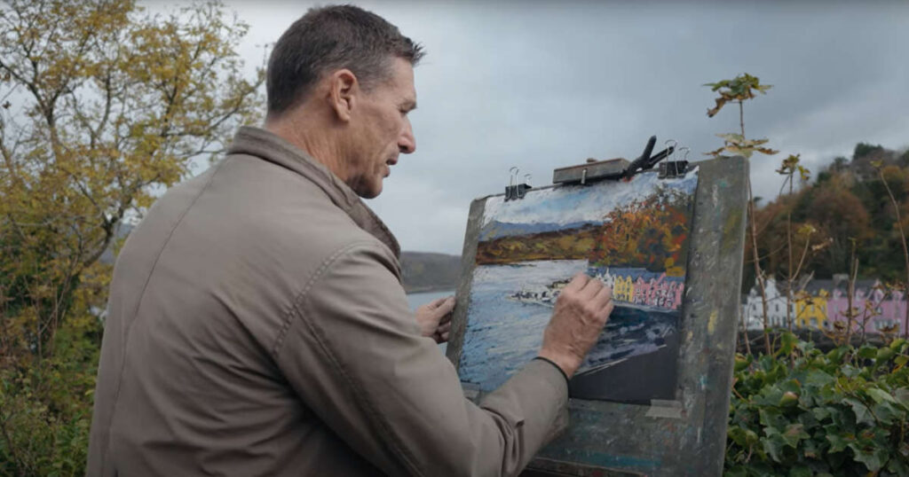
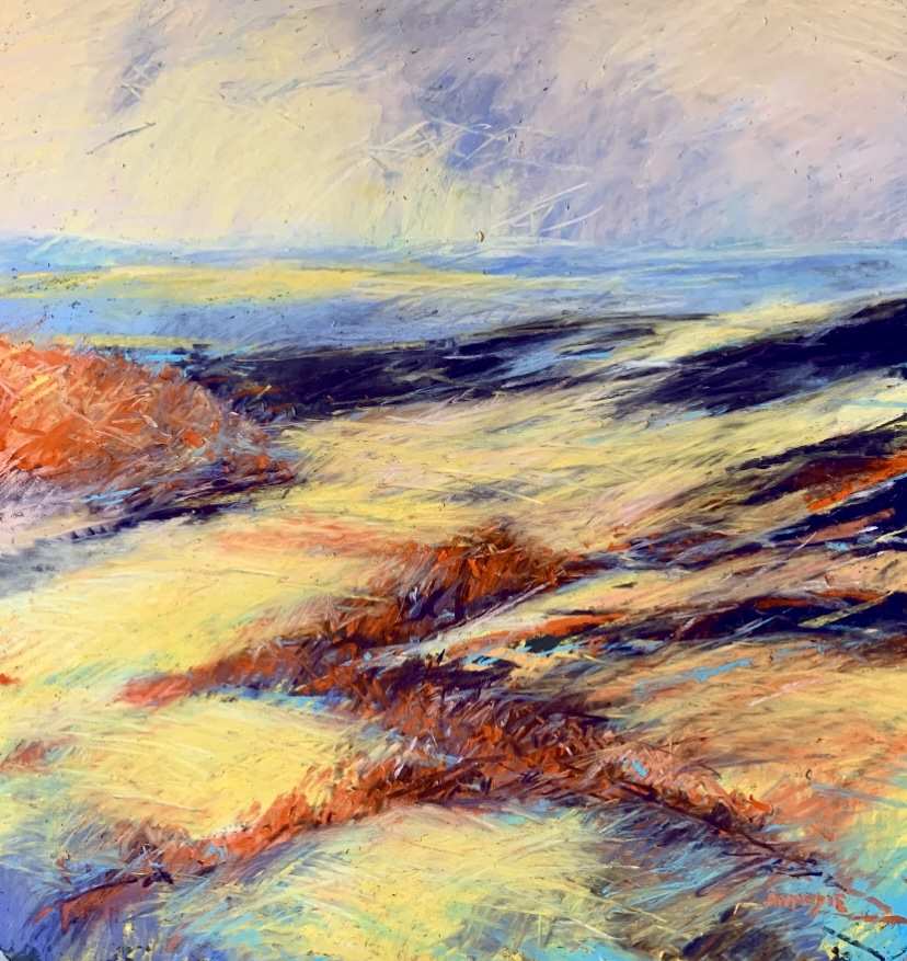
A Moodie Skye Part 6 – Portree Quayside
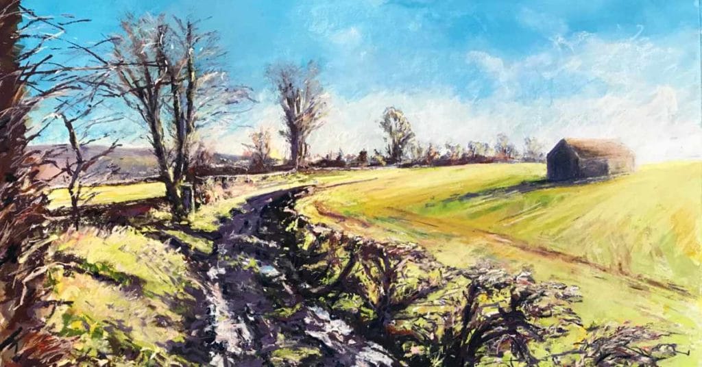
After being blown away and rained off at Neist Point, we headed back inland to Portree, the capital of Skye and its largest town, visited each year by many tourists, as well as artists and photographers.

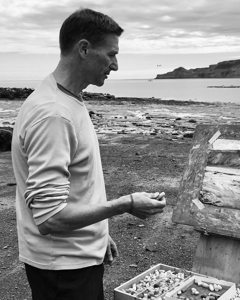
For as long as Andrew can remember, he has loved and been inspired by art. He managed to continue to draw and paint throughout a busy first career as a lawyer and, since retiring (slightly) early at the end of 2018, he has relished the opportunity to follow his passion full time. Having spent the majority of his office years and childhood using soft pastels, his first love remains with this most immediate of media, and he has been an avid user and supporter of Unison pastels since their first appearance in the market.
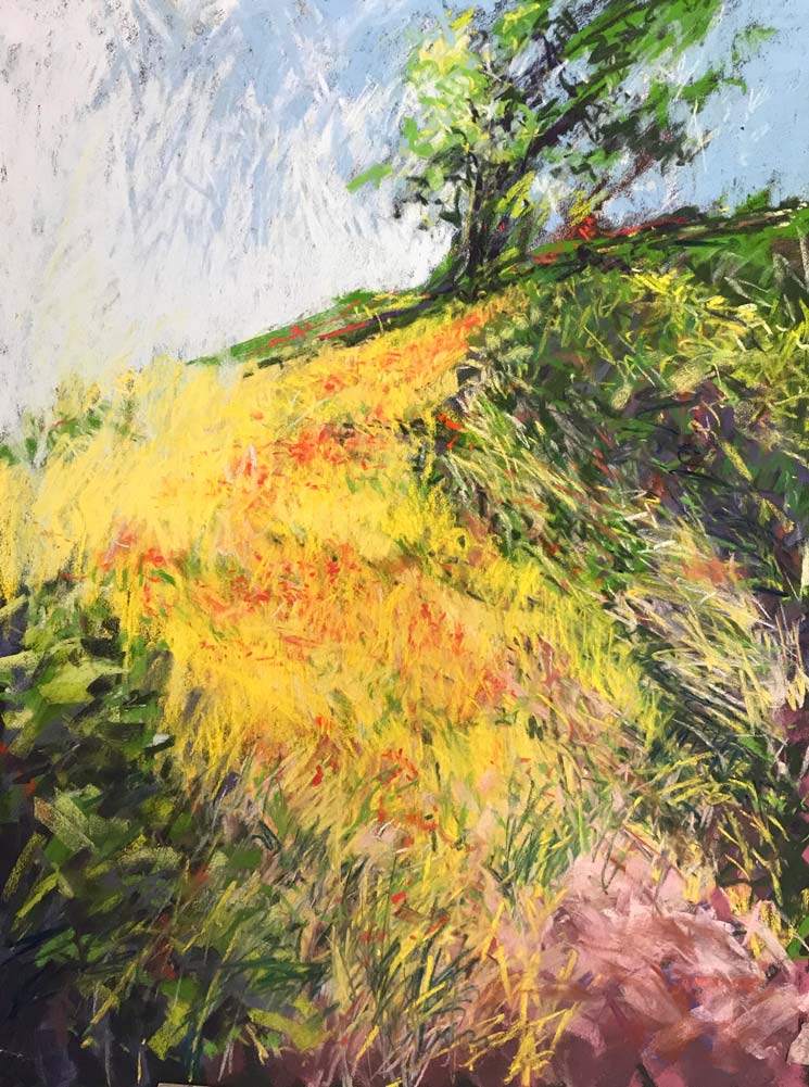
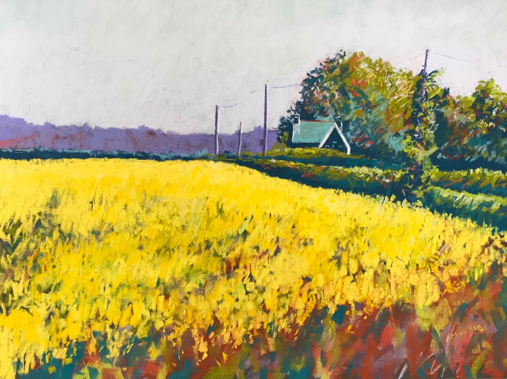
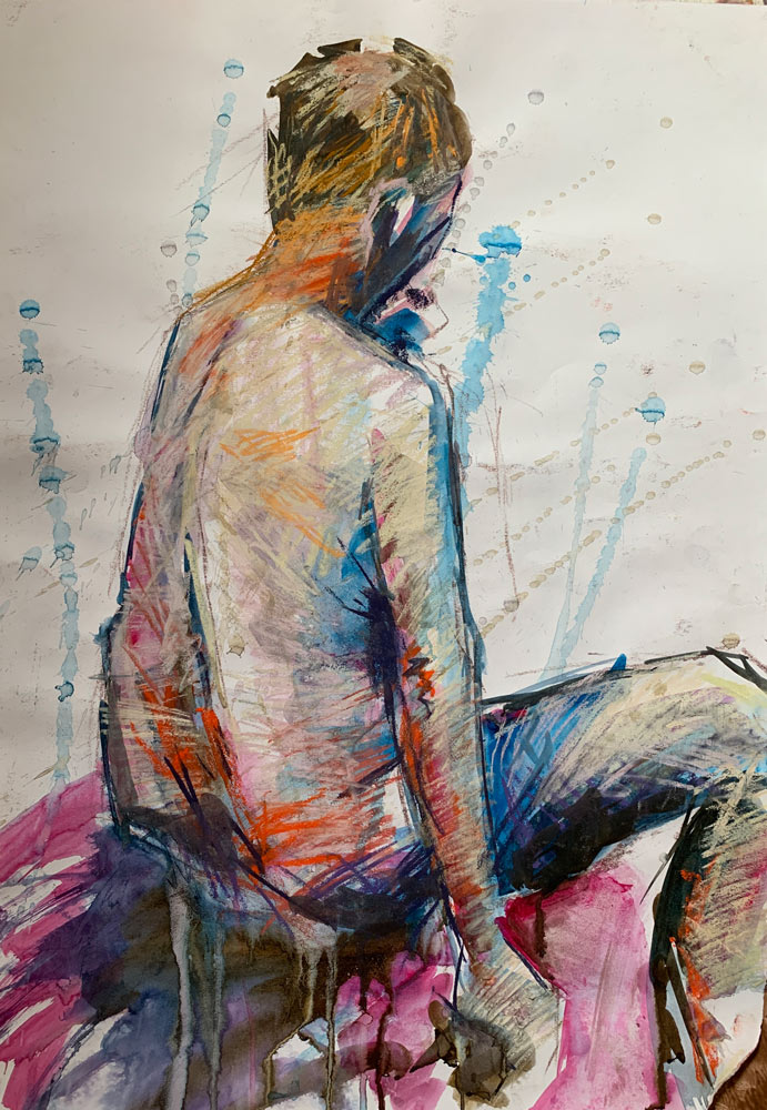
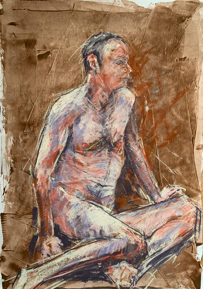
Andrew’s favourite subject is the landscape, in particular the Yorkshire Dales (on the doorstep of where he now lives in Harrogate), and also the nearby coasts of Yorkshire and Northumberland and the breathtaking scenery of his home country of Scotland when he manages to get back north of the border. He is never happier than when he is outside with his easel seeking to capture the landscape in all its glory. He also seeks to enhance his drawing skills with a weekly life class and also paints portraits (both human and animal!).
Andrew’s intention when painting the landscape is to imbue the viewer with a feeling of immersion, to hear the birdsong, to smell the grass and wild flowers, and to be uplifted by the light; all the things that bring Andrew to the landscape in the first place. He seeks to create expressive images and often adopts a mixed media approach, using acrylic inks, paint and sprays, watercolour, graphite and liquid graphite in varying combinations, to create expressive bases and layers in preparation for further mark making with pastel. At all times he seeks to maintain an energy in the work to uplift and inspire the viewer. He works en plein air or from life whenever possible, usually completing the work in the studio, but always seeking to preserve the in situ energy.
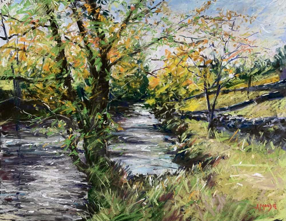
After being blown away and rained off at Neist Point, we headed back inland to Portree, the capital of Skye and its largest town, visited each year by many tourists, as well as artists and photographers.
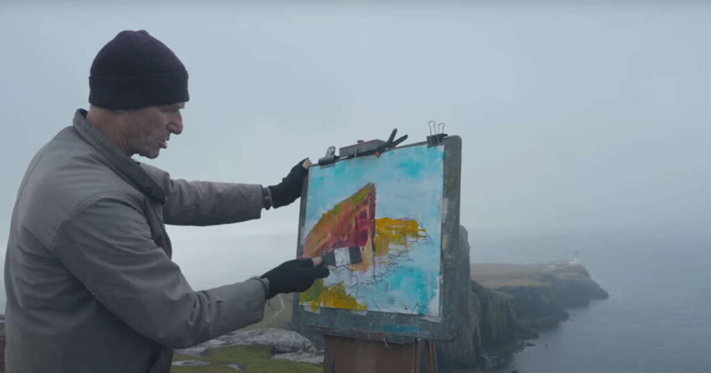
Watch me battle with the elements to create a mixed media painting, starting with an underpainting using acrylic inks on watercolour paper, before driving rain and wind took over!
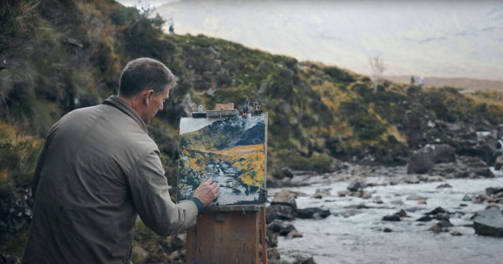
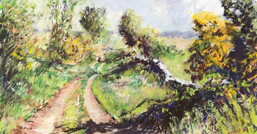
The Fairy Pools are a popular landmark on Skye, being a series of clear natural pools and waterfalls below the Cuillin mountains.
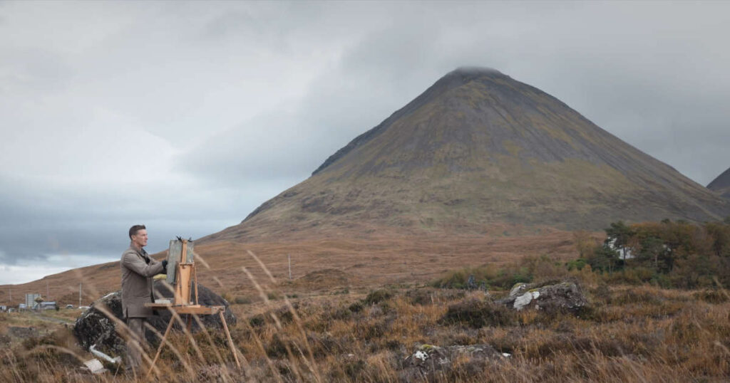
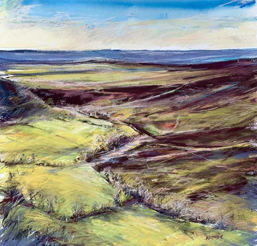
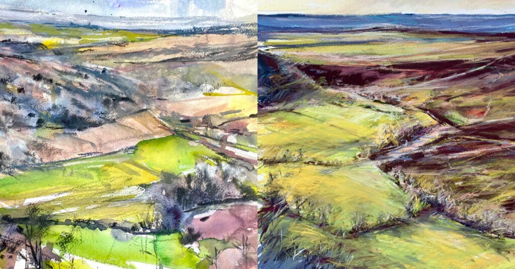
This landscape is like being in another world. The bleakness of the moors, devoid of trees, but with rocks, rivers and mountains, all apparently strategically placed for the benefit of artists and photographers.
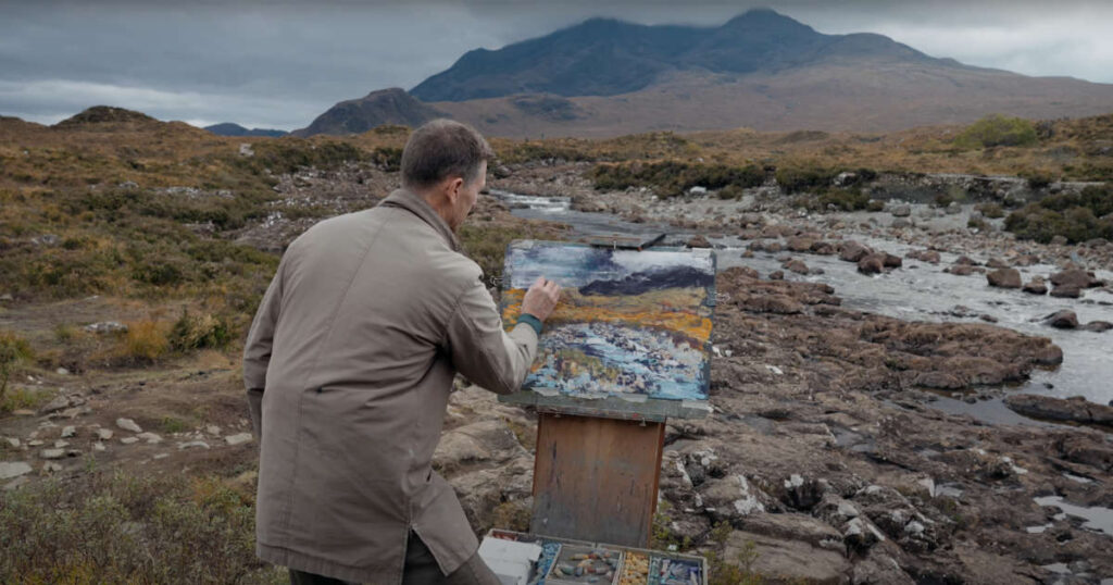
See me painting at Sligachan on the Isle of Skye with Unison Colour pastels, seeking to capture the beauty of the landscape at Sligachan.
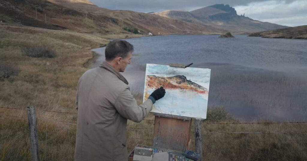
This was my first painting on my trip to Skye. The morning was gusty and cold but down by the side of the Loch the winds were more gentle.
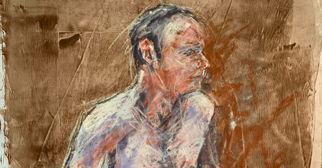
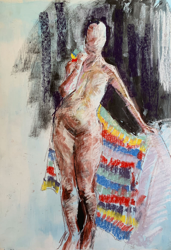
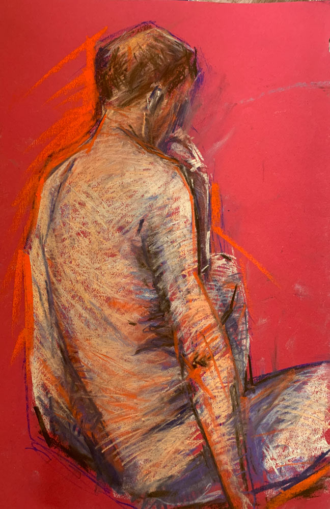
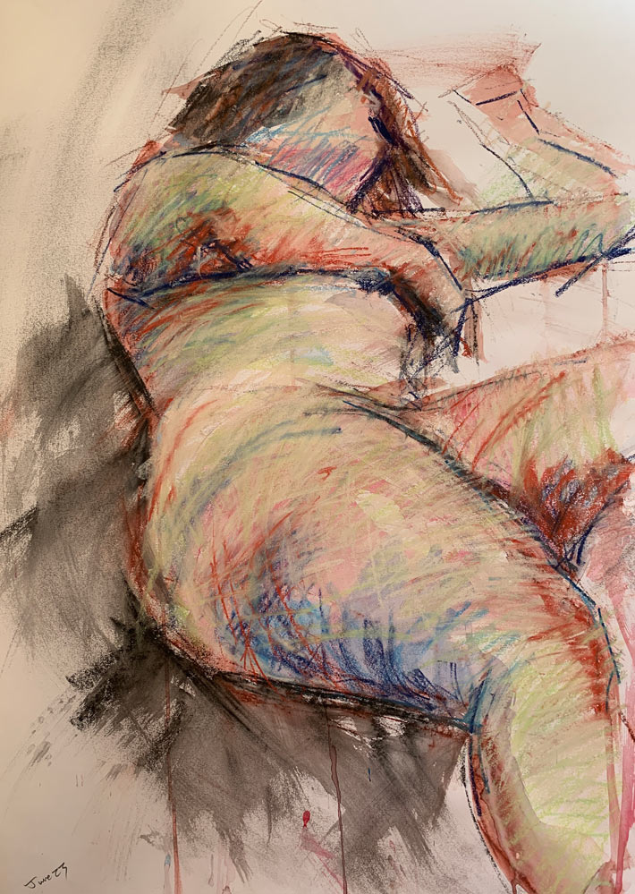
I have attended a variety of life drawing classes over the years and have come to realise just how helpful they are to my progression as a pastel artist of landscapes.
My knowledge of the North York Moors is scant at best! My go to locations have tended to be the Yorkshire Dales, given their proximity to Harrogate where I live.
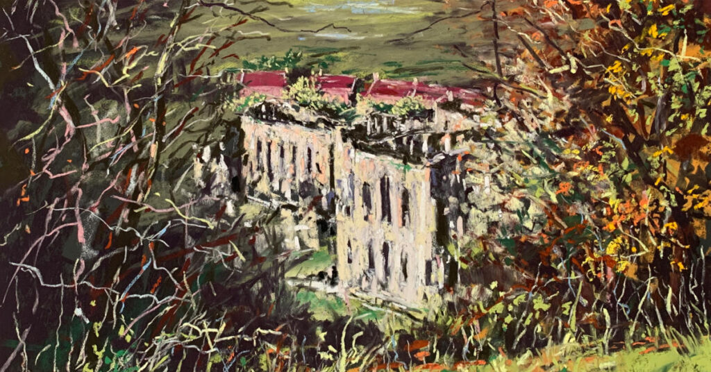
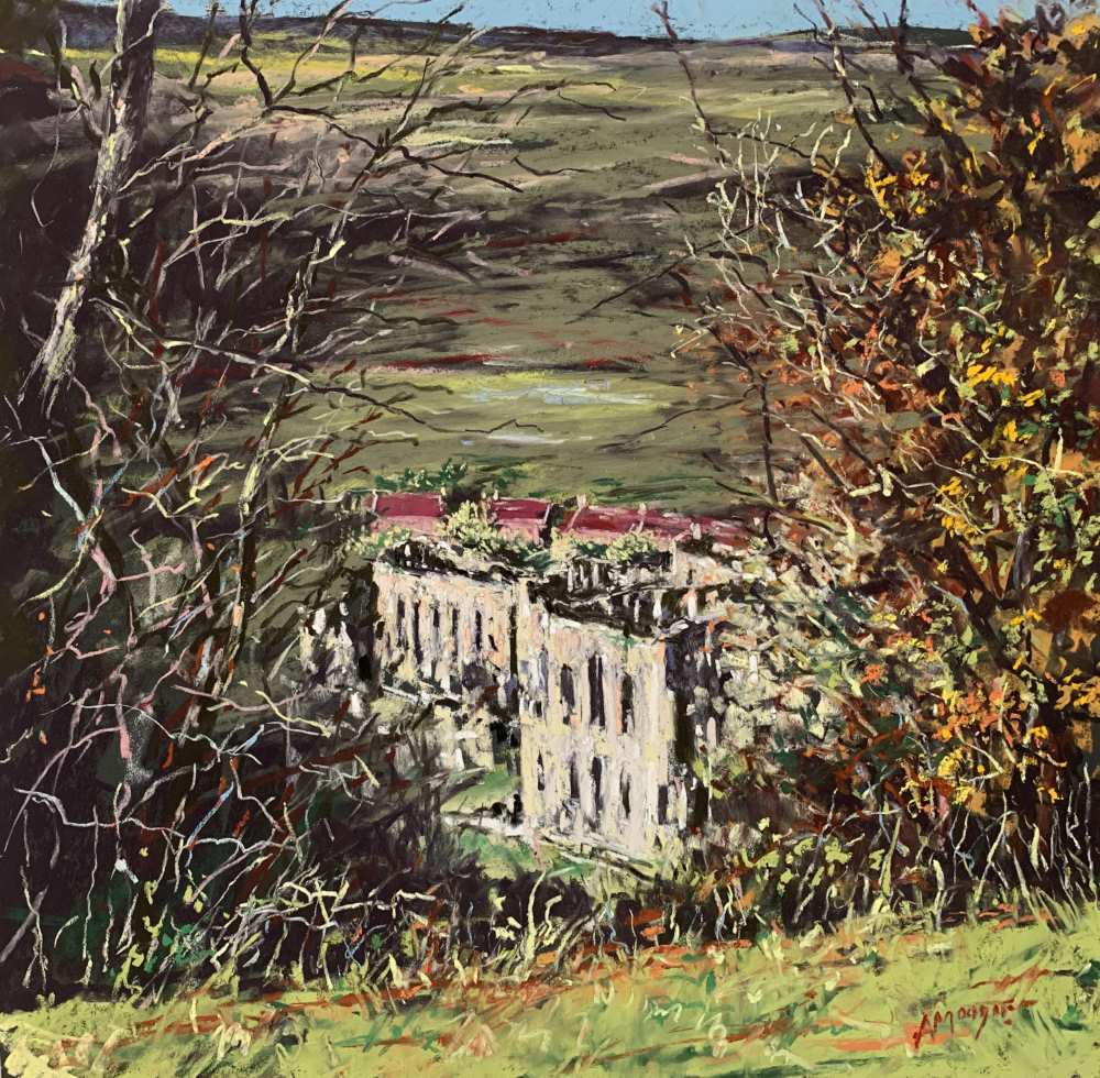
In this part 2 short video of my day at Rievaulx Terrace, I seek to capture the majesty and beauty of the view of Rievaulx Abbey far below the Terrace, set in a late Autumn landscape.
This short video provides an insight into working outside in the Yorkshire landscape, using Unison Colour pastels.
'I have many times felt that I have lost the excitement and energy of the initial underpainting stage by overuse of pastel, and I felt that had perhaps happened here when I considered the finished work.'
It is such a privilege to be part of the forthcoming Exhibition ‘A Yorkshire Year’ to be held at Nunnington Hall in the heart of the North York Moors between 14 September and 15 December 2024.
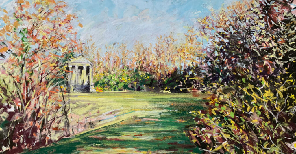
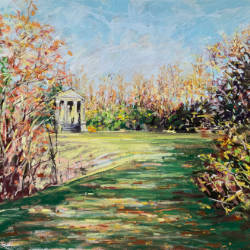
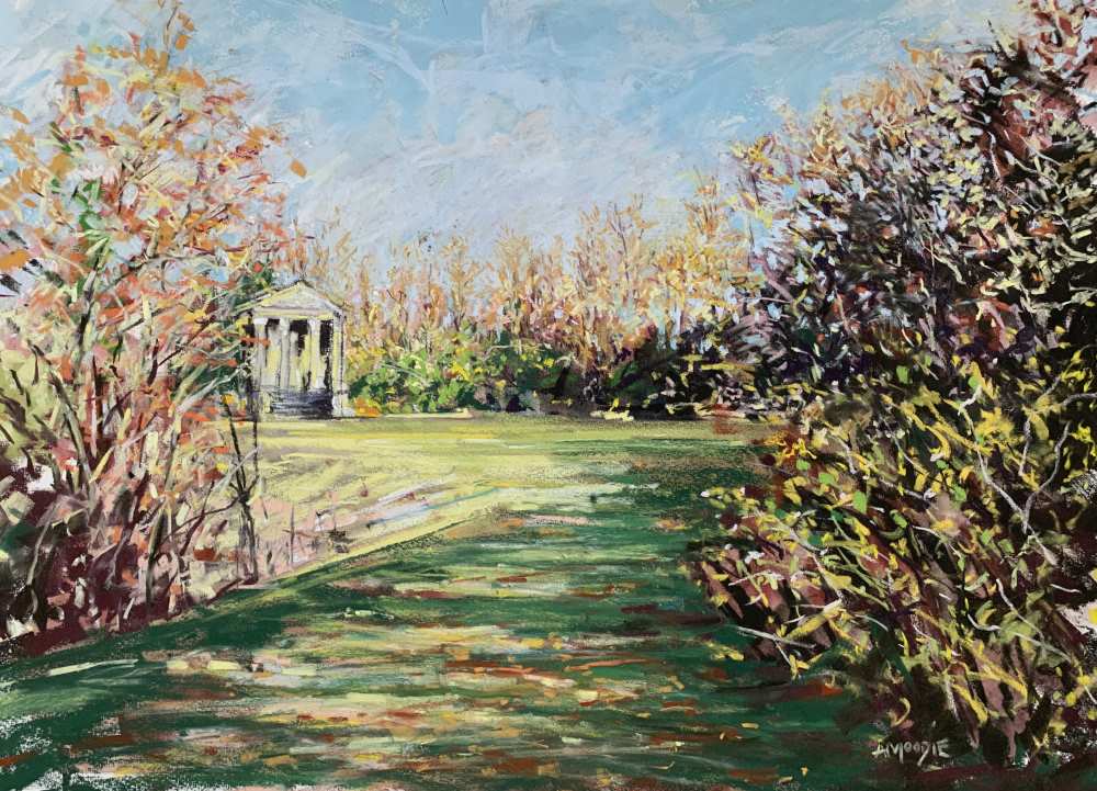
In this Part 1 short video, I create a mixed media painting of the Ionic Temple on the Terrace, using ArtGraf Tailor Shape blocks of water soluble pigment, watercolour and Unison Colour pastels.