Profile photo of arild frisnes

Arild Frisnes

Unison Colour Associate Artist

www.arildfrisnes.com

About:

Arild Frisnes b. 1966 is a self taught pastelist. He has lived most of his life in the north western part of Norway with the beautiful and wild nature this area of Norway has to offer. He is educated horticulturist and has worked as and had his own company in that field for several years. After a health issue in 2014  he had to retire and now he is a full time artist. Arild started to work with pastels in 1991 and  it has been his main medium for the whole time with the exception of some years.

“My art journey started like many of us in the childhood. I remember drawing a giraffe and discovered how to make shadows , it was an eyeopener. “

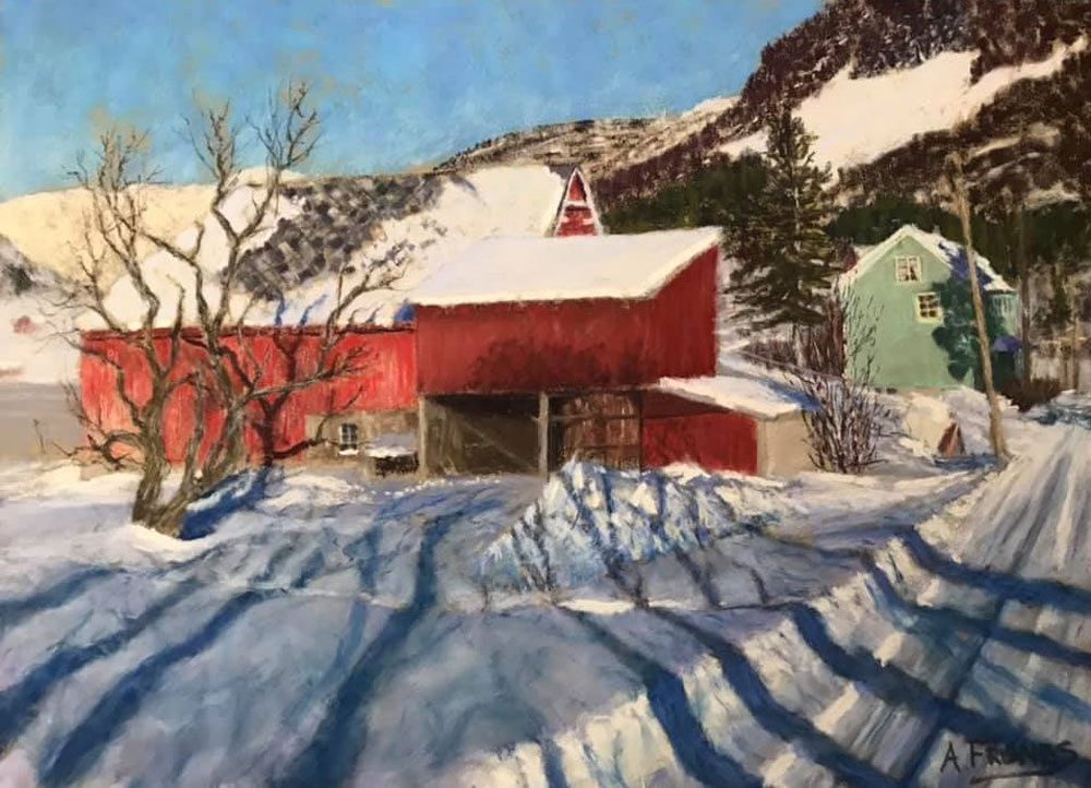
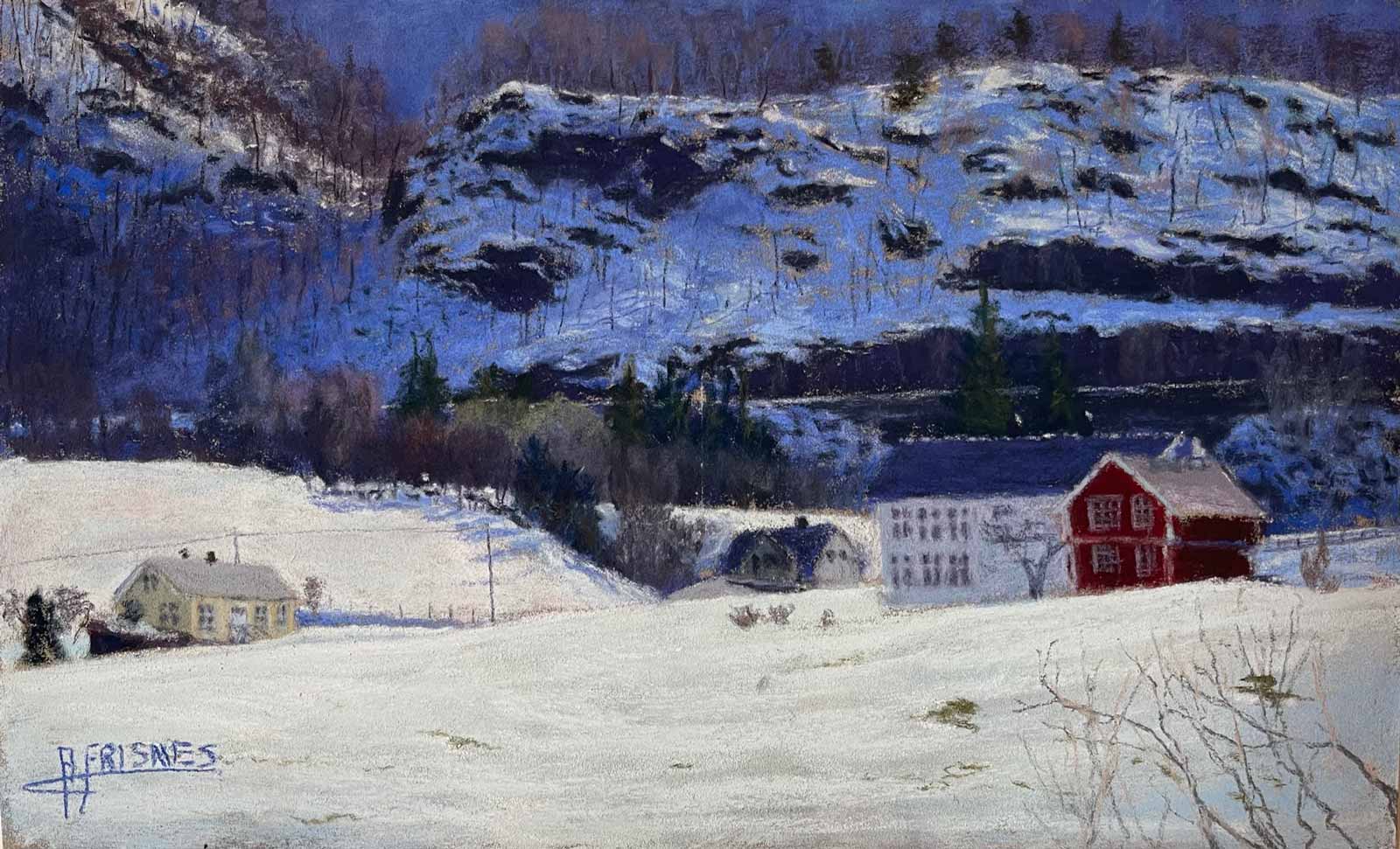
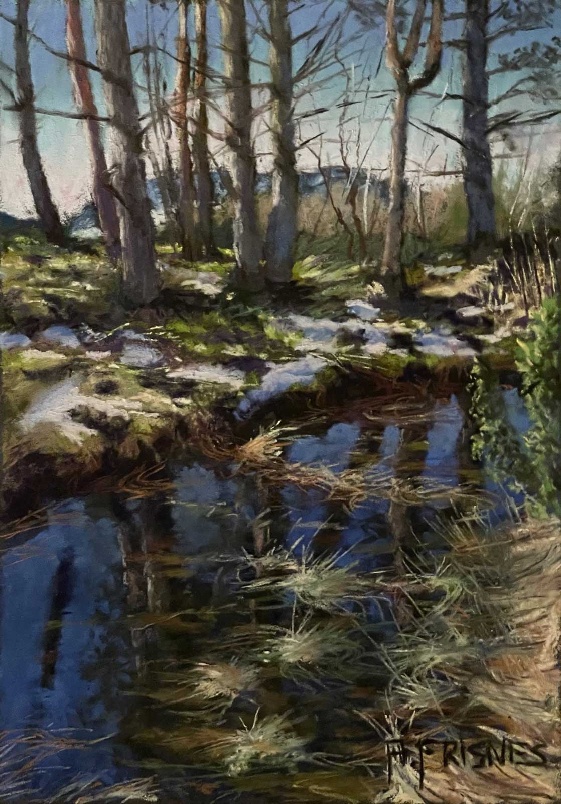
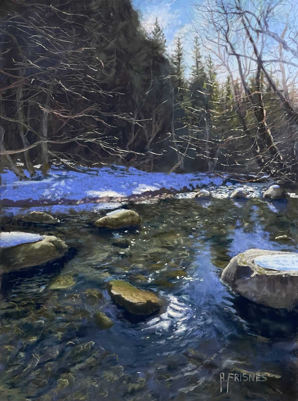
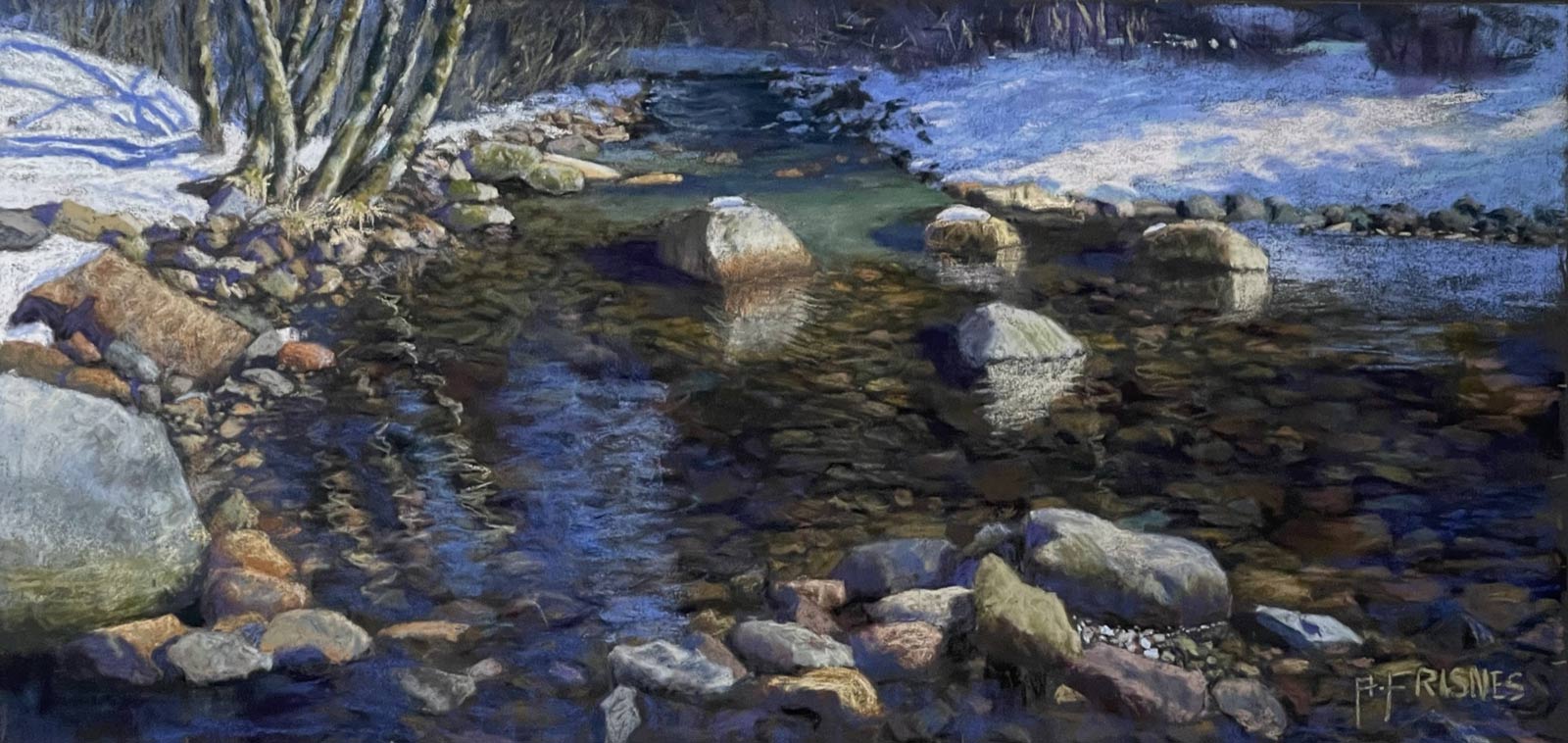
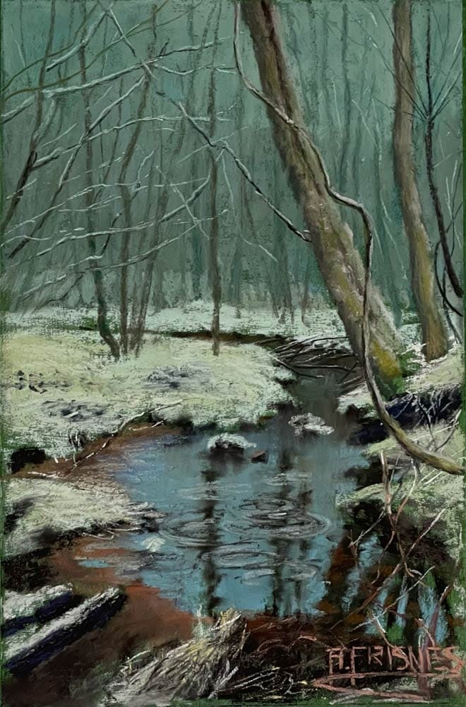
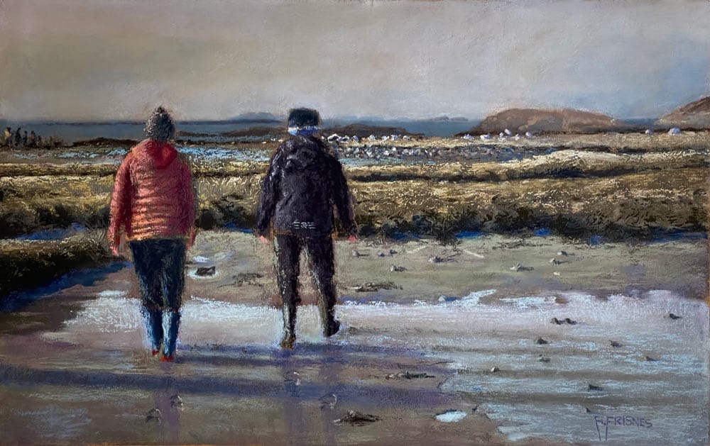
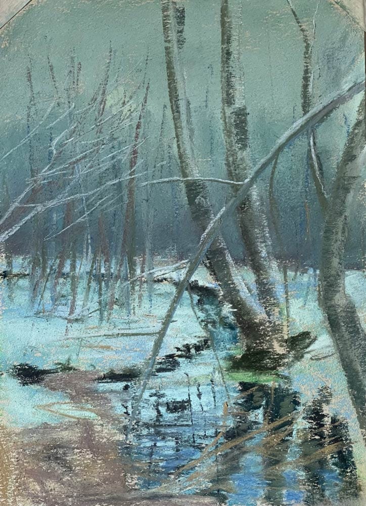
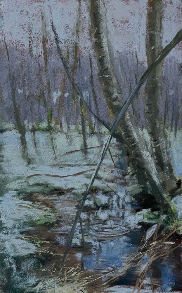
“I always seek to find a subject or mood in the landscape that has a meaning or starts a emotional spark in me”

Arild constantly tries to push himself forward by exploring the way we are percepting the nature and environment around us.

Arild is inspired of the impressionists and has special place in his heart for the Norwegian artist Fritz Thaulow (b.1847 d.1906) He is active in his local artclubs and  has participated at exhibitions both localy and internationaly. He is also a member of Pastel society of America and Pastelguild of Europa.

He now lives in the town Molde with his wife Inger Anne and Andrea, the youngest of three daughters.

Blogs by Arild Frisnes

  • Read Eye catchers September 2025 by Arild Frisnes.

    Eye catchers: September 2025

    First of all, I would like to thank Unison Colour for the honour of having the opportunity to be a guest curator of Eye catchers, my selection of 10 images posted on the Unison Colour Soft Pastelling Community Facebook Group in September.

    Arild Frisnes

    17th October, 2025

  • Find your inner artist by arild frisnes feat

    Find Your Inner Artist

    I get a lot of comments like “wow, looks like a photo”, but with a closer look it’s not so close to the reference after all. My goal is not to recreate the photo in all the details.

    Arild Frisnes

    9th December, 2022

Colour Chart Guidance

We believe the colours in our web based colour chart are a faithful representation of our pastel range. But with any colours portrayed on the internet, there’s a whole heap of variables which mean that what you see, may not be what we see. That said, there’s some things that can be done to mitigate some of the variance.

Mobile phone and tablet screens tend to be pretty good for colour, so they’re always worth using, when viewing our colour chart.

We hate to say it, but cheaper computer displays, including laptops, can be rather hit and miss, in both colour and contrast, so they might not reveal the depth of the colour, as well as the true tone.

If you’re really keen on getting your computer up to speed on colour representation, you can use a calibration device to reach your display's fullest potential.

With all that said, if you think we’re way off the mark with any of the colours then, by all means let us know, and we’ll give it another shot.