Soft Pastel and Clear Gesso Technique
A six step guide to using Clear Gesso with Soft Pastel, by Cory Goulet. Achieve interesting shapes, texture and depth with this simple guide.


I am an Artist, my platform, my passion and my obsession is art.
My art is a part of who I am and a necessity in my life, it is how I express myself. I work in both pastels and acrylics – mixed media. I love trying new tools and techniques in the creation of my art and I am continuously working to evolve my craft, it is a continuous process of learning.
I have a strong desire to learn and push the boundaries of abstraction and at times a love hate relationship but nothing I would rather be doing. I love investigating the history of art and artists. I have so many questions. Making a connection with a fellow artist is also particularly important to me. I find inspiration from other artists and enjoy learning from them. Isn’t life after all, just one big learning experiment.
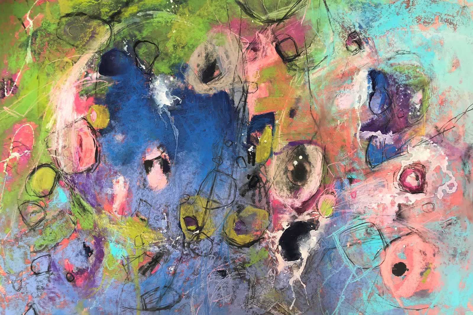
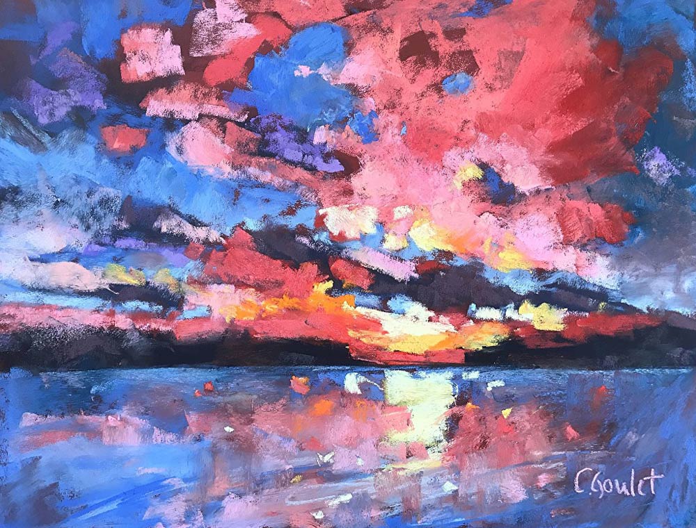
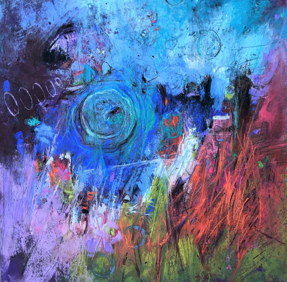
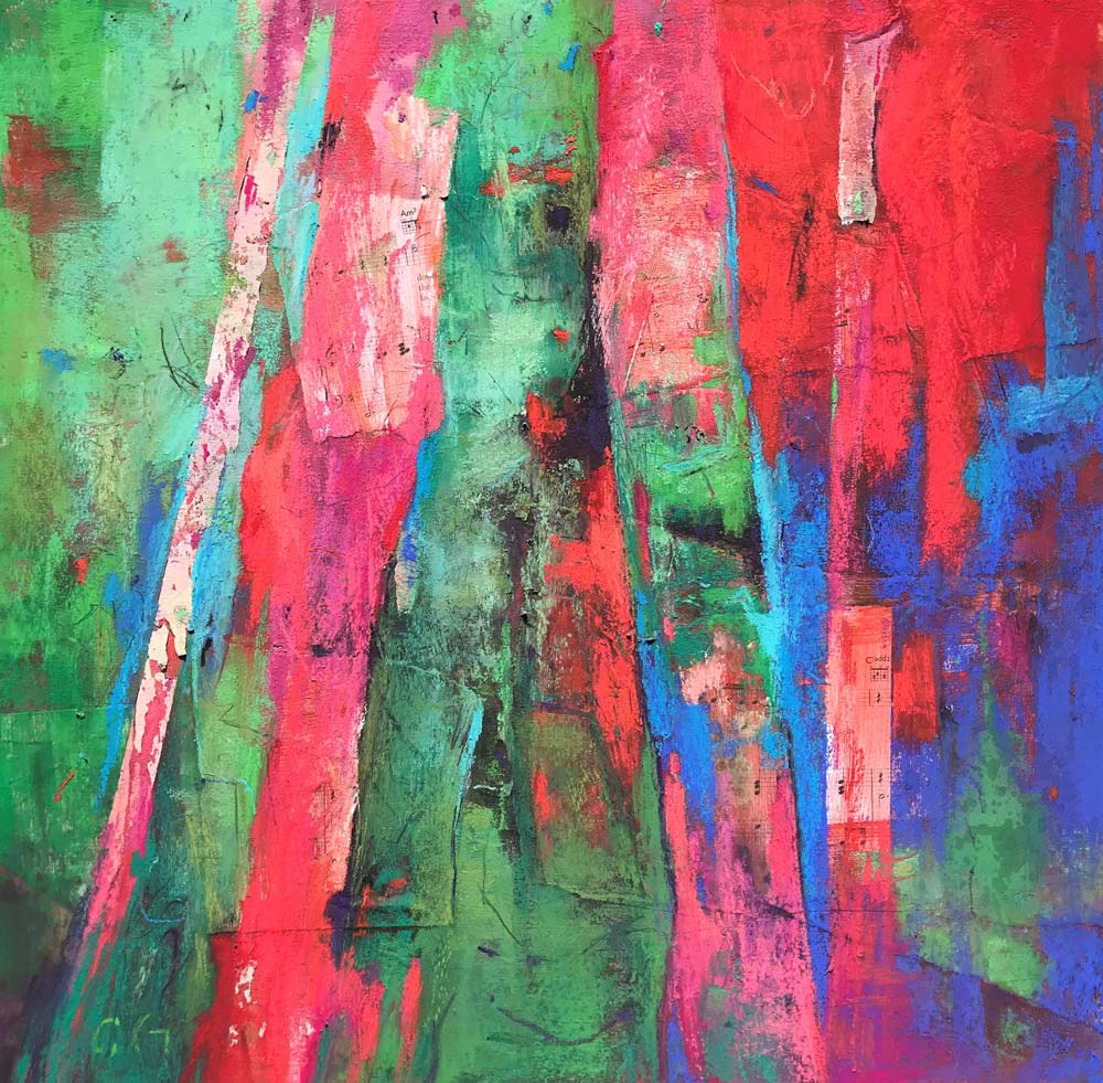
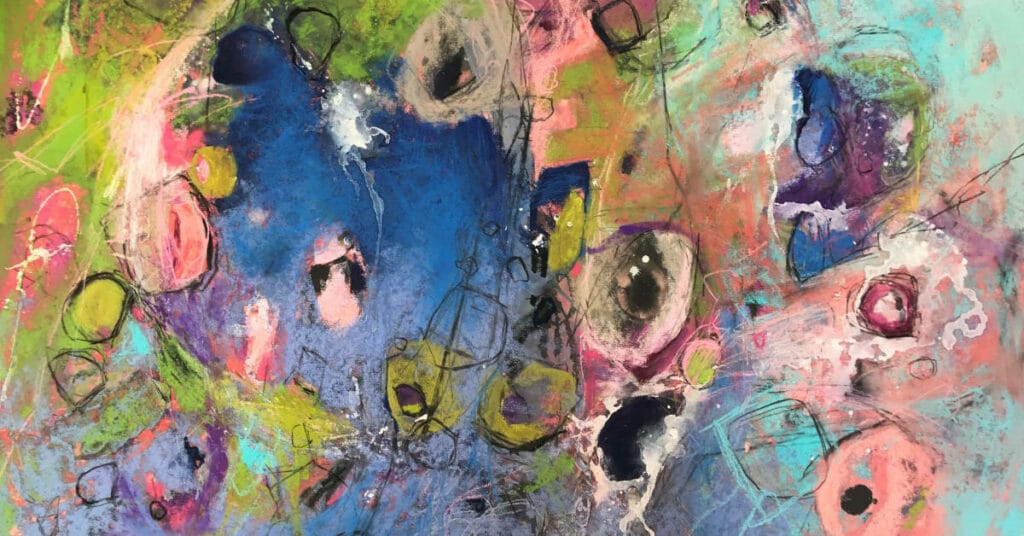
My paintings style is intuitive, organic, and dynamic. Inspiration comes from memories such as places traveled or from what is currently happening around me and, in the world at large.
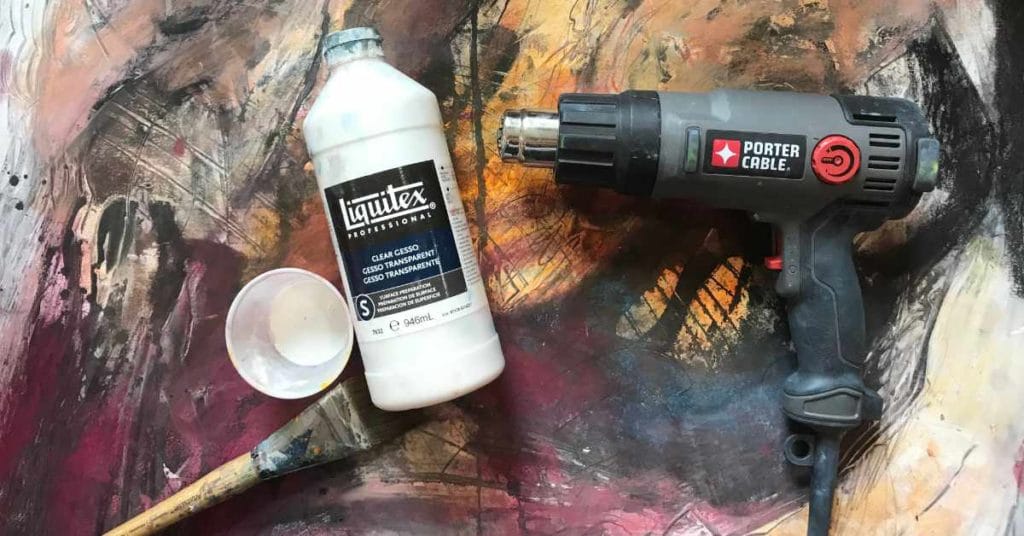
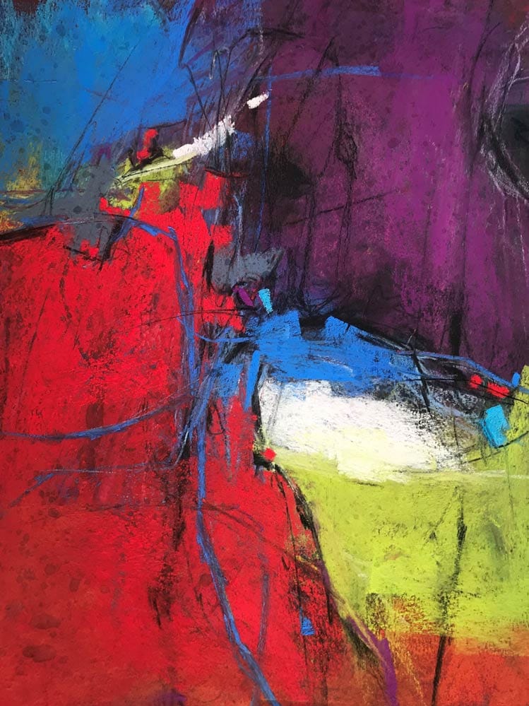
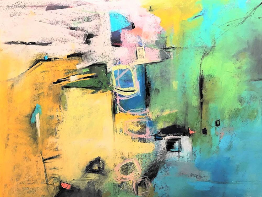
As my journey in art grows, so does my curiosity, I may infuse my paintings with other mediums such as clear gesso as an example, where I will use a heat gun to super heat the gesso, the effect is interesting textures and shattered images. This gesso technique allows an overlay of pastel color on top of color with exciting texture. The bonus: I did not burn down the house.
My art is about being in the moment and projecting that energy onto the canvas. I work hard to create something different in my pieces, I want my work to be part of a new art movement, I want my work to start the conversation.


A six step guide to using Clear Gesso with Soft Pastel, by Cory Goulet. Achieve interesting shapes, texture and depth with this simple guide.
When it comes to working in the abstract style, one might think there is no process, no structure, no thought, or plan on what goes into the creation of abstract art.