David shkolny profile photo

David Shkolny

Unison Colour Associate Artist

www.davidshkolny.com

About:

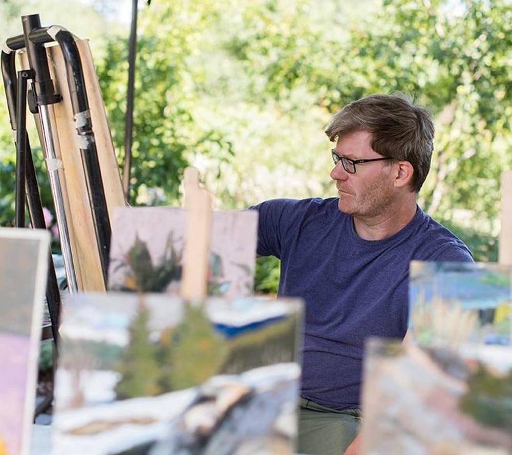
The first time I touched a pastel to paper was in my freshman year of college. Something just resonated – the combination of using such a direct way of applying colour on a toothy paper, the scumbly appearance of the stroke, the colour of the paper peaking through, even the subtle sound – a synaesthetic experience for me. I couldn’t get enough of it.

As often happens that unfettered joy of artmaking slipped into the ether after I graduated and I didn’t return to soft pastels until I went back to college some years later to study design. A happy reunion in a drawing class with the medium reminded me of the charge it gave me. A few years later and I fully launched back into it and haven’t looked back.

I was eager to try new products, and Unison soft pastels were on my radar. I bought a 72 landscape set and was set!

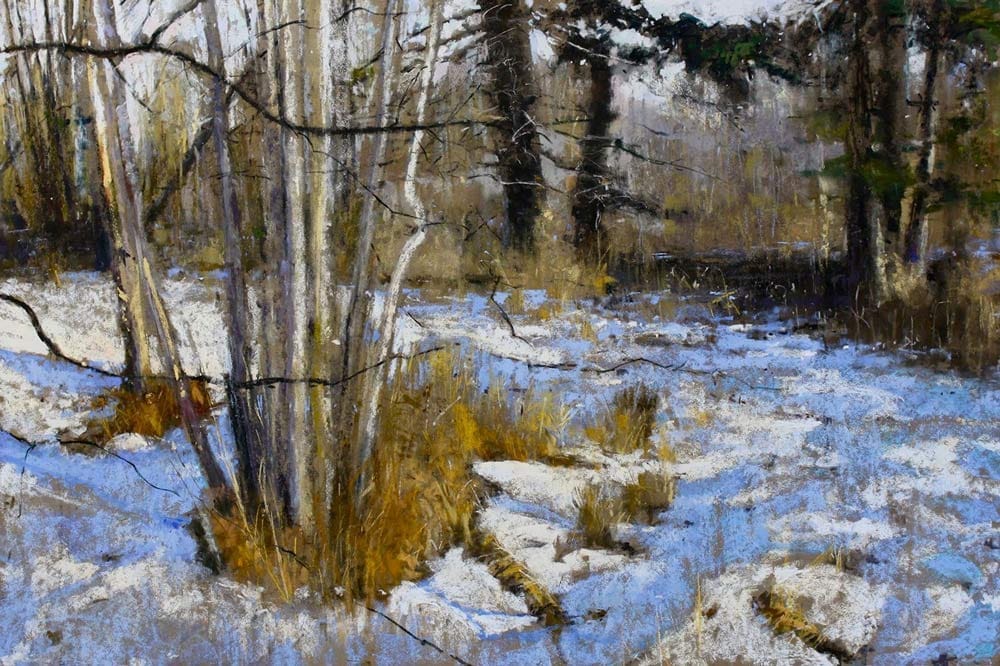
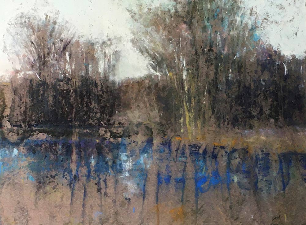
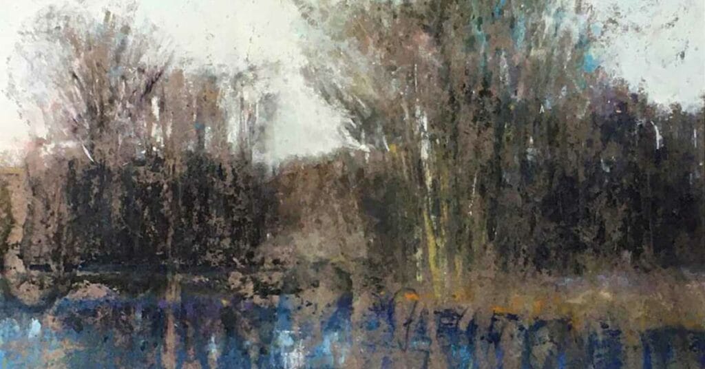
I have always looked to landscape as my main subject of expression. Chalk it up to living in Canada – wide open spaces and lush wilderness! A penchant to experiment with colour and texture keeps me engaged and inquisitive – what would happen if I tried this… All in all pastel is my favourite carrot!

Blogs by David Shkolny

  • Happy accident by david shkolny feat

    Happy Accidents?

    Several years ago, 2012 to be precise, my pastel painting took a side road off the path I had been following for a long time. We’ve all been there I think (we pastellists that is). A piece that went sideways because of various reasons: too many layers of pastel, the sinking realization the composition wasn’t…

    David Shkolny

    15th June, 2021

Colour Chart Guidance

We believe the colours in our web based colour chart are a faithful representation of our pastel range. But with any colours portrayed on the internet, there’s a whole heap of variables which mean that what you see, may not be what we see. That said, there’s some things that can be done to mitigate some of the variance.

Mobile phone and tablet screens tend to be pretty good for colour, so they’re always worth using, when viewing our colour chart.

We hate to say it, but cheaper computer displays, including laptops, can be rather hit and miss, in both colour and contrast, so they might not reveal the depth of the colour, as well as the true tone.

If you’re really keen on getting your computer up to speed on colour representation, you can use a calibration device to reach your display's fullest potential.

With all that said, if you think we’re way off the mark with any of the colours then, by all means let us know, and we’ll give it another shot.