Take it Outside (and your comfort level)!
I am always amazed at how many pastel artists have always wanted to paint “en plein air” (out in the open air) but were hesitant to try.

Like a stick of bright pigment in a Unison pastel set, I find myself in colorful company, and happy to be here!
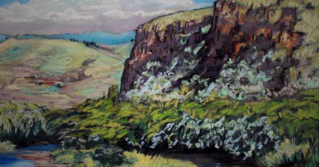
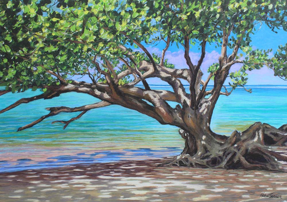
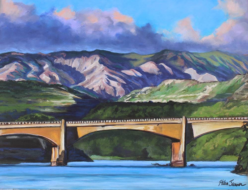
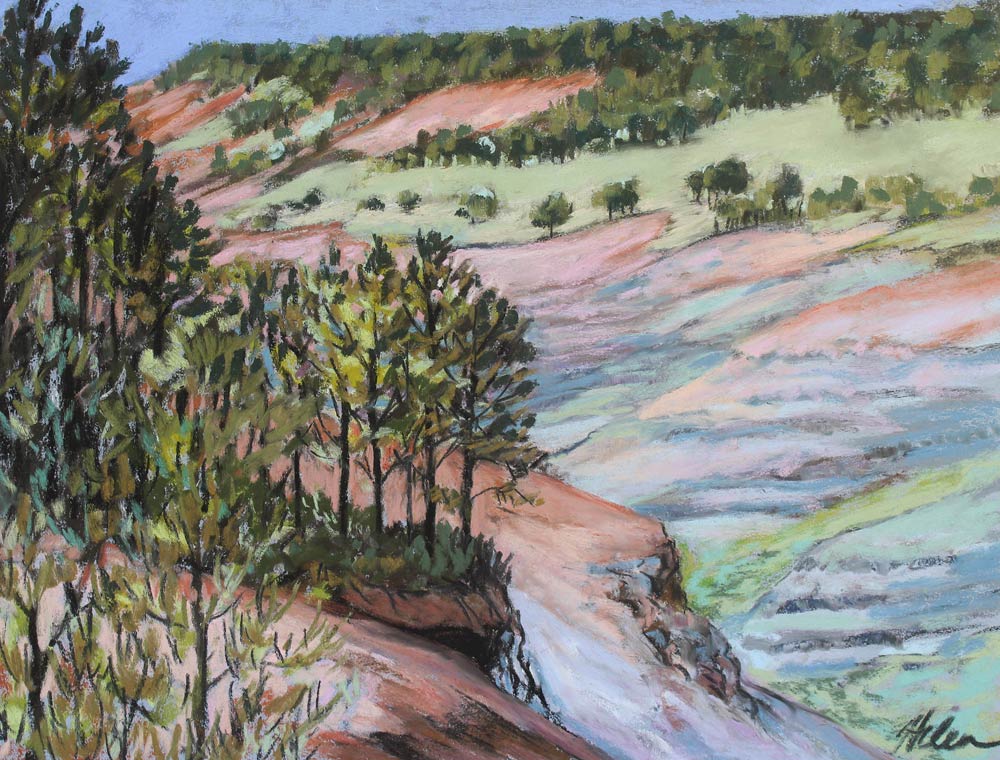
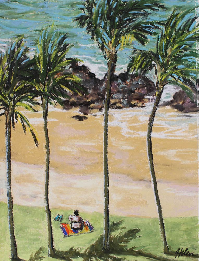
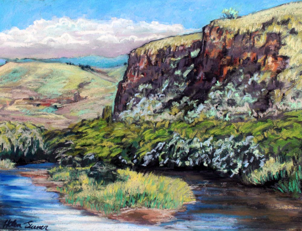
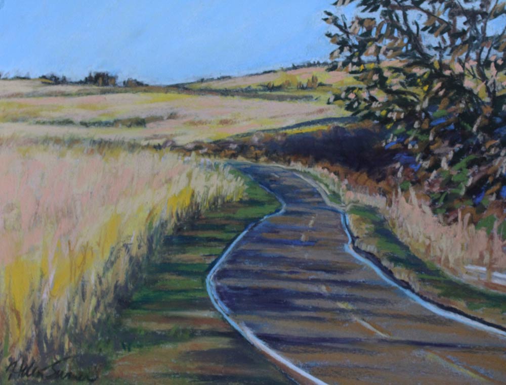
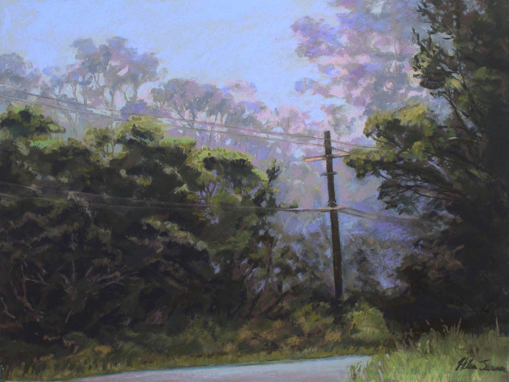
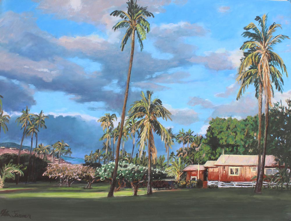
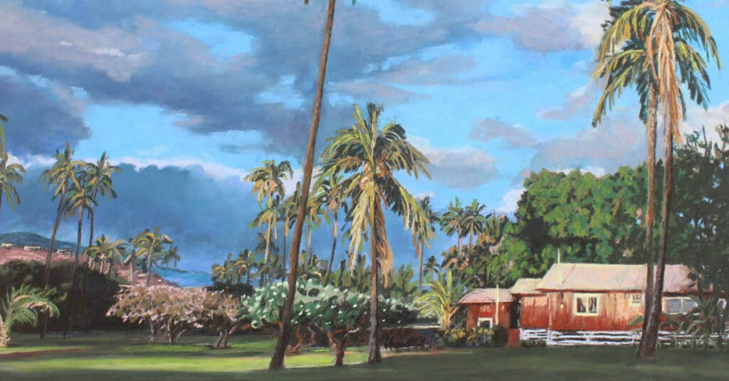
My name is Helen Turner and I live on the west side of Kauai Island, Hawaii. I have lived here for over 40 years and delight in the diversity of the micro climates from green ocean shallows to arid, canyon vistas.
I am also a self taught artist, believing painting everyday, either in the studio or plein air, improves your performance.
I am a Signature Member of the Pastel Society of the West Coast, and also the Pastel Artists of Hawaii, as well my local art societies.
My work has been purchased by our State Foundation of the Arts for Art in Public Places, and I continue to enter shows to keep me striving for perfection. Despite the recent economic woes, I still have a Studio/Gallery, where I paint, and teach plein air in the field.
Unison Colour were my first experience with true, soft pastels when I won Best of Show for my first Jury pastel show! (Thank you Richard McKinley!) The big starter set of Unisons was the most beautiful thing I’d ever laid eyes on and I am still a collector.
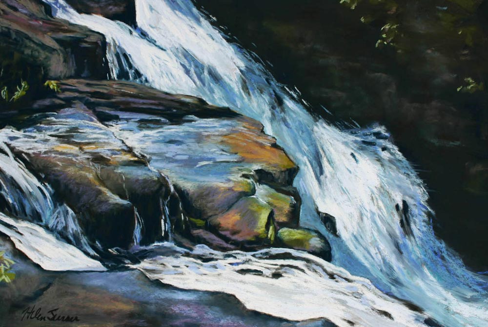
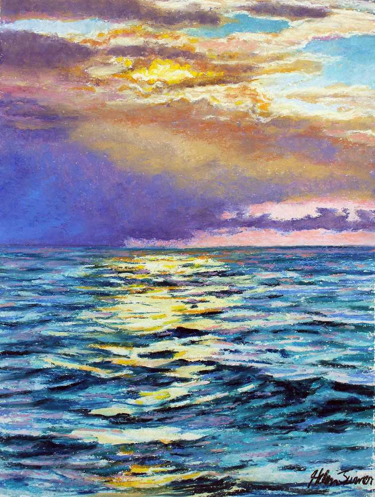
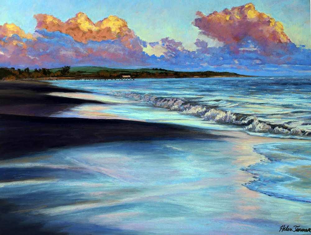
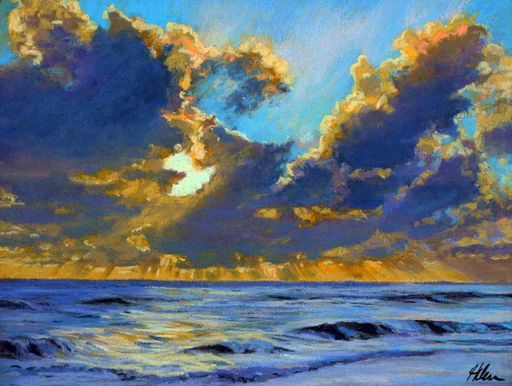
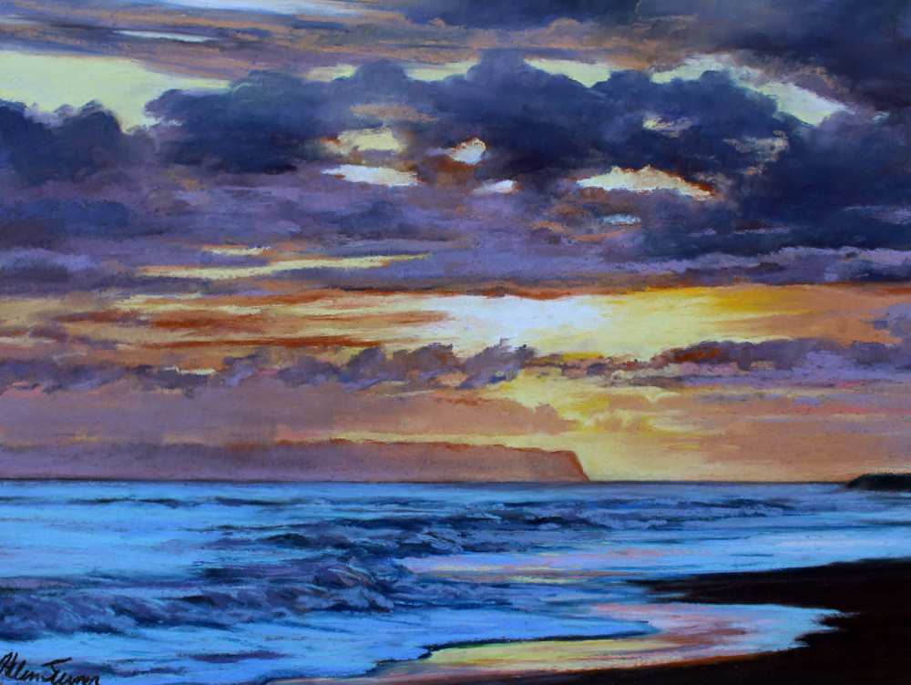
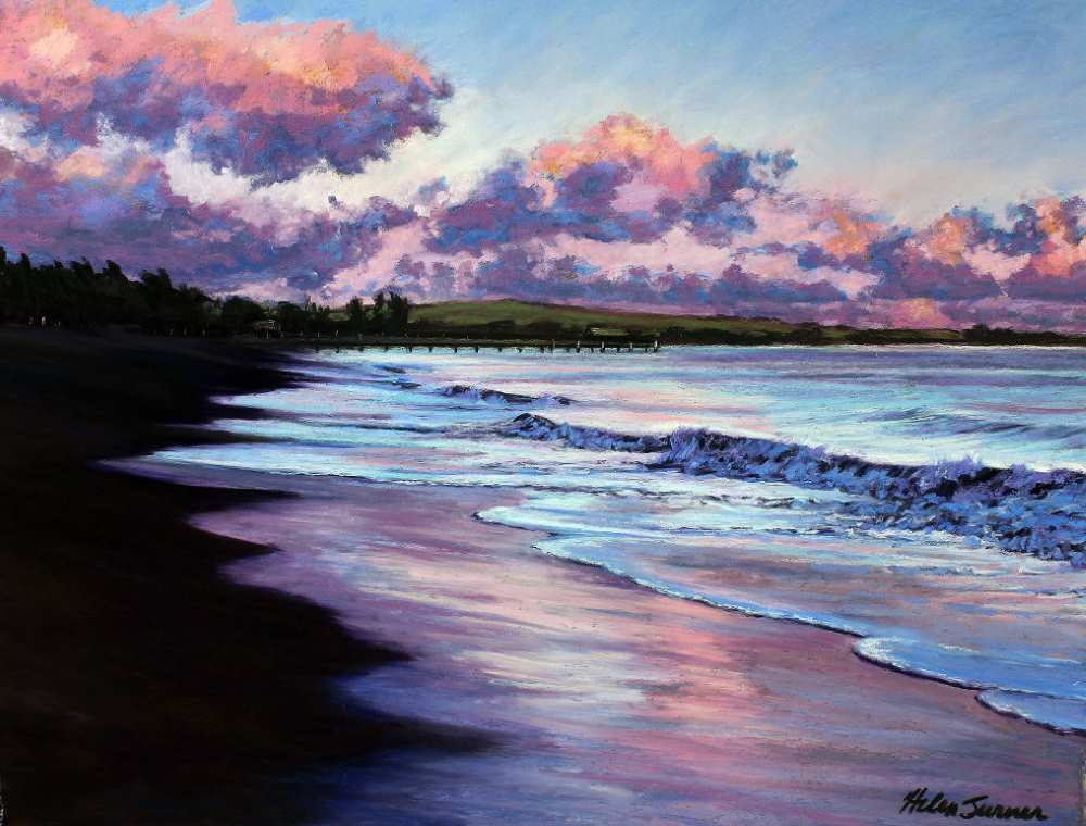
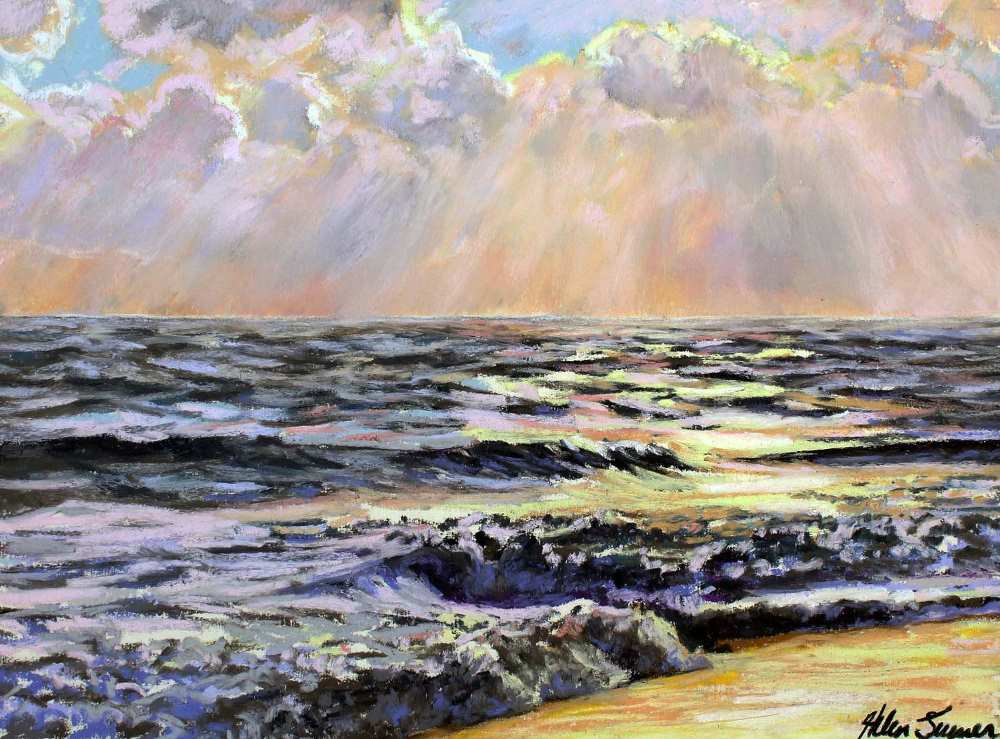
My goal is to capture a rare landscape moment, fleeting sunset rays, reflective light, interesting shadows, and to preserve a little of my island home before progress takes a toll.


I am always amazed at how many pastel artists have always wanted to paint “en plein air” (out in the open air) but were hesitant to try.

Aloha fellow artists, I am writing from my little island in the Pacific. My name is Helen Turner and I live on the western most part of Kaua’i in the Hawaiian island chain.
If you use social media, then your followers can comment and “love/like” you in the virtual world, but what about entering pastel art competitions?