Jack Barnhill profile photo.

Jack Barnhill

Unison Colour Associate Artist

jackbarnhill.com

About:

Jack Vincent Barnhill is a professional artist skilled in multiple medias.  He currently teaches at the Naples Art Center and provides private classes.

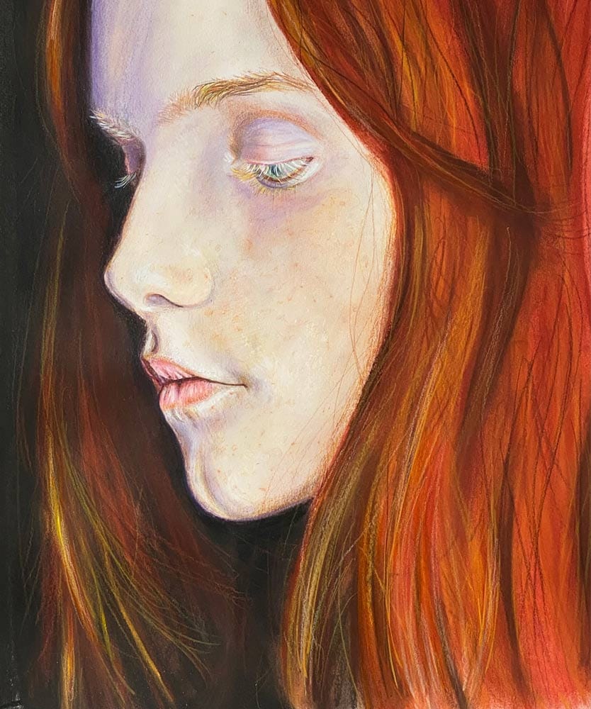
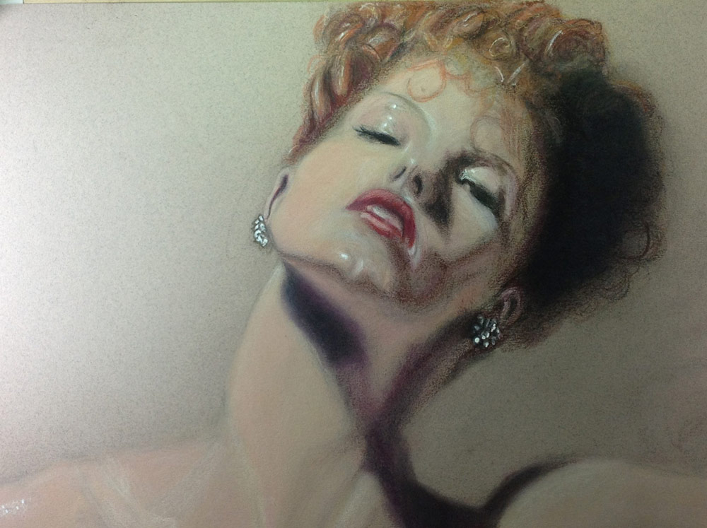
Although largely self-taught, Jack has studied at Otis College of Art and Design in Los Angeles, under Linda Jo Russell, Chris Warner, Franklyn Liegel and Laddie John Dill. He creates full-scale realistic paintings in both in oil and acrylics and on canvas and panel.

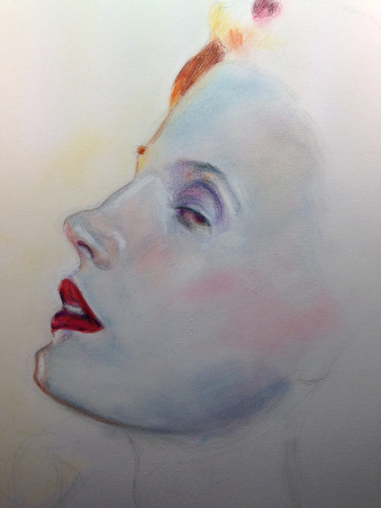
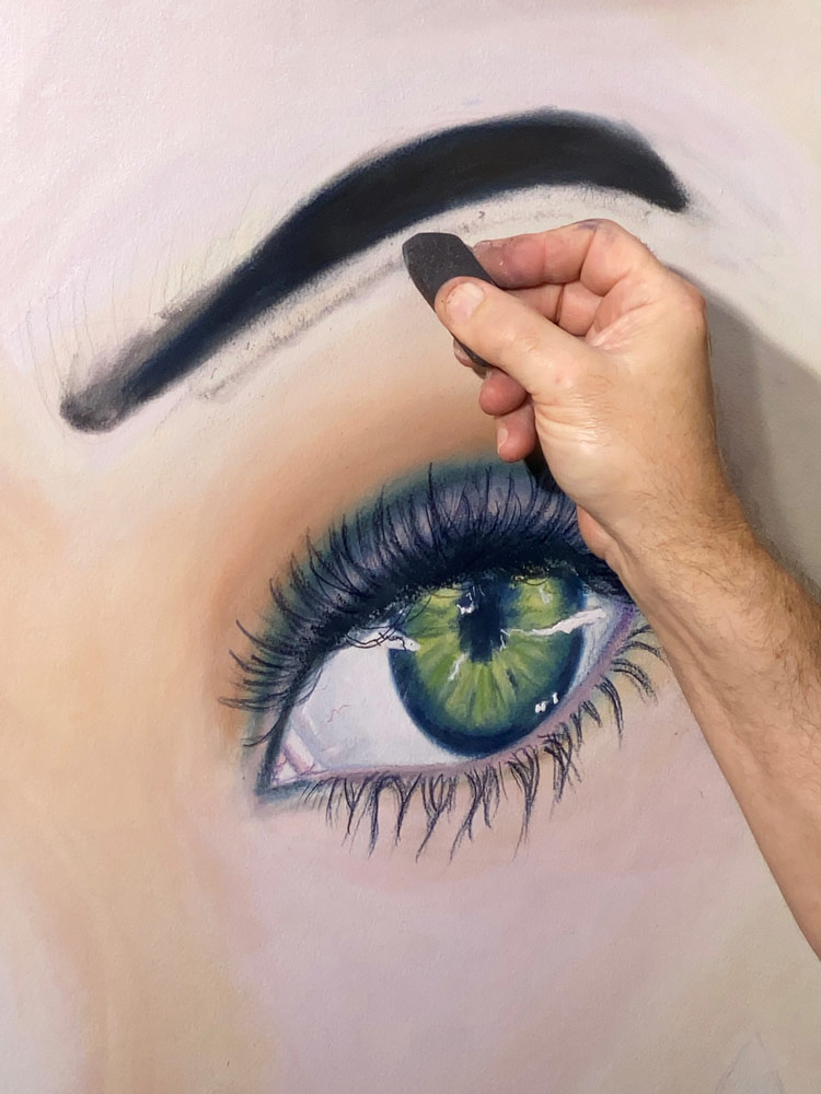
For 6-years Jack taught Trompe O’eil and Realism at Otis College of Art and Design.  He has also lectured and taught both private and public classes in Advanced Drawing, History of Pigments, Abstract Painting, Art for Children, Advances in 3-D Art, Paint Making, Pastel Painting and Drawing, Color Mixing and Theory.

Jack has been in 16 national and international shows and has been reviewed in three magazines. In 2015 his “Self Portrait” won first place in the California Open competition sponsored by the TAG Gallery. In 2019 he was invited to show at the National Art Center in Tokyo, Japan.  He is a member of the Oil Painters of America, Portrait Society of America, National Oil and Acrylic Painter’s Society and the Pasadena Society of Artist. He is also a founding board member of Warrior Theatre, a non-profit organization dedicated to providing innovative art therapy to survivors of child abuse.

Jack lives in Naples, Florida USA.

Blogs by Jack Barnhill

  • Portraiture and unison colour soft pastels by jack barnhill feat

    Portraiture and Unison Colour Soft Pastels

    My travels developed in me a love for the Human face in all its myriad colour and contours. People all over the world share a common humanity we seem to have forgotten. Merriment in a child’s eyes are the same in Iraq as Panama.

    Jack Barnhill

    8th June, 2021

Colour Chart Guidance

We believe the colours in our web based colour chart are a faithful representation of our pastel range. But with any colours portrayed on the internet, there’s a whole heap of variables which mean that what you see, may not be what we see. That said, there’s some things that can be done to mitigate some of the variance.

Mobile phone and tablet screens tend to be pretty good for colour, so they’re always worth using, when viewing our colour chart.

We hate to say it, but cheaper computer displays, including laptops, can be rather hit and miss, in both colour and contrast, so they might not reveal the depth of the colour, as well as the true tone.

If you’re really keen on getting your computer up to speed on colour representation, you can use a calibration device to reach your display's fullest potential.

With all that said, if you think we’re way off the mark with any of the colours then, by all means let us know, and we’ll give it another shot.