
Tell A Story In Your Paintings & Speak Your Truth
“Why did I pick that to paint?” Stop for a moment and ask yourself that before you move on. I usually know why I picked my subject, before a single pastel stroke hits my paper...

After many years as a fashion illustrator and designer, Jeri took time off to raise a family while working from home as a textile and graphic designer. Devoting herself to full time painting over 10 years ago, and sharing her love of pastels by teaching, has led to a new and interesting “next act”. Jeri has found that the immediacy of pastels make them the perfect medium in which to “Make the Ordinary, Extraordinary” and tell stories in her paintings.
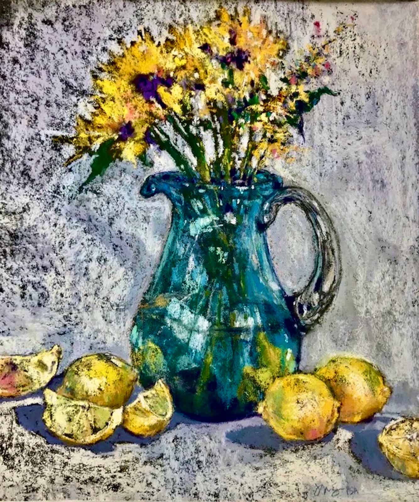
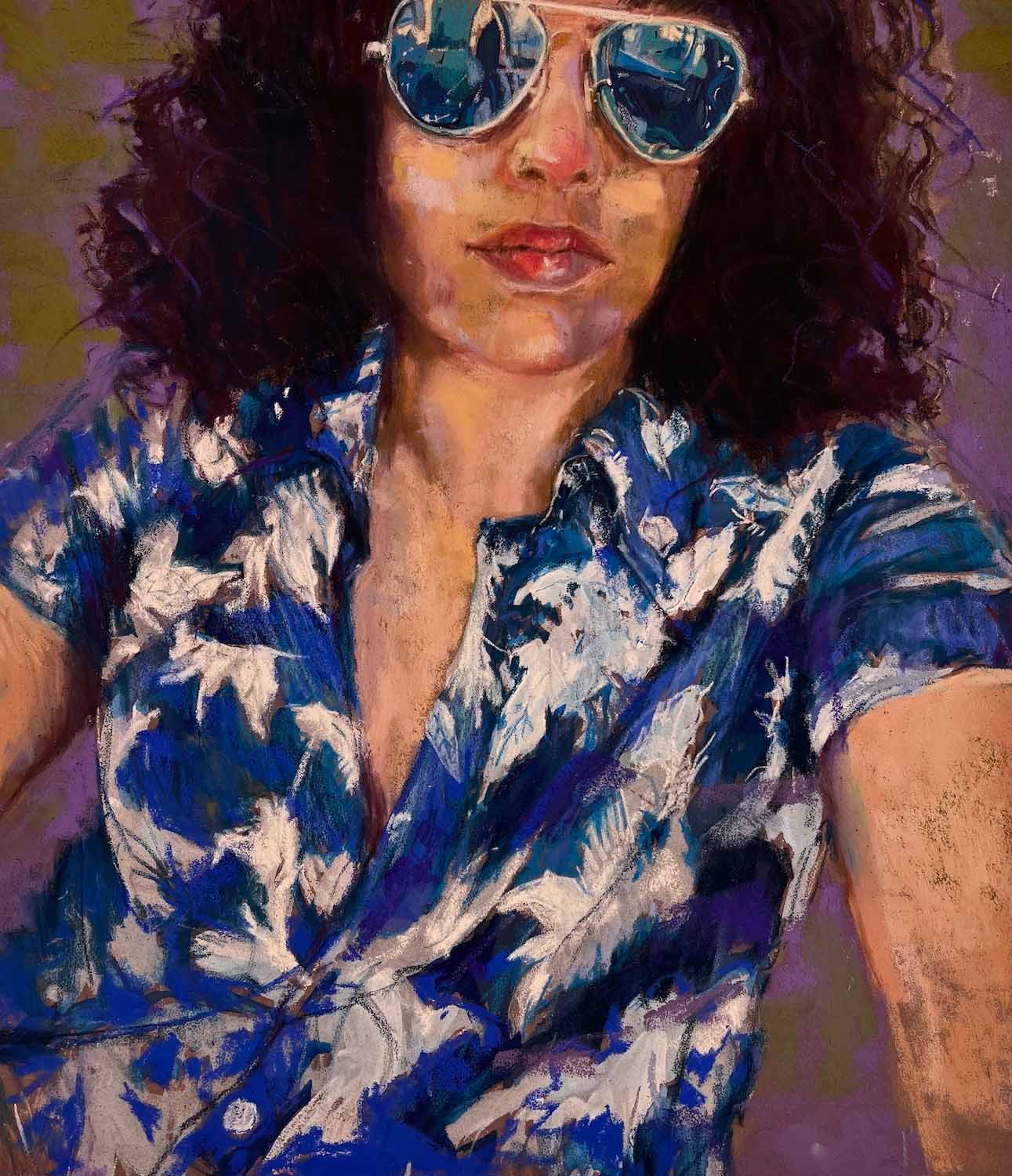
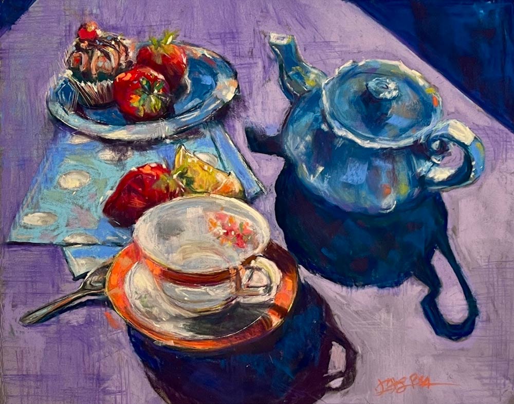
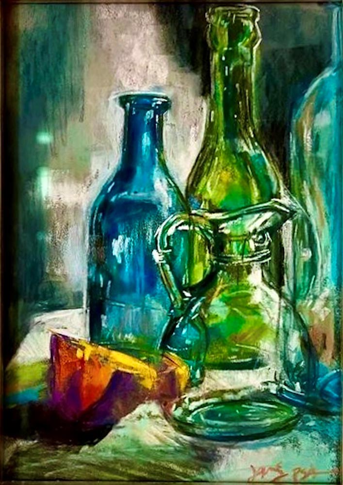
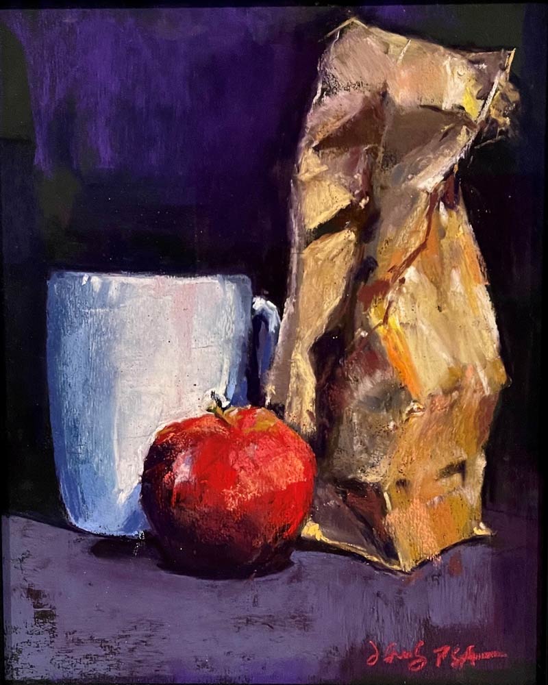
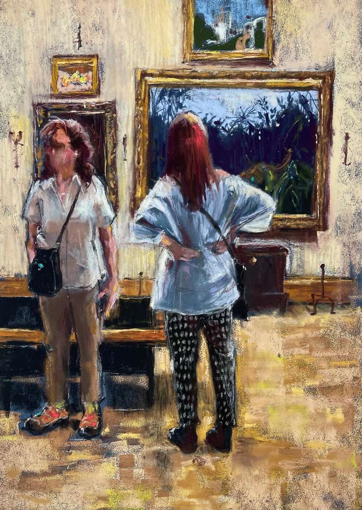
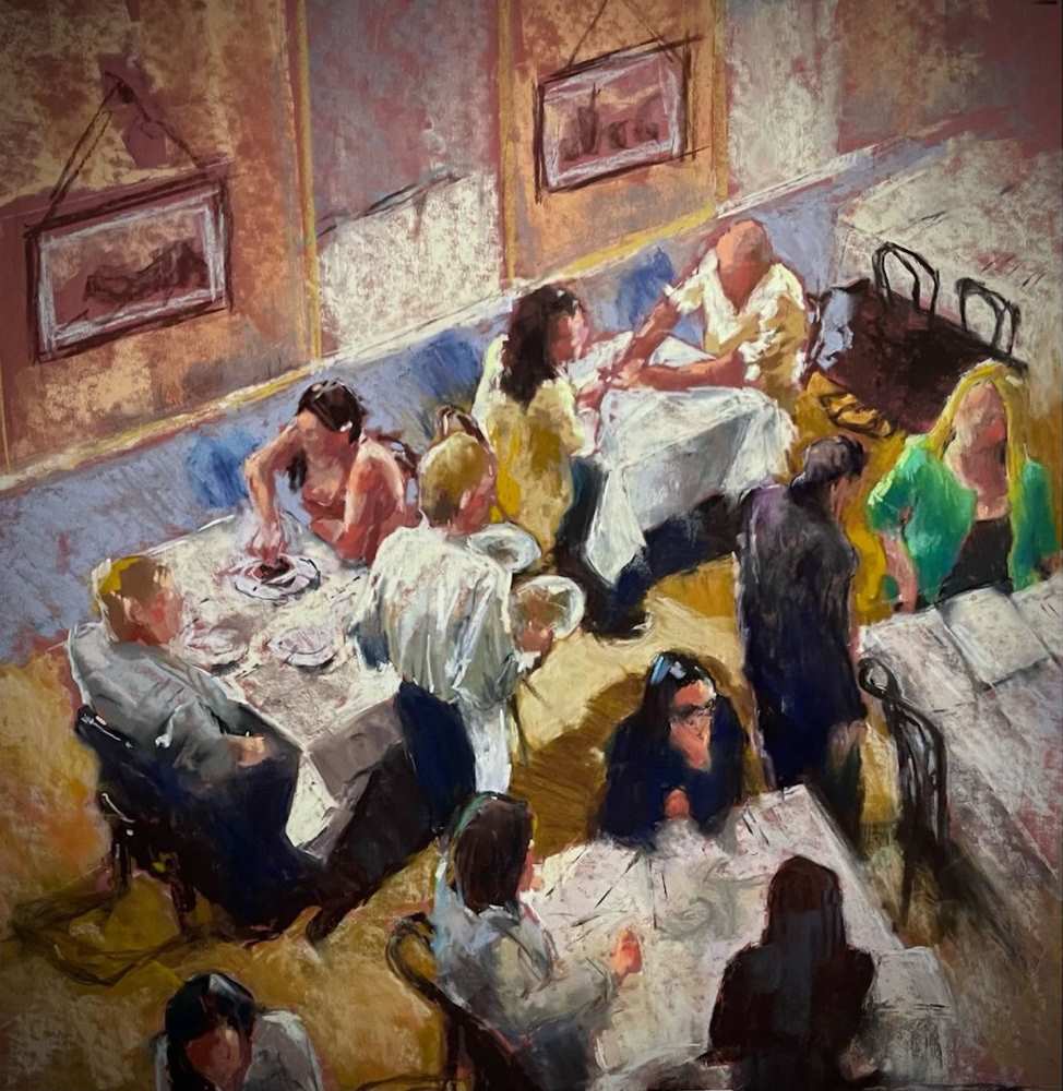
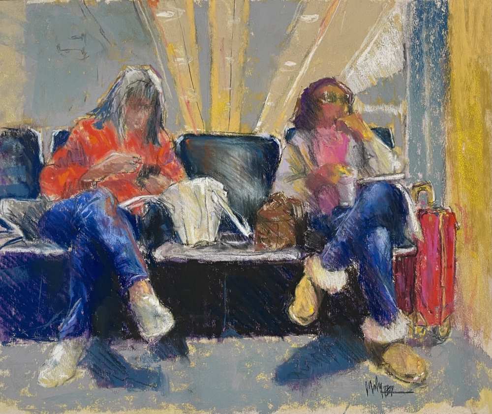
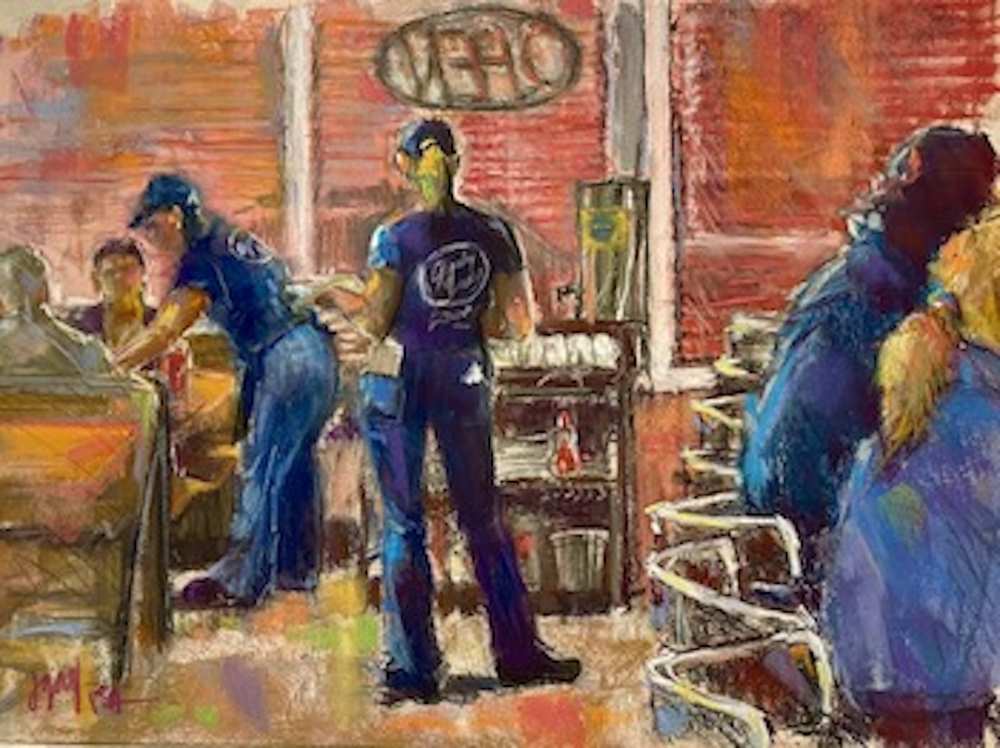
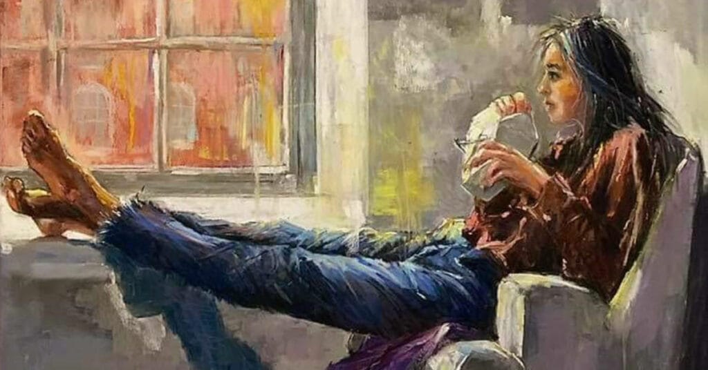
Jeri loves painting still lives, urban interiors, and especially figures & fabrics. Her interest in negative space painting and finding “hidden colors” in objects make her classes enlightening. Jeri has been teaching weekly Zoom classes and workshops since July 2020 to students from all over the country and the UK!
(Pre- Covid,) Jeri taught weekly classes in New York & New Jersey, and now teaches weekly at the Cameron Art Museum in Wilmington, North Carolina and continues to do demos and workshops via Zoom with plans to return to in person teaching in 2022.
Affiliations
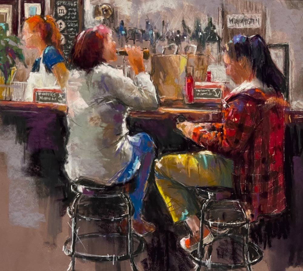


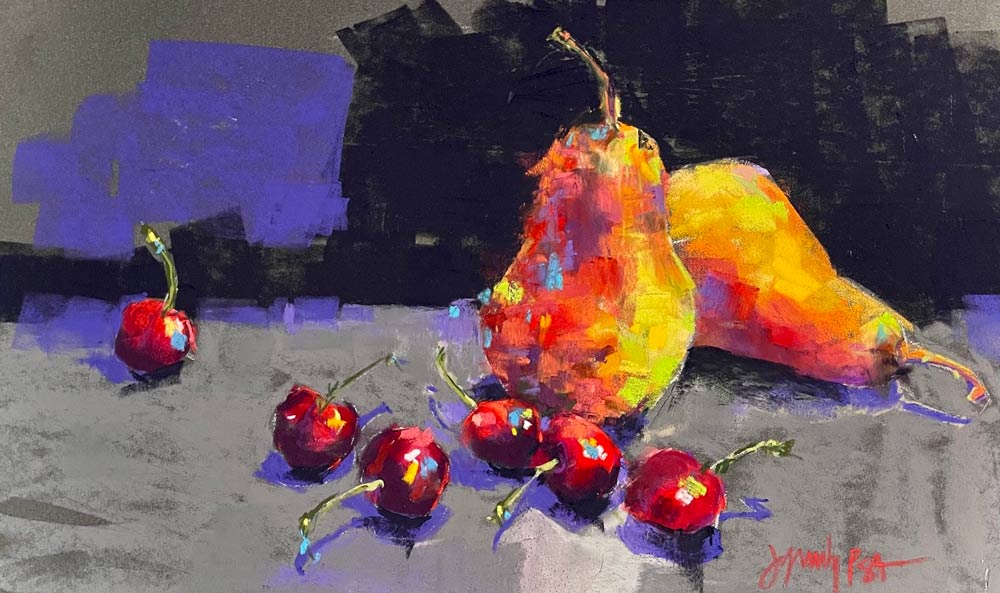
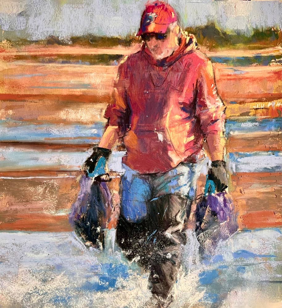
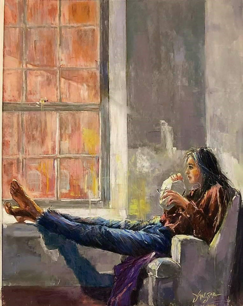
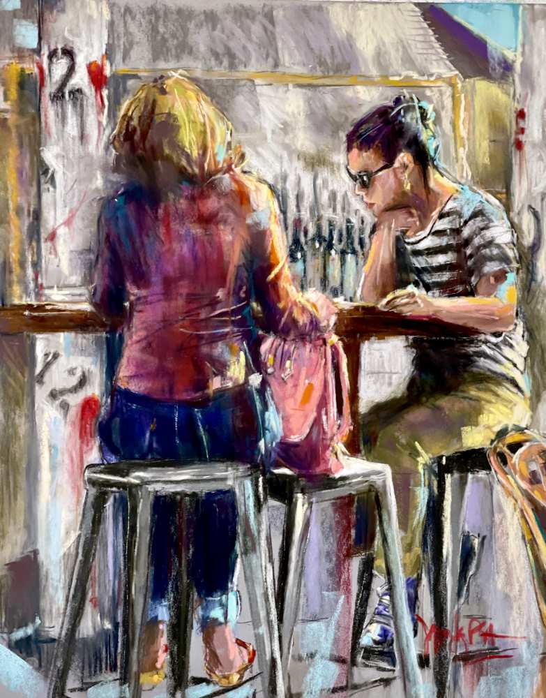
“Why did I pick that to paint?” Stop for a moment and ask yourself that before you move on. I usually know why I picked my subject, before a single pastel stroke hits my paper...
When you’re not a painter of trees and lakes, but you ARE a painter, you need to find what subject or subjects make you want to drop everything and head to your studio.

Those that know my work know that I’m not a landscape painter. The thought of painting trees and grass and mountains gives me the willies.