When Pastels Equal Freedom
I spent my childhood drawing cartoons, but never really imagined I could do much more artistically. I chose music classes over art and chose environmental education over music when it came time to choose a career.

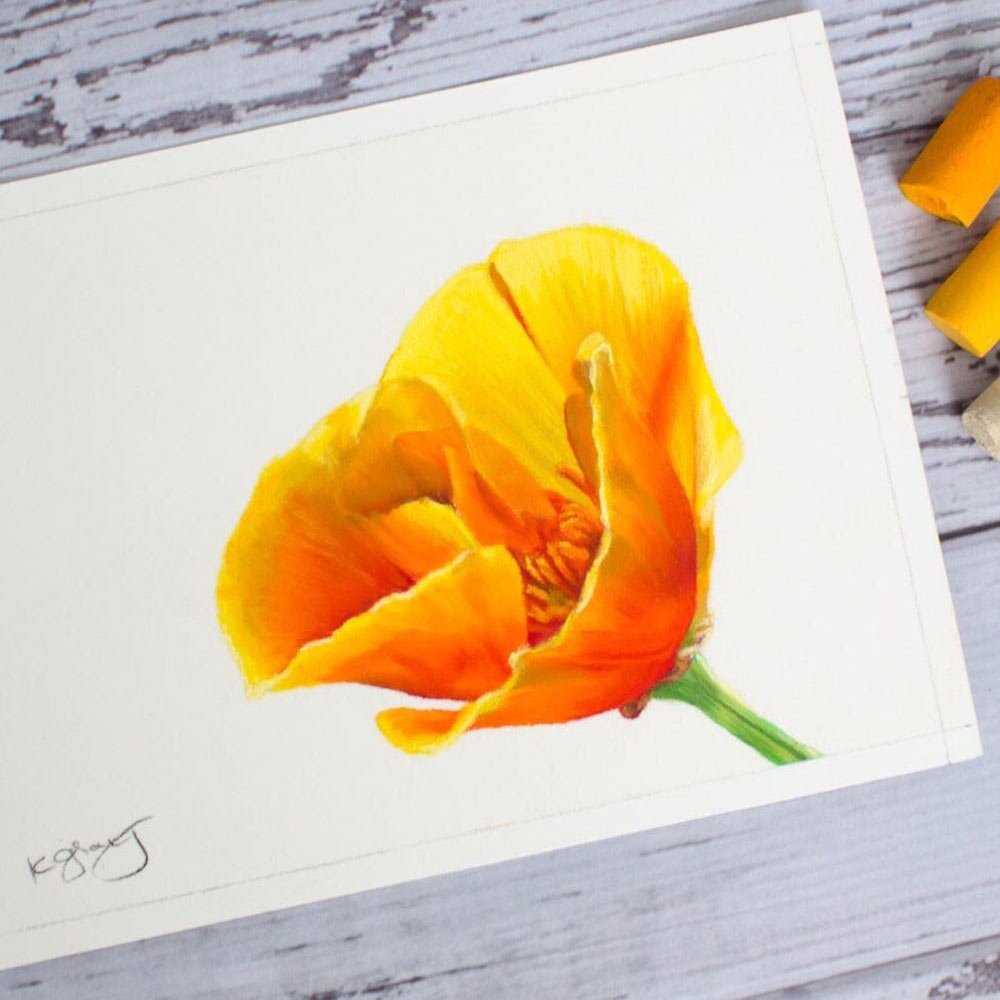
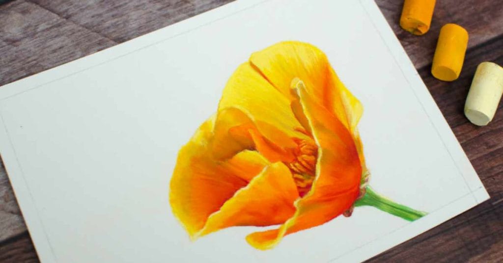
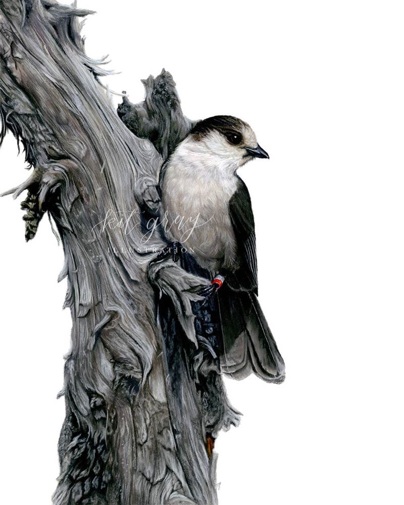
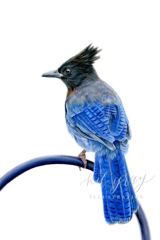
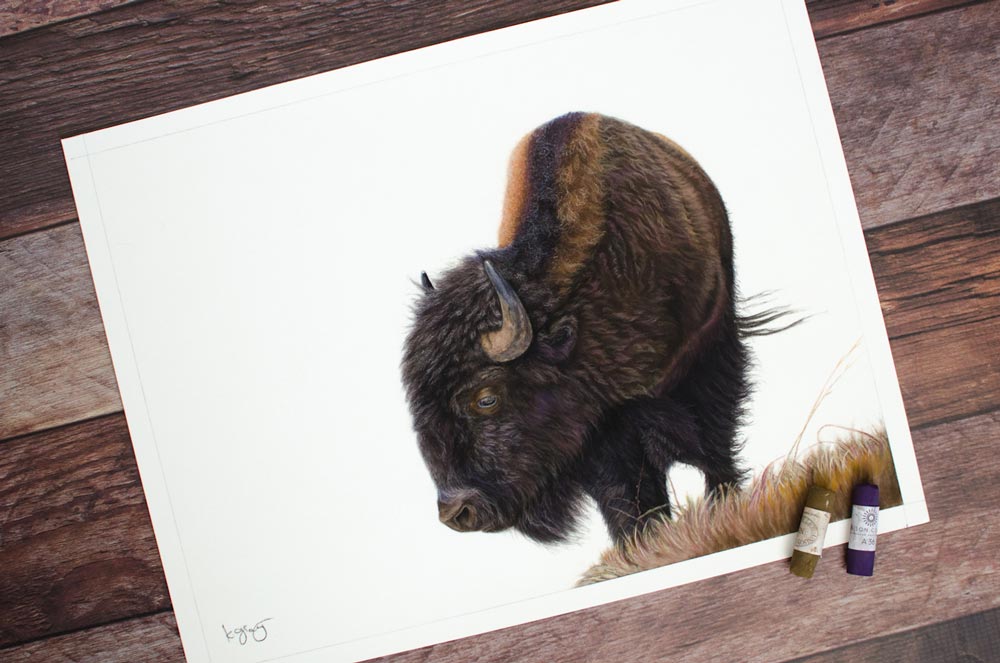
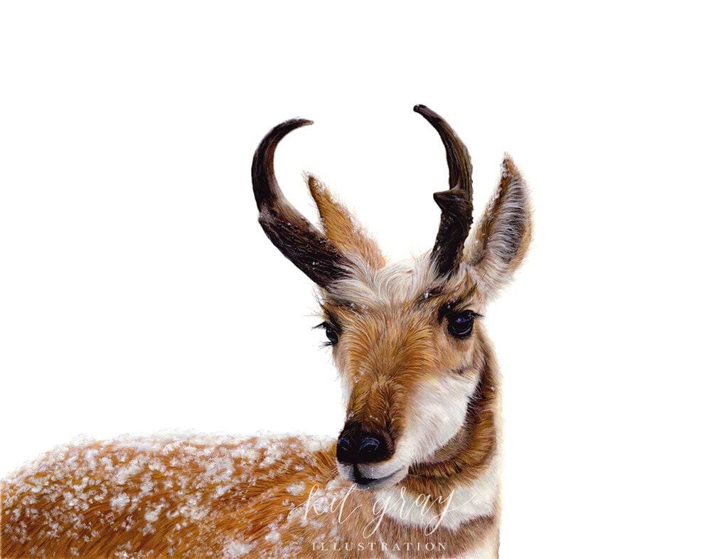
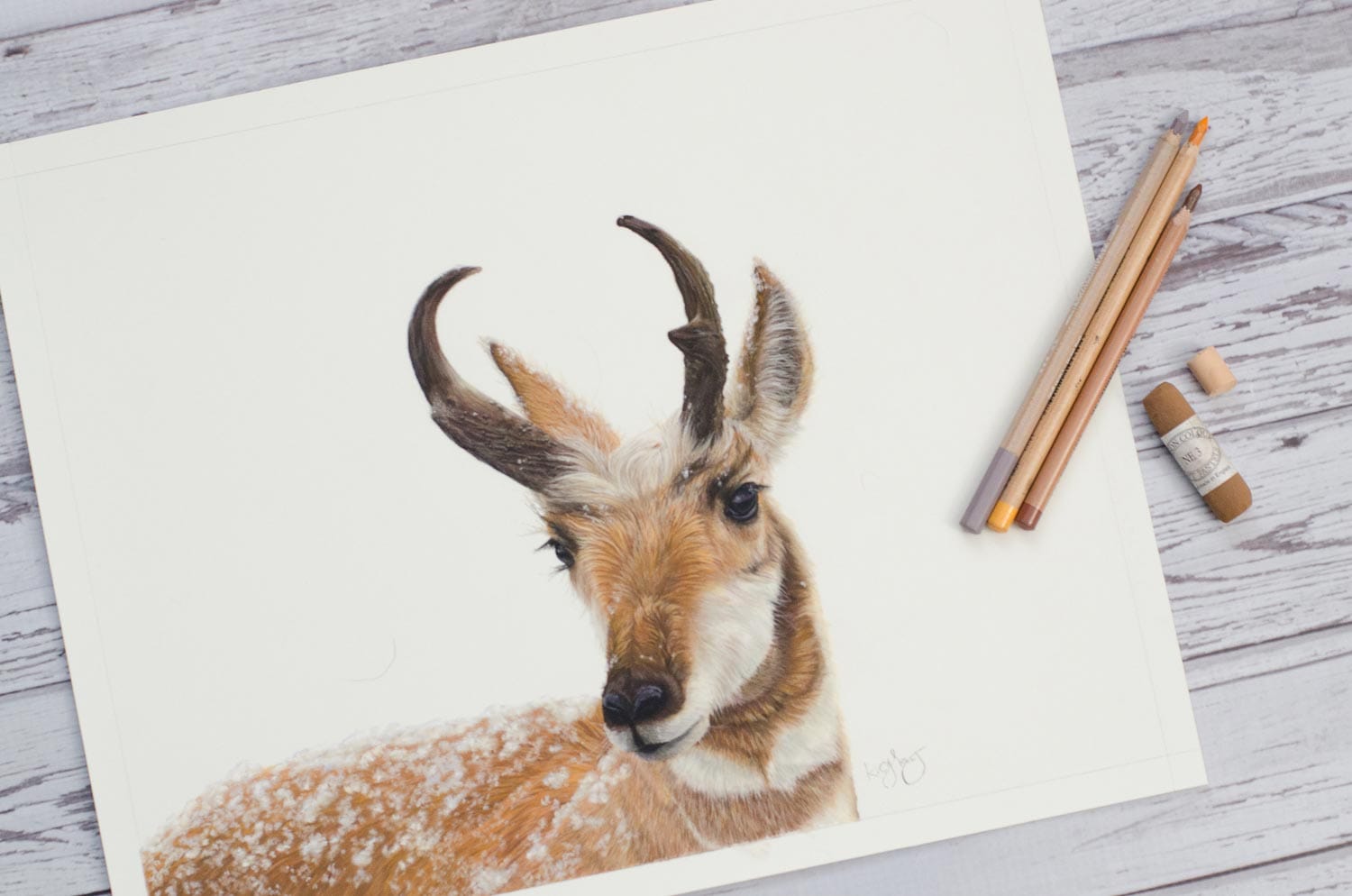
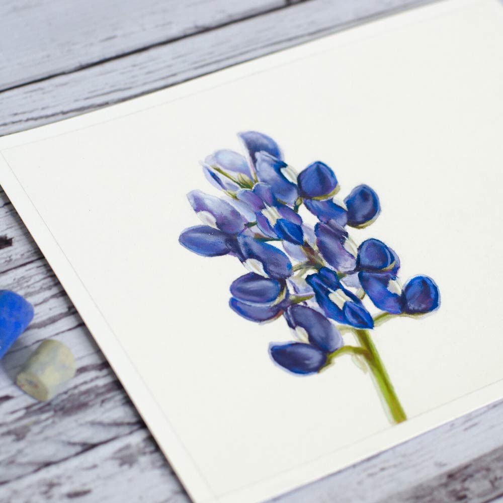
Kit Gray never planned to become an artist, but when life necessitated a career change to accommodate her health, she decided to find new opportunities and ways to adapt. With a passion for environmental education and birding, Kit loves to take a scientific illustration approach to creating wildlife, botanical, and pet artwork. She tends to create work she can imagine in a field guide or textbook, with each piece serving as a study of a different species or individual. Pastels help guide this work by lending beautiful colors and soft, yet detailed textures to each new study. Should her style evolve over time, Kit can’t really imagine leaving pastels behind due to their unique characteristics and versatility.
In 2019, Kit was selected by peers in the creative industry as one of Rising Tide Society’s “20 on the Rise” – a curated list of creatives making a difference via empowerment, impact, purpose, and passion. She is very passionate about environmental conservation as well as advocacy and support for disabled people. In her spare time, Kit enjoys birding, doing field and target archery, and spending time with her partner and their two rescue dogs.
I spent my childhood drawing cartoons, but never really imagined I could do much more artistically. I chose music classes over art and chose environmental education over music when it came time to choose a career.