I was born in Stavanger on the West coast of Norway where I still live and work. I am married and have two teenage daughters and a stubborn dog who like to keep me company and share my otherwise solitary studio life, slumbering and snoring under my table.
Colours have fascinated and kindled my imagination my whole life, colour has always been the main ingredient and has followed me throughout my years. But different opportunities came and I made a career as an Art-Director, a few years later I moved to England where I studied Art and Art Therapy, I did my art training at Tobias School of Art in East Sussex, and got my diploma in 1997. Back in Norway I worked as an Art Therapist mainly with children and young adults.
Colours have fascinated and kindled my imagination my whole life, colour has always been the main ingredient and has followed me throughout my years. But different opportunities came and I made a career as an Art-Director, a few years later I moved to England where I studied Art and Art Therapy, I did my art training at Tobias School of Art in East Sussex, and got my diploma in 1997. Back in Norway I worked as an Art Therapist mainly with children and young adults.
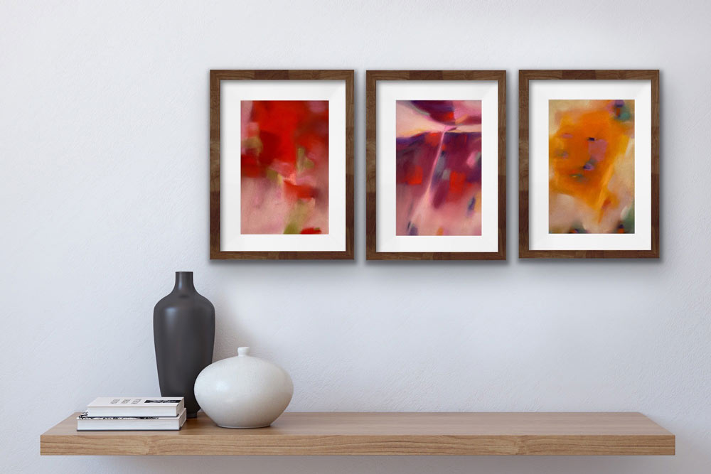
Two years ago, I decided it was time to follow my heart and passion and develop my own artwork. It has been a hectic time and I have been creating more artwork than ever. Showing my artwork on Instagram has made it possible to connect with galleries and curators, I have been invited to and participated in several exhibitions, got an award of excellence and sold my work both nationally and internationally, my dream is coming true. I am enjoying it every day and every step on the way!
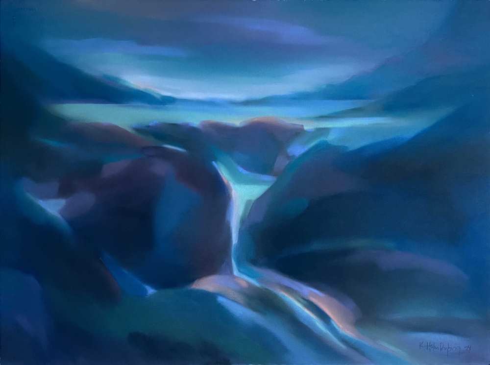
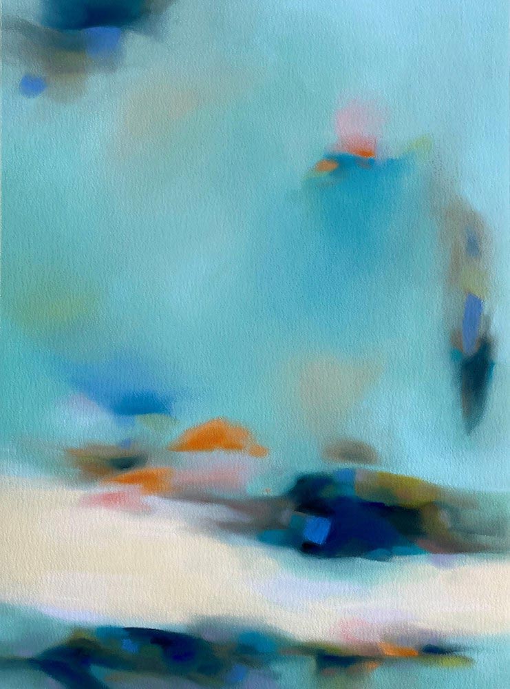
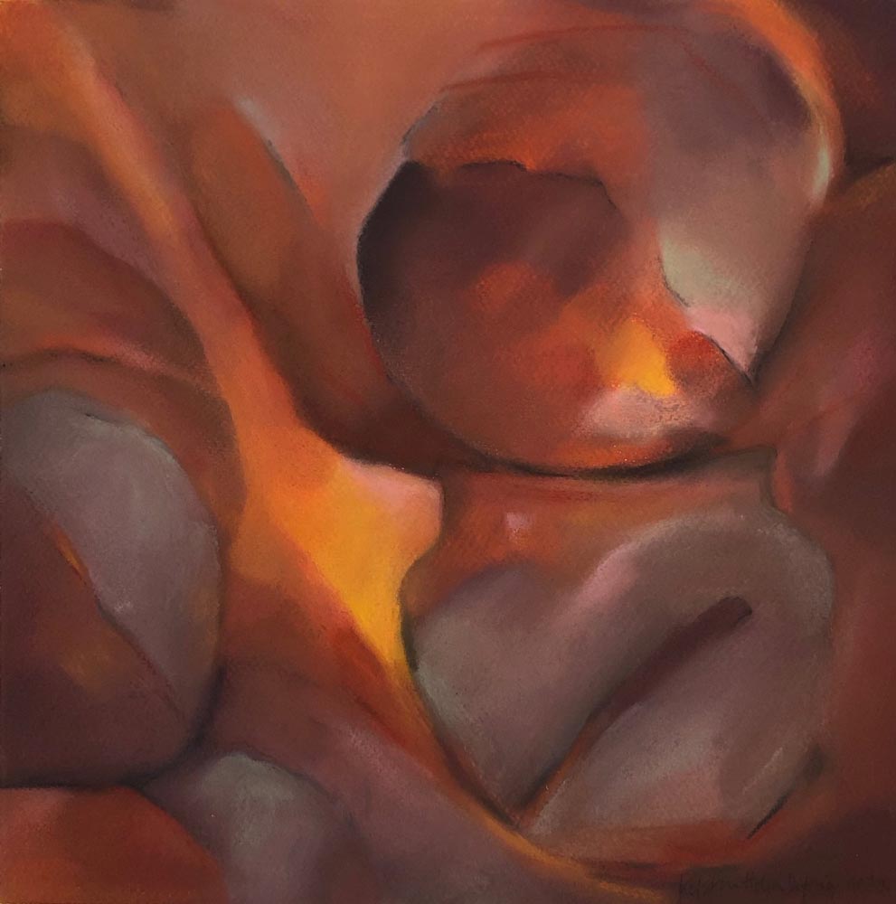
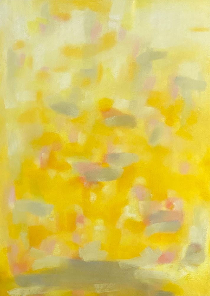
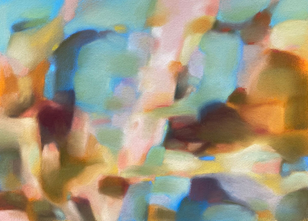
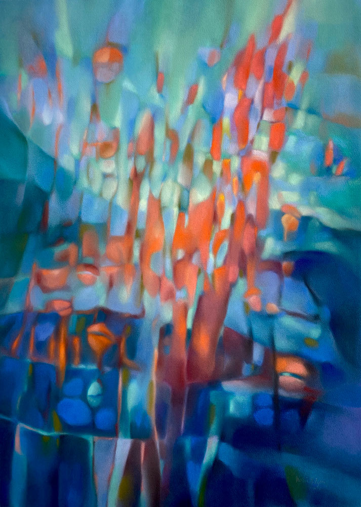
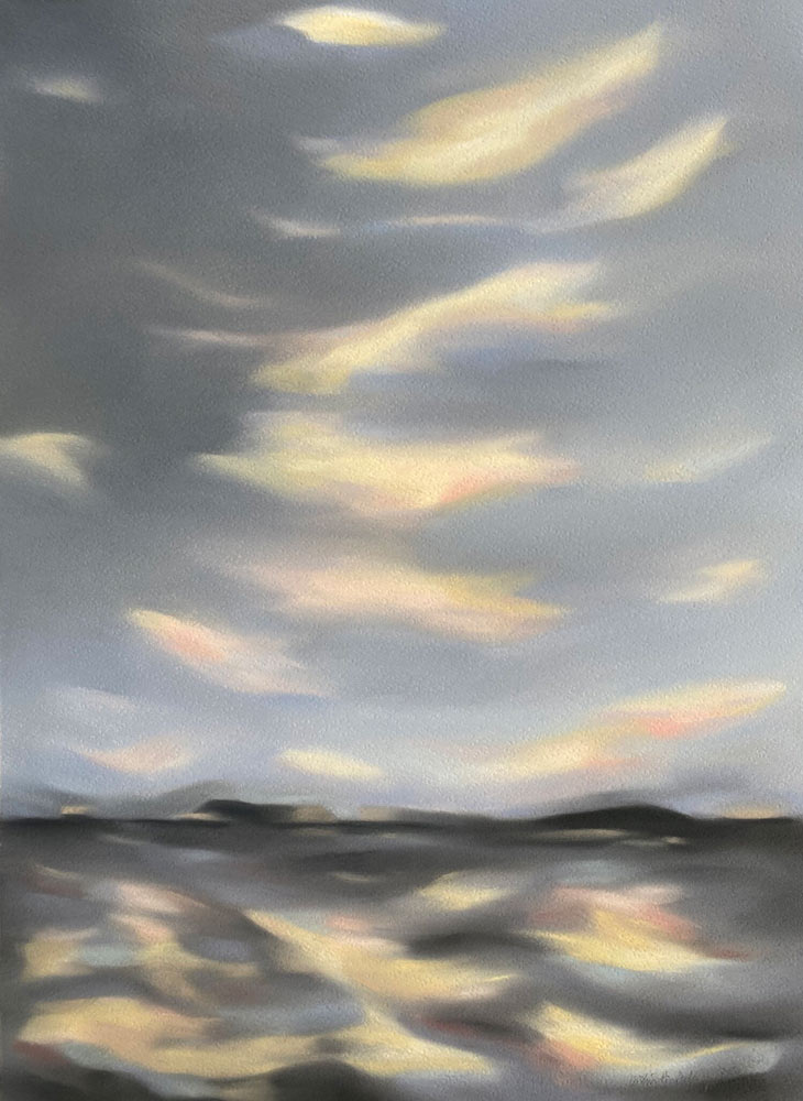
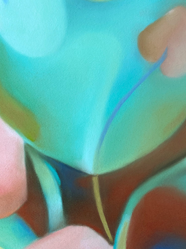
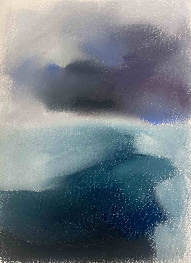
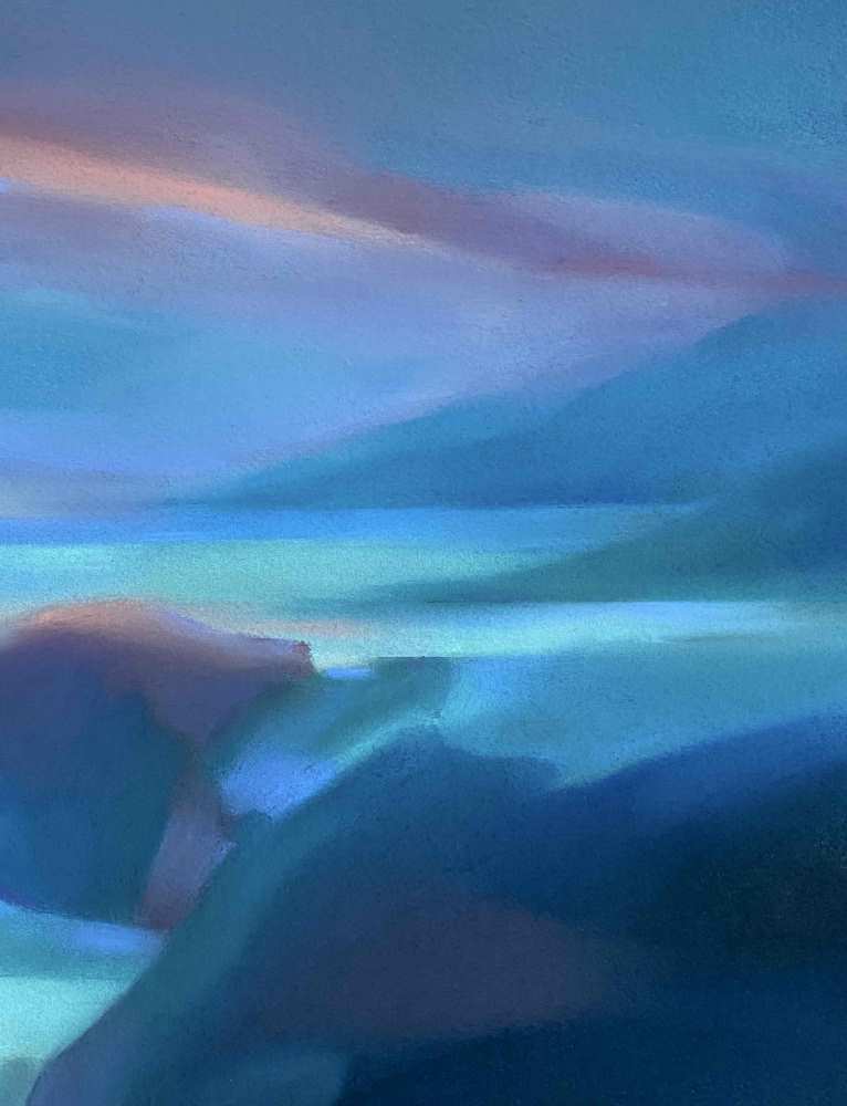
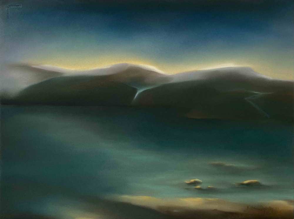
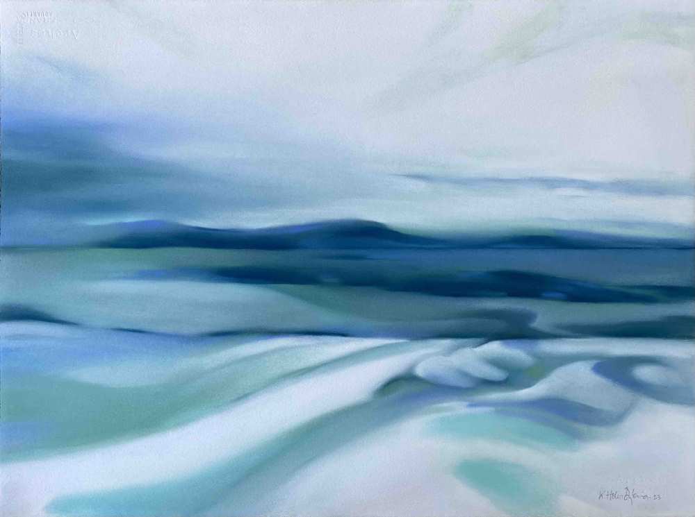
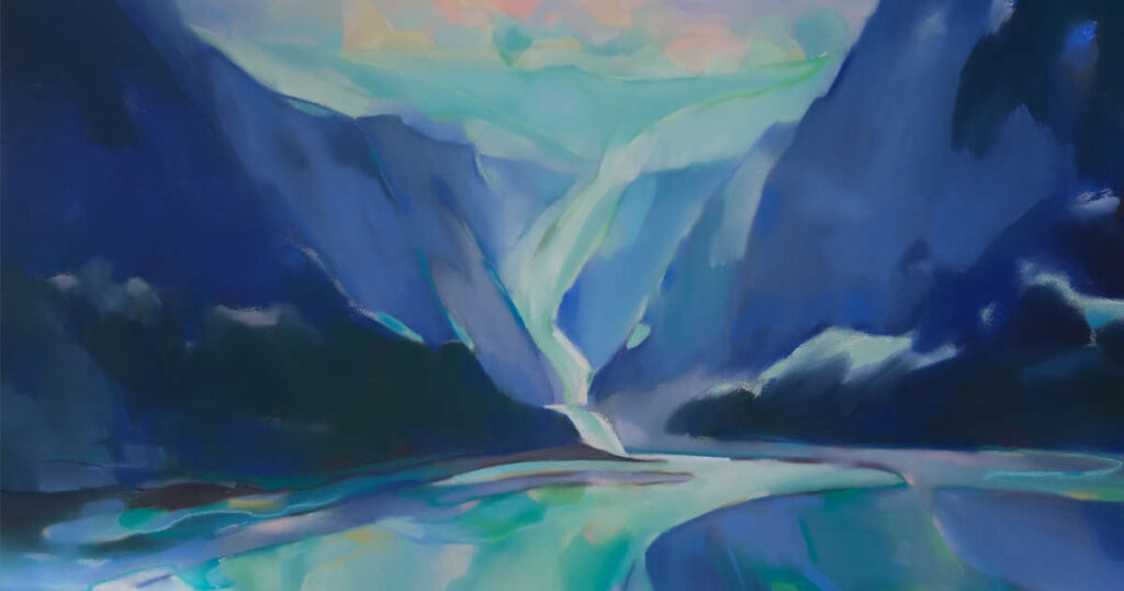
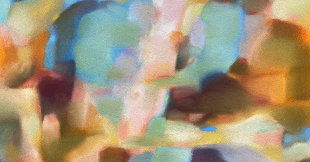
I have been fascinated by colours as long as I can remember and my memories often dwells on colours and colour combinations, like my grandmas light blue apron when’s she’s standing white haired in her summer garden surrounded by pink flowers and greenery. Beautiful colours, vibrant or soothing, surprising, and fun, all of them wherever they appear continue to fascinate and inspire me to create colourful abstract artworks. I work intuitively, choosing the colour to start with from the mood I am in. I work from memories, preferring to create series of paintings from the same inception.
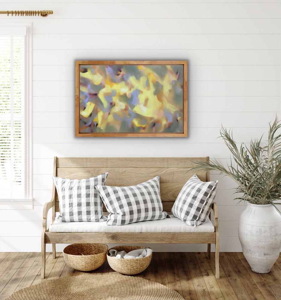
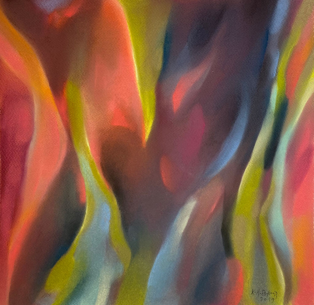
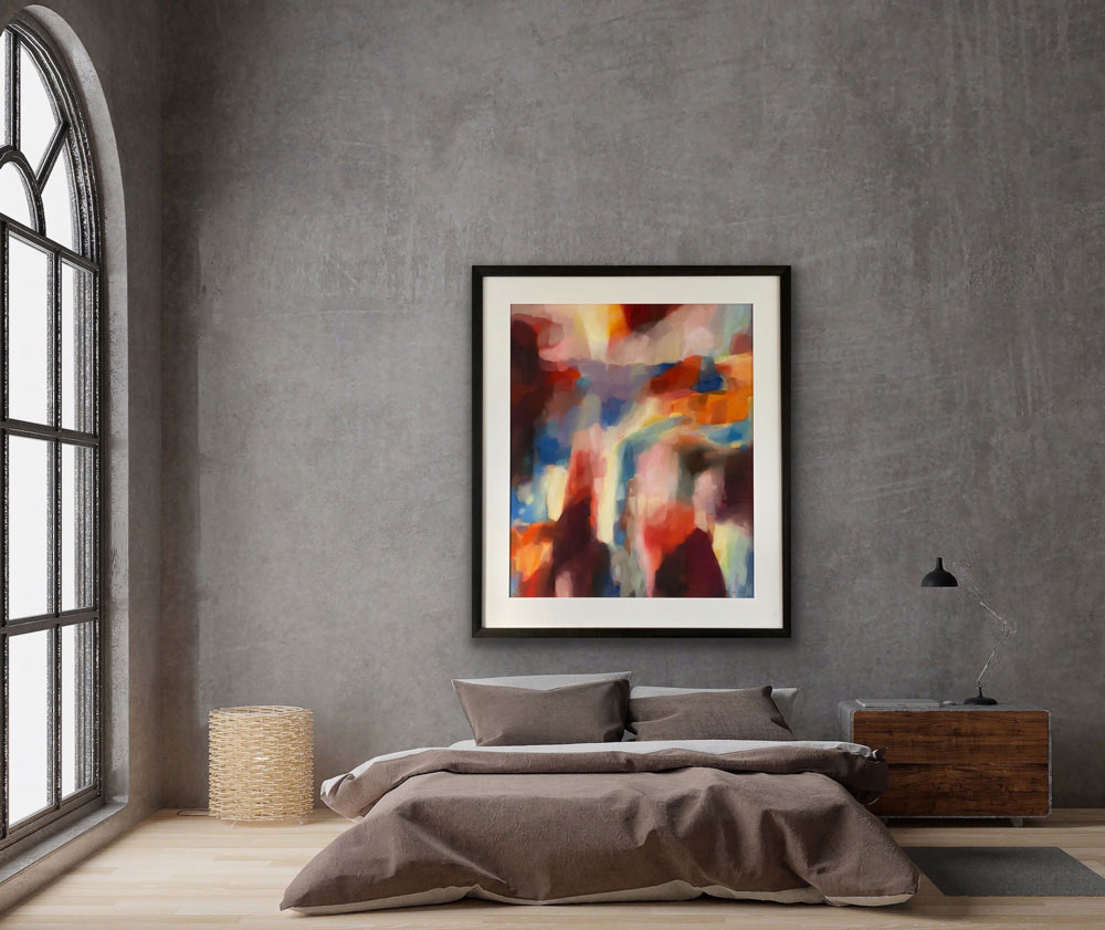
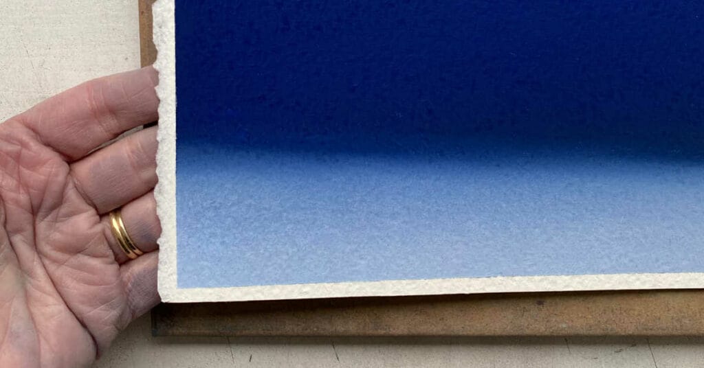
As a tactile person dry pastel are the obvious choice and much preferred medium to work with. Using a hands-on approach is exactly right for me. I love the feel of the pigments in my hands, creating movements and flow, moving the pigments around, mixing them, creating shapes, edges, or shadows, all with my hands and fingers. I am a painter by heart, my way of thinking and applying colour matches the dry pastels well, which benefits my abstract colour work, that I like to call pastel painting. The vibrancy and purity of the pastels appeals to me, the way they carry the luminosity of the different colours are fantastic and as close to my imagination and perception of colour as I have found in any medium, this combined with the silky soft surface they create makes it an interesting and satisfying medium to work with, leaving me with a beautiful artwork that I’m proud of and enjoy.