Michele ashby associate artist profile pic

Michele Ashby

Unison Colour Associate Artist

www.micheleashby.co.uk

About:

With a very successful career in Graphic Design, I have recently found the perfect work/life balance in a new career as an artist.

I have a BA (Hons) degree in Graphic Design and forged a successful career including running my own business for roughly 25 years. More recently I started to use pastels, loving the vibrancy and immediacy of colour and was hooked.

As well as being juried into the Pastel Society of America’s Enduring Brilliance Exhibition, NYC and winning the Chartpac Inc. Mussini prize for distinctive accomplishment in pastel, I have recently gained signature member status with the Pastel Society of America.

I have been selected or preselected by four London Art Societies; The Pastel Society, The Royal Society of Marine Artists, the Society of Women Artists as well as the Society of British Artists at the Mall Galleries, London. I also won Best in Show at the Institute of East Anglian Artists.

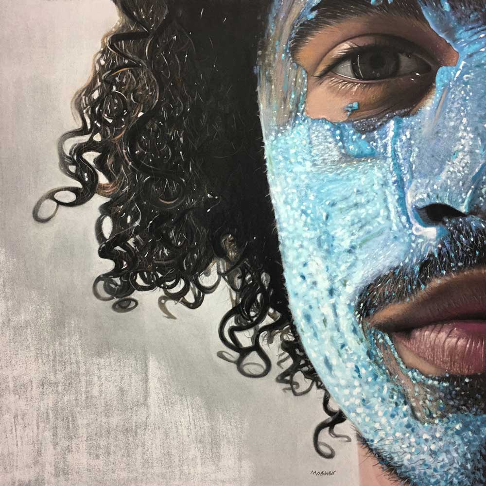
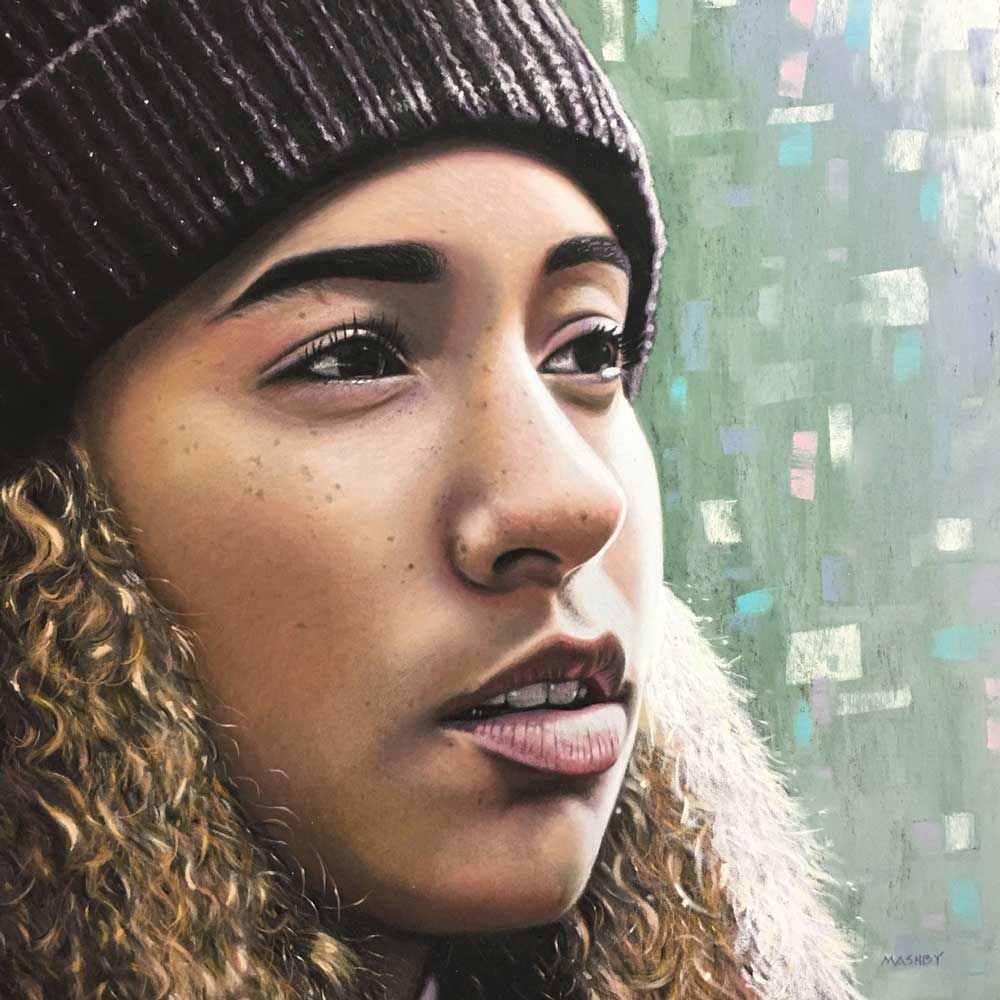
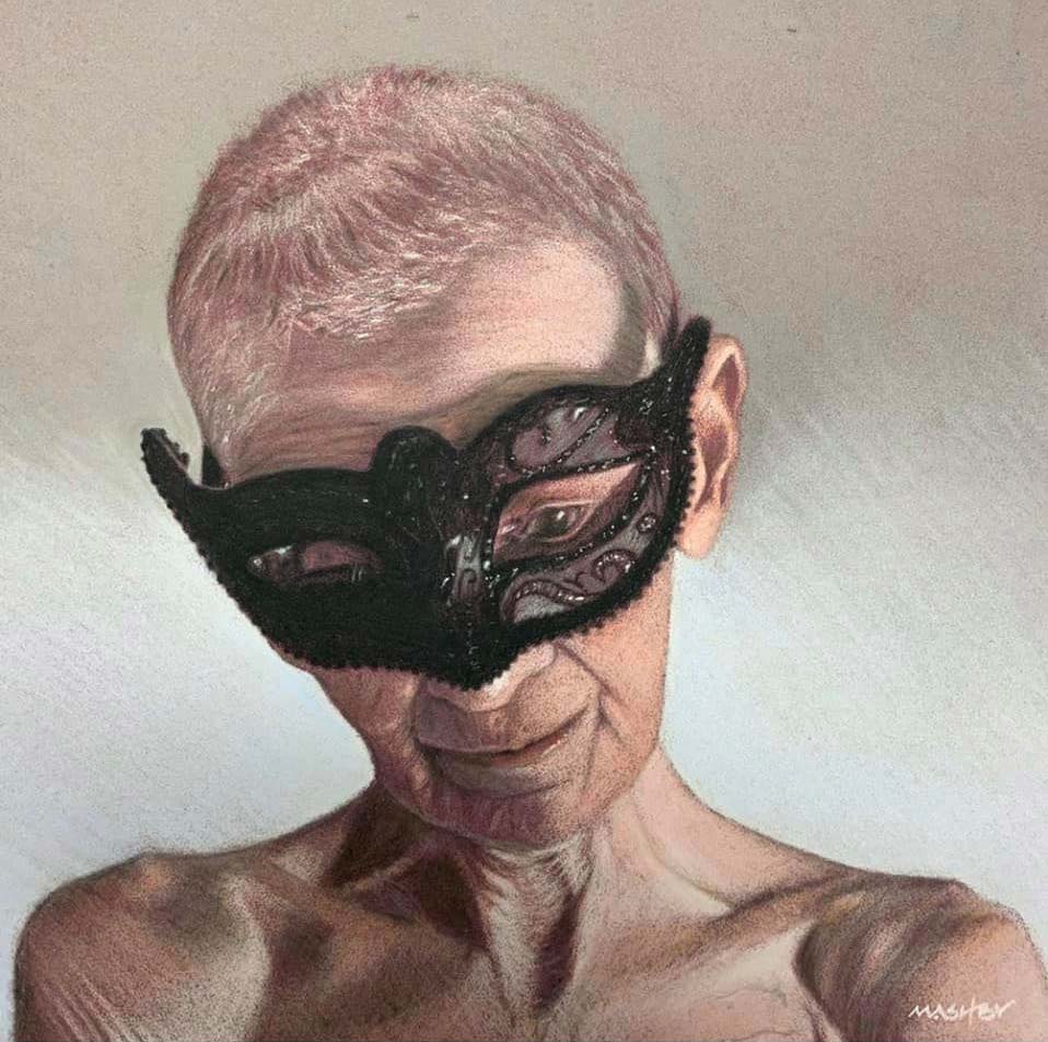
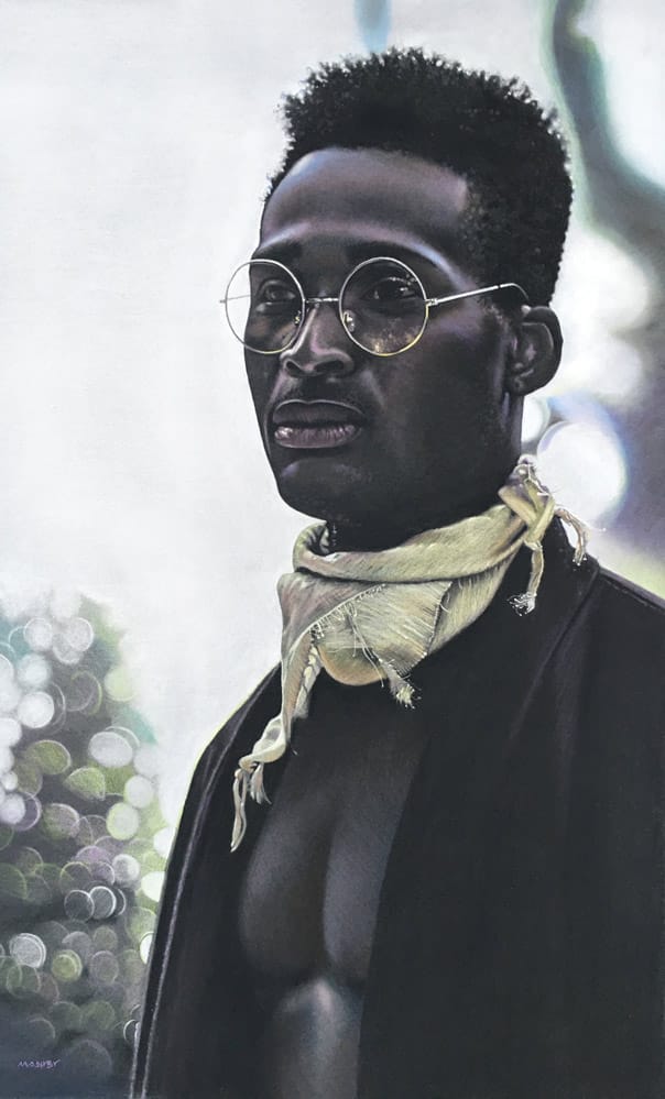
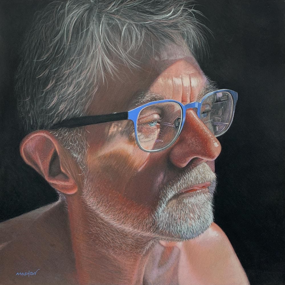
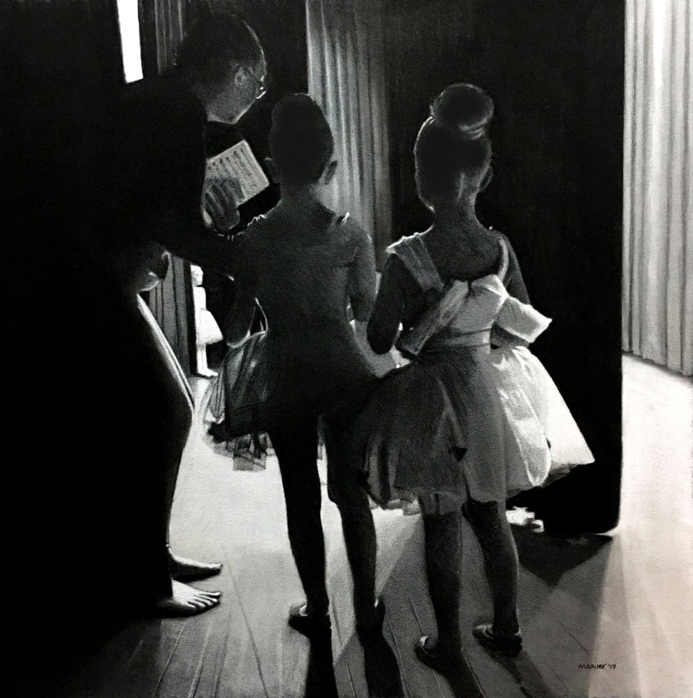
I have a penchant for contre-jour and chiaroscuro dramatic lighting effects. My style is detailed with a passion for contemporary realism.

Blogs by Michele Ashby

  • Zaria forman exhibits at the childrens museum of arts

    Zaria Forman exhibits at the Children’s Museum of Arts

    On a recent trip to New York City I was fortunate enough to be invited to the Private View of “Scale: Possibilities of Perspective” at the Children’s Museum of the Arts; where one of my favourite pastellists, Zaria Forman is exhibiting two of her beautiful paintings.

    Michele Ashby

    16th May, 2018

  • From graphic designer to pastel artist by michele ashby feat

    From Graphic Designer to Pastel Artist

    Making the jump to become a professional artist just over 5 years ago never in my wildest dreams could I ever have thought so much would happen in such a relatively short period of time.

    Michele Ashby

    11th February, 2022

Colour Chart Guidance

We believe the colours in our web based colour chart are a faithful representation of our pastel range. But with any colours portrayed on the internet, there’s a whole heap of variables which mean that what you see, may not be what we see. That said, there’s some things that can be done to mitigate some of the variance.

Mobile phone and tablet screens tend to be pretty good for colour, so they’re always worth using, when viewing our colour chart.

We hate to say it, but cheaper computer displays, including laptops, can be rather hit and miss, in both colour and contrast, so they might not reveal the depth of the colour, as well as the true tone.

If you’re really keen on getting your computer up to speed on colour representation, you can use a calibration device to reach your display's fullest potential.

With all that said, if you think we’re way off the mark with any of the colours then, by all means let us know, and we’ll give it another shot.