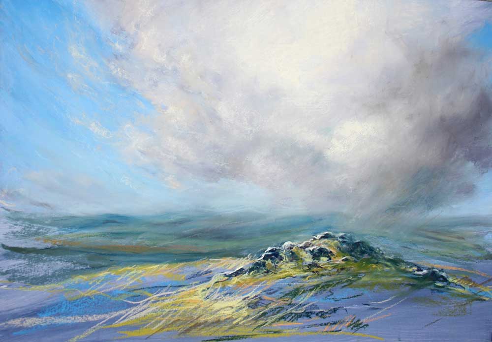
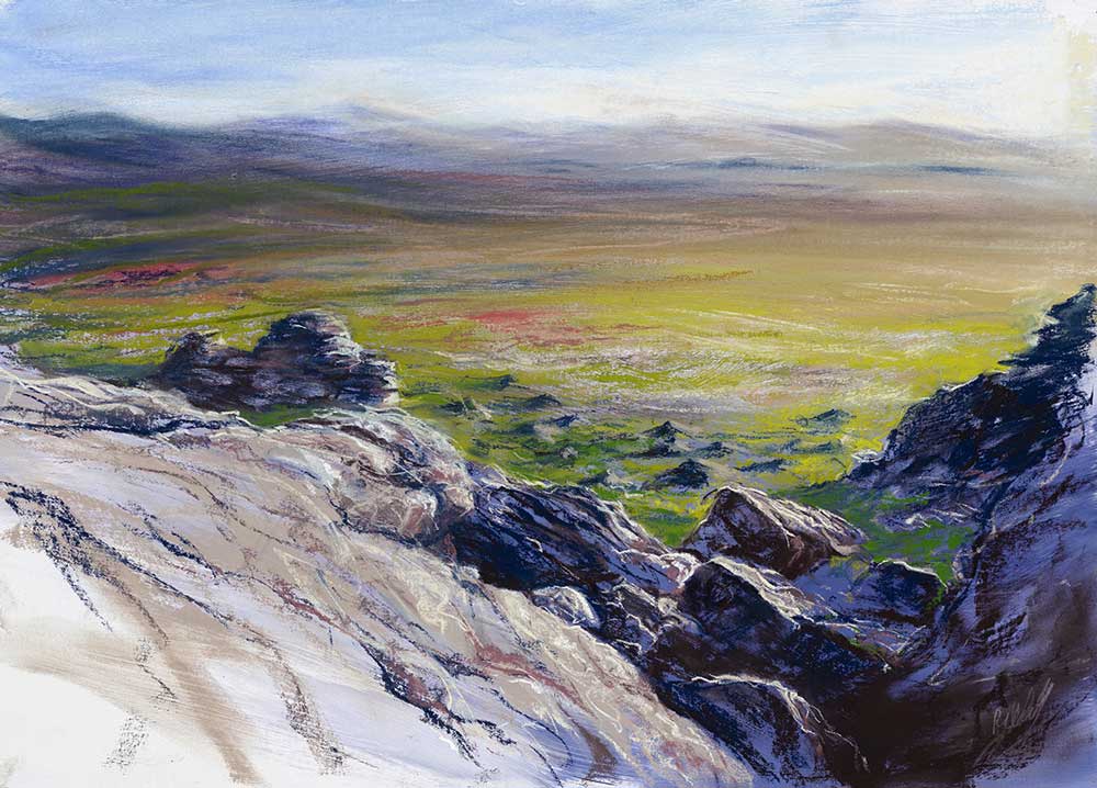
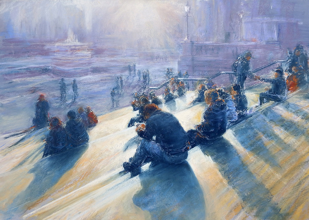
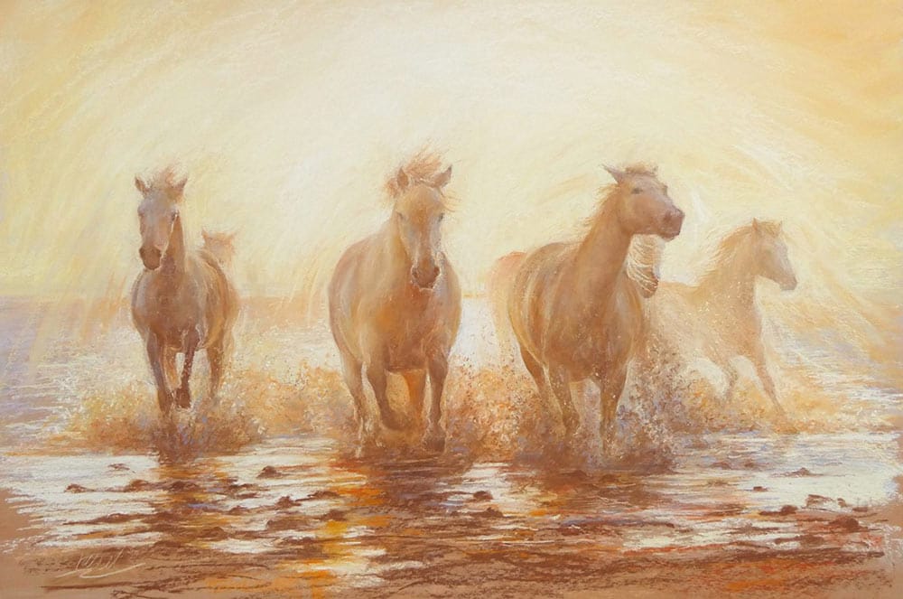
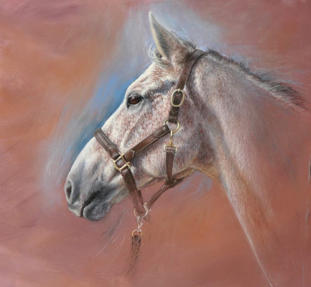
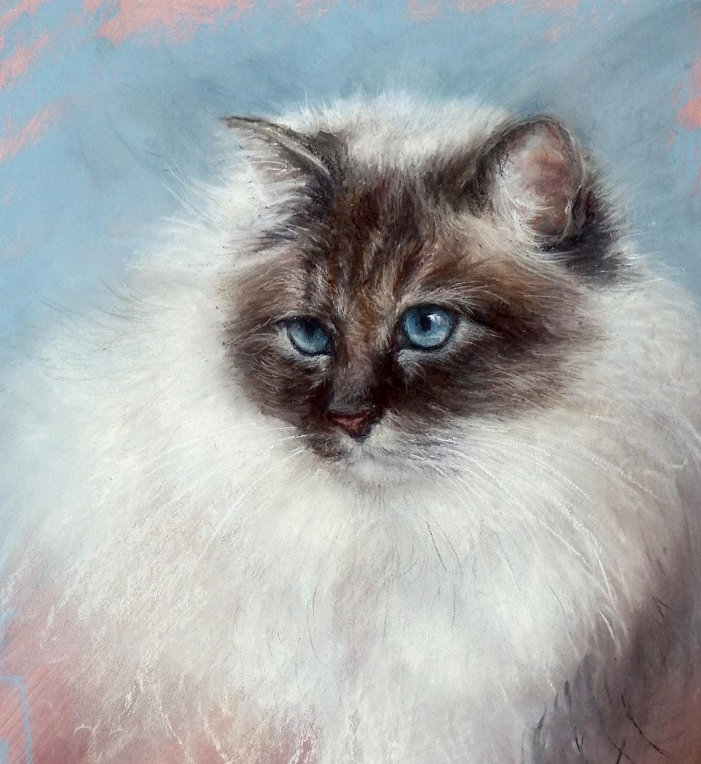
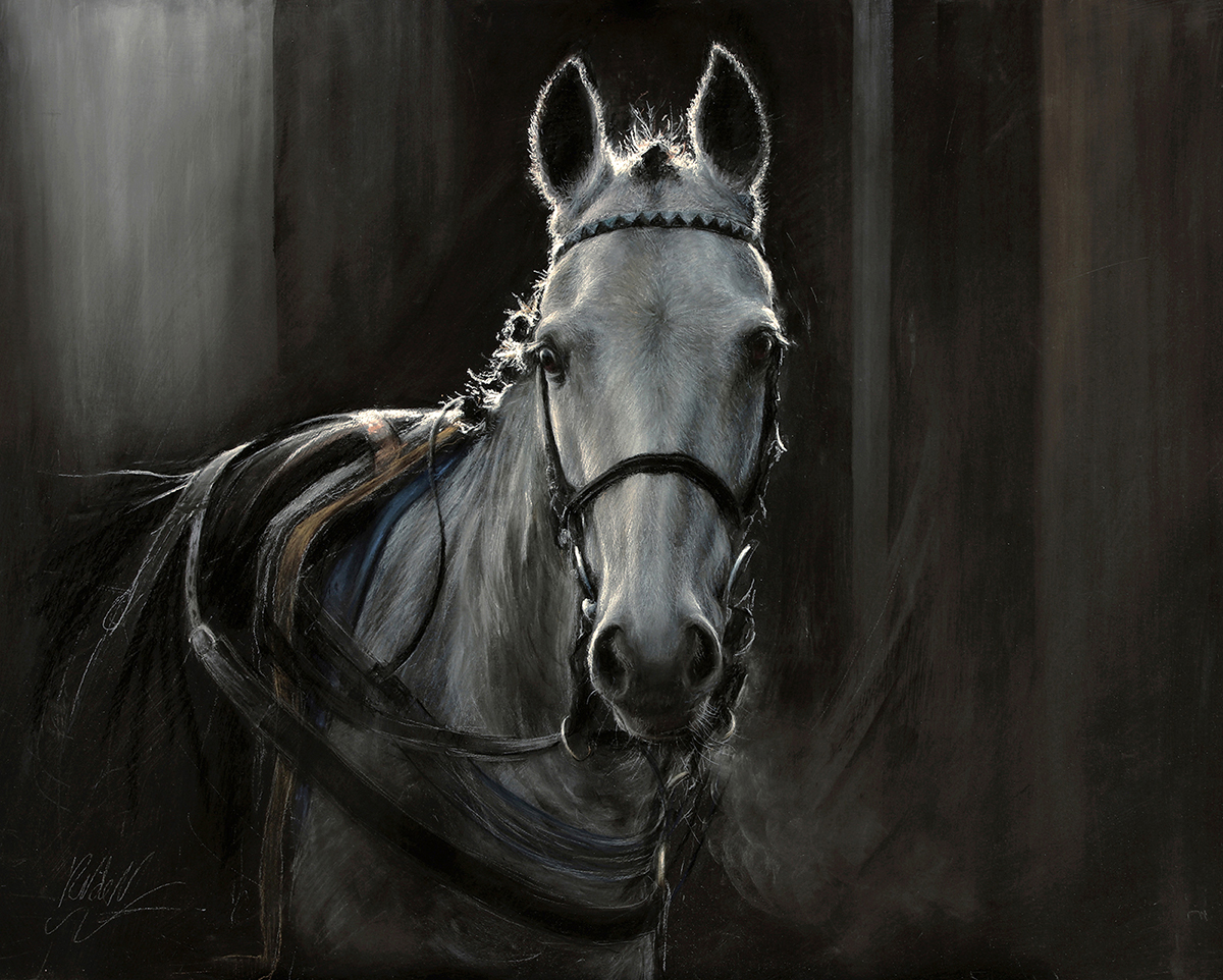
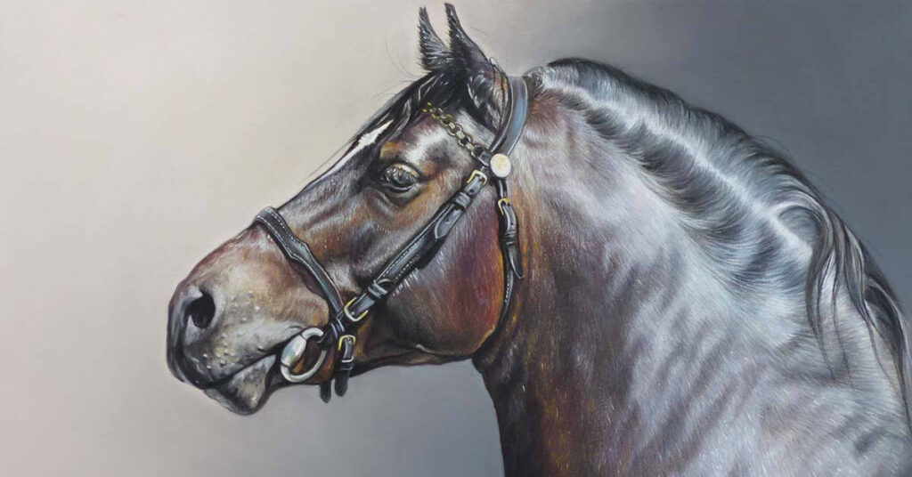
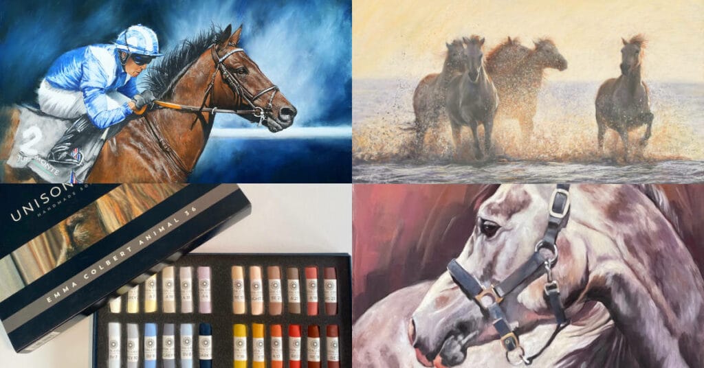
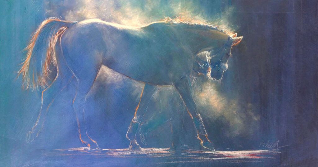
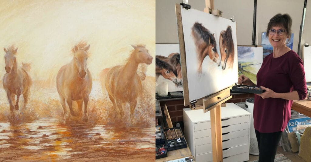
Rebecca’s dynamic pastel paintings have developed throughout a varied career in the arts. The atmosphere, movement and energy in her work were first inspired by her training in Theatre Design at Wimbledon School of Art. With her portraits, and paintings of horses and dogs she strives to capture the energy of her subjects; with her landscapes and interiors to convey to the viewer what it feels like to be there, not just what it looks like.
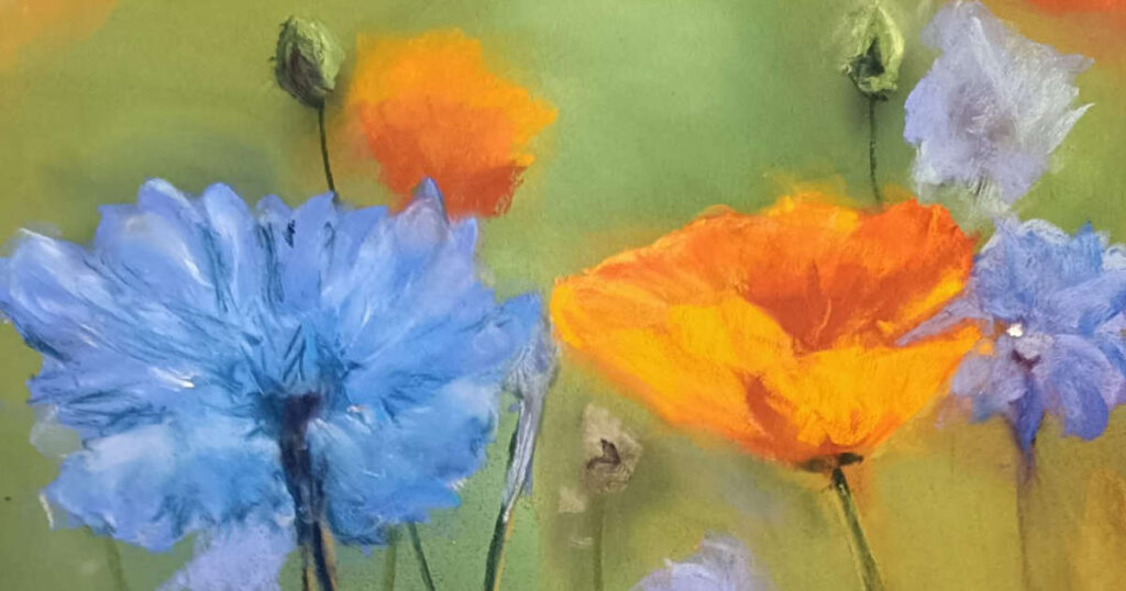
Rebecca finds that pastels are the perfect medium, allowing her to simultaneously combine drawing and painting; making marks with energy and fluidity but also precision. She loves the pure pigments and softness of Unison pastels, but also their strength and resilience.
In her early career, Rebecca worked with designers Kevin McCloud and Maria Bjornson, on many projects ranging from Harrods Food Hall to Phantom of the Opera. Other early work included illustrating 10 travel books, working for the BBC and sculpting for Madame Tussauds.
Portrait commissions include leading West End actors, and in 2006 Rebecca was invited to work with English National Ballet, producing a series of paintings from rehearsals and performances.
Rebecca is an Associate Member of the Society of Equestrian Artists and has exhibited her work at the Mall Galleries in London both with the Pastel Society, and in the ‘Artists of the Year’ Exhibitions, 2017, 2018 and 2019.
Rebecca teaches pastel courses in Britain and Italy. She writes for Leisure Painter Magazine, and the SAA, and teaches online with ArtTutor.com. In 2013 she cofounded The New Pastel School with her great friend and fellow pastel artist Nel Whatmore.
Her book, ‘Pastels for the Absolute Beginner’ was published by Search Press in 2019, receiving fantastic reviews.