Sketch pads, Pause Buttons & Pastel Dust
How many times however do we see something and regret that we didn’t bring paper and pencil with us. Not all of us can be like Toulouse Lautrec who could doodle on the menu card at the Folies Bergere.

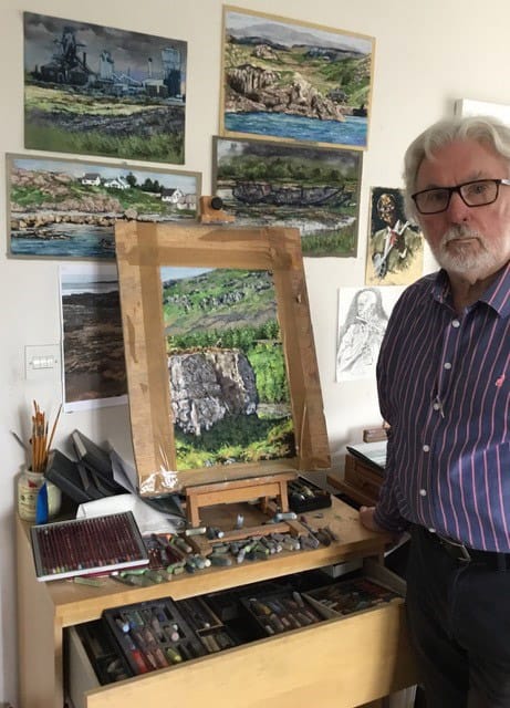
Having retired from my post of Consultant Gynaecologist in 2006, I achieved my longstanding and long overdue ambition of completing an A level in Fine Art. Throughout my career I have continued to paint and draw and came upon pastels about 35 years ago, initially as a compact and easy medium to carry on holiday. However it didn’t take long to establish it as my preferred medium.
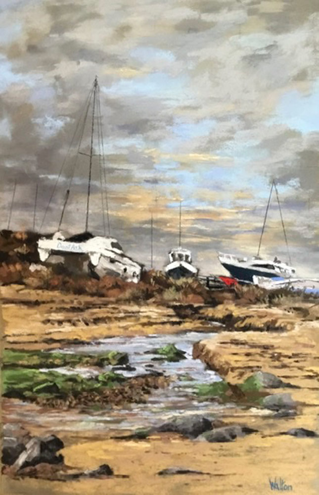
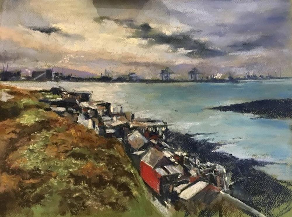
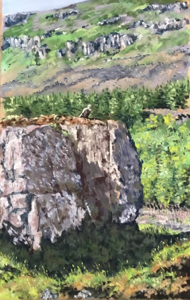
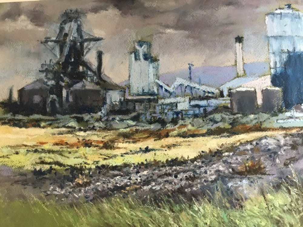
I paint landscapes and portraiture and have completed a number of commissions. The latest commissions were providing art work for the Howick Church (the resting place of Earl Grey) Kneeler Project and also a series of industrial Teesside landscapes for my former hospital. Having tried many brands of pastel, I find the Unison colour range unmistakably extensive and well suited to the North Northumberland landscapes and coast where I live. Added to this the texture of the pastels combines a softness and the right amount of ‘chalkiness’ making application easy and fluid.

How many times however do we see something and regret that we didn’t bring paper and pencil with us. Not all of us can be like Toulouse Lautrec who could doodle on the menu card at the Folies Bergere.
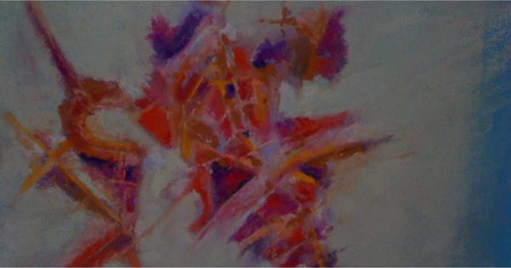
Although I am primarily a figurative artist, I have had an admiration and fondness for Abstract art. The main problem, and I would think not uncommon amongst figurative artists, is that I have had great trouble producing a piece of Abstract Art with which I am entirely happy.