About:
Vicente Romero was born in Madrid in 1956. At the age of 19 he started degree in Fine Arts in the “Universidad Complutense de Madrid”, specialising in sculpture aimed for acquiring strong fundamentals in drawing. In 1982 he was qualified for teaching Fine Arts. Despite political stability after 40 years of dictatorship, it was still a difficult time for the Art industry as the country was suffering from post-dictatorship period where only in the seaside, plenty of foreign tourism, that there was a place for art and freedom. For this reason he became a bohemian, itinerating along the Mediterranean coast and Canary Islands.
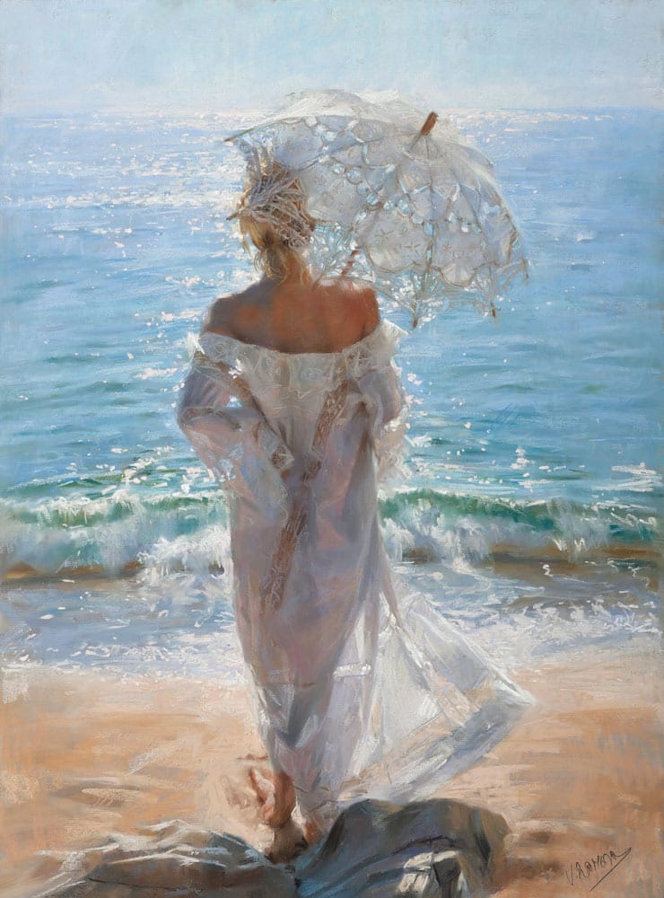
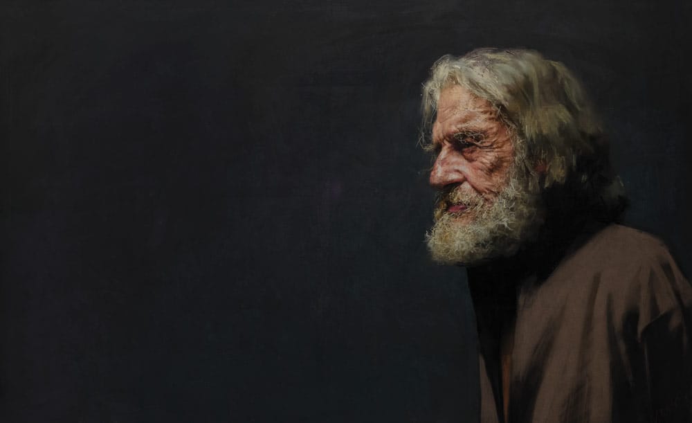
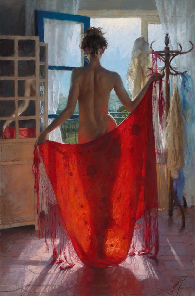
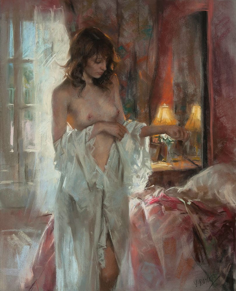
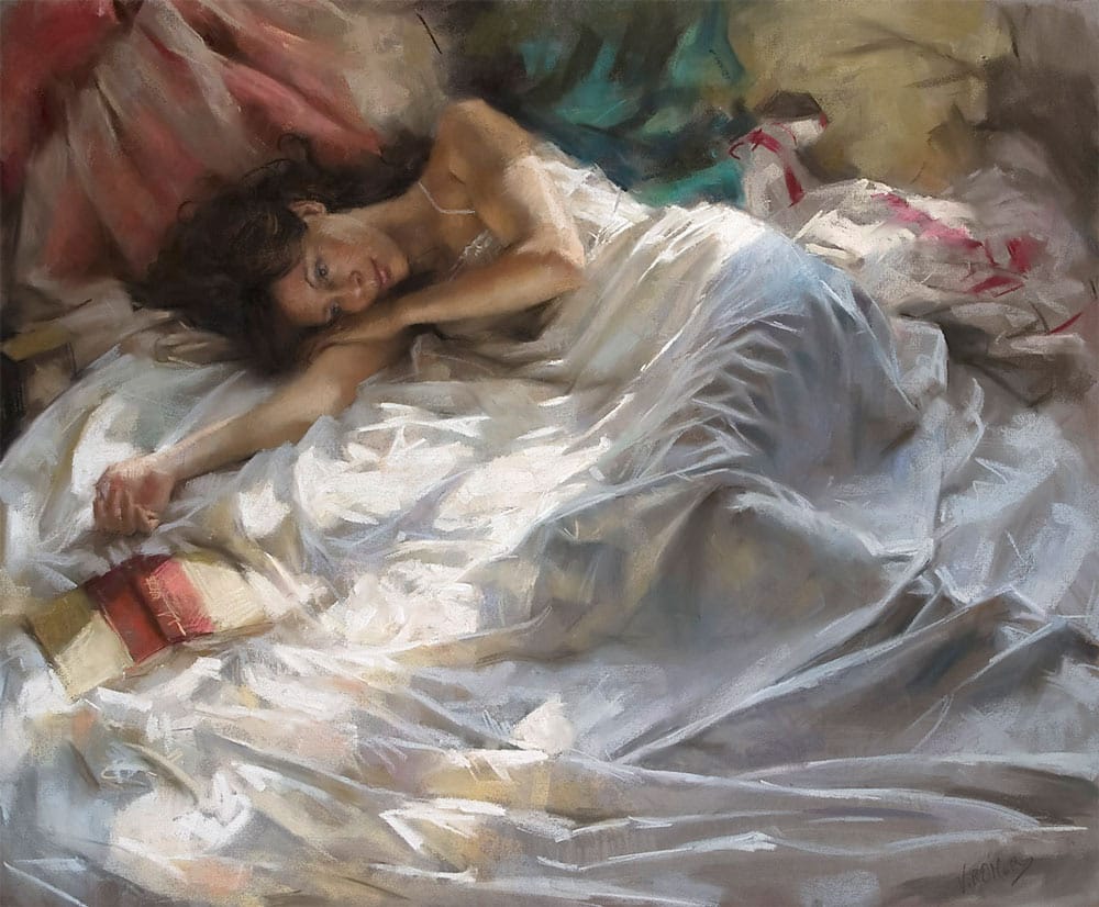
His paintings were mainly based on the female figure although he also painted portraits, another style that initiated him into the “pastel” technique. It was in 1988, when he definitively established himself in the charming Costa Brava, a magic place in the Mediterranean, being the Mediterranean light dramatically influencing his paintings. Since then, he has exhibited his work in several art galleries in Europe, North America and Asia.
As a classicist he intends to create a balanced world from an invasion of unbalanced stimulus beating our senses. Although fascinated for light, secrets of which were legated from impressionists, is his almost renascence nature that allows him to include all the sensitive chaos into forms, precise and clearly defined, legacy from his education in sculpture, with the purpose of capturing the essence of the surround world.
Blogs by Vicente Romero
- No blogs from this artist, yet...