
About:
Lisa Ober, PSA, IAPS/MC, is a portrait and still life painter, workshop teacher, and owner of OA Gallery in St. Louis, MO. When not in her studio painting or busy at the gallery she travels as a workshop instructor, sharing the versatility, beauty, and immediacy of pastel painting. Her contagious enthusiasm for the pastel medium has made her a sought after teacher and mentor, and she considers it her mission to endear artists, collectors, and galleries to pastel.
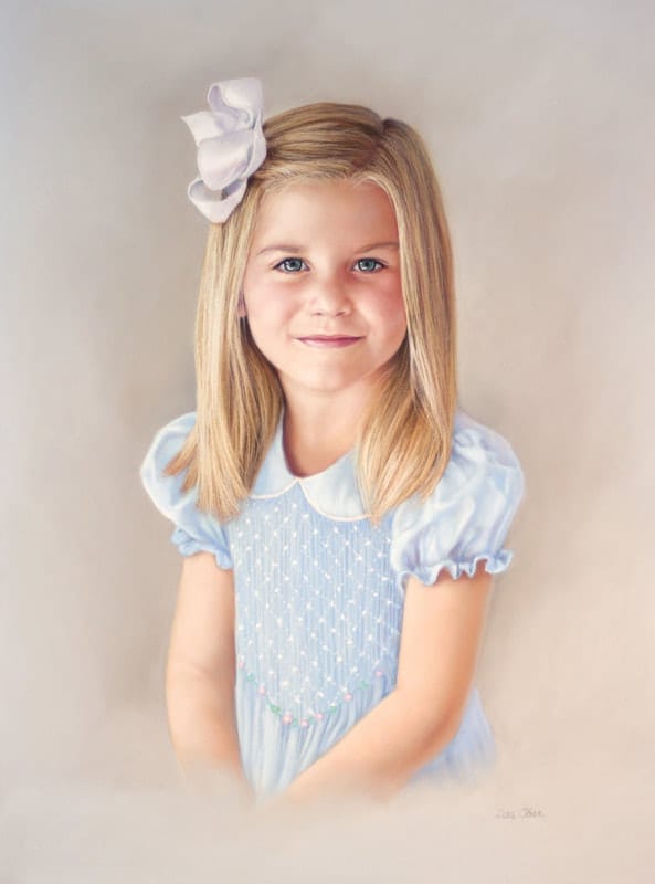
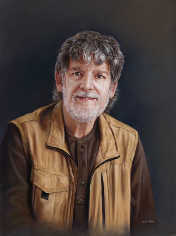
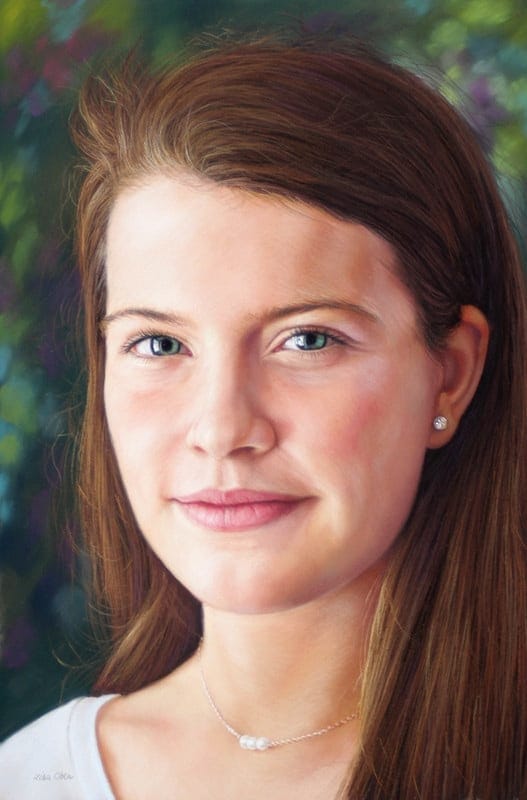
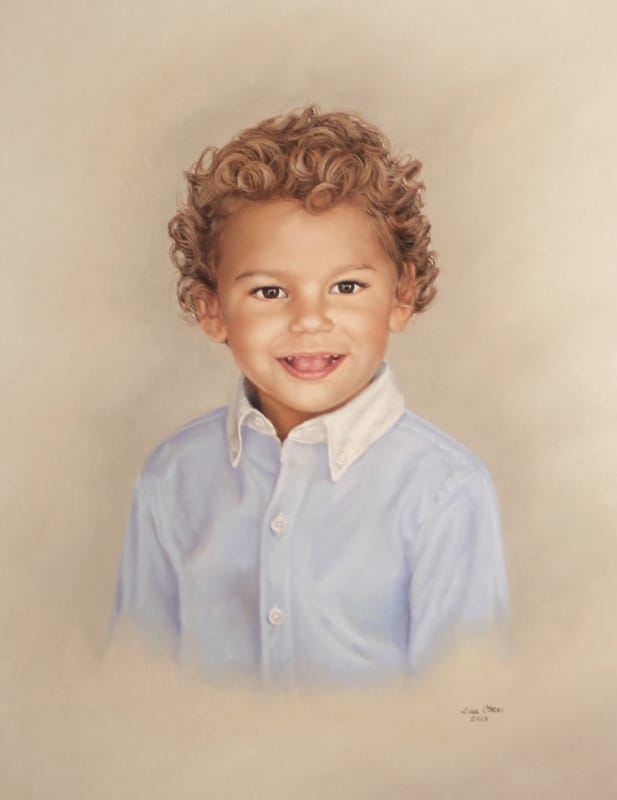
Ober’s work has appeared in numerous publications including The Pastel Journal, Southwest Art, and American Art Collector. She has enjoyed awards in competitions such as Pastel Journal’s Pastel 100, Bold Brush, and IAPS PastelWorld. Collectors have recognized Ober’s work for its clever content, exquisite realism, and detail. Ober enjoys making pastels “behave” the way she envisions as she endeavors to use the medium in fresh new ways.
Ober is a signature member of Pastel Society of America and a Master Circle member of IAPS. She is actively involved in the arts in the Midwest and serves on the board of Hope Creates, an organization dedicated to improving the lives of young adults in recovery from addiction by connecting through the arts with mentorship and entrepreneurial skill-building. She is also a founding board member of Marketing My Art, an organization dedicated to training artists to be more effective in the selling and marketing of their art. Ober wishes for 48 hours days, but does her best in their absence by painting in her studio until around 4 AM and considers herself blessed beyond measure.
Blogs by Lisa Ober
- No blogs from this artist, yet...