Coming from years of living on both coasts of Scotland you would think painting the sea would come as easy as breathing; nothing is further from the truth. The sea, art and pastels have been constants in my life since I was three but the thought of tackling water, waves and movement just seemed beyond my reach. Ever the “procrastinator”, I watched, listened, yearned and sketched but couldn’t put pastel to paper.
For the Celts, water and waves are mystical; the haunts of mythical creatures like Kelpies, Selkies, shapeshifters and other mythological figures. The sea, shallows, water or pools are gateways to the Otherworld; the realm of the Gods and the underworld. Perhaps the magnitude of all this lore was overwhelming but at the same time luring like a siren. As a child of the sea you can’t resist the invisible tug it has on you and like undertow you are inevitably drawn in.

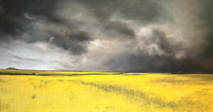
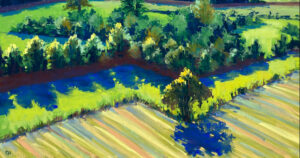
After years of painting expressive, contemporary landscapes, occasionally with waterways, it was finally time to take the plunge.
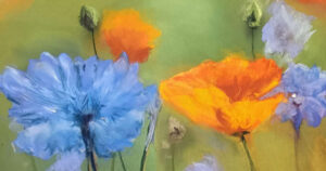
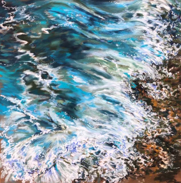
My technique as a pastel artist is somewhat untypical as I prefer to layer thickly with soft pastels from the outset without underpainting on sanded card. Unison have always been my workhorse and a set of Unison lights gave me the impetus to tackle the crests of tempestuous waves and pooling shallows.

Sea foam is three dimensional and simply using white isn’t enough to create that tactile feeling or depth and that is where the subtle grading of Unison lights with their lilacs, blues, greys and other neutrals is extremely useful. The buttery feel of the pastels allows for a fabulous build up of texture and values.
On a humorous note, I prefer working in natural light but late one afternoon I was in full painting flow and as the light faded there was no stopping me. The next morning when I popped into the studio and looked at my easel my waves were all cresting with fabulous pale pink sea foam.