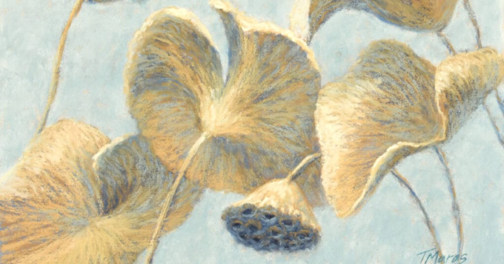
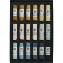
For a painting to work effectively, it should include a range of values as well as a variety of warm and cool colors. In addition, color harmony will be more successfully achieved when utilizing a limited palette. With this in mind, I have undertaken to complete a series of paintings using individual color sets of Unison Colour Pastels.
In this first painting of the series, I discuss my decision-making process for selecting a color set and demonstrate the development of the painting, “Enlightenment.”


6 comments
Lori
While the video was fun to watch, it was listening to you explain your thought process that was very “enlightening”! I’m going to consider more carefully how limiting my pastels can make a difference!! Thank you.
Tracey Maras
Lori, your comments were so kind. My hope is always to explain things well as I cherish opportunities to share what I’ve learned. Thank you so much.
Kay L Tomlinson
Very interesting! Fascinating concept, and helps me understand more about how to use a limited range of colours. Thank you!
Tracey Maras
Kay – When I first started hearing about using a limited palette, I didn’t really understand. I would pick a group of colors that I saw in the scene and inevitably, the painting wouldn’t work well. It wasn’t until I really understood the concepts of value and color temperature did it all click. Values (a range of dark to light) to hold the composition together and color temperature (warm to cool colors) to create a sense of depth and dimension, cooler colors receding and warmer colors coming forward. And I’m continuing to experiment with different color palettes to see where it takes my work.
Lynn MacAdam
What a clever idea and approach to exploring values and colour hues–the idea of a constrained challenge really appeals to me and has resulted in some of my most dynamic work, as it has clearly resulted in a beautiful work of art by Tracey. Thank you so much for sharing your process Tracey!
Tracey Maras
Lynn – Utilizing a limited/constrained palette can be a challenge given all of the colors we have at our disposal. But, as you mention, doing so can make for more dynamic painting and more harmonious color schemes. Over the past few years I’ve been attempting to begin my paintings with no more than 20 different pastel sticks. I try to complete the majority of the painting using these colors. I can always add a few notes of color, as needed. But with the majority of the painting completed with the more limited palette, it forces me to carry the selected colors throughout the painting, resulting in a more harmonious look. Now I just have to decide which Unison color set to use for my next challenge. Exciting!