22nd – 26th November

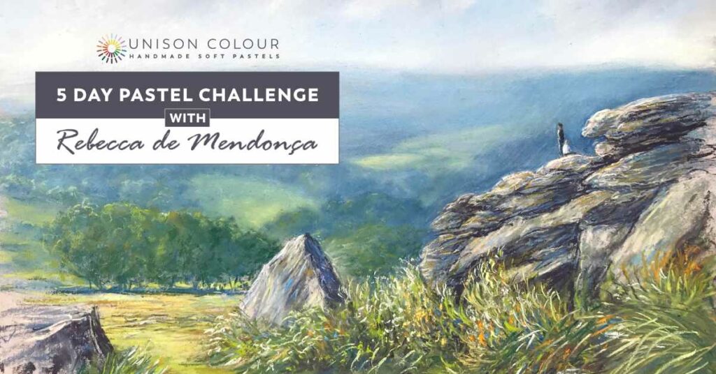
It’s once again with great pleasure that we welcome you to our 6th 5 Day Pastel Challenge, to be held from Mon 22nd – Fri 26th November. This time we are working in conjunction with esteemed soft pastel artist Rebecca De Mendonça. Rebecca is an experienced teaching artist and published author. She has been part of the Unison Colour family for many years and is a fantastic advocate of our handmade soft pastels.
For this challenge we will be capturing the beautiful light and colours of a moorland scene.
From the bright sunlight on the rocks, to the blue haze in the distance, this is a chance to understand more about the amazing range of colours available with Unison pastels, and what you can do with them!
Over the 5 days of the challenge, we will be looking at how to use and mix colours, especially greens. We will learn how to choose warm and cool colours to create distance, what to do if your colours are too bright, and how to use tonal contrasts.
Rebecca will show the variety of different marks and techniques she uses to create a landscape full of life and energy.
As always, it’s a completely free event held in a dedicated Facebook Group, where you’ll be guided through with a daily video and worksheet, and each evening Rebecca will host a Live Q+A session to answer questions from participants.
So register for this challenge today, and be part of a fantastic community event with like minded artists from all over the world.
To sign up, click the button below.
We look forward to seeing you there!