One of my biggest ‘ah ha’ moments has been discovering that ‘copying’ rather than ‘creating’ can result in very dull work. So, what do I mean by that?
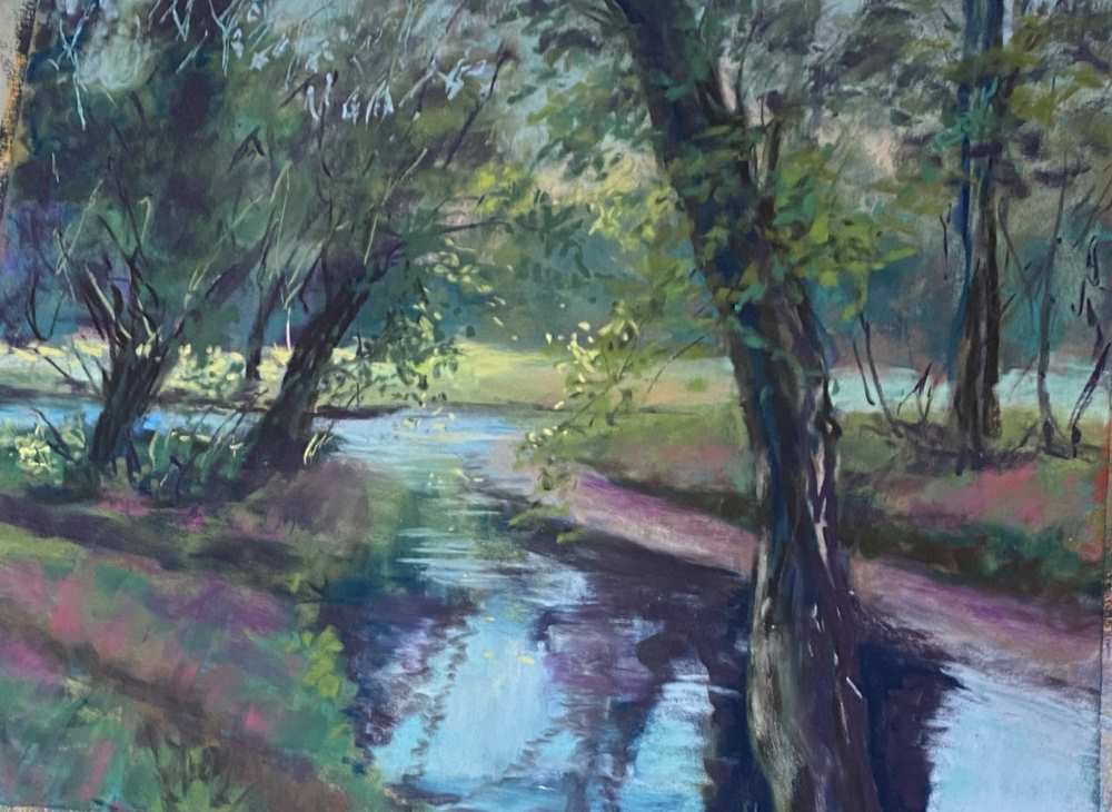
You can see that in my painting of the river Deben below that the colours are very lacklustre, it has no atmosphere. It’s a nice representation of the scene but it’s not very interesting or exciting. I painted it with the colours true to the scene, but something was missing. Even when I went back and tried to liven it up after, it still didn’t have the feel that I wanted. To me, it still looks a bit flat and dull. You can see the video on YouTube where I tried to add colour afterwards.
So, what did I do wrong? I tried too hard to copy the image and not create my own version. An artist’s challenge with landscape painting is how to capture the ‘essence’ of what you see. When I took the photo, the scene evoked certain emotions in me. How then do I recapture that in a 2-dimensional image? That is what the impressionists were masters at and they used colour in a variety of ways to capture the scene, to create their own ‘impression’!
Just a note: It is always best to paint from your own reference photo because of copyright rules. There are some competitions that won’t allow you to enter your work if you have used someone else’s photo, even with permission. Working from photographs gives you freedom to alter the colours to create a certain mood or atmosphere. When we first start painting we try so hard to copy all of the colours and all of the details of the image that we’re working from. This is what I did in the painting above. However, when we think about what appeals to us about a piece of artwork it isn’t necessarily that it replicates the subject.
What appeals to us is the way the artist has interpreted the subject. Isn’t that what creating art is all about? Finding your own style, your own artistic rhythm and voice. There are so many elements that attract us to a piece of art but one of the key ones is the use of colour.
Colour is a whole science in itself and can take a lifetime of study, but for artists, learning some fundamental colour theory can totally transform the work you produce.
Mixing it up
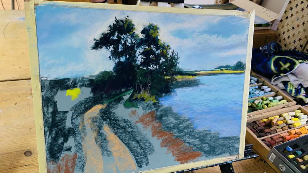
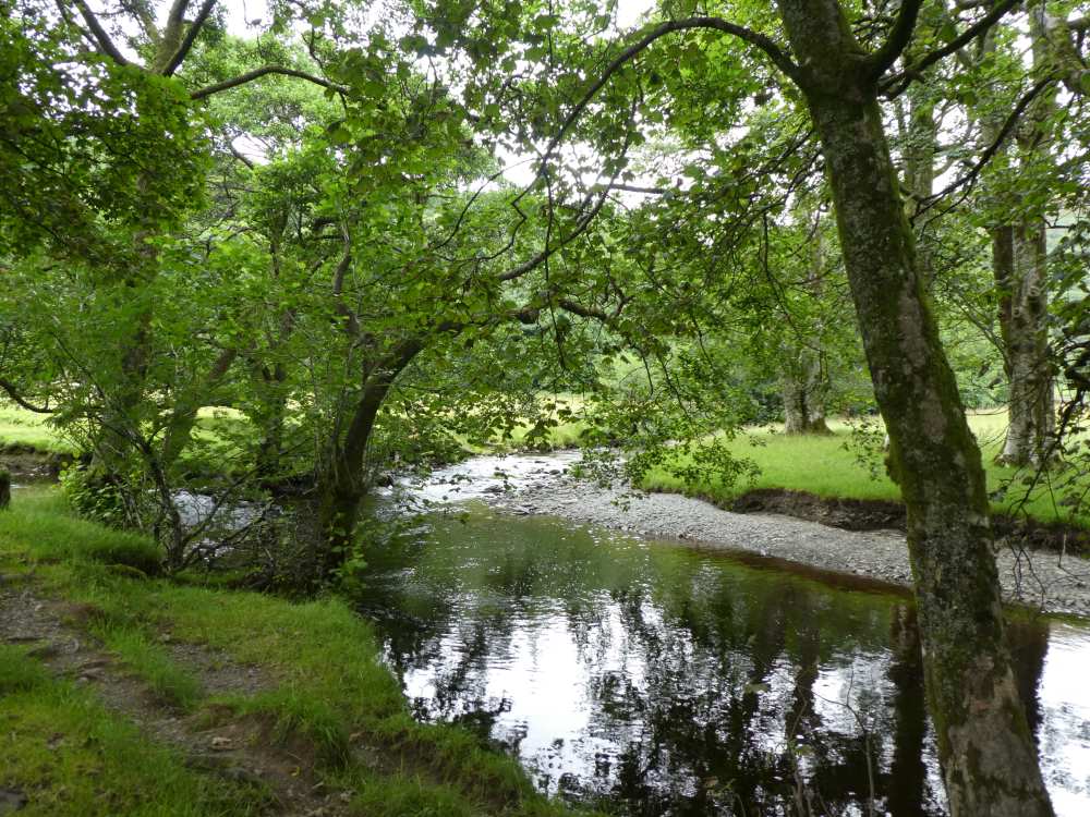
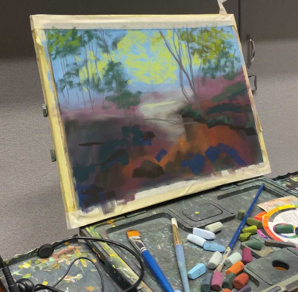
The image below is the photo reference I used for an art club demo. It is very much all one colour. The second image is the unfinished painting. With this painting, instead of copying the colours in the photo reference, I used a complimentary underpainting. A complimentary colour is the one opposite on the colour wheel. The opposite of green is red so, I used a lot of pinks and reds under my greens and you can see how the under painting has started to make the piece sing. For me this looks much more interesting and is definitely one of the key things I have learned on my art journey. When you allow some of the complementary underpainting to shine through pastel layers, it brings it to life. When you choose your own colours for your painting this is what gives your work your voice and allows you to create a completely original piece of work. So be adventurous, be brave and experiment.
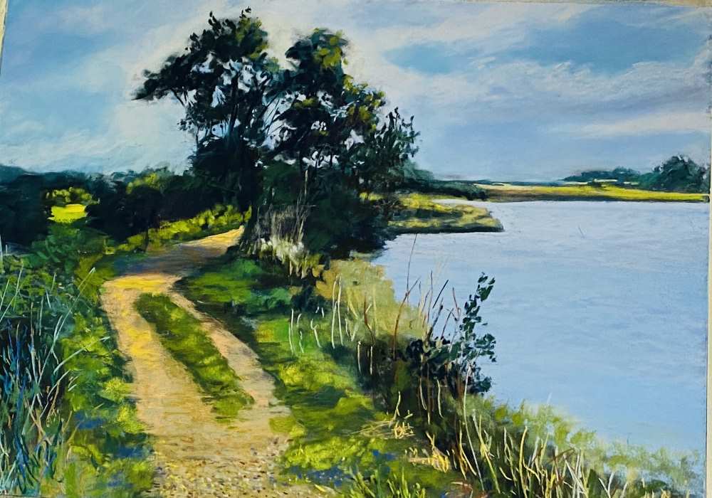
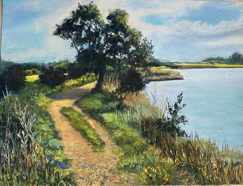
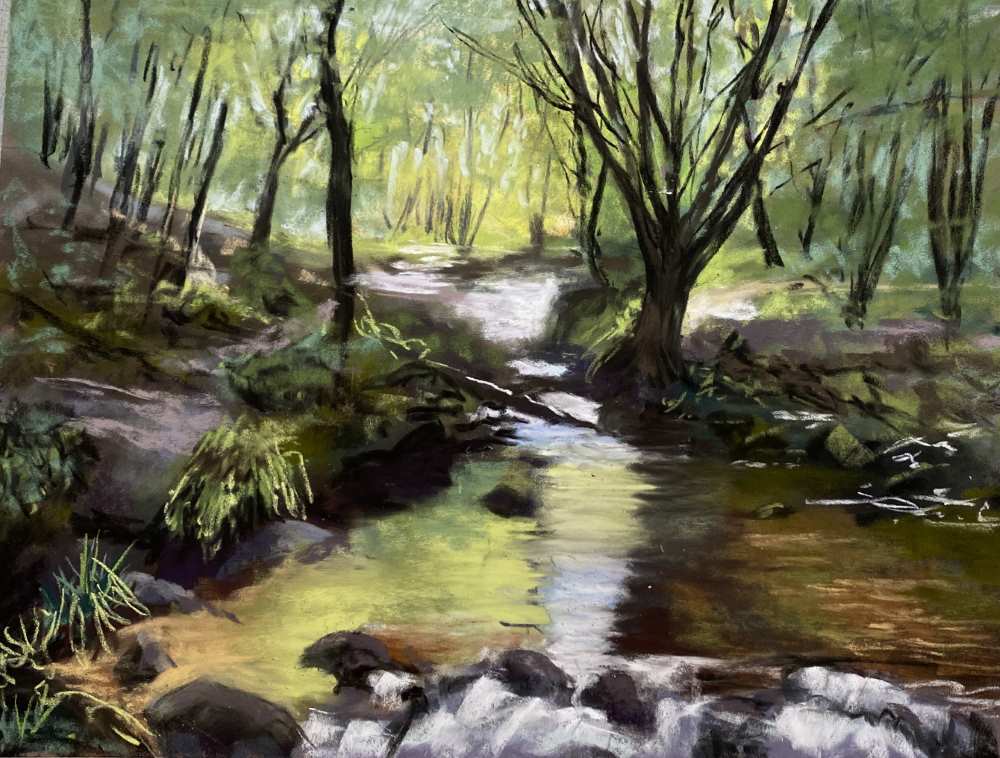
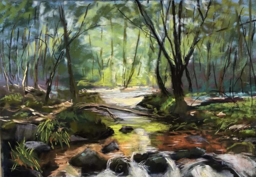
I also find it useful to do several versions of the same painting. Below are two examples of this. Version 1 is the original one I did, working true to the colours and version 2 is where I was more creative with my underpainting. To me, version 2 looks much more vibrant. It’s subtle but it’s just more pleasing on the eye and feels somehow ‘richer’.
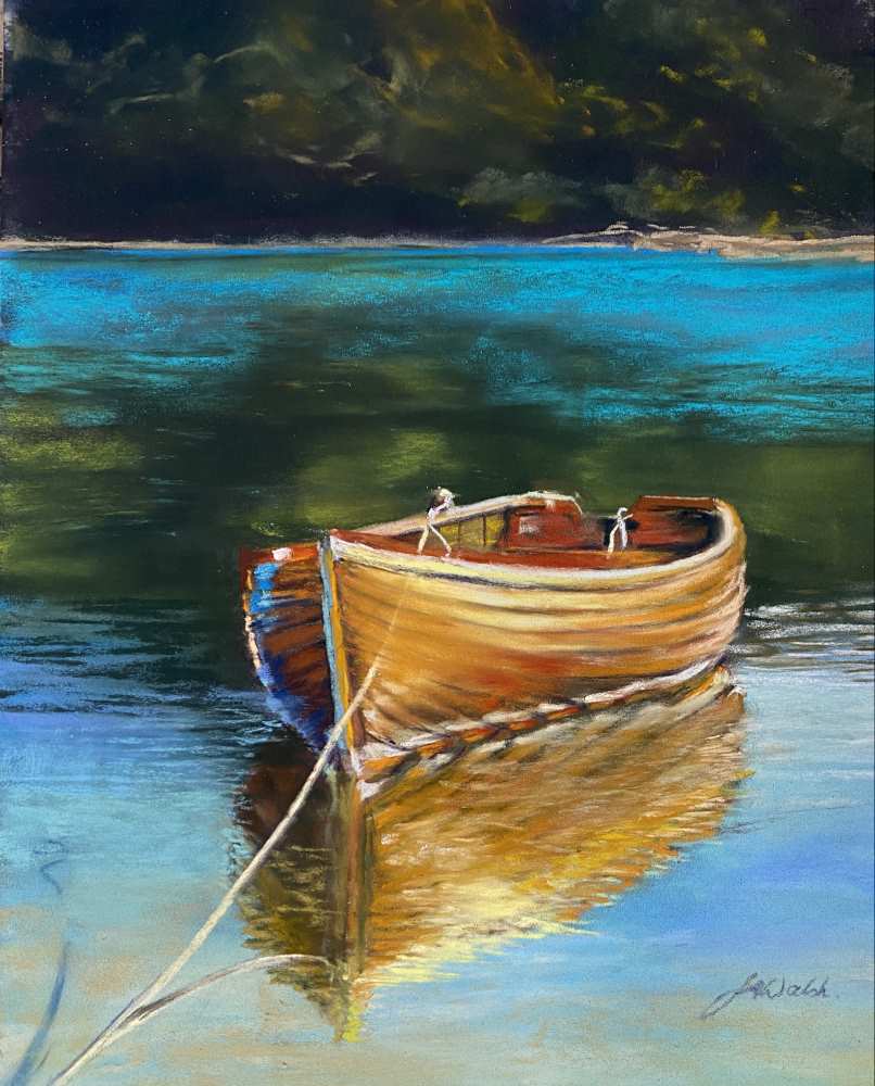
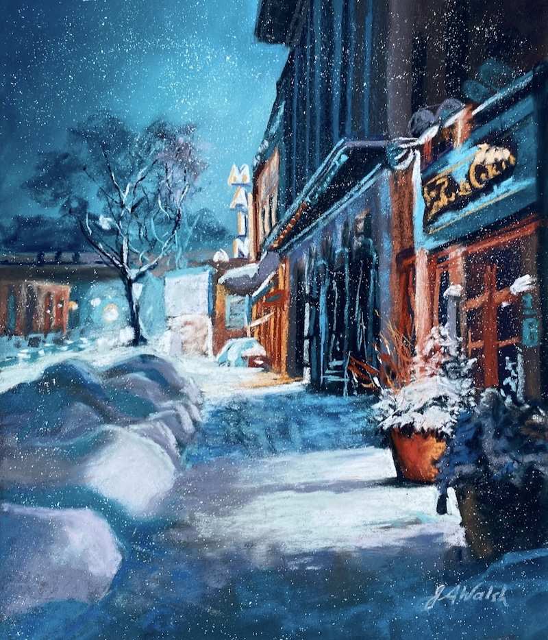
Another way to incorporate colour theory into your artwork is to use a colour scheme. Golden Rowboat and Snowy Cityscape both use the complimentary colours of turquoise and orange. It seems to be a colour combination I am particularly drawn to. You will probably find that there are particular combinations that you prefer too. I find Pinterest is a wonderful way to discover colour themes that inspire me.
The boat was painted from my own reference photo and the Snowy Nocturne reference is courtesy of Josh Hild. They are both available as step by step, recorded soft pastel tutorials on my website JulieFordArt.com
One of the fantastic things about using the high-quality materials, is that it allows me to be as creative as I want without worrying about mistakes. One of the reasons that my preferred paper is ClaireFontaine Pastelmat is that it gives me scope to change and correct and continue to add colours until I feel I’ve got a result I like. If I don’t like something I just paint over it or take a stiff paintbrush and brush it off outside. I can blend it with sponges or my fingers, pushing the initial layers into the tooth of the paper, or I can create wet under paintings on it and then build up layers gradually. Pastelmat holds 30+ layers of pastel if you are careful with your pressure.
Soft pastels have this wonderful capacity to create beautiful under paintings. The paper needs to be compatible with wet media and not all of them are. If you are not sure which ones are, I have attached here a link to Jackson’s art blog on pastel papers which will help you to identify which papers you can use wet media with.
This technique will only work though, with high quality pastels like Unison. If you are using cheaper pastels they will have more binder in them, and they won’t then dissolve into a beautiful colourful ink when you wet them like Unison do. Unison pastels are so highly pigmented that a very little goes a very long way. So, to create an underpainting you can literally put a light layer of pastel onto the paper then wet it with either water or a white spirit of some sort and a soft brush. Alcohol works as long as it’s a pure alcohol such as gin or vodka not a sticky alcohol like a liqueur. This saves the tooth and allows you to build layer upon layer of colour once it is dry. Although Pastelmat appears expensive at first glance, it can actually be washed off under the tap if you don’t like what you’ve done and reused.
I tend not to use hard pastels even in my under paintings. I love Unison’s because they go such a long way when blended or liquified. I would rather have fewer pastels but of higher quality then lots of colours of lower quality and even though I have some of my original cheaper brand in my pastel box I just never pick them up.
Creating art is such a wonderful journey and I am sure that like me, painting is your ‘happy place’. However, the more we learn and build our skills the happier we are with the outcome and the more fulfilled we feel. It can be frustrating when we don’t see the image appearing on the paper that we have in our head but be aware that there will always be an ‘ugly’ stage. A point at which you want to throw it in the bin and start again. Instead, push through, keep going, pastels allow you to do that. Just keep on until you see something that makes you happy. It’s all worth it in the end.
So, to summarise some of the key learnings for me on my pastel journey have been:
- Create rather than copy
- Understand and use colour theory
- Use premium quality pastels and paper
- Explore, experiment, have fun and don’t give up!
Happy pastelling 😀




2 comments
Lynn Waters
Thank you for this well written blog Julie. I have a group of pastelists (in Cambridge NZ) who I meet with each week to learn together. I would love to show them this blog and discuss your methods. Im sure they will all want to sign up to this website to see this and other interesting articles for themselves as well. Thanks Unison for this.
Julie Ford
Hi Lynn
Many thanks for your comment, it really does mean a lot to know my thoughts are of interest to others. 🙂