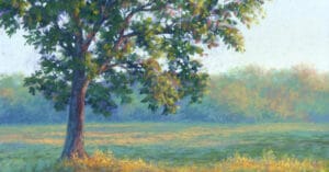
The sky is blue and clouds are fluffy balls of cotton.
This notion follows us from our childhood and unfortunately, can inform our paintings, if we let it. To successfully take on a “skyscape” requires observation, a little science, and a bit of unlearning.
This tutorial includes an overview of the “anatomy” of sky and clouds. Knowing what to look for can make all the difference when you are gathering reference materials, whether plein air sketches, photographs, or just taking a walk. Observation becomes critical, especially when working from a reference photo. What the camera gives to us is rarely ideal composition and almost never correct in terms of values and colors.
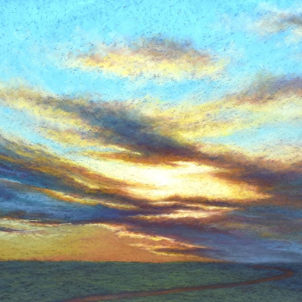
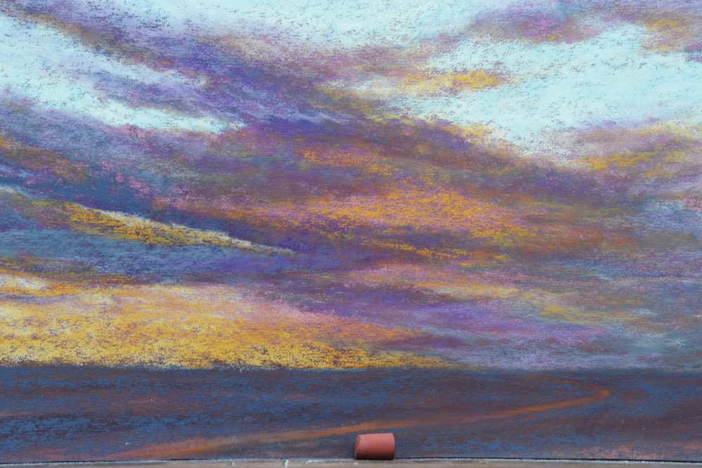
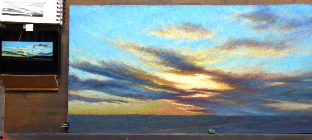
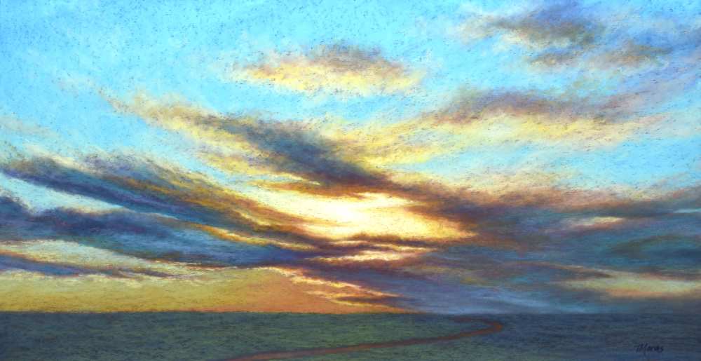
In “Braided Light”, pastels are layered using a light touch to create gradations of color through the sky, sweeping veils of colorful clouds, a glowing intensity of the sun, and a simplified, yet intriguing landscape. Blending is rarely used and only strategically.
This tutorial also offers two alternatives for an underpainting. The traditional approach of liquefied pastel is reviewed. However, the process of re-purposing paper from a previous painting is also demonstrated, allowing you to experiment with the effects of each.
Most importantly, this tutorial demonstrates the process for assessing and correcting a compositional error, even well into the painting process.
The goal of this tutorial may be to paint a dramatic skyscape. Yet it provides much more information that can lead to other successful skyscape paintings. All we need is observation, a little science, and unlearning what our brain thinks we know.
Materials

Unison Colour pastels…
- Blue Violet 6
- Blue Violet 5
- Additional 35
- Brown Earth 23
- Blue Green 9
- Blue Green 10
- Additional 3
- Additional 51
- Additional 52
- Grey 21
- Blue Violet 5
- Blue Violet 15
- Grey 27
- Red Earth 5
- Additional 25
- Yellow 3
- Grey 22
- Grey 26
- Red Earth 3
- Yellow 5
- Red 3
- Blue Green 15
- Blue Violet 14
- Blue Green Earth 5
- Additional 45
- Green 4
- Light 1
Other materials…
- Hard pastel – Umber
- Backer board (foamcore, gatorboard, Masonite, etc.)
- UArt pastel paper
- Masking Tape (white, beige or black)
- Cup
- Isopropyl alcohol for underpainting
- 1” to 2” wide brush for the underpainting
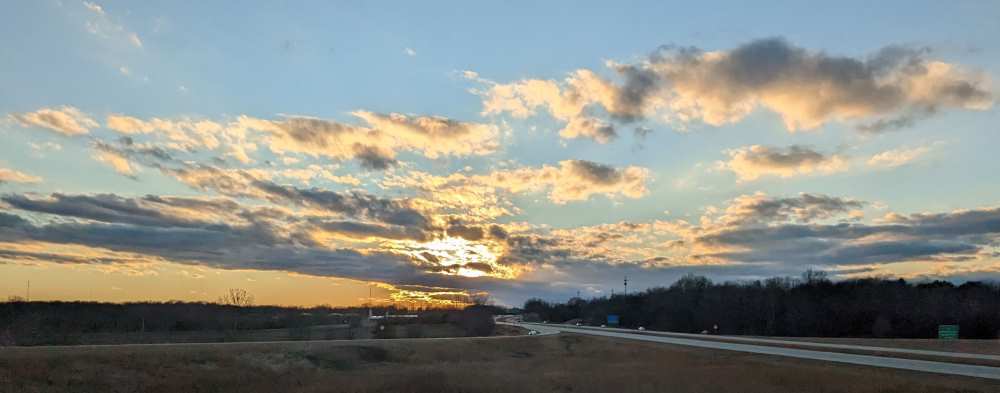
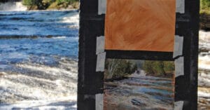
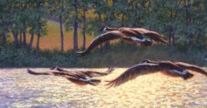
Reference Photo
Stage 1: Design & Composition
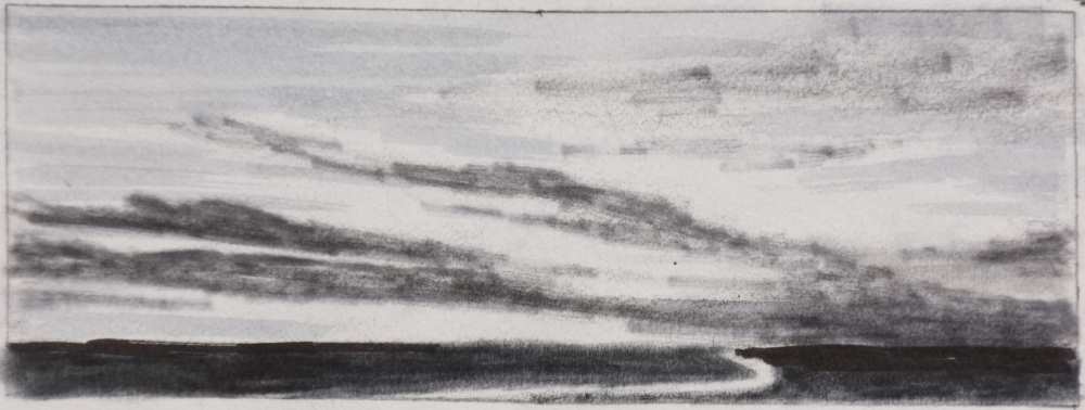
Thumbnail sketches can be beneficial in the design on your composition. They can help in the telling of your story, can identify potential compositional problems, and can help you separate from simply copying a reference photo.
Rather than copying the reference photo literally, I created several small thumbnail sketches (2×3”) to consider various compositions and to determine which design I preferred. When creating thumbnail sketches, I loosely sketch the large shapes using a pencil. I then use value markers (generally in 3 different values including black, medium grey, and light grey) to establish the value relationships in the scene. The lightest light is retained as the white of the paper.
As with most of my paintings, the photo serves only as a source of inspiration. Ultimately, I decided to change the design of the clouds, remove the line of trees and the highway, and adjust the placement of a path in the foreground.
Stage 2: Preparing the Painting Surface: Underpainting versus Reclaiming Pastel Paper
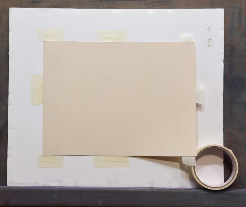
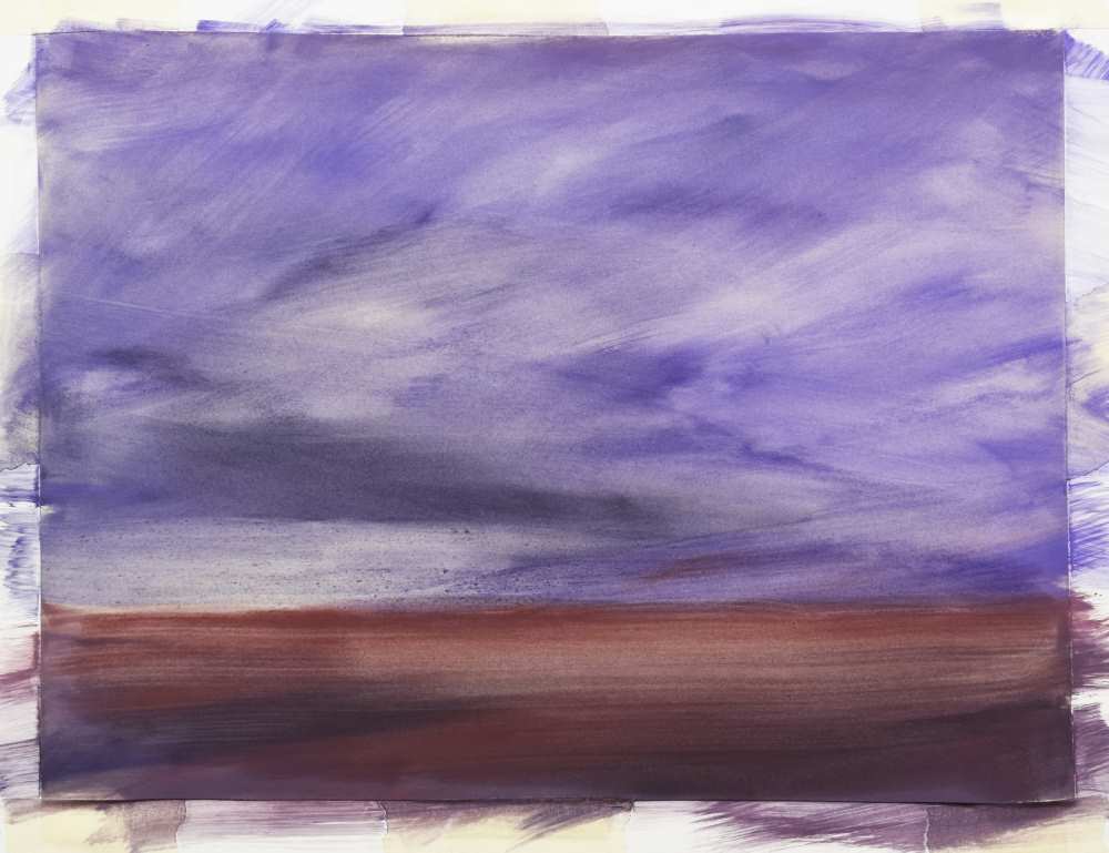
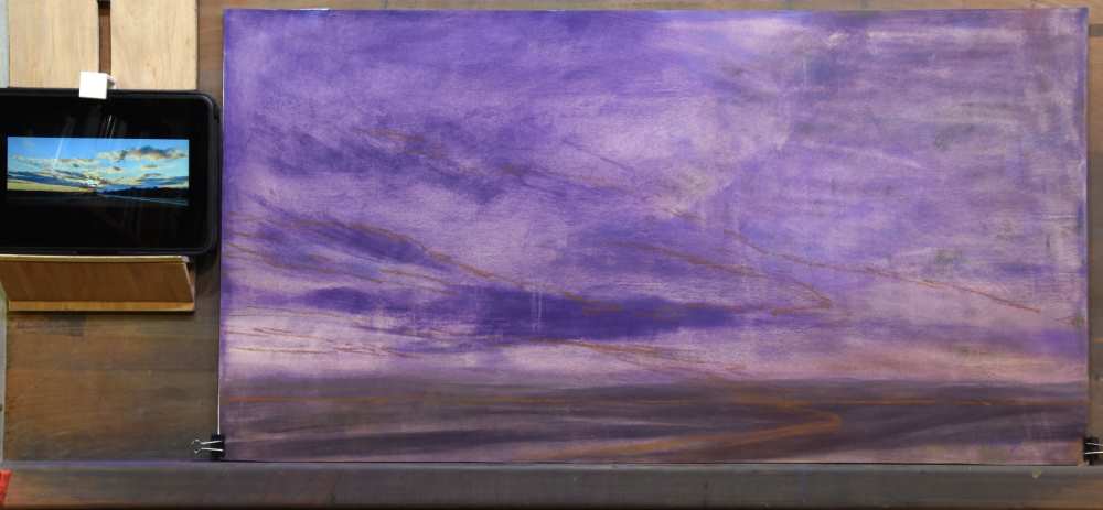
If working from a clean piece of pastel paper, such as UArt, I begin by taping the paper onto a support surface/backerboard. I apply tabs of masking tape on the back of the paper at each corner and halfway along each side. You’ll notice that the proportions for the piece of UArt pastel paper in the photo do not match the proportions of the thumbnail sketch. Prepping the paper and underpainting in the following photos is a demo of the techniques I would use for a clean piece of pastel paper. However, for the painting itself, I will be using a piece of re-purposed paper, which I will also demonstrate.
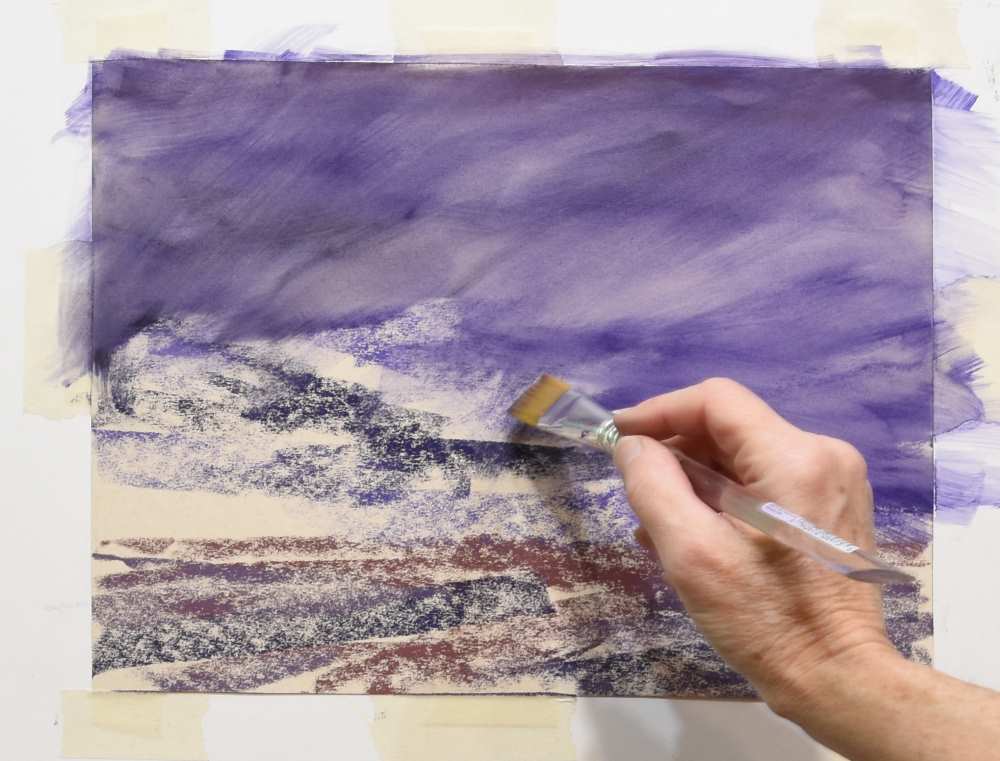
To tint a clean piece of UArt paper for an underpainting, I would have selected 4 pastels that would be incorporated into the overall color scheme. For this demo, I used BV6, BV5, A35, and BE23 Using the side of the pastel, I LIGHTLY dragged BV5 across the majority of the sky. A small amount of BV6 was placed for the clouds on the left side of the sky and the right and left foreground. When dragging the pastel across the paper, I left some of the paper showing. A35 and BE23 were placed along the horizon and loosely indicating the central pathway.
The pastel can be liquefied with Isopropyl alcohol, water, or Turpenoid to tint the paper. For this demo, I used 70% Isopropyl alcohol and a 1” wide brush.
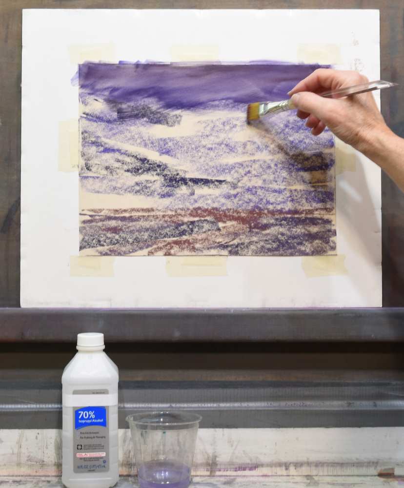
If I was using this underpainting, I would let the underpainting dry fully before proceeding.
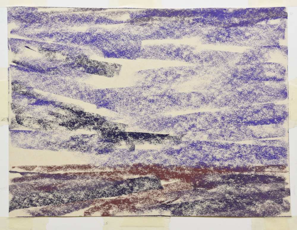
However, for this painting I decided to use a piece of UArt paper that was reclaimed from a previous painting. When I decide that it is time to “retire” a painting, I remove it from the frame and brush off the pastel with a stiff brush. I use an air compressor to remove some of the residual dust. Then I use Isopropyl alcohol and brush over the remaining image to lock the pastel into the paper. This allows me to re-use the piece of pastel paper for another painting. However, not every brand of pastel paper will work well with this technique. UArt does. I then save these re-purposed papers for future paintings, as in this case.
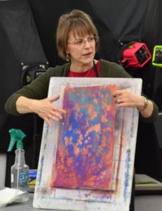
Here’s some samples of re-purposed papers.
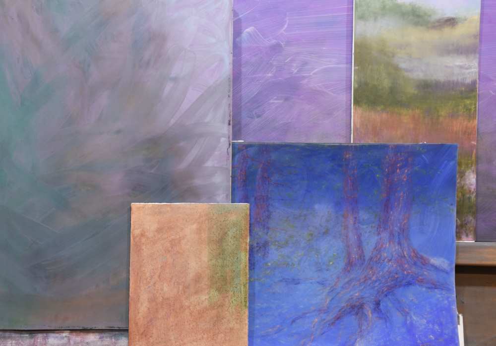
For “Braided Light,” I planned to use the larger 18×24” piece of re-purposed paper that was already mounted on a board. This was a piece of UArt 240 grit, pastel removed with a brush, blown off with an air compressor and then brushed with Isopropyl alcohol. It’s hard to believe that this previously was a painting of mountains with aspen trees and a log cabin.
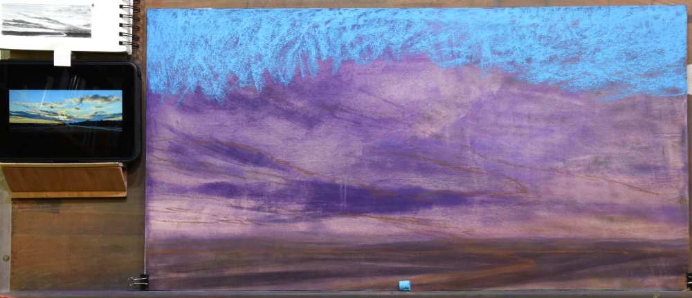
Using an Umber-colored hard pastel, I loosely sketched the horizon line, path, and placement of the stronger cloud elements.
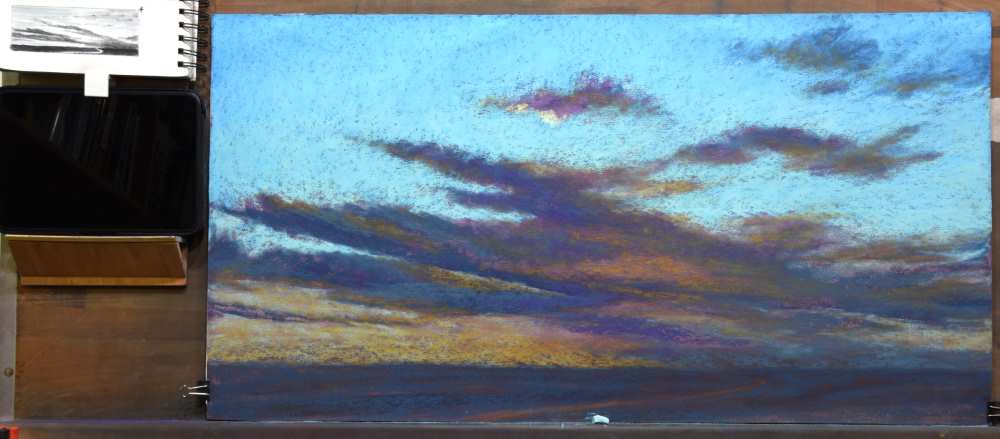
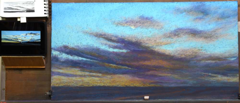
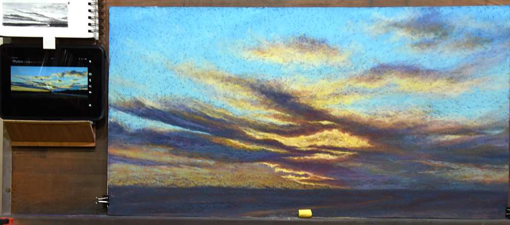
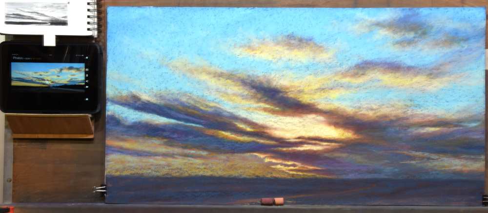
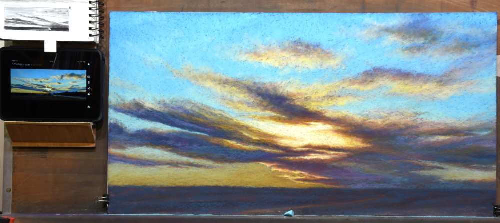
In any scene with clouds in the sky, I consider whether I will paint the sky and then layer the clouds over it or if I will paint the clouds and sky somewhat separately. In this scene, the clouds form thin veils of color over the sky as well as encompass substantial design elements in the sky. Therefore, I decided to first establish the sky colors where wispy clouds will glaze over the sky. At the same time, I would leave open areas for the thicker, more substantial clouds.
The blue of the sky was created by layering 3 different blues. When we are outdoors looking at the sky, the most saturated blue is directly overhead, shifting warmer and lighter as it approaches the horizon. That color shift relationship is evident in this scene as well.
Beginning with BG9 and using the side of the pastel, approximately 1” in length, I dragged it across the top of the sky, creating broken color over the underpainting. My goal, at this point, was to not fill in the tooth of the paper as I applied pastel. As I moved farther down roughly 1/3 of the painting, I diminished the amount of BG9 that was applied, using a progressively lighter touch.
I then repeated the process using BG10, beginning at the top and bringing it slightly lower than BG9. I loosely indicated placement of the larger cloud shapes by leaving these areas of underpainting untouched.
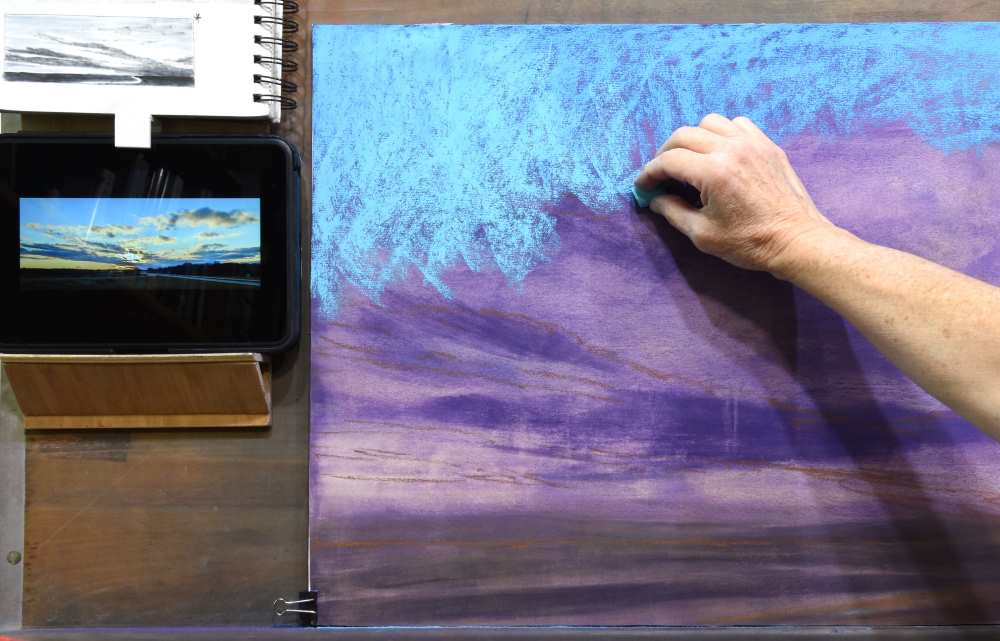
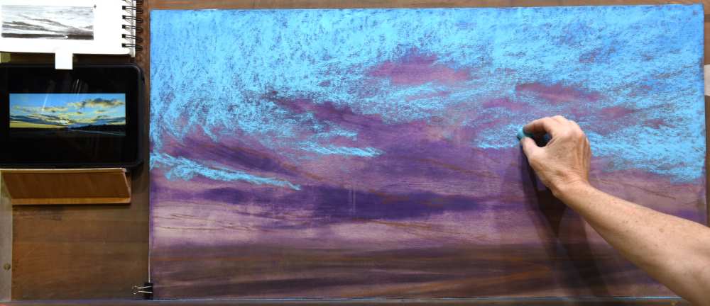
Approximately ¼ of the way down from the top of the painting, I began adding A3 and bringing it to the middle of the sky. Each layer of pastel was applied lightly to avoid filling the tooth of the paper and covering up the initial underpainting.
It is very important at this point to avoid blending the pastels with your fingers or a blending tool. Blending the pastels will greatly dull the colors of the pastels. There was still a strong presence of the underpainting. This would be resolved after the cloud shapes are established.
The darkest shadows of the clouds were established using A51, using the side of the pastel lightly dragged across the paper. Notice how it appears darker and chromatically stronger when placed directly on the underpainted surface. This is the result of simultaneous contrast of the complementary reddish hues in the purple underpainting contrasting with the greenish hues in the turquoise. In addition, when A51 is placed on top of another pastel, in this case the sky colors, there is a slight mixing of the colors, subduing the darkness and chroma.
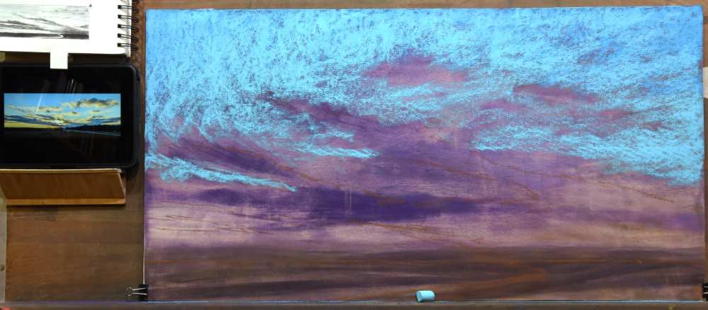
A52 was used to carry the clouds on the right to the horizon and to begin building form through the remaining clouds.
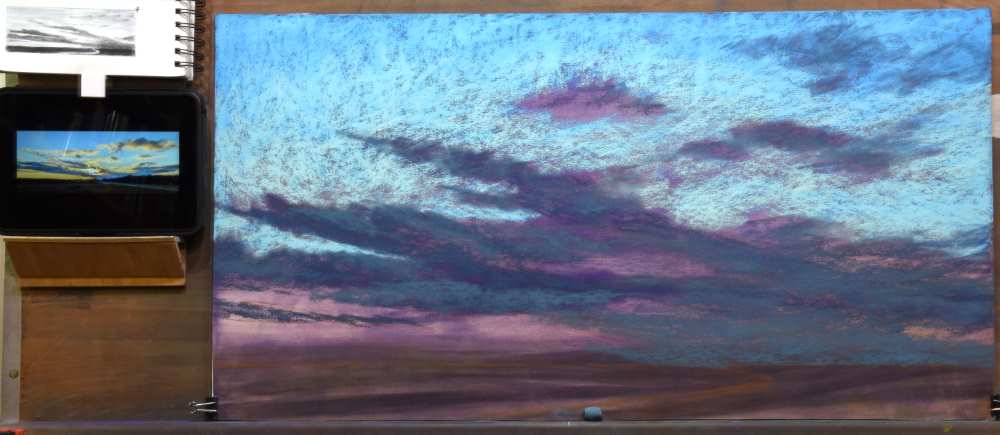
A51 was dragged across the foreground to indicate the land. The pathway was left untouched to allow the warmth of the underpainting to show through.
Returning to the sky, I used A3 to block in the remaining sky shapes in the lower part of the sky.
GREY21 was glazed over the lower portions of the sky to add warmth. Again, notice how a single pastel will read as a different color depending on what color it sits upon or next to.
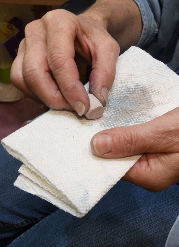
As I moved to the upper clouds using GREY21, I frequently wiped the pastel on a paper towel to keep the color clean and vibrant.
BV5 was added to the central clouds to begin adding some vibrancy to the shadows of the clouds.
Up to this point, I had been largely establishing the dark values. To help me get a better feeling for the value extremes, I placed GREY27 as a test spot on an upper cloud. This would help me judge the value ranges as the painting progressed, recognizing that I would be working towards that degree of light value.
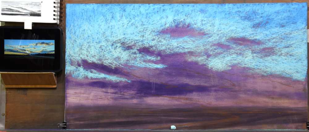
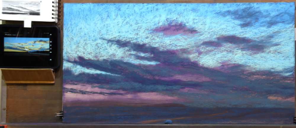
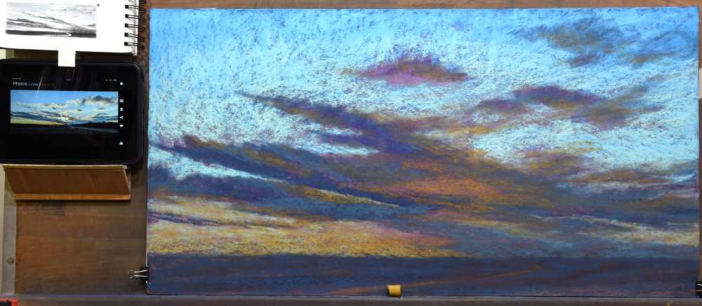
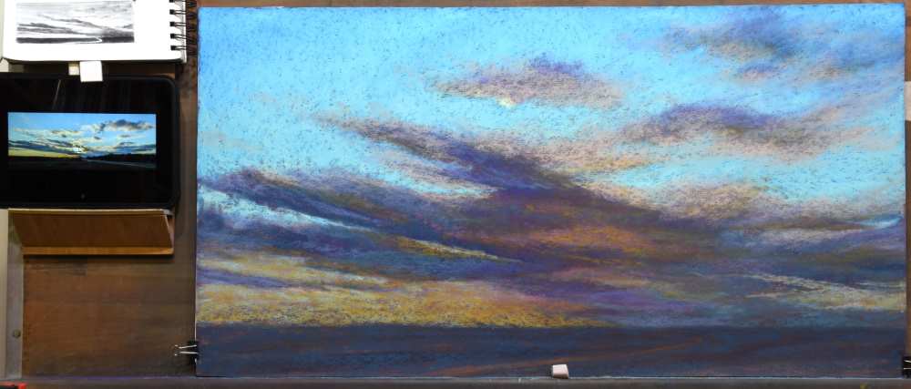
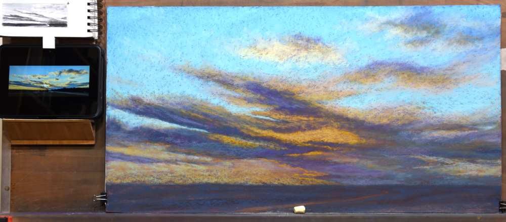
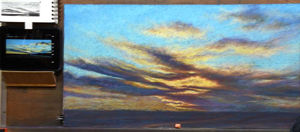
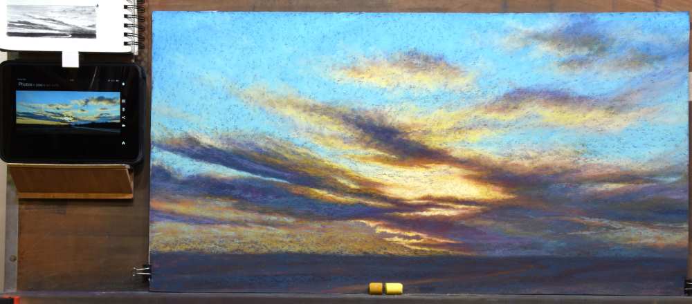
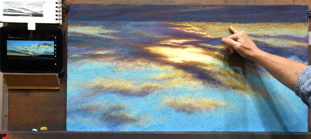
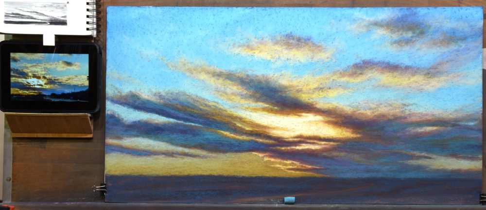
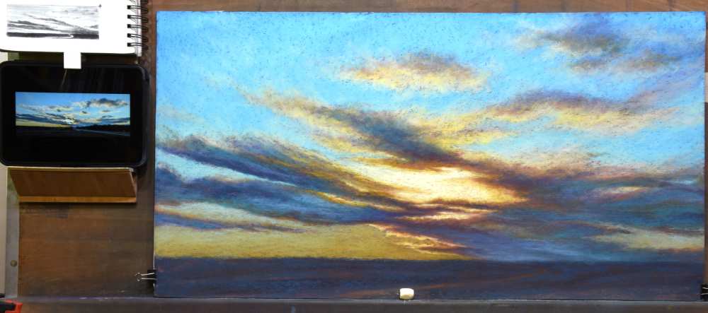
Stage 4: Chatter in the Sky
Now that the large shapes were established, it was time to return to the sky. When an underpainting competes with the pastel that is applied, it is called “chatter.” When this happens, there is a tendency for the artist to want to begin blending the colors. Unfortunately, this dulls the colors and leaves the blended areas flat and lifeless.
To diminish the amount of “chatter,” I prefer to add more pastel to cover the underpainting to a greater degree. However, I do want to retain some of the underpainting to add an additional element of color. In the case of this painting, the re-purposed paper was UArt 240 which has an aggressive grit, making the “chatter” more evident.
I returned to BG10 and reapplied it over the upper half of the sky. A3 was added over the middle sky.
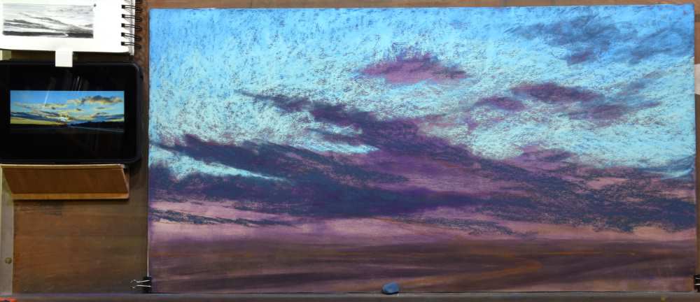
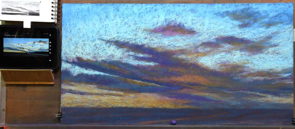
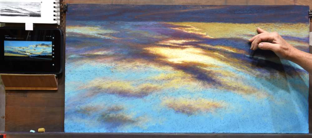
Stage 5: Clouds are Water Vapor
When painting sky scenes, I remind myself that clouds are composed of water vapor. While at a distance or in a photograph, clouds may appear to have solid form. But they are still simply water vapor. Therefore, when painting clouds, I use a light touch while layering in color. Particularly along the periphery of a cloud, I layer the edges of the cloud over the sky colors, allowing bits of blue to peak through to create a translucent appearance.
To begin creating the appearance of the water vapor veil of color, I lightly glazed BV15 along the upper edges of the clouds, dragging it into the sky. This also added warmth and lightened the central clouds near the horizon. Notice how I continued to apply pastel using the side of the sticks, lightly glazing the color across the paper.
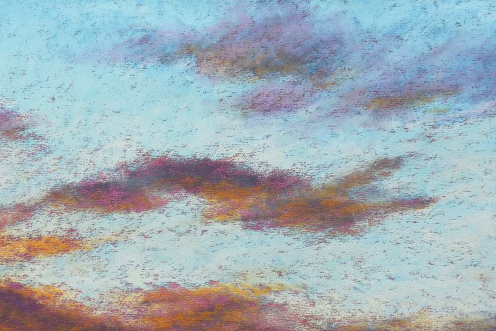
When the sun is positioned behind something, the powerful light wraps itself around the object, imparting a warm glow. In this scene, the light of the sun wraps around the clouds nearest the sun. This phenomenon is called halation. To begin imparting this warm glow, I used RE5 for a few notes of color along the central clouds.
On close-up you can see the variety of colors dancing about in the clouds, beginning with the warm purple of the underpainting.
When layering pastel, it is easy to pick up dark pigment onto your stick of pastel, which can then leave undesirable marks on the paper. As I move to lighter values, I frequently wipe the pastel onto a paper towel.
Using A25 I glazed the underneath edges of the upper clouds that are catching sunlight.
I then moved to the lower clouds.
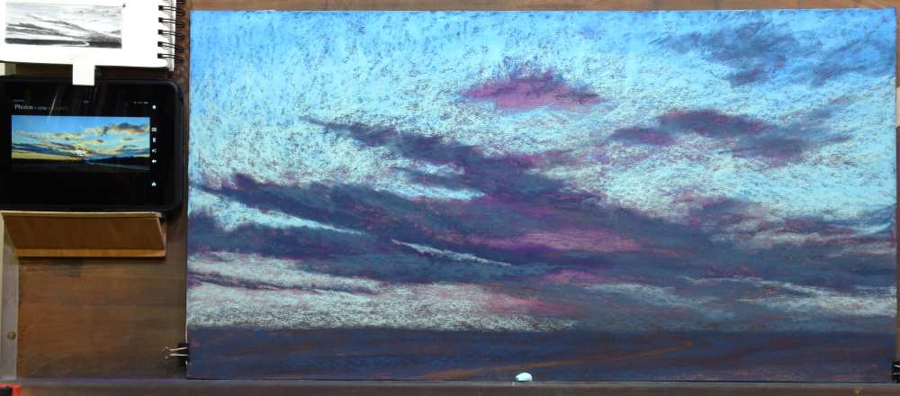
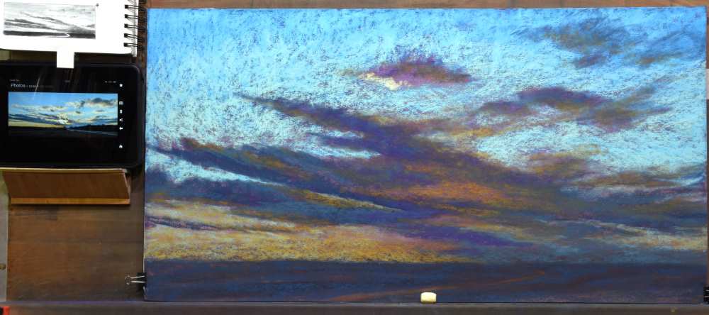
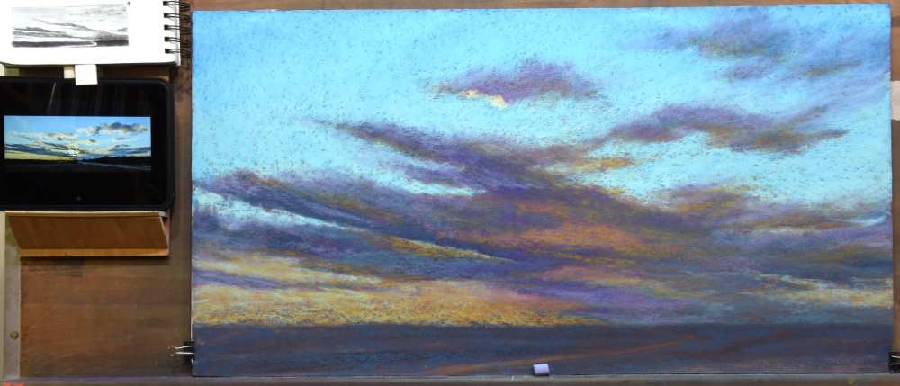
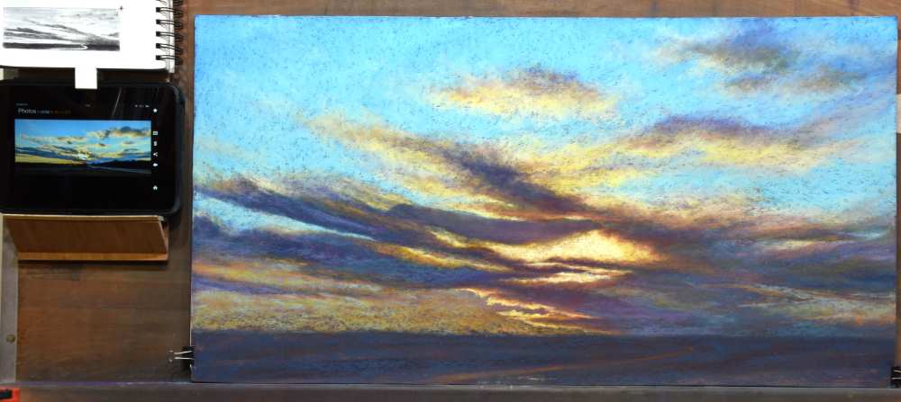
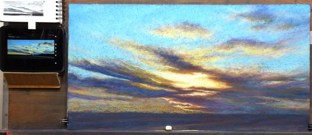
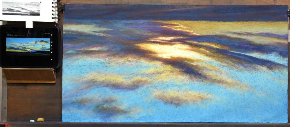
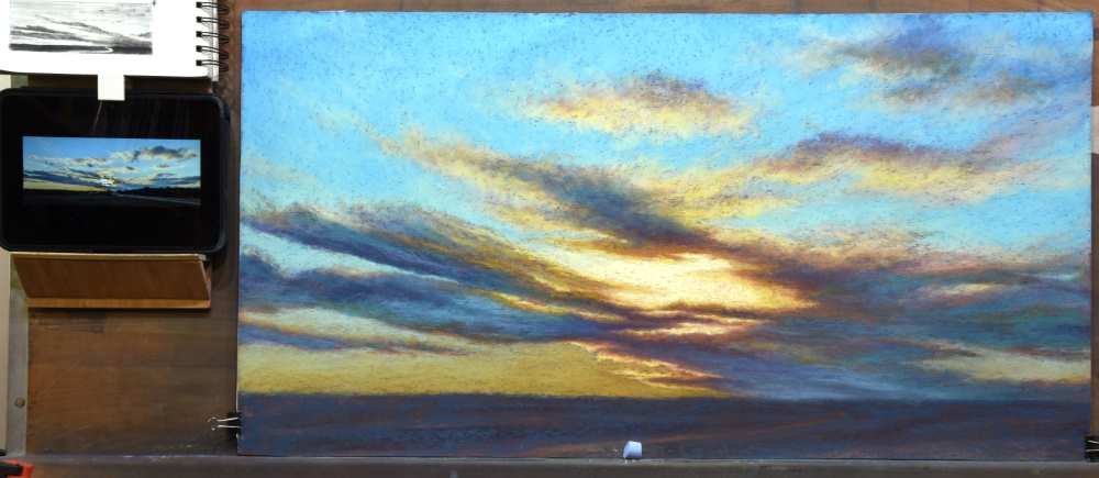
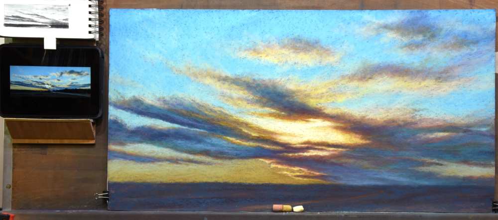
Stage 6: Bringing on the Light
Now it was time to start warming up the sun.
To create the illusion of the blinding glow of the sun requires a step-by-step sequence of moving from chromatically strong warm hues to yellow/white and even a touch of pure white. I began with Y3 to outline where the strongest warm light touched the edges of the clouds. I then used GREY22 to block in the placement of the most brilliant light.
Continuing with GREY22, I glazed the edges of the central and upper left clouds to begin warming them with the sun.
Referring to the reference photo, I noticed the need to carve in some additional sky color. First, I used a small stiff-bristled brush to remove some of the pastel in the clouds. I then used BG10 and A3 to reestablish some sky details.
Using GREY27, I began lightening the clouds.
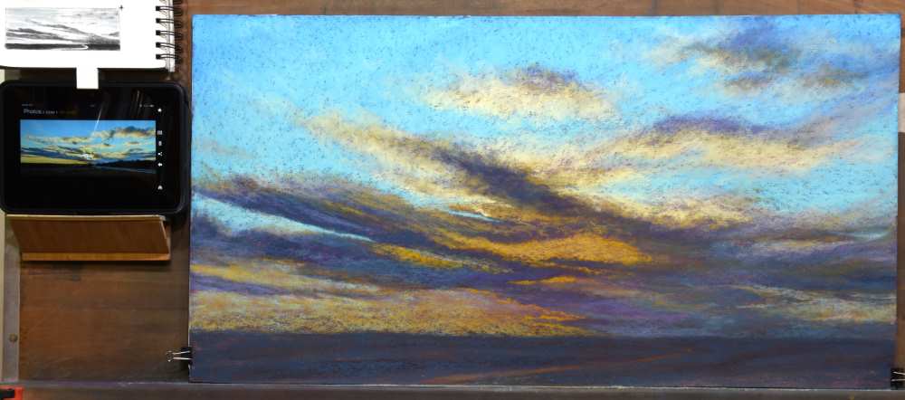

The halation glow of the clouds nearest the sun was strengthened using RE5.
The clouds were further warmed using RE3. This was used predominantly along the periphery of the lower and central clouds and the middle of the upper clouds.

The clouds were further warmed with Y5 along the edge of the clouds.
RED3 accentuated halation along the cloud edges near the sun.
The intensity of the sun began to be developed using GREY26.

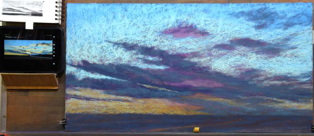
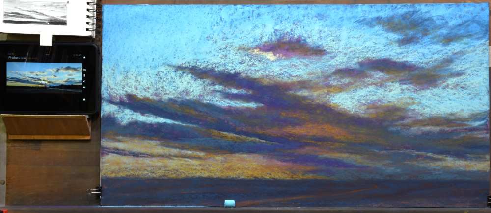
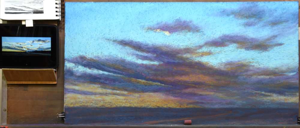
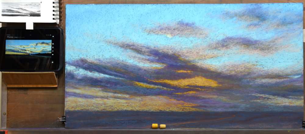
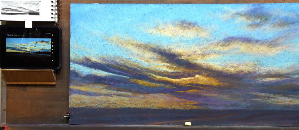
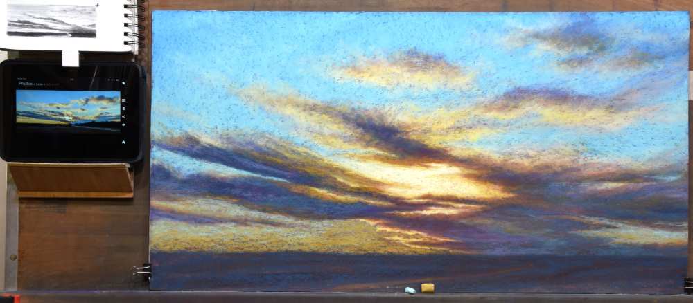
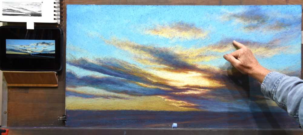
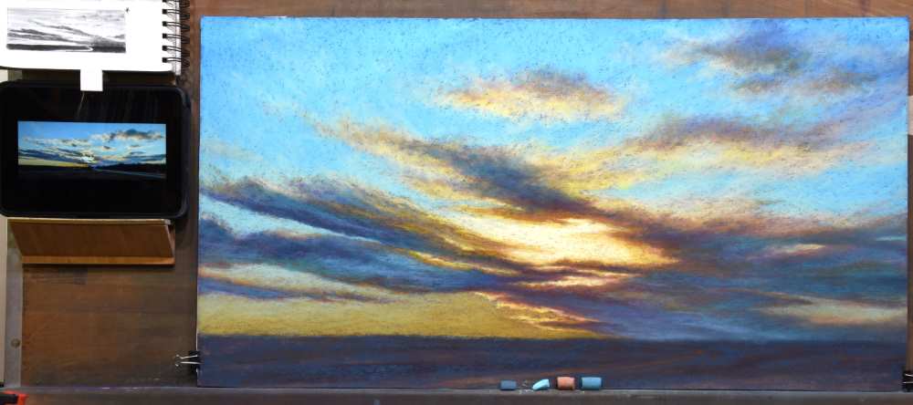
Stage 7: Correcting a Compositional Error
Periodically during the painting process, I step back to assess. I assess the accuracy of the drawing, the flow of the composition, the value relationships, making sure that the darks, mid-values, and lights are accurate. I’m looking for anything that looks incorrect or awkward. I am also assessing if the painting has captured my initial intent and vision.
When assessing the composition of “Braided Light”, I realized I had made an error. As can happen when working from a reference photo, I discovered I had begun copying the photo rather than the design I had developed in the thumbnail sketch. The dark clouds encircled the sunlight rather than permitting the sunlight to radiate into the left side of the sky.
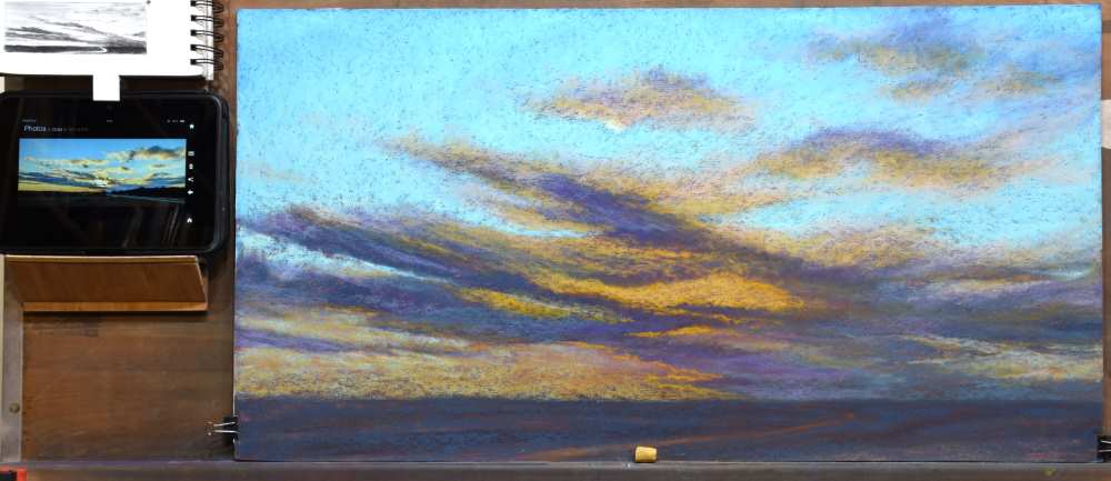
To correct this error, I brushed off the pastel from the blocking cloud. I then applied BG10 followed by a glazing of GREY27 to re-establish the sky.
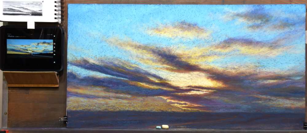
Halation along the clouds was re-established using RE5 and RE3.
The cloud edges were further highlighted with GREY22 and Y5.
The intensity of the sun was expanded into the newly opened area using GREY26.
Now it was following along with my original design plan.
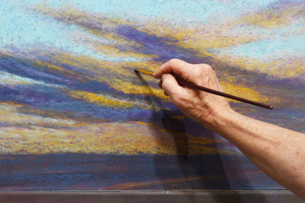
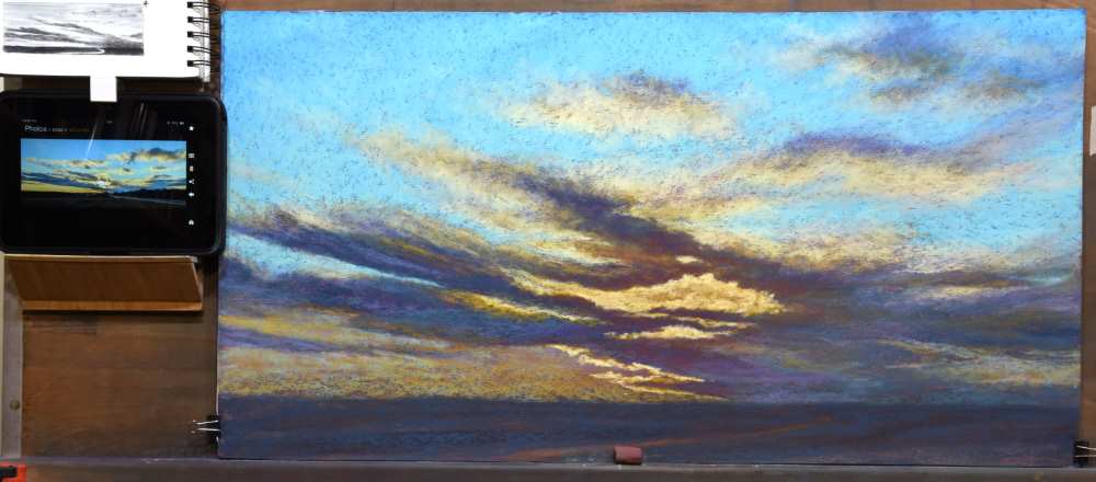
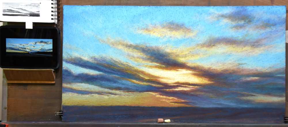
Stage 8: Receding the Lower Sky
Moving to the lower portion of the sky, I re-introduced A3 to refine the shapes of the lower clouds. GREY22 was glazed over the A3 to warm the light at the horizon.
Because of the amount of “chatter” from the underpainting and the visible pastel marks, I decided to selectively and lightly blend these areas to help the sky recede into the distance. By turning the painting over, it was easier for me to see the horizon line to keep it level. Using my little finger, I softly blended the lower sky.
I then returned the painting to upright to assess it. The blue sky across the middle of the painting was continuing to show too much “chatter.” To create a gradation for the sky to move from near (at the top) to distant (at the horizon), I decided to add a little more BG10 and A3. These areas were not blended.
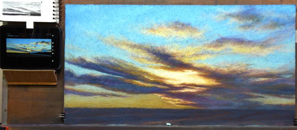
BG15 was added to the lower clouds to add an element of reflected color from the ground.
BV14 was also added to the lower clouds and was softly blended for the clouds at the horizon to help them recede into the distance.
Stage 9: Refining the Clouds
A small amount of BV14 was added to the upper clouds and softly finger blended to diminish “chatter.”
A few wisps of GREY27 softened the upper edges of the clouds on the left and created subtle veils of water vapor across the sky.
When assessing the cloud shapes, I decided the cloud just above and to the right of center had too strong of a presence, being a little too sharply defined. Returning to warm cloud colors of RE3, GREY22, and GREY26, I added wisps to connect this cloud to others, softening its overall appearance.
Similarly, the clouds on the lower right were softened and re-shaped using A52, BG10, RE3, and BG15.
Warmth was added to the central sky at the horizon using RE3, softly blended to keep it in the distance. GREY27 was used to begin adding highlights to the edges of the clouds.
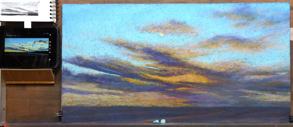
Stage 10: Getting the Values Right
When working from a photo to paint a landscape, it is important to be aware of some of the pitfalls of cameras. In the presence of a bright light source, a camera will have a tendency to push the light too light, or the dark shadows too dark, or both. In the case of this reference photo, the darks have been pushed too dark. The landmass and trees have been rendered near-black and the darks of the clouds were also darker than they appeared in real life.
Knowing this allowed me to plan and adjust the value relationships in the painting. I knew that the land needed to be darker than the darkest elements of the clouds, but not as dark as was evident in the photo.
From the initial laying-in of the underpainting, some warmth from cast light was established for the land. And A51 had already been lightly glazed over the last to establish its overall dark value. A51 was again used to strengthen its presence as pastel dust from work done earlier had drifted down onto this area. Note that the underpainting is still visible. While glazing A51 across the land, I rechecked the horizon line to make sure it was still level.

Dragging the side of the pastel horizontally across the foreground, A52 was applied, slightly more heavily at the horizon on the left and less so on the right as this area would be darker from the shadows cast by the clouds.

A45 was lightly glazed across the central foreground to hint of ambient light from the sky.
A little more A45 was added on the right as that area seemed too dark.
GRN4 added more of a sense of sunlight on the ground in the central foreground, but was also lightly glazed in a few spots at the periphery of the landmass.

While the pathway had no pastel added to it, being only the warm underpainting, it had become dingy from residual dust. I used a small brush to clean the pathway of loose dust.
The final highlights included a touch of LT1 at the center of the sun to increase its glowing intensity. And then just a little more GRN5 on the land to expand the sense of light.
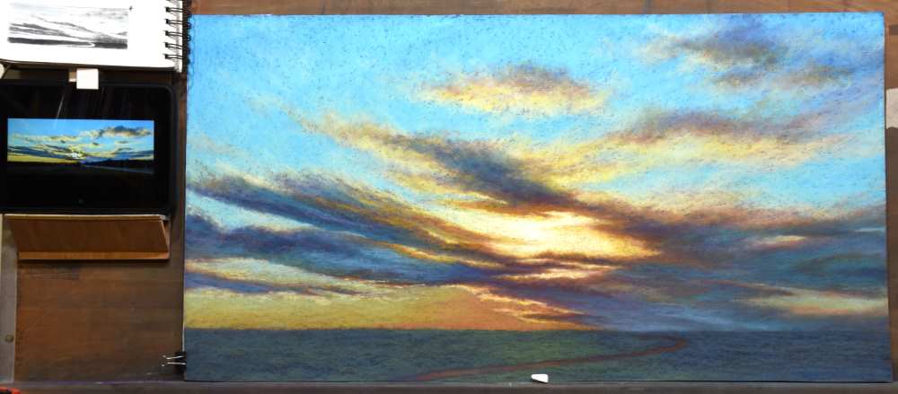
Through observation and being knowledgeable of the anatomy and atmospheric conditions of the sky, you can surmount the limitations of a camera to make a painting of a skycape that is dramatic and believable.

