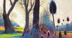
The enriching, nearly endless range of colour that pastels offer us is one of my favourite things about the medium. How lucky we are, to have all the world’s palette at — and, after a good day at the easel, all over — our fingertips!
In my early years as a pastelist, exploring colour was a scary prospect. I struggled to see or interpret colours beyond what appeared in reference material. My vision was limited and unsophisticated. With time and practice, I’ve learned to view subjects with more finesse, discerning light and dark and temperature to see how shifts in value denote form.
Colour became easier to handle and manipulate when I began painting animal portraits. Remembering long lost lessons in biological illustration helped me capture light on fur and feathers. Looking back at my work, I can see the point during 2017 where I finally trusted my use of colour, and let myself deviate beyond the constraints of reference photos.
Studying the angles and curves of an animal’s bone structure and overlying musculature helped me see the dynamic relationship between light, colour and anatomy. “Pippy in Repose,” shows how these elements intersect.

Scumbled mid-tone and mid-dark purples over the planes of the head set the light source and emphasise the contours of the dog’s face. Choosing purple to highlight the dark fur, rather than shades of grey, creates so much more visual interest and makes the whole piece instantly more engaging.
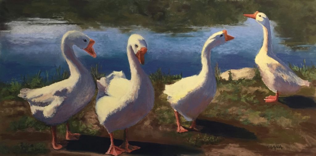
“Chorus Girls” was a fun look at a small flock of domesticated Chinese geese that I made during the summer of 2017. It became an exercise in reflective colour, as their white feathers absorb all the light of the Golden Hour. Even in shadowed areas, the plumage glows. I’ve since applied that same creative lesson to white-coated dogs, whose fur is so lacking in pigment that it’s almost transparent (and susceptible to the colours around it).

In “Coco in the Morning,” done later that same year, I continued to use colour more imaginatively. The time of day and season — morning in early Fall — created such exaggerated contrast in value and temperature: deep warmth indicated by golden yellows and maroon darks as well as coolness tinged by blues and layers of ultra-dark green and purple. Were there any colours I didn’t use?
Colour also helped me illustrate how differently a fluffy retriever coat will reflect light than the coat of a short-haired dog. The texture of an animal’s coat is central to expressing the individuality that each animal possesses, an important feature in my work.

Expanding my pastel collection helped, too. And not just because I love buying new pastels! Somewhere along this journey I realised that owning colours specific to my subject matter would make the resulting portraits that much better. In 2017 I acquired Unison’s Dark 18 set, a versatile range that gave me new options for rendering fur and its highlights. Likewise, in 2018, I jumped at the chance to have the Midnight Set of 8. All of these colours are a great compliment and addition to my self-curated collection of dark pastels.
Rendering fur and feathers is always more than the things themselves. Painting the light of an animal — their spirit, essentially — and using colour to capture this light, lets me bring them to life in the portraits I create.