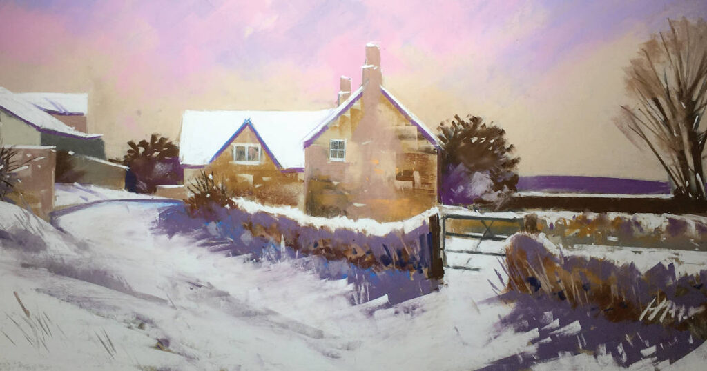
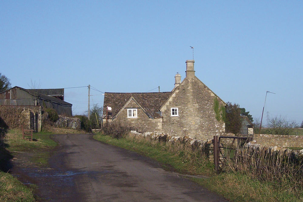
For this article, I have chosen a scene in the village of Monkton Farleigh, just two miles from my Wiltshire home. I have passed this scene many times and the photograph below was taken on a clear winter’s day.
My Reference Photograph…
Some Initial Thoughts
As presented, the scene, although a reasonable composition, does not offer much excitement by way of tonal values and, in addition, the sky is a monotonous blue.
I therefore decided to change the weather conditions to snow and to explore an alternative treatment for the sky. With a black felt tipped pen, I quickly sketched the scene on a sheet of cartridge paper and printed off a few copies. I was then able to try out different pastel colour schemes for the sky as shown below:
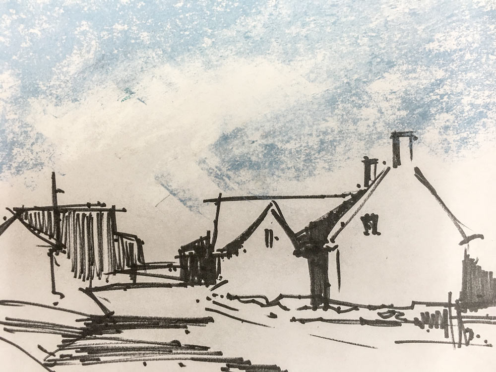
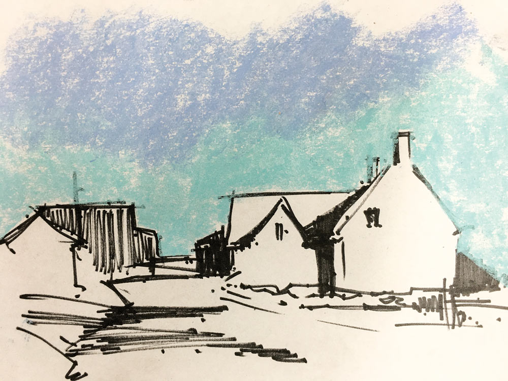
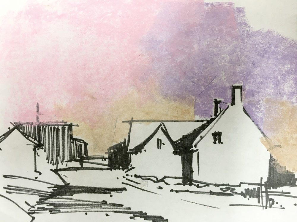
I decided that number 3 would be most suitable as this looked wintery and with a hint of more snow to come.
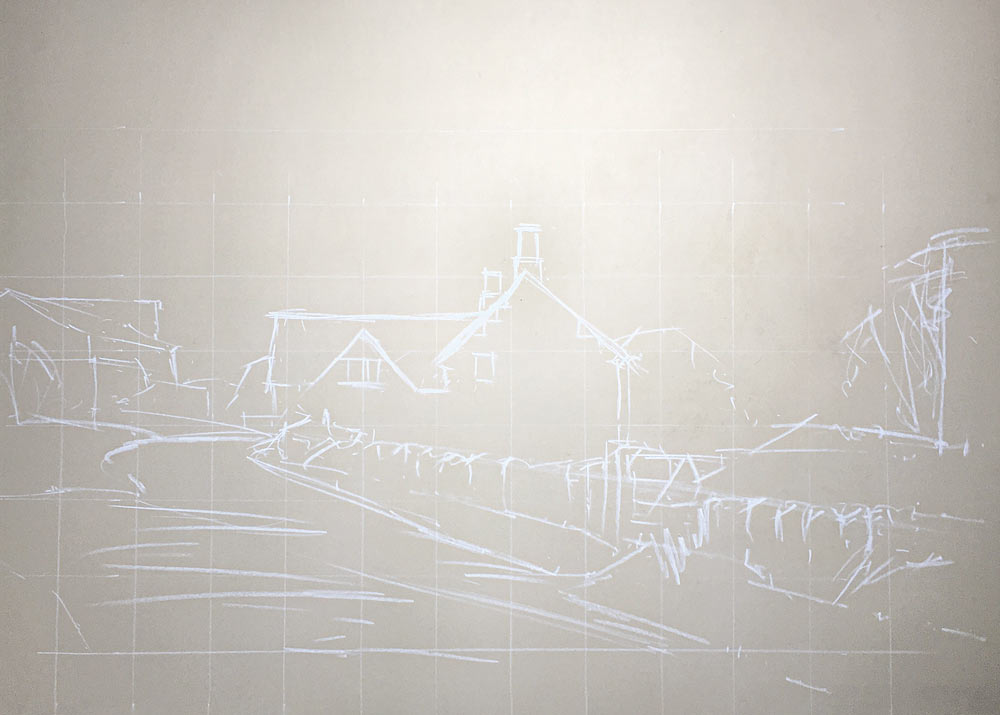
Stage 1
Using a sheet of cream Clairefontaine paper, I sketched the scene using a white pastel pencil. To help with accuracy, I squared up the photograph before transferring the image onto the pastel paper. With architectural subjects, I often do this as any drawing errors tend to stand out more with this type of subject.
Stage 2
Using a medium Derwent pastel stick, I roughed in the darks and did a test mark for a couple of colours that I thought might be suitable for the building.
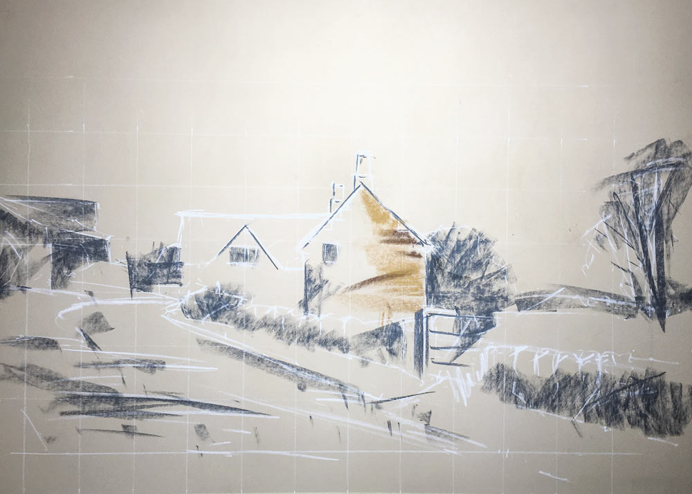
Stage 3
I continued to make preliminary dark marks on the buildings, walls and shadow areas in the snow.
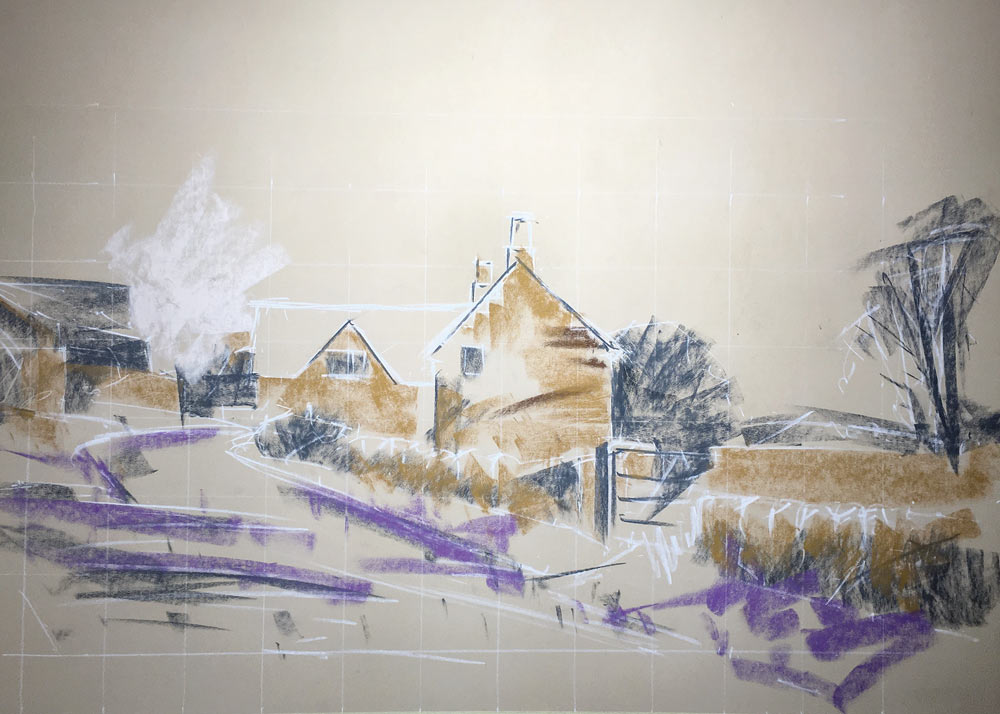
Stage 4
It was now time to put in the sky. I generally do this at an early stage of the painting as it helps to set the overall tone and mood of the work. I used the colours that I had originally tried out on the cartridge paper, semi blended this work, and then added further pastel marks until I was satisfied that the sky worked for the overall picture design.
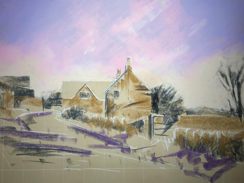
Stage 5
For some time I had been concerned about the shape of the large gable end of the cottage. If you look at the reference photograph, you will notice that the sloping sides to the roof are not equal and you can see at stage 4 where I have dropped a centre line down from the chimney stack in order to check this. Had this been a commission for the building’s owners, I would have needed to faithfully represent this but, on this occasion I decided to make both sides equal. There is a saying in painting that, ’if it looks wrong, it is wrong and, if it looks right, it is right.’
I now added texture to all the building surfaces including the garden wall in front of the building. I tried to indicate the nature of the stone without being too fussy with my mark making. I also included some of the snow at this stage in order to judge the texture and tone of the stonework. Although there were no strong shadows in the composition, I did use a cool purple on those parts of the snow that were not directly receiving light from the sky, particularly on the verge under the wall.
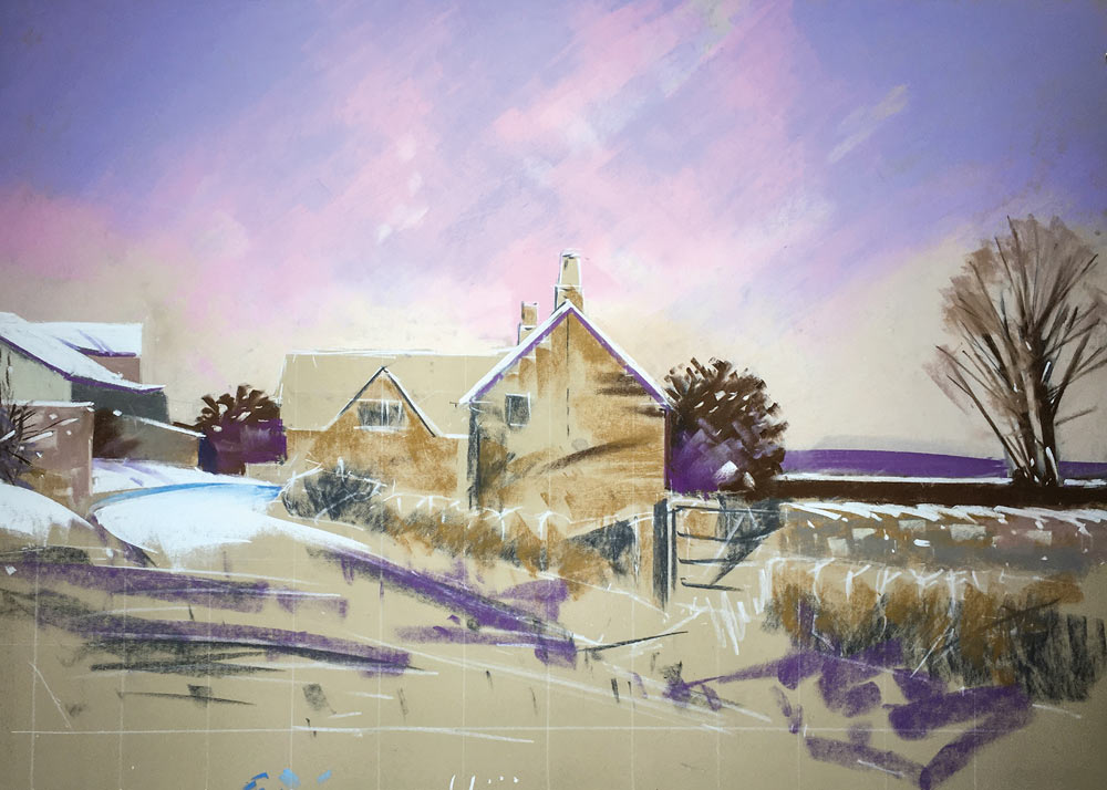
Finally, I added the details of the windows with a white pastel pencil.
Stage 6
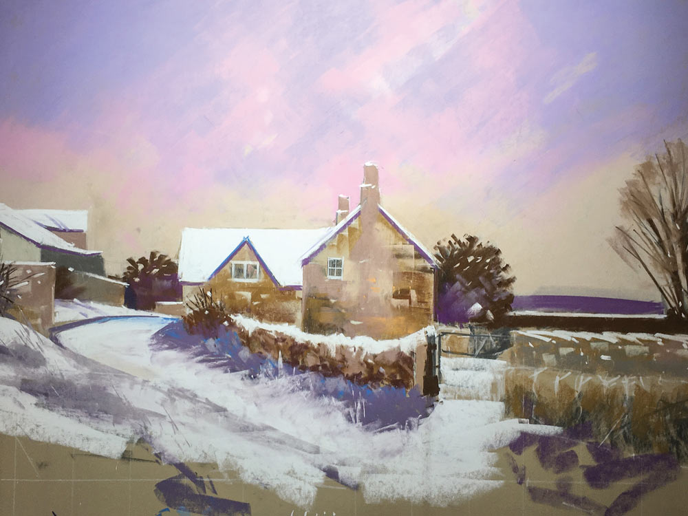
I continued the snow down to the bottom of the picture and finished the right hand garden wall and the gate.
Notice how the snow is never totally white, even in flat light. There are various shades of purple and grey on the snow’s surface, as it meanders over the uneven ground and where some of the underlying vegetation shows through. I tidied up a few bits of vegetation and added some marks to the centre of the road, and considered that I had gone far enough with this picture.

Colours
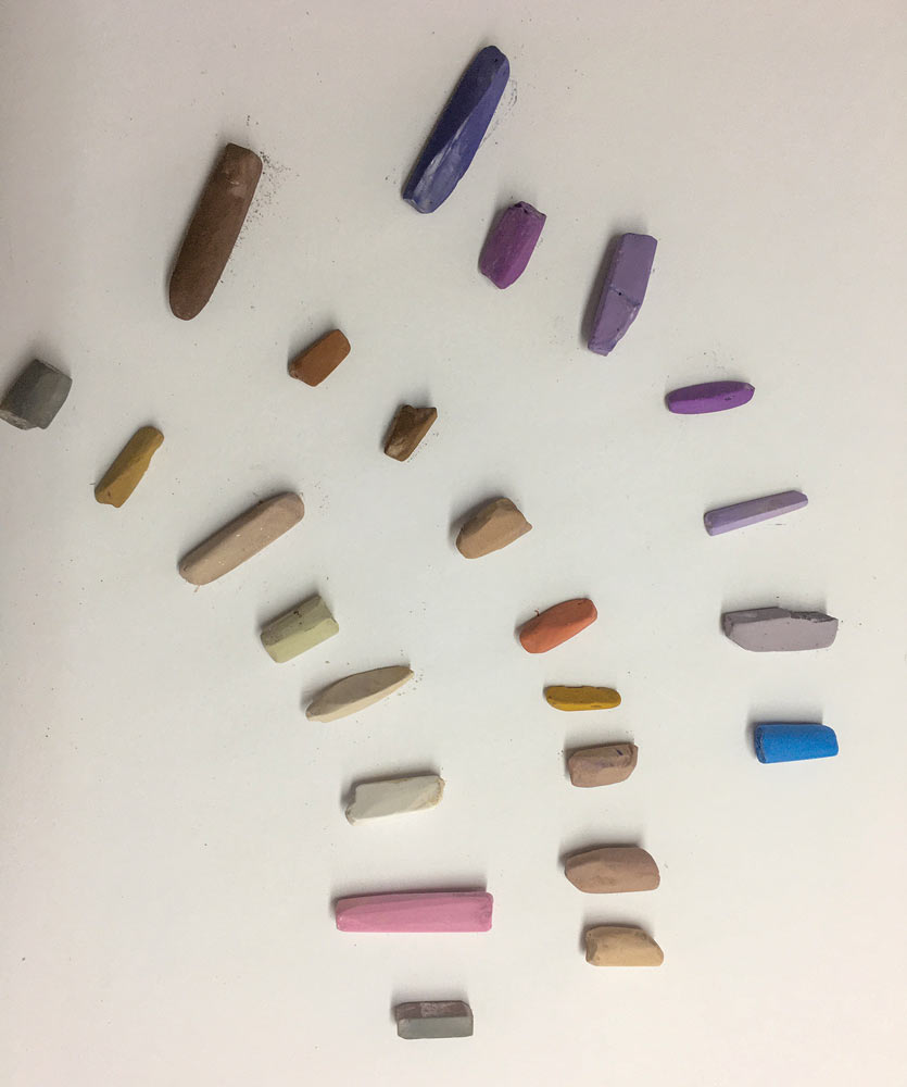
I am often asked what colours I use and, generally find this a difficult question to answer. Unison Colour produce such a wonderful array of hues that it is a bit like a ‘little boy in a sweet shop’. I do, however, consider an approximate overall scheme prior to starting a picture, hence the colour notes at the start of this publication. I thought it might be helpful to show the actual pastels used – there were just twenty-four and were selected from a range of purples and browns with pink in the sky and, of course, white.

3 comments
Hon. Joyce Krutick Craig
Thank you. Snow is always difficult. I am a Unison addict although a strict hobbyist! I have a full set plus many more!
Anette Douglasdotter Brander
Thank you so much for this wonderful tutorial! ✨️
I will definetely give this a go myself- perfect timing! ❤️🎅
Kay L Tomlinson
Very helpful–thanks for this! I especially enjoyed the tips about the gable end of the building, and about squaring up the paper in order to make sure the buildings were right.