For the beginning pastellist the amazing array of available colours and tones can be both exciting and overwhelming.
In paint you can start with the three primaries (red,yellow, blue), plus white and begin mixing to create tones and colour variations. But where to begin in pastel when there is so much on offer!
As a teacher I recommend a basic set which includes those primaries plus a whitish light and a blackish dark. I then encourage students to get to know the qualities of that set… play and mix, smudge and layer… even make mud!
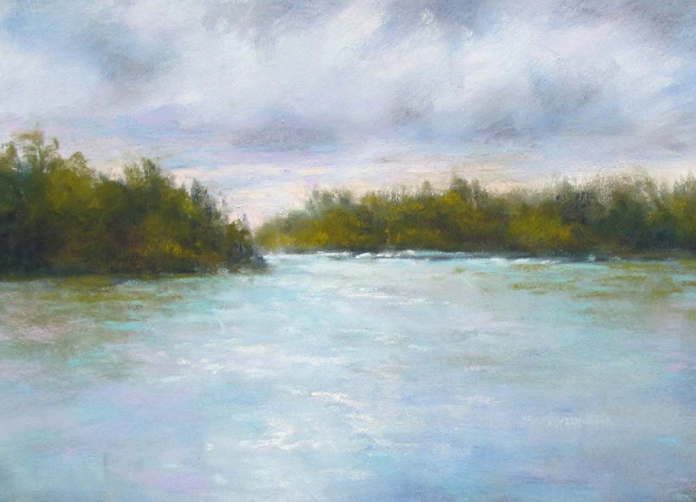
In my first example, “Twilight”, you see what a limited range of colour can do. The monochromatic colour scheme allowed me to freely overlap and blend without fear of creating mud.
(Unison blue greens – light to dark- BG 1 through 6 plus Add 49)

This palette also creates the opportunity to explore the expressive quality of soft pastel…. from the most illusive of edges to the sharp contrasts of light against dark.
As your confidence grows try (and this is only a suggestion!) a half stick set (e.g.starter 18 or more). This has a good variety and you can begin to explore colour relationships.

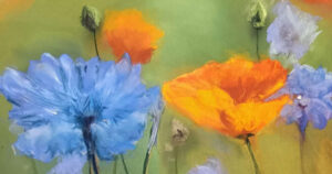
In this next example you can see what happens when opposing colours are placed beside each other.
With experience you will find yourself saying, ”I wish I had a warmer green, a pinker blue, etc”… Then it’s time to consider expanding your palette… and that’s when the fun really begins…start studying the colour charts.
What a pleasure it is to find that favourite illusive colour that makes your picture pop or ties a whole composition together.
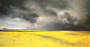
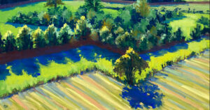
Two more examples for you… the same simple scene – two ways – one an overcast day and then an evening sunset.

My daytime study is dependant on the subtle contrast of Unison blue violets (e.g. BV1,2,9) against warm greens (e.g green 15,13, ADD 37 ) while the sunset has a more vibrant palette. (pink, Y10-orange, BG9-blue green set off with ADD 49 and Grey 36).

So be free to experiment… You will soon be saying I can’t live without a certain shade and know that it can always be at your fingertips (remember with pastel there will be no desperate mixing to recapture that illusive tone you used last week!