What a wonderful month of artwork showcased on our Unison Colour Soft Pastelling Community page. I had the great privilege of being the August 2025 Eye Catchers curator, with thanks to Lynn Howarth. As a travelling wildlife artist, I am drawn to wild places that evoke emotion and draw me into a place that holds my imagination.
Choosing just 10 pieces from the month was a tricky task with so many incredible styles and subjects from artists across the globe.
Keep sharing your fabulous art everyone, as it’s such a joy to see artists enjoying the medium with so many different styles and subject interests. I have thoroughly enjoyed looking at posts every day through August.
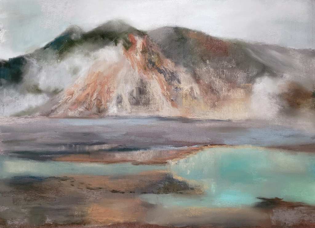
Painting by Jocelyn Pryor
I am so drawn to this colour combination! Jocelyn was given permission to paint this piece from a photograph found online of a location in Japan. This landscape depicts an ethereal feeling, with a calm, dream-like quality. I see myself dipping my feet into the inviting turquoise hot spring, my hands under my chin resting on the soft earth watching soft fluffy clouds pass by the mountain side. I really love the blended finish of this piece on textured paper. This has enabled Jocelyn to maintain gentle marks within the landscape for depth whilst still maintaining an overall tranquil landscape.
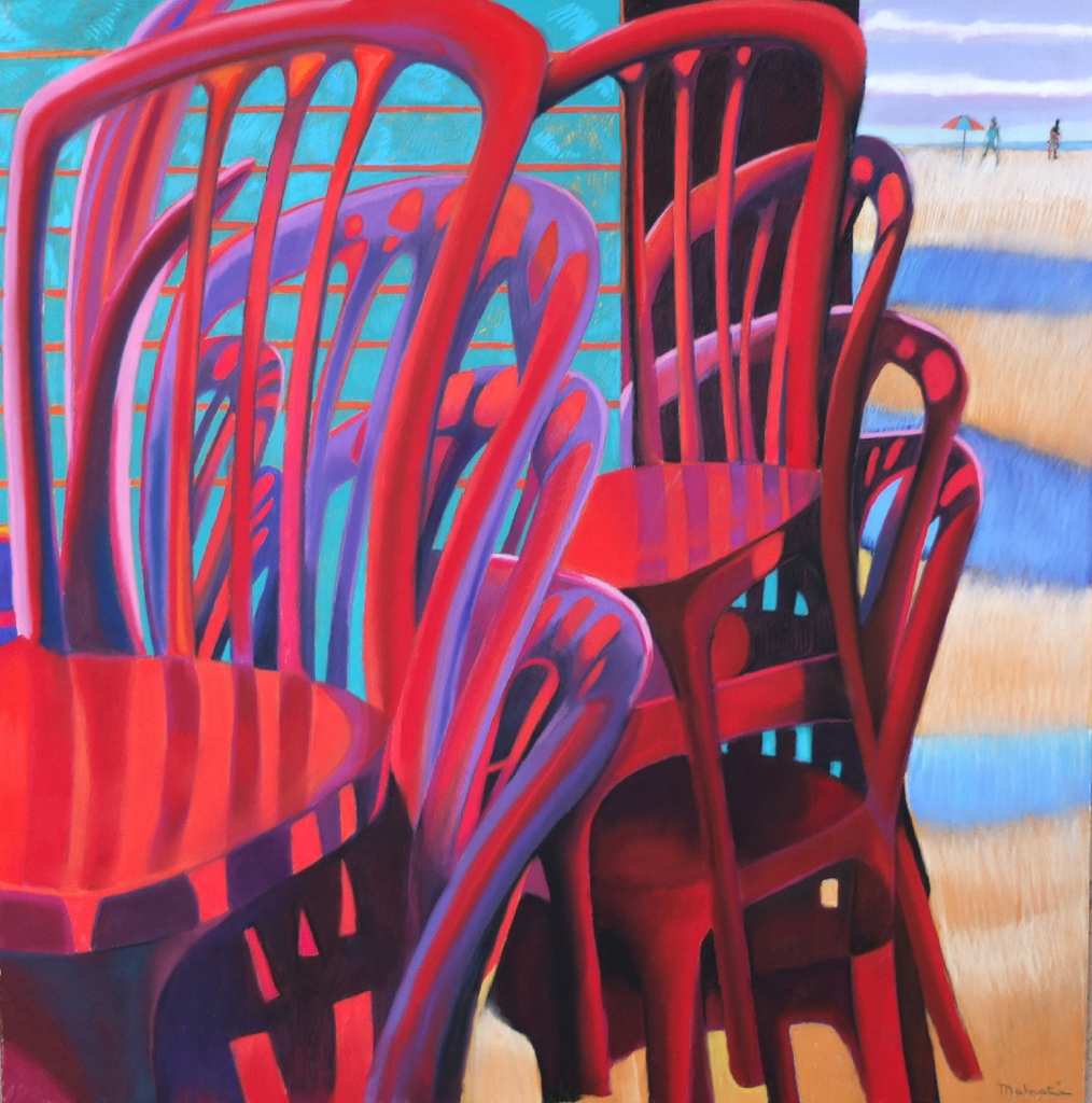
‘The Red Chairs by the Sea’ – by Francois Malnati
Francois posted several pieces of his work over the month and I love his bold use of colour. This piece sang off the page and easily caught my eye! The clean lines and subtle shifts in colour and shade are expertly used to create this visually appealing stack of beach chairs. The shadows, and use of purple, beautifully soften the high contrast reds and turquoise and draw us into the scene.
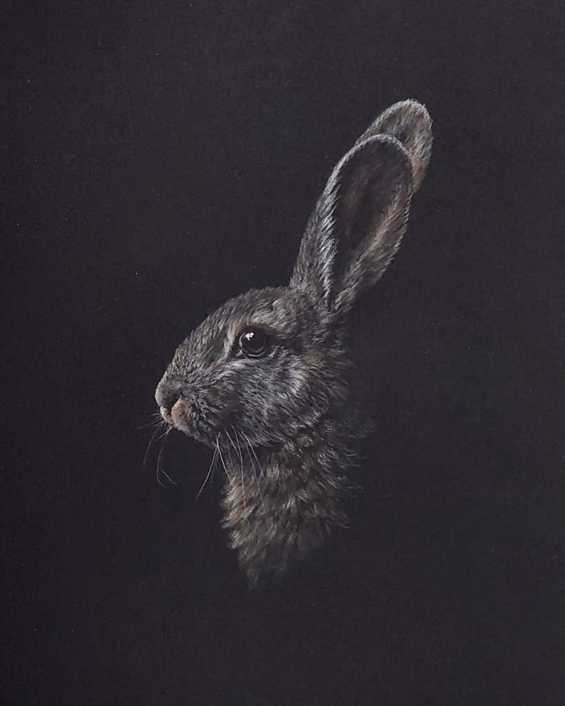
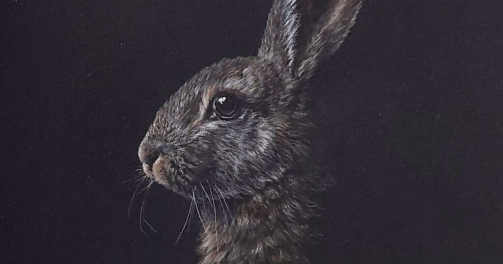
The Rabbit – by Liz Buckley
In complete contrast to the artwork above, my eye was caught by the simplicity of this beautiful rabbit peering out of the dark. The soft edges against the dark paper really do make the rabbit ‘pop’ out of the dark. As a wildlife artist and photographer, I was drawn in by the rabbit’s eye, still and quiet, surveying its territory. As a viewer I can sense the stillness of night.
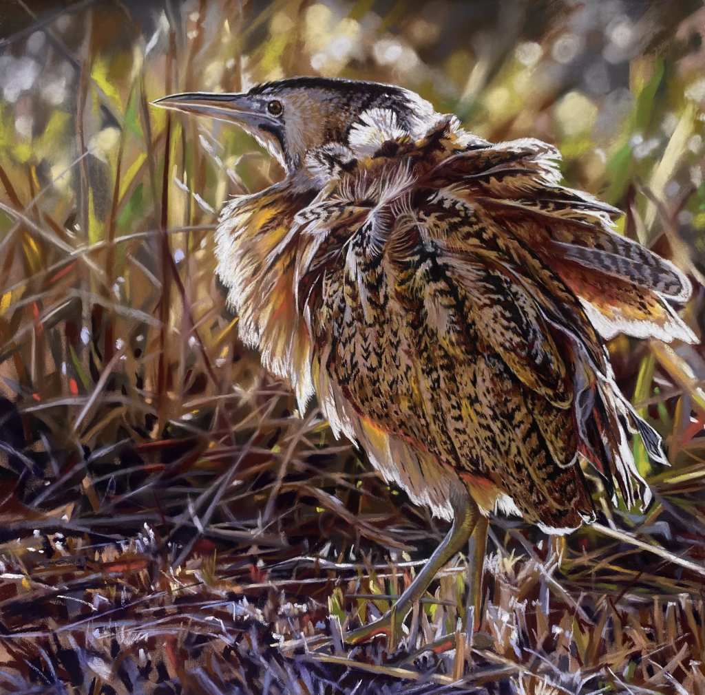
Bittern – by Teresa Seals
Wow, Teresa really does command an outstanding level of realism and detail in her work and this Bittern is simply stunning! I love the little breeze lifting the birds delicate feathers and the light highlighting it’s delicate plumage. The background with its deep foliage paired with the subtle bokeh effect create a wonderful balance, ensuring the Bittern remains the focus of attention.
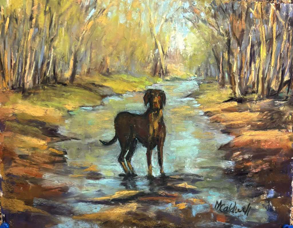
Painting by Mary Smith Caldwell
I was happily imagining being the owner of this lovely pup walking down the wet woodland landscape. The stance longing for his owner to catch up and to run through the water in glee. Freedom to explore the great outdoors evoked happy memories of woodland walks with my own best friend. With minimal mark making, Mary has captured the essence of her friend’s dog. The touch of vibrant turquoise creates a tranquil scene and captures a feeling of the dogs cheerful personality.
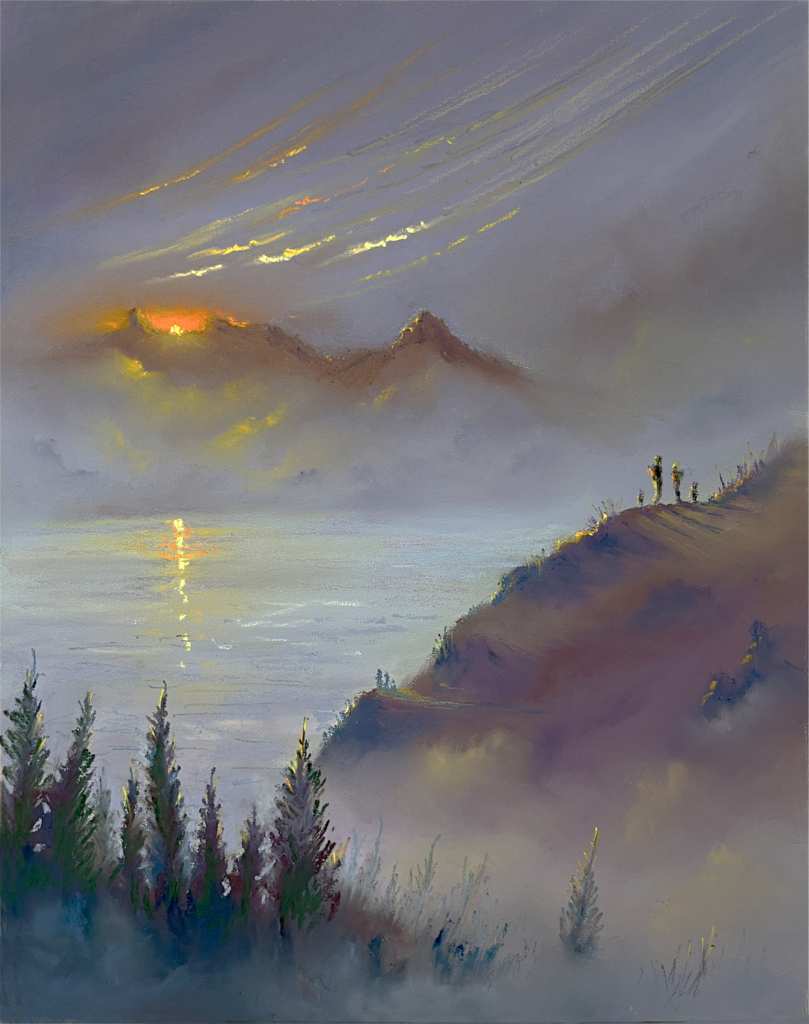
‘Onwards and Upwards’ – by Stephen Fuller
The light catching the small figures along the hillside are exquisite! Being able to highlight such small figures within the landscape whilst also achieving form through clever use of colour and delicate mark making, demonstrates so much skill and precision use of pastels. The viewer is drawn towards the couple whilst surrounded by the bold scenery. I am opening my flask as we speak sat watching that sunset behind the distant mountains.
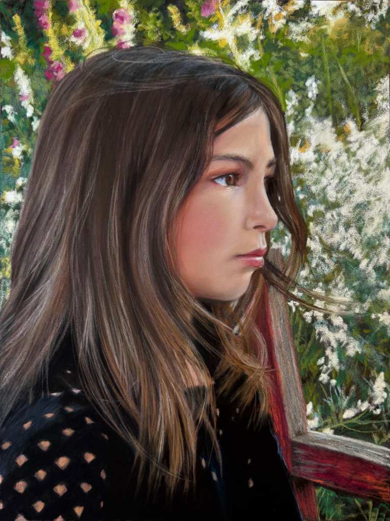
‘Giorgi’ – by Lynn Howarth
For me Lynn is a master of human pastel portraits, creating realistic art whilst using a loose, painterly technique. Her understanding of colour theory with delicate shading and values in skin tone capture this girl’s expression wonderfully. I have been lucky to see Lynn painting a portrait of Jim from Unison Colour in person at their headquarters and her ability to master expression quicky and with passion is such a wonderful skill.
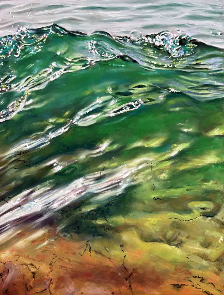
‘Transparencias’ – by Sandra Frey
Kudos to the artist that can create realistic water. I love to zoom in to see it from a more abstract view. I personally find water a frustrating subject of shapes to masterfully create ripple and waves and rich tones. In Transparencias, Sandra invites the viewer to dip a toe into the ocean and listen to the sound of the gentle waves of this striking emerald and turquoise sea. The composition of the sea is grounded by the burnt umber and orange tones of the earth. Using a combination of broad and delicate sweeps of pastel to depict the ripples, foam and sparkles of light across the gentle waves, the piece is tranquil and vibrant.
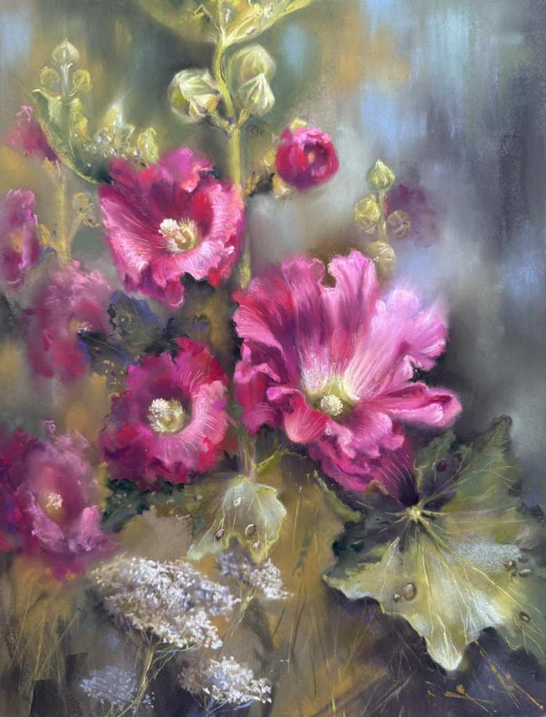
‘Flower Code of Ukraine’ – by Inna Siroshtan
The beauty of Hollyhocks. Living in rural Yorkshire in the UK, Hollyhocks grow amongst my walled garden plants. With so much time spent travelling, I love being welcomed home by beautiful tall bright blooms.
Inna’s sweeping pastel strokes highlight the petal’s natural fragility, combined with their soft blended edges. A dewy feel is captured by the atmospheric background using cool blue and green tones set alongside warm tones. I admire her ability to create flowers and foliage, combining both a painterly and more controlled realistic style of pastel mark making.
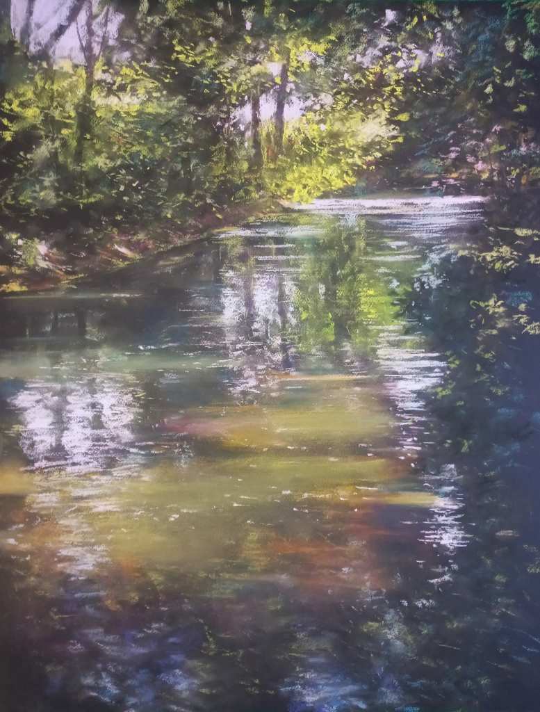
‘In Wonderland’ – by Alain Voinot
I am sitting at the edge of the river reminiscing whilst my mind drifts along the delicate ripples of the water and reflections of the trees gently swaying from above. Sometimes less is more and for me Alain’s piece with it’s muted and earthy tones invites you to sit beside him and escape the hustle and bustle of life.