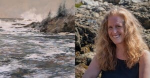
To begin with, selecting paintings from a large grouping is never an easy task! However, I was thrilled to be asked by Stephen Fuller to take on the challenge of choosing this month’s Eye Catchers from the Unison Colour Soft Pastelling Community page. I eagerly checked the Facebook entries each day and it was exciting to see how many artists of all different skill levels, from absolute beginners to professionals, posted their paintings during the month of February. The variety of work was wide and varied and covered several genres. It is encouraging to know that there is such enthusiasm for the wonderfully expressive medium of pastel!
To narrow down my choices, I decided I would focus on paintings that, first and foremost, pushed the boundaries of genre, color palette, expression, or technical skill. I looked for paintings that showed an artist’s unique approach to their subject matter. I also looked for paintings that just made me want to take a deeper look, or paintings that intrigued me for one reason or another.
Thank you for the opportunity to participate in choosing the February Eye Catchers; the paintings that follow are in no particular order, and I would have picked at least ten more if given the chance!
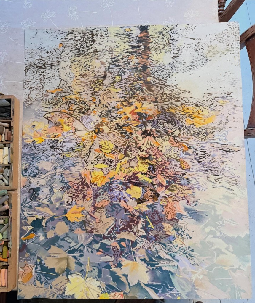
Work in Progress by Katy Bailey
They say that a painting must “work” at every stage of its evolution, and this is an exquisite example of a work in progress that foretells success in the finished piece. I am blown away by the intricacies of this piece, the dynamic, but gentle color palette, the implied movement, and the sense of the reflection that is already so apparent even before the piece is done.
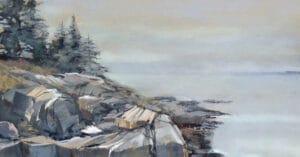
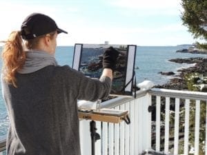
Crib Goch by Dave Roberts
A good painting should be technically sound but also should engage the senses in order to tell its story. In this painting, I can feel the cold and hear the soft wind while everything else around me is silent. The distant sunlight, filtered through the clouds and haze is a beautiful contrast, both in value and temperature, to the shadow that covers the foreground courtesy of the darker, more ominous cloud to the left. A masterclass in light, texture and atmosphere.

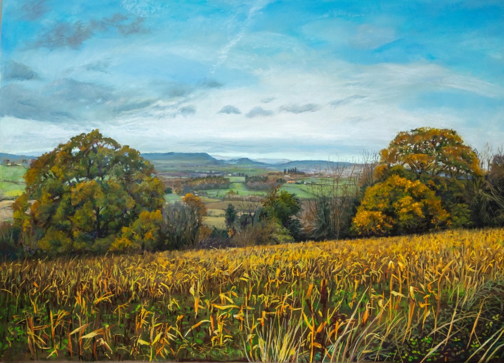
A View from our Favorite Walk by Bridget Derc
A classic, pastoral beauty. The diagonal line of the foreground in this painting is so effective, preventing the scene from feeling static. I love the way the two large groupings of trees on that line frame the distant view. Even the clouds and the faint vapor trail in the sky help to keep my eye moving, then landing once again in that distant space.
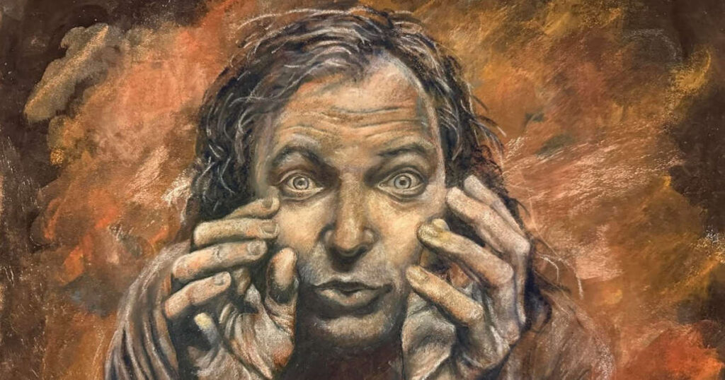
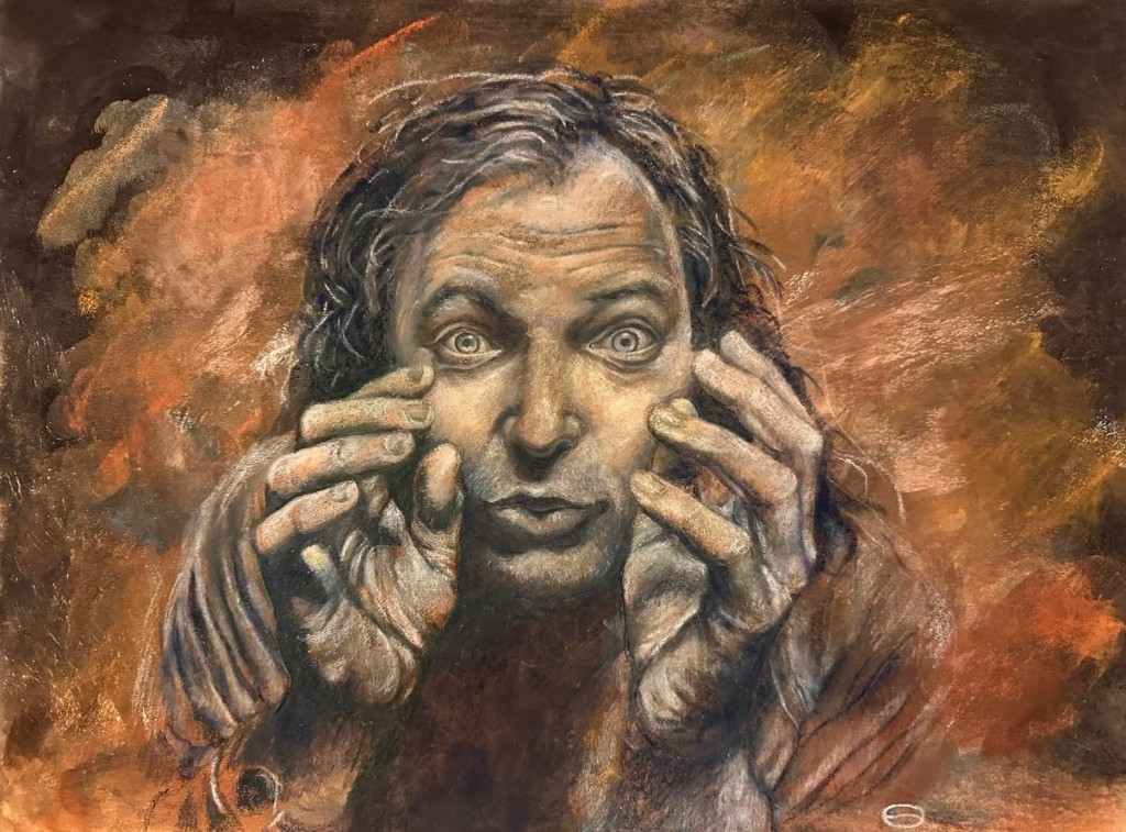
Portrait by Stefania Crivello
Wow…this portrait uses color, mark-making, perspective, and emotion to come at you in such a powerful way! It is unnerving in its intensity, because all the elements that went into the making of this piece are working in tandem to create a specific moment of action infused with some sort of uncertainty that feels unsettling. The beckoning gestures of the hands, the wide staring eyes, the creases in the forehead, and the slightly disheveled hair are made even more dramatic by the limited orange color palette.
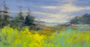
A Quiet Season by Tim Blackwell
The unusual but highly effective division of space, the careful analogous color palette, and the attention to detail and edges really speak to me in this piece. The use of yellow is like a punctuation mark that really makes the rest of the piece sing. There is something a bit like Wolf Kahn meets Gustav Klimt in this painting.
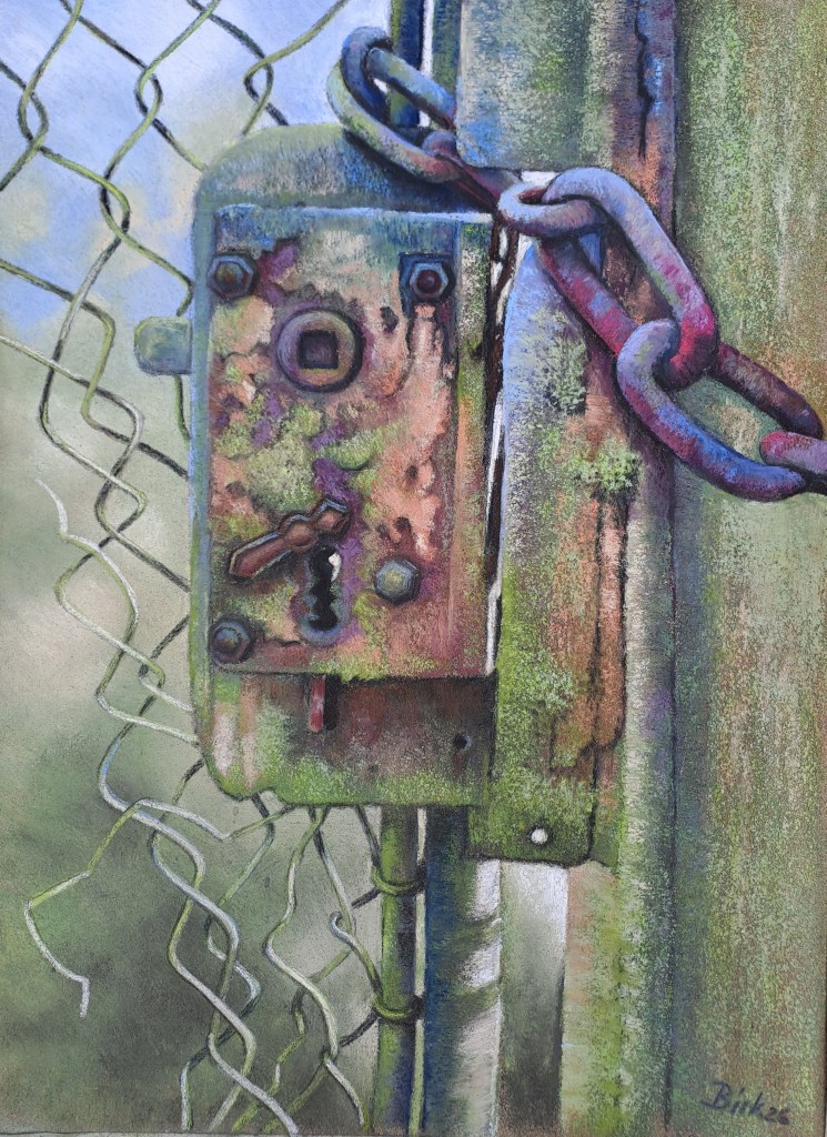
The Forgotten Gate by Kerstin Birk
I love it when an artist can give an inanimate object a sense that it has more to offer than what it would seem at first glance. There is something wonderful about a composition that allows the angles and planes and curves of a functional object to tell a story. In this particular piece, I am especially intrigued by the gorgeous colors and textures, but the curves and drape of the chain, along with the interlocking wires of the broken metal fencing add a gracefulness to what might otherwise have been a stiff composition. Everything about this piece makes me want to know more of its story.
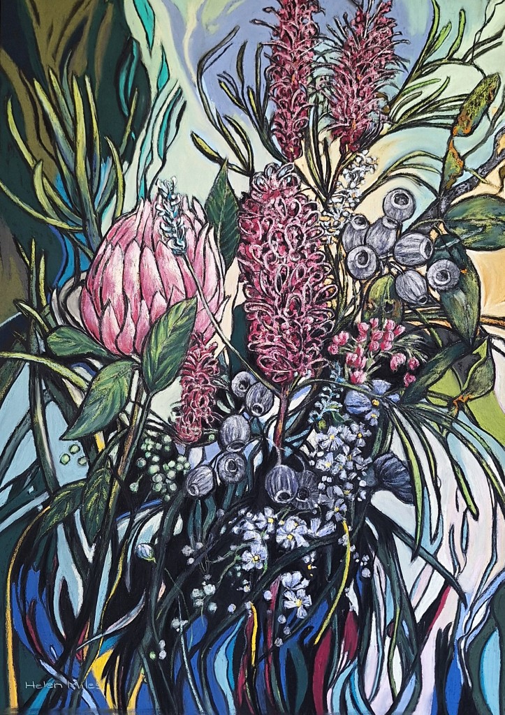
In the Thick of It by Helen Miles
With a combination of excellent drawing, painting, and compositional skills, this painting tackles the floral genre in such an exciting way! It feels both classic and modern, with the intricacy of the flower forms held in place by the swirls and curves of the foliage and patterns around them. Even the colors move and float through the piece, from bold blues and yellows, magentas, and dark greens to more subtle shades of blue, violet, and pink. Eye movement never settles in one place in this piece and it’s a delight to make new discoveries every time I look at it.
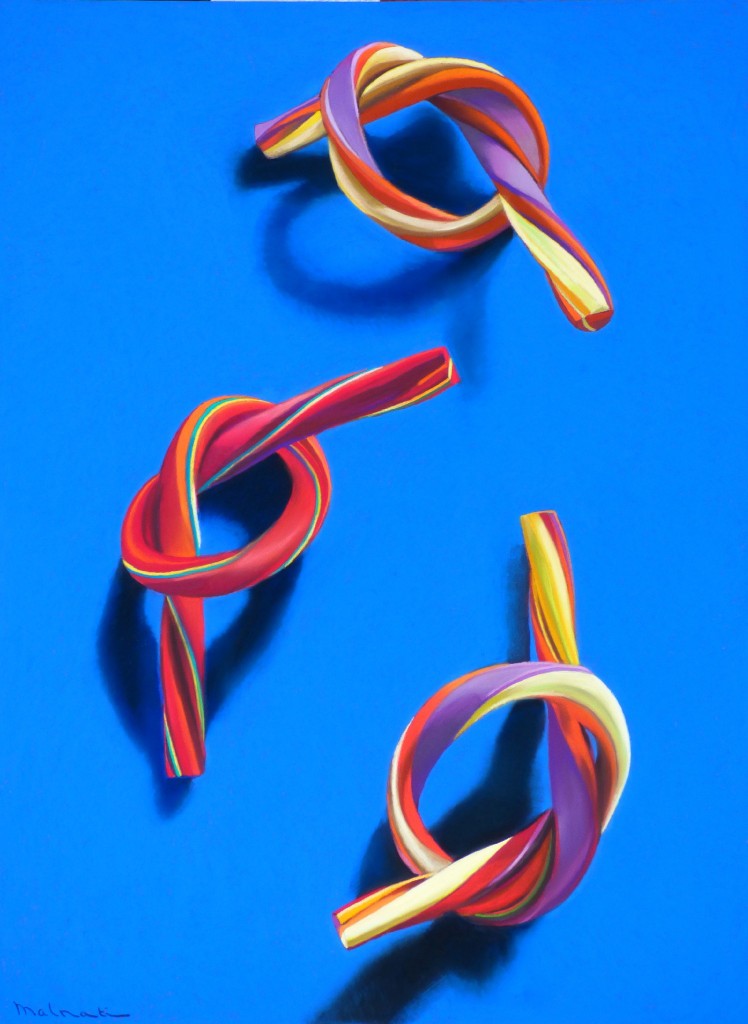
Knots by Francois Malnati
Such a fun piece! I think the playful precision of the knots and the bold, primary and secondary colors that make up this piece give the impression of simplicity when, in fact, I imagine this piece was quite difficult to execute. The sparse composition includes just three objects and their shadows but there is nothing simple or awkward or unplanned about their arrangement. They have been skillfully placed to help lead the eye from the bottom of the painting up and around and back down again. A masterful still life!
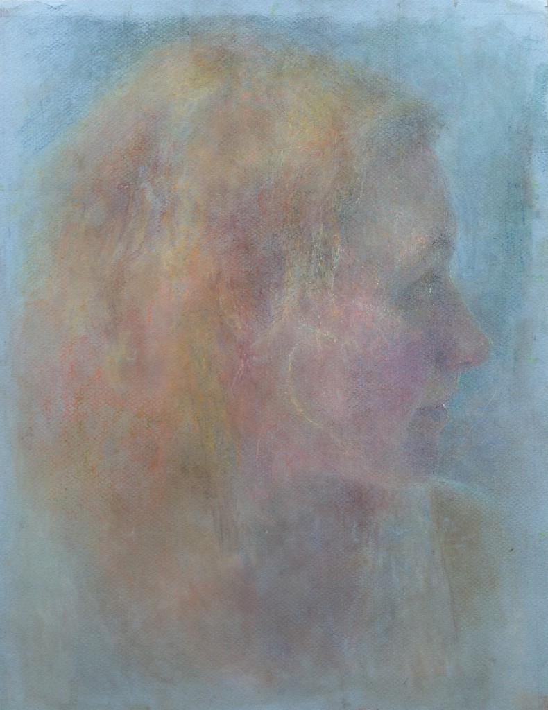
Portrait of a Girl by Mary Greenacre
I keep zooming in on this piece and marveling at the subtlety of it. With barely a hint of value change, it conveys light and shadow, emotion, detail, form, and texture, and it does so beautifully and convincingly. It deserves to be studied more closely to see the power of color as it contributes to edge work.
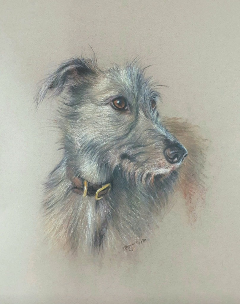
Lurcher by Peter Hogarth
What I loved most about this painting, and what drew me in immediately, was the use of so much color in the dog’s coat, and the way those colors work together so wonderfully to describe the way the light plays on the wiry texture of the fur. I am glad the artist chose a profile view, allowing the longer, darker fur under the chin and the small tufts of fur over the eyes to catch the light.