Thank you to Stephen Fuller for asking me to choose 10 (11 oops!) “Eye Catchers” for January from the Unison Colour Soft Pastel Facebook group. I look forward to seeing all the pieces submitted every day — it’s such a valuable community space for both experienced and new pastelists. There is always something in every piece that begins a thought process for me: a colour palette, a different approach to mark making, or an interesting choice of subject matter. That exchange of ideas is so important for all of us, as it challenges how we work and helps us grow creatively.
There are so many ’beautiful drawings on here, such incredible skills, I also love seeing newer artists emerging, this group is incredibly supportive, and every contribution adds something meaningful to our collective learning experience. Fresh perspectives, experimentation, and works-in-progress are just as inspiring as highly polished pieces. By sharing regularly, you not only track your own progress but also inspire others who may be at a similar stage in their journey. Every voice and work is valued here.
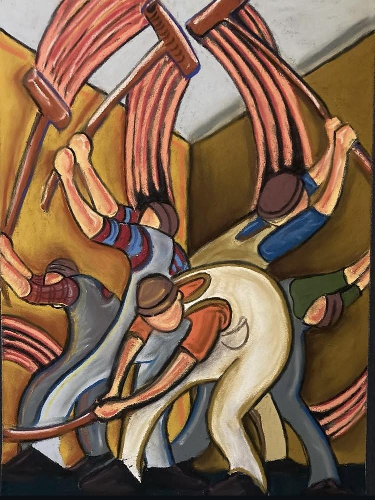
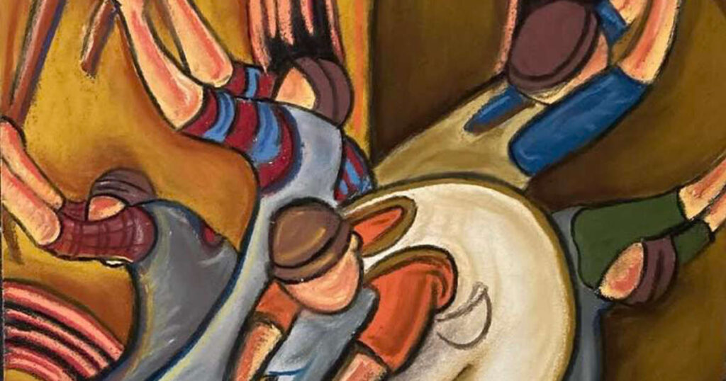
This piece by Anthony Savage really jumped out at me. There is a flow, the eye travels around the painting by very clever use of diagonals and symmetry. I imagine conversation between the workers as well as an engrossed silence. This painting feels energetic, chaotic, and slightly unsettling—in a deliberate way. There is a strong sense of motion. The figures are twisted, bent, almost pulled by invisible forces, and the sweeping red arcs above them create a rhythm that feels industrial or mechanical.The figures don’t feel individualized; instead, they read as a collective, almost interchangeable. Maybe a social comment going on here.
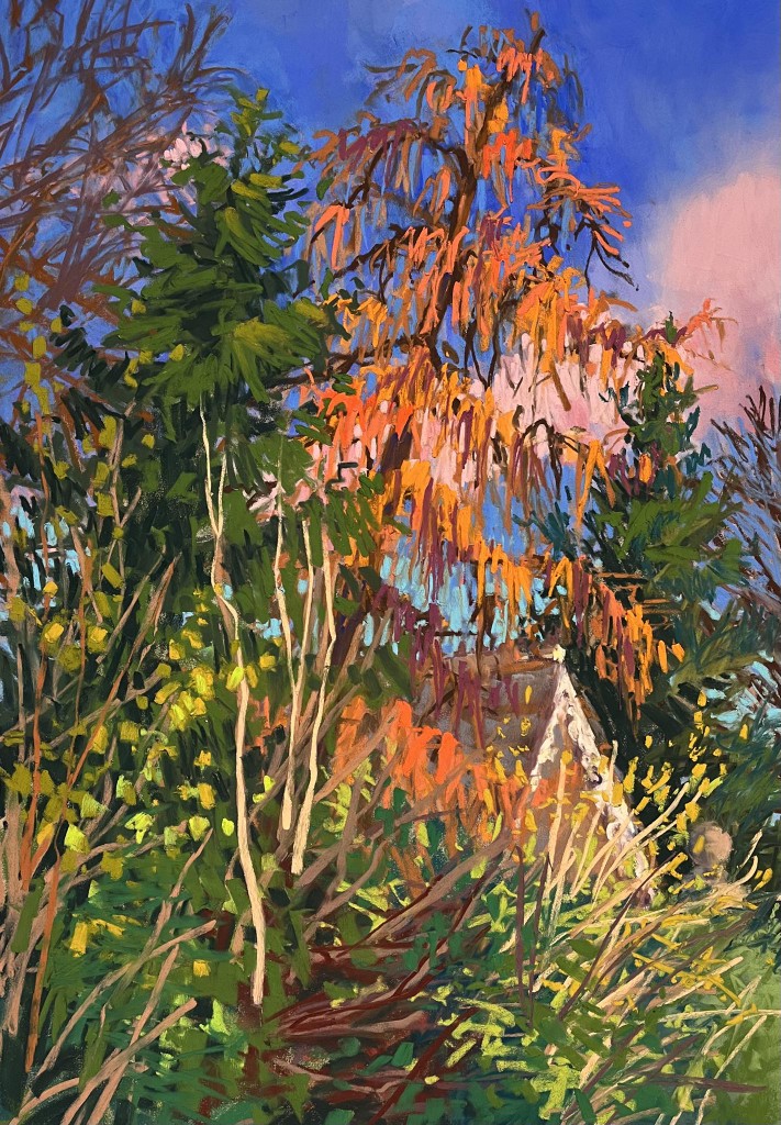
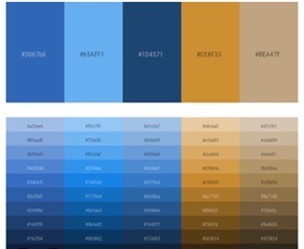
I chose this piece by Cathy Pearce because the colour combination caught my eye and immediately made me think about colour opposites. It’s incredibly subtle how easily colour relationships can succeed or fail. What makes this painting work is the pairing of an almost cobalt blue with a very brave, unapologetic orange. This Hex chart below shows quieter echo of that relationship. Had the orange been softened, the blue would have asserted itself too strongly and tipped the balance.
The apex of the roof acts as a visual arrow, guiding the eye towards the barely-there pink cloud, a movement reinforced by the stripped branches. The tension between the pink and orange creates a gentle clash that keeps the surface alive, teasing the viewer with a careful balance of warmth and vibrancy. For an experienced pastelist like Cathy Pearce, these choices feel instinctive rather than calculated — a quiet confidence built from years of looking and practice.
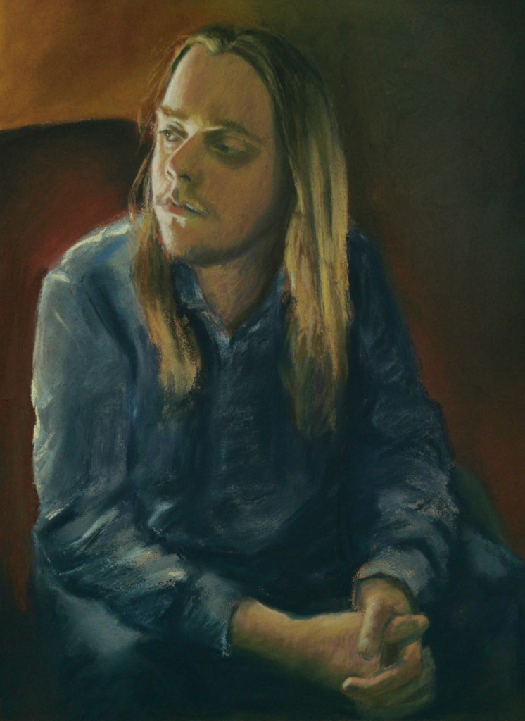
This contemplative figurative study by Marian Littlejohn is so well observed, small touches of light on the face and shoulder suggesting a window. It can be so tempting sometimes when drawing to overdo the light in a dark piece like this. I feel like Marian gently teased this drawing into its finished state without over drawing. We don’t need to know what the background is or where the model is, the focus is on his meditative profile. I also find myself considering the models thoughts, there is an assuredness as well as a frailty and melancholy in him. You can feel the weight of his arms on his thighs, it feels grounded.
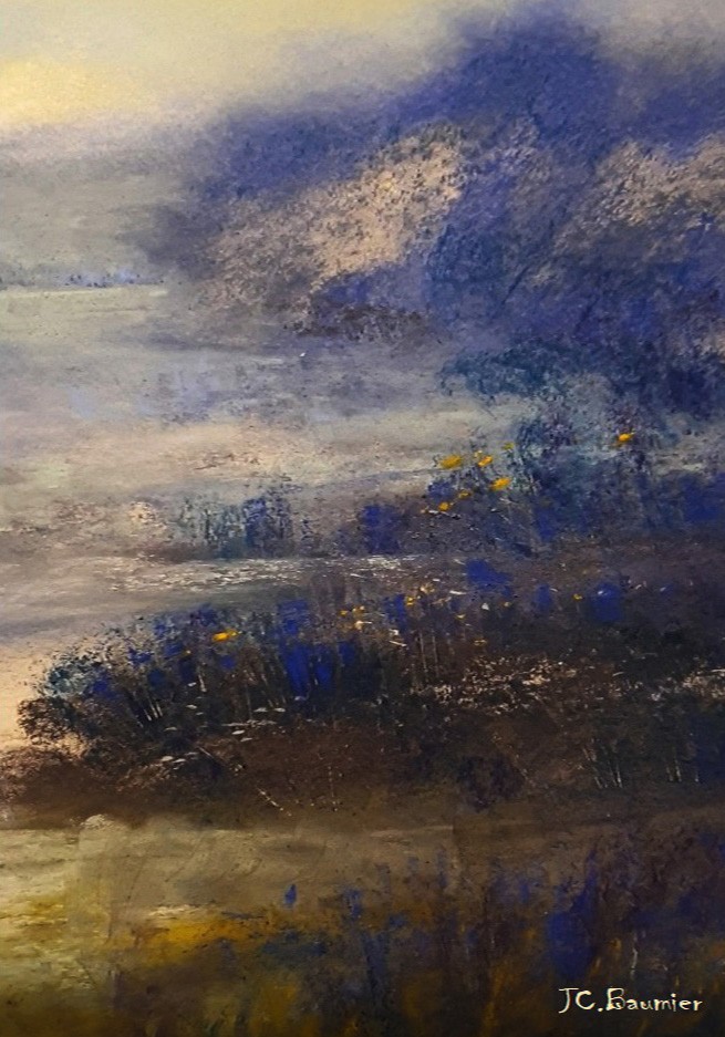
I recently watched The Turner sketchbooks on TV, 37,000 sketches in his lifetime. There is something in Baumier,s piece here that echo Turner’s way of working. The forms aren’t crisp, more a dissolving blend between land and sky, haze and mist and a wonderful glow which makes light the dominant driver. One of the strongest elements in this painting is texture, using the roughness of the paper to allow the pastel to feel powdered and loose. It feels like this is painted from a feeling rather than an observational drawing. The left side feels slightly more breathable, evoking a distance, balancing the darks of the right-hand side.
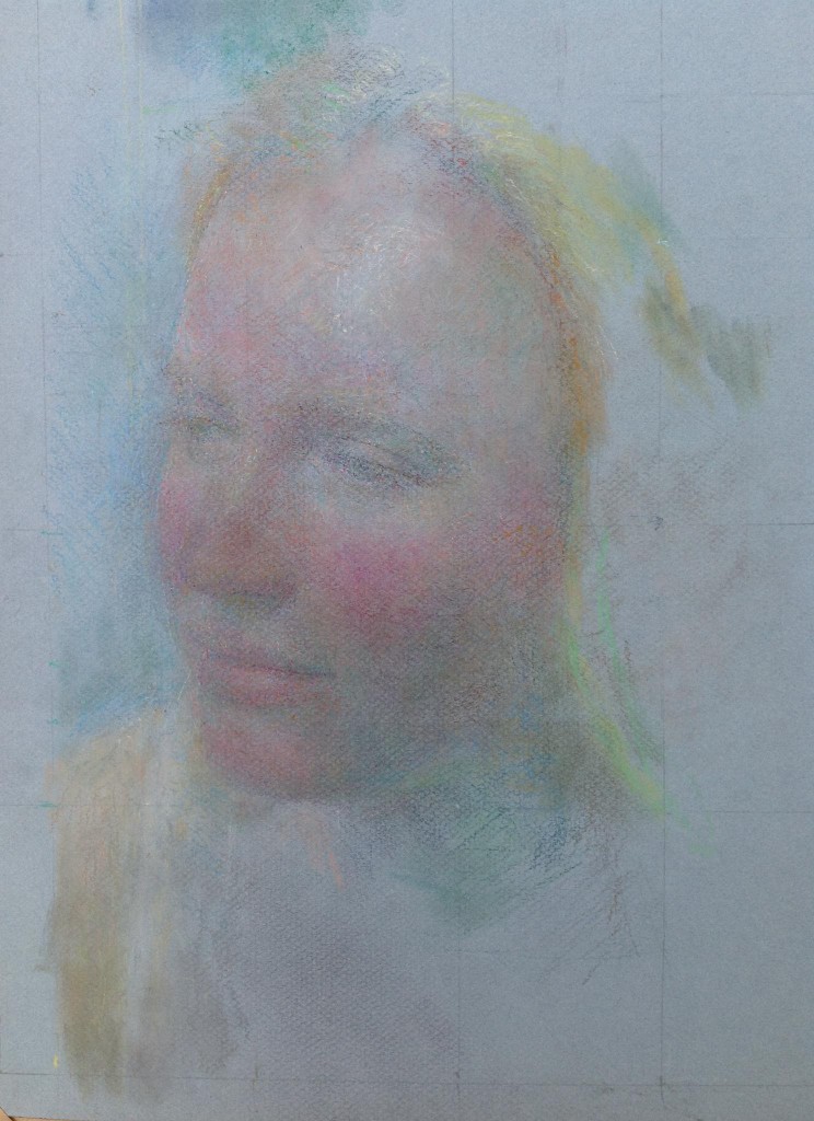
This beautiful image by Mary, emerges out of the paper with such a tenderness and softness. The colours vibrate with each other. This piece shows that you don’t always have to draw a complete image, our imaginations are very good at filling in the missing pieces. As you look at this, you start to notice a soft green, which blended with the rose tone, creates a very believable shadow. Again, as in all these works, I feel like this has been painted from feeling and a knowing, that in turn makes the viewer feel like we are privileged to be part of this intimacy.
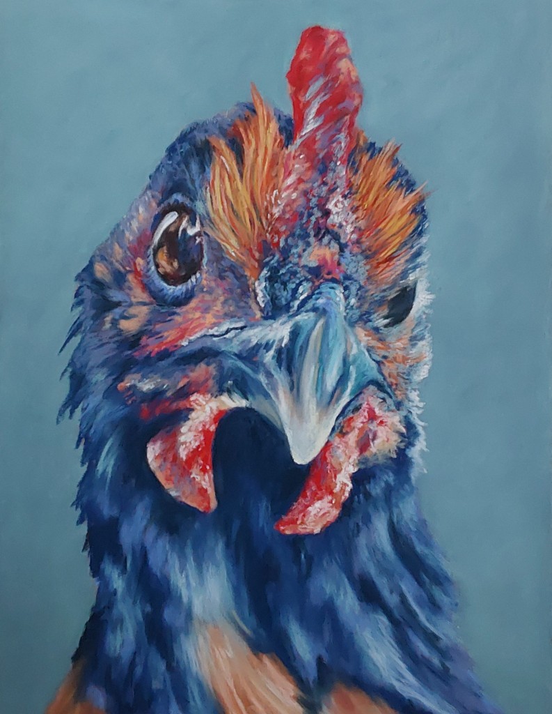
I have chickens in my garden, this evoked the humour and quirkiness that I see every day. The colour palette is interesting and believable. The chicken is looking directly at the viewer, unapologetically asking for scraps probably. I feel like Liz is an experienced pastelist, she has used just the right amount of blending and sharp detail.
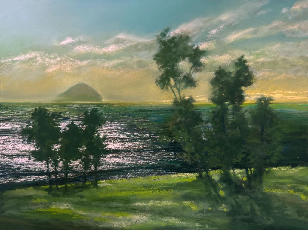
I chose this piece because I love the light, the distance, the low hazy form on the horizon feels remembered, nothing is overworked, Lynn handles her pastels with assurance and experience. Her palette has a cool/warm balance, the cooler water offsets the muted golden light of the sky. The gentle movement across the water suggesting that it is dusk, the loosely described trees direct our gaze across into the landscape beyond. I can imagine sitting here quietly watching the sun go down.
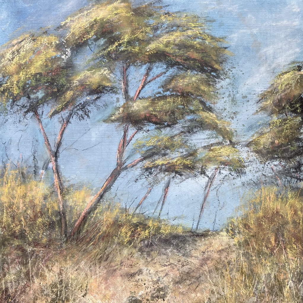
The looseness of this drawing gives it energy, the light evokes remembered walks across hot dunes to a beach, I can smell the trees and hear the wind in this painting. It captures the landscape as a moment in motion rather than a static view. The trees are bending decisively to the right, suggesting wind as an invisible force and creating a strong sense of direction that carries the viewer’s eye across the canvas. The expressive, layered mark-making in the foliage adds so much energy and texture, giving the leaves a shimmering, almost restless quality. The colour palette balances soft blues in the background with warmer yellows and ochres in the foreground, creating depth and a gentle atmospheric perspective. Subtle reddish tones in the trunks ground the composition and provide visual contrast. The path at the bottom acts as a natural entry point, guiding the viewer into the scene. There is a strong sense of place, it feels like it is somewhere Lynn knows very well.
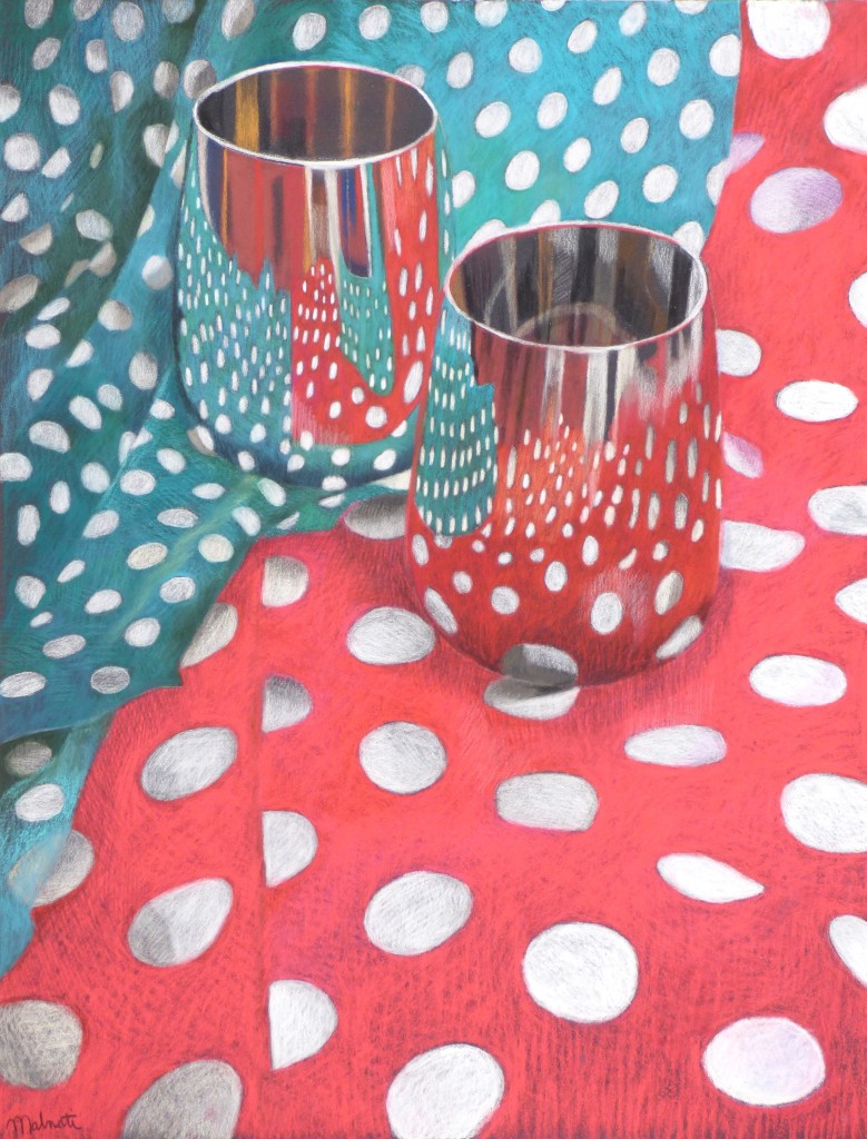
This piece turns an everyday tabletop scene into a playful study of pattern and perception. I imagine Francois would have had a ot of fun drawing it. The bold polka-dot fabrics immediately command attention, creating a dynamic visual rhythm that blurs the line between foreground and background. The contrasting red and teal cloths energize the composition, while their overlapping folds introduce movement and depth.The reflective surfaces of the glasses are particularly engaging. They subtly distort and echo the surrounding patterns, adding a layer of visual complexity that rewards closer looking. This interplay between reflection and fabric creates a conversation between realism and abstraction, as the viewer navigates what is solid versus what is illusion.

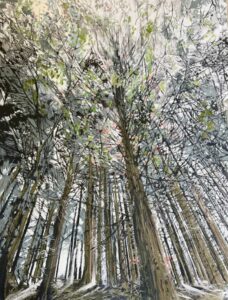
This painting beautifully captures the fleeting magic of light filtering through a wooded landscape. The eye is immediately drawn to the luminous interplay between the sunlit foliage and its reflection in the water, creating a quiet dialogue between reality and mirror image. This piece shimmers with movement and light and atmosphere. The greens are vibrant, yellows, and touches of pink and violet are woven throughout the composition, lending it both richness and harmony. These brighter notes are balanced by the deeper, cooler tones in the shaded areas, which ground the piece and enhance the illusion of depth. The reflections are especially effective, slightly abstracted yet convincing, encouraging the viewer to linger and explore.
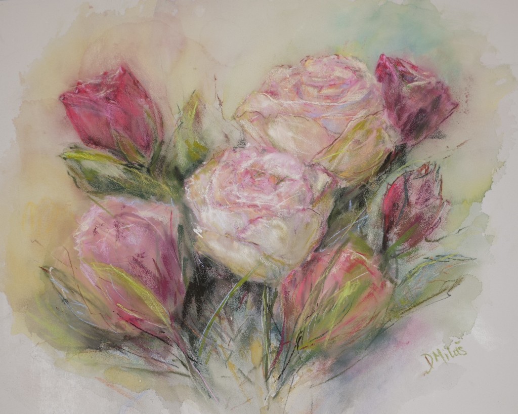
Such a delicate and well observed drawing, a light hand, blending adds to the softness, there are no hard lines here, a few touches of dark bringing the flowers forward.