Thank you to Unison Colour for the honour of being guest curator for the Eyecatchers feature for the month of June. Thank you also to Stephen Fuller for passing on the baton, which has given me the opportunity to study all the contributions in more detail than perhaps I would normally find time to do!
It is such a difficult task to choose only 10 images and I could easily have chosen many more, a high bar was set!
I have attempted to select a range of topics and styles to reflect the offerings of this wonderfully talented Unison Colour Soft Pastelling Community, whilst choosing paintings that did genuinely catch my eye for a variety of reasons.
I would like to invite fellow Unison Colour Associate artist Lynn Howarth to be guest curator for the July submissions.
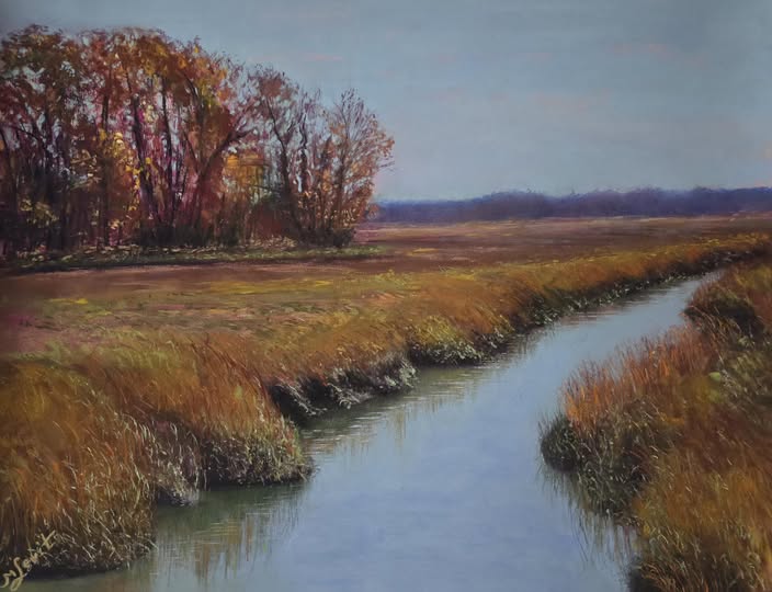
Mena combines bold, striking lines and rich autumnal colour and texture, to create this strong, yet peaceful, landscape. The water, with its subtle reflections is particularly well done.
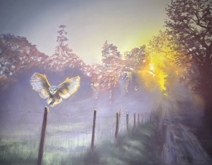
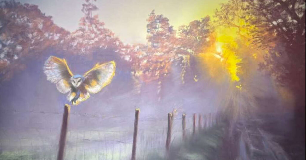
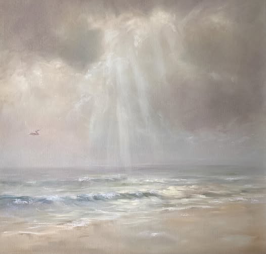
I admire any artist who can capture light convincingly, and this painting captures that early morning mood perfectly. We, as viewers, really feel the warmth from those early rays of sun and the moisture in the air from the lingering mist.
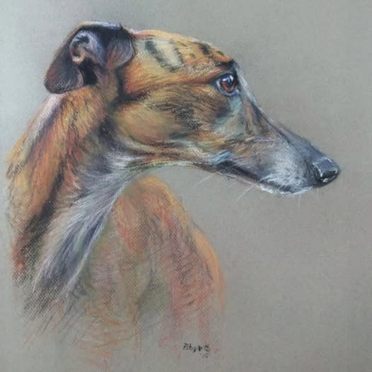
Several of Peter’s animal portraits have caught the eye in June, but for me, this was his stand out piece. Lurchers have an angular elegance that can provide the perfect subject matter, and Peter captures their character beautifully here.
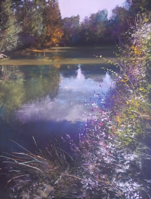
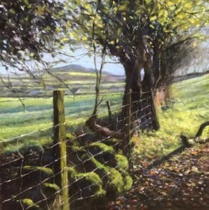
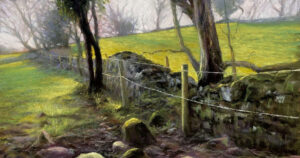
Alain is a master in his treatment of water and foliage, and I have long been an admirer of his works. This is an excellent example of his ability to place the viewer precisely in his own footsteps, and to share his beautiful interpretation of nature.
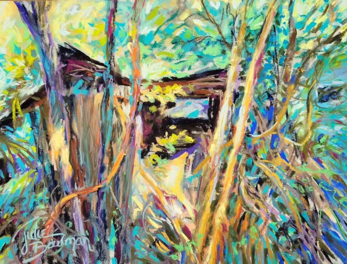
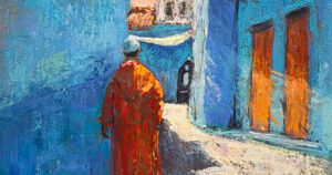
This certainly qualifies as an Eyecatcher for me! The freedom of mark making employed here, together with such an exciting palette, bring what could potentially be a darker subject, to glorious life. A joyful and optimistic painting.
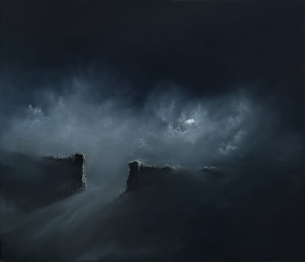
Stephen reproduced this to a larger scale from an original 6×8”, and I’m sure that it only adds to the power of the painting. The viewer is invited to form their own interpretation of this dark yet compelling scene. We are presented with a choice, do we enter or not? A well executed and thought provoking piece.
As a painter of the coast and someone who has spent many, many hours happily walking beaches alone, this resonated with me completely. The subtle choice of colour and quiet drama captured here, make this a painting that the viewer willingly immerses themselves in.
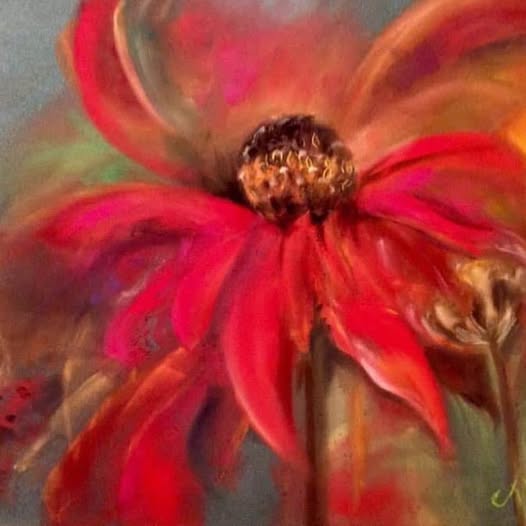
There is no title or description attached to this painting, but some paintings do not require an explanation. This is a simple statement, yet a perfect example of the power of soft pastel. The depth of colour, the edges and the interplay of overlapping colours, make this such an eye catching piece.
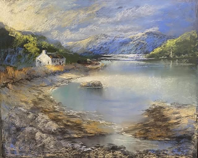
This inviting and atmospheric landscape possesses a romantic charm that draws the viewer right in.
From the curving foreground shore, the eye is led to the focal point of the half lit cottage and on to the beautifully rendered distant mountains. The textures, palette and excellent capture of light all combine to make this another eye catcher!
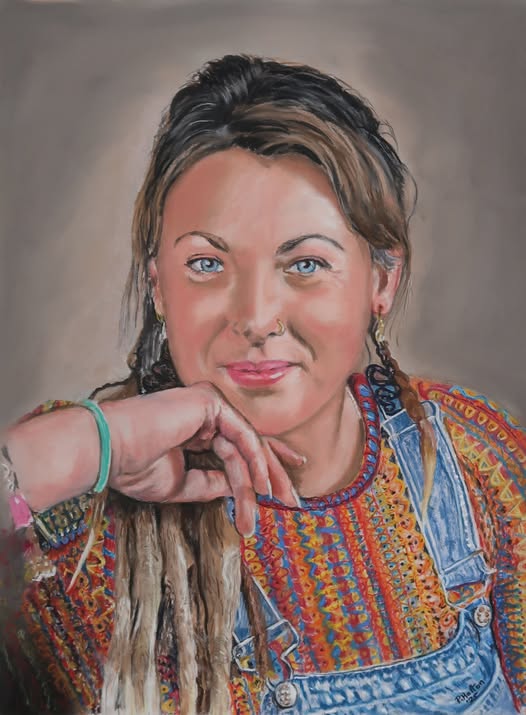
As an admirer but a non painter of portraits, I do appreciate the skills that this particular discipline requires. I found the expression here to be an attention grabber, the controlled smile and the steadfast gaze, are captivating. The composition is also excellent and the challenging detail of the clothing is handled superbly well.