Welcome to our new monthly blog called “Eye Catchers”. Every month we see a wide range of beautiful pastels, across all genres, posted to our “Unison Colour Soft Pastelling Community” Facebook page. We thought it would be fun to invite guest curators to choose 10 pieces that caught their eye during the previous month. Stephen Fuller has agreed to be our first curator. The pastels he has chosen are in no particular order and are not necessarily the most technically adept but have all met the sole criteria of “having caught the eye”. We hope that you enjoy his selection and that there are a few of your favourites in the mix as well.
Stephen Fuller –
Firstly, a huge thank you to Unison Colour for asking me to be the first curator and looking at all the pictures posted I was really spoilt for choice – it took me a while to “sort of” whittle it down to 10. I hope you like my selection.
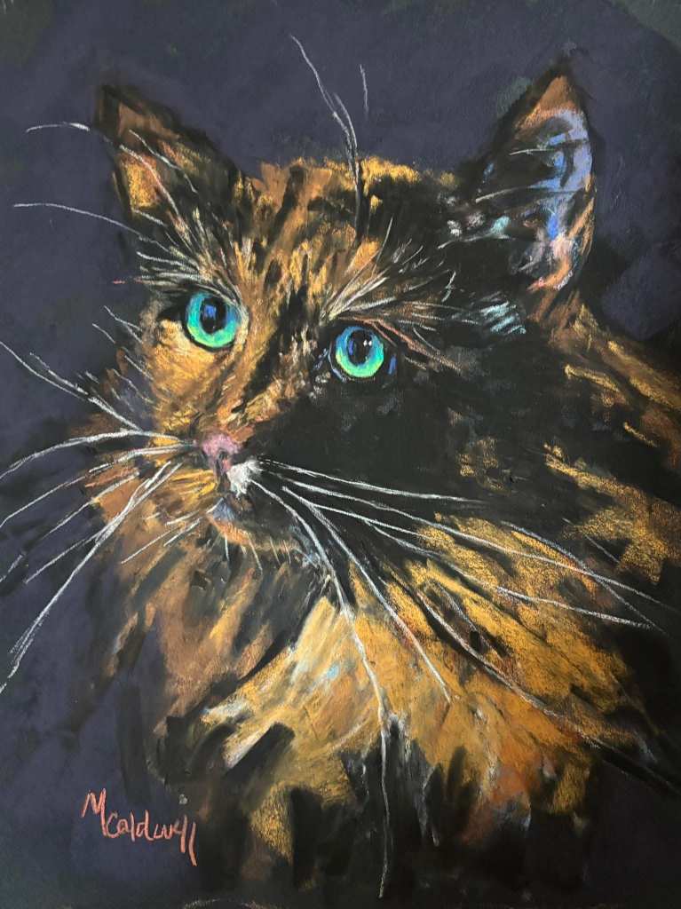
The first piece I have chosen is Mary Smith Caldwell’s cat portrait. There were a number of absolutely amazing animal portraits posted in May but in this one I loved the loose pastel strokes in the fur and the captivating intensity in those green eyes is amazing.
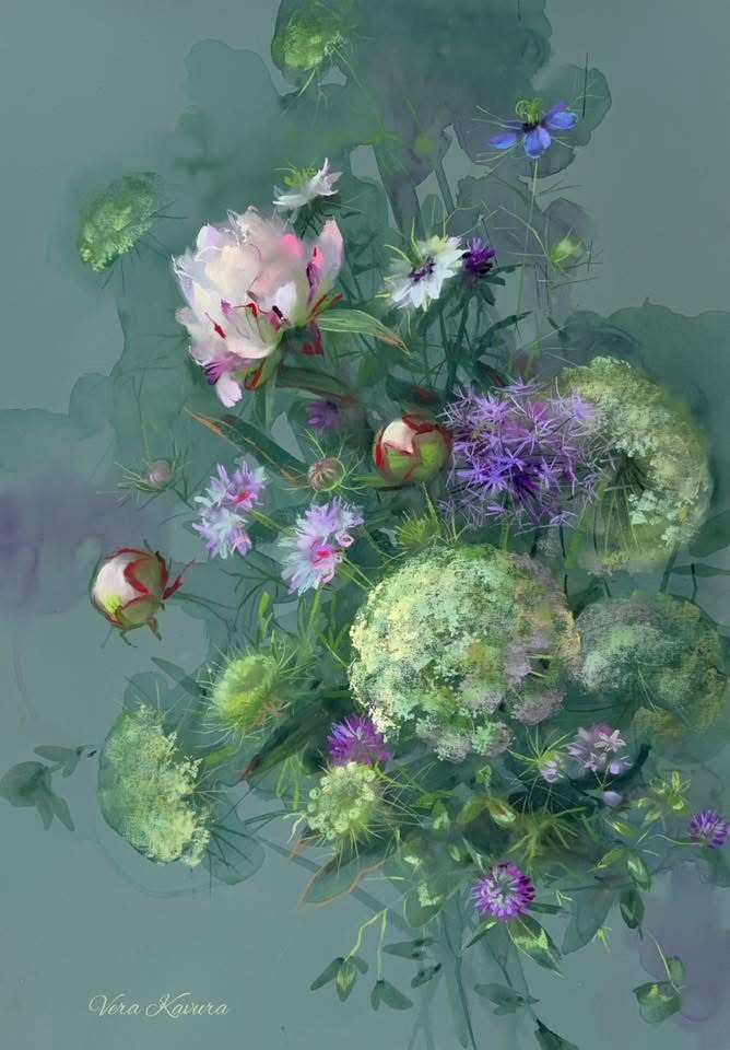
The second piece on my list is Vera Kavura’s “Floral Embroidery”. There were several of Vera’s pieces that could have made the list but I thought that this one particularly balanced some beautifully precise pastel work against the looser watercolour background. There’s also a wonderful rhythm in the piece and that delicate pink peony is the absolute star of the show.
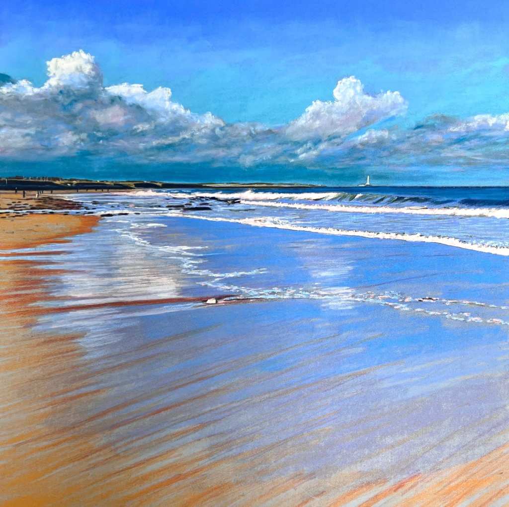
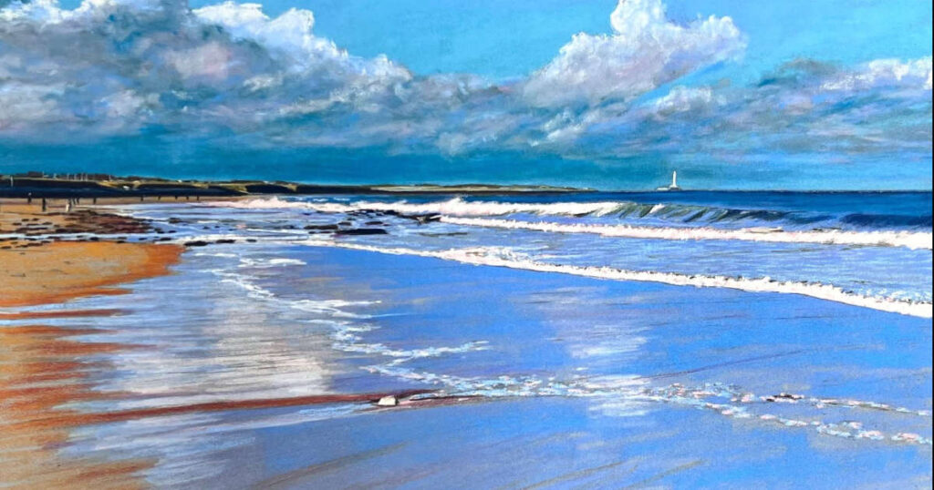
The third piece to make my list is Darren Ambrose’s “Whitley Bay Beach”. Darren has invoked a wonderful feeling of space in this work. Whilst the leading lines take you into the picture from right to left this is balanced by a very captivating movement from left to right generated within the reflections, clouds and distant yacht. The reflections generated within the water draining down the beach are sublime.
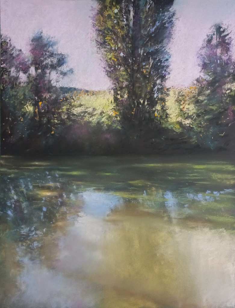
The next piece I’ve chosen is Alain Voinot’s “Riverside in Summer”. I’ve always been a fisherman and I think that I might have stood on that river bank a thousand times. The depictions of reflections, sunlight dapples and weed on that slightly turbid brown/green water are masterful. The beautiful colours in the bank shadows are perfectly set against the glowing field and sky and the strokes depicting the negative space in the trees and foliage are very effective.
I think it’s fair to say that Gareth Jones has been on fire over recent weeks – all of his pieces are absolute eye catchers. However, the one I wanted to choose, “The scent of sea and pine” was posted at the end of April so it’s out of contention.
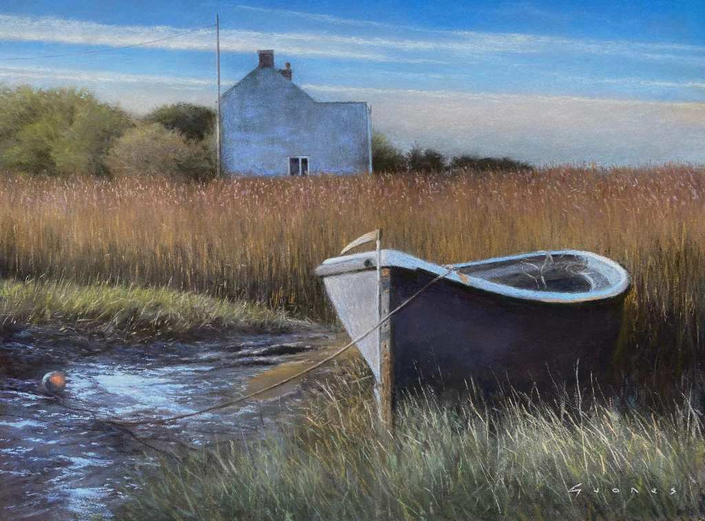
He also has posted a number of dynamic seascapes which all have wonderful movement. The one that I have chosen is “Amongst the Whispering Reeds”. The sense of tranquillity and solitude oozes from this piece. However, I think it also generates a senses of almost “Hopperesque” uneasiness, which makes it very compelling. I think this comes from the slightly austere depiction of the house and also the way in which Gareth has placed the right hand edge of the house directly in line with the keel of the boat.
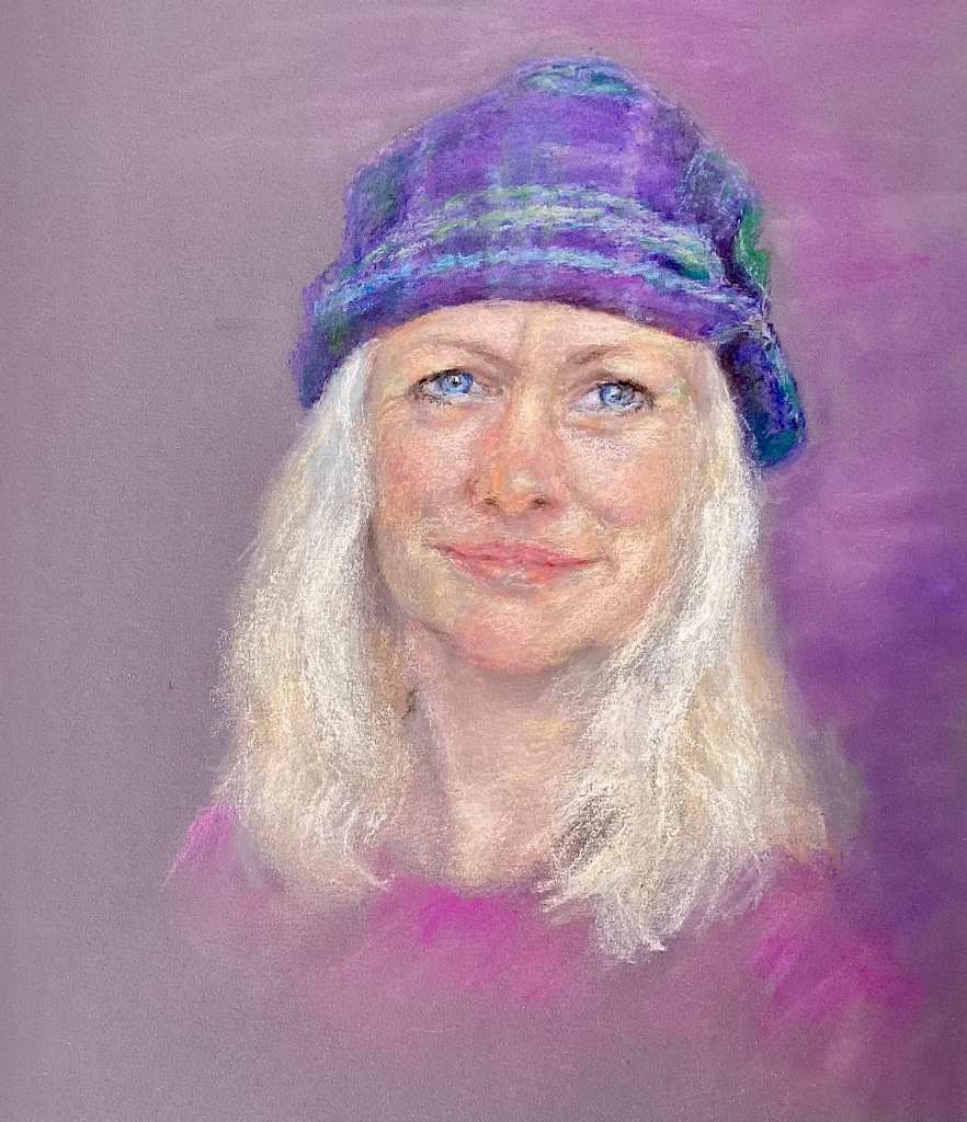
The sixth piece I’ve chosen is Pam Stevenson’s “Lorna’s Hat“, which is such a sensitive portrait. I love the analogous colour palette and the delicate use of soft and hard edges. I suspect that Lorna loved it too.
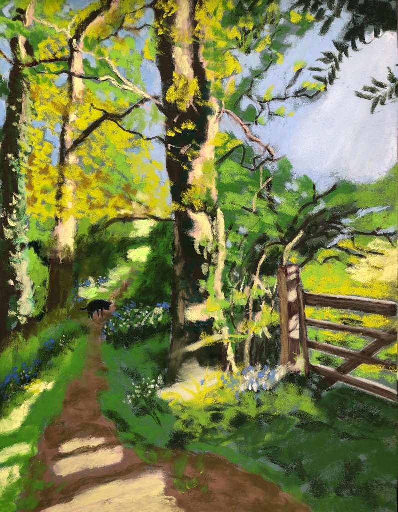
My seventh piece is Angela Bell’s ”Daisy’s favourite lane”. The spilling light in this beautiful landscape works so well against the cooler shaded areas. Angela has also loosened and simplified her shapes (just like the masterful Tony Allain does) and has painted some great negative spaces, which makes the piece so much more painterly. Just when you think you’ve seen it all, you then spot Daisy quietly walking up the lane.
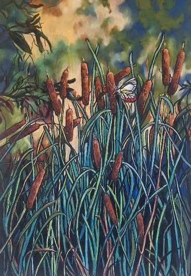
My eighth choice is Helen Miles’ “Bull Rushes And Visitor”. I absolutely adore the complexity of the intertwining bullrush stems against the soft bokeh background. The maze of stems also leads you beautifully up to the butterfly at the focal point.
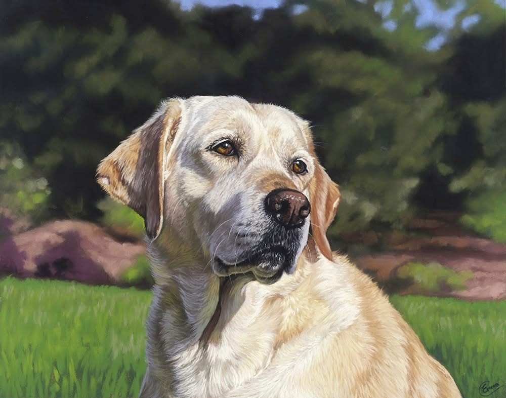
My ninth choice was a tough choice as a number of wonderful animal portraits were posted throughout the month by Peter Hogarth, Ludmila Skopintseva Yagodzinska and Jenny Mack (amongst others). All wonderful depictions completely full of character. However, it was Emma Colbert’s “Betty” that caught my eye just a little more. The dog’s expression and character really come through and sit beautifully within the soft, semi-bokeh background.
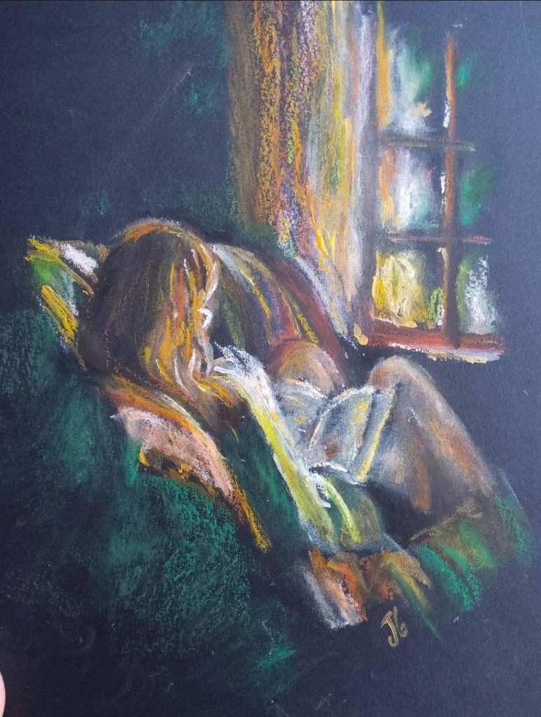
My final choice was again a struggle – There were some lovely landscapes full of light and I also loved Arild Frisne’s, Martina Diez-Routh’s and Dave Filcroft’s pieces, but in the end I was drawn to Jenny Sucu Color’s wonderful portrait. Jenny used a real economy of strokes to create the scene and there’s a lovely delicate light streaming through the window. It’s a sensitive and really engaging study.
Wow, choosing May’s eye catchers wasn’t easy – please have a look at all the pictures posted and comment about the ones that you would have chosen. There were quite a lot of other pieces that were amazing and I loved but that I didn’t have space to include.
Finally, my last job – for next month’s guest curator I nominate the very talented Unison Colour Associate Artist, Gareth Jones.

1 comment
Leone Madden
Wow!! ..Awesome choices Stephen and don’t envy your task.. I loved them all and certainly appreciated all their different techniques..
My absolute favourite is ‘Lorna’s Hat’.. So soft yet so defined ..gorgeous..
thank you for sharing these beautiful pieces . Cheers Leone..