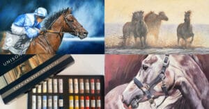
I thought it would be easy to pick my favorite 10 posts from the Unison Colour Soft Pastelling Community in November, but how wrong I was! This really is a wonderful community of pastel artists, ranging from experienced professionals to complete beginners, but each piece of work posted has a beauty of its own. I have loved looking at the variety, the different approaches to pastel painting, and choices of subjects.
I am sorry if I haven’t chosen your painting, there were so many others that were worthy of being on the list!
I hope that you enjoy taking a look at my choices for this month…..
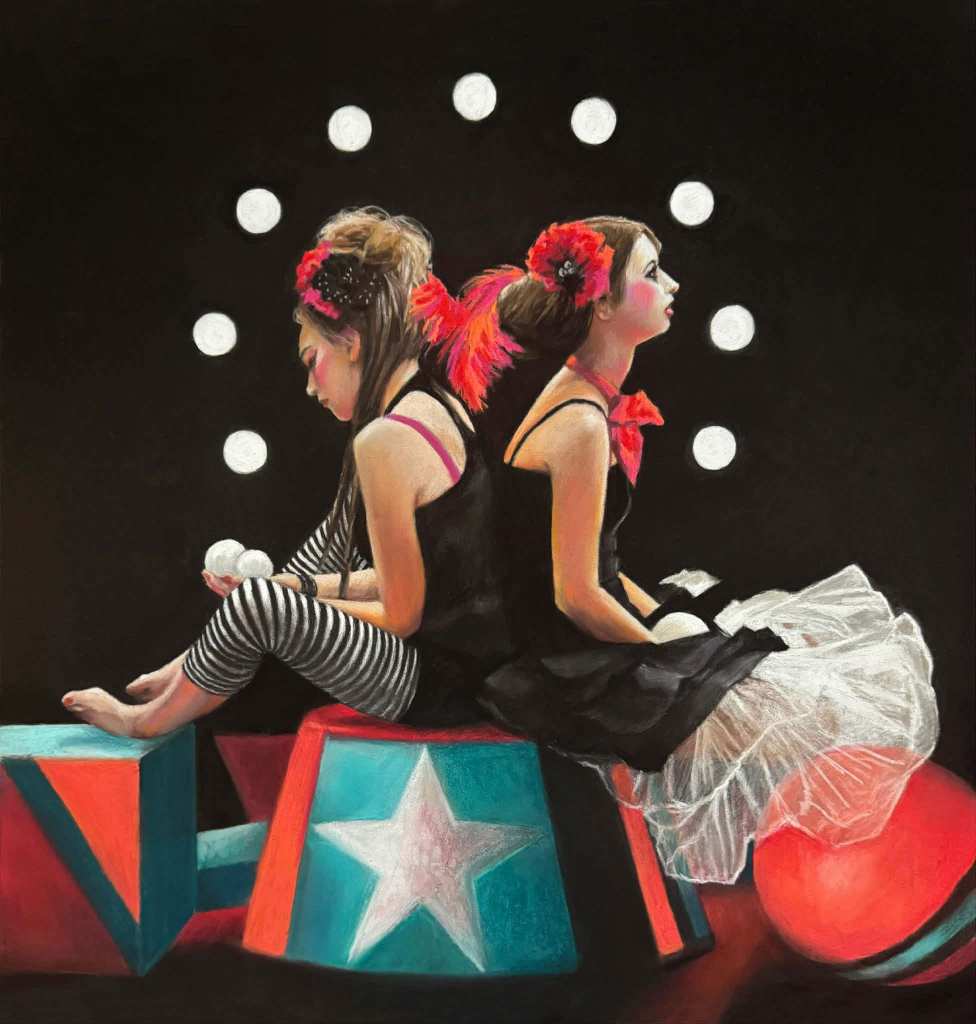
I think this is such a strong composition and rendering of figures. Lynn has captured the poses beautifully as well as the sense of theatre, with people waiting to perform, and an extra level of difficulty with portraits – face paint. I also love the strength of tone and colour contrasts. It’s a real showstopper!
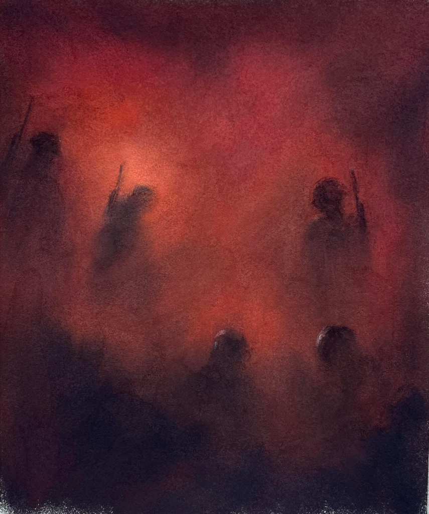
What an incredibly powerful pastel. Stephen’s subtle style really lends itself to this sort of work. I think this piece has huge impact.
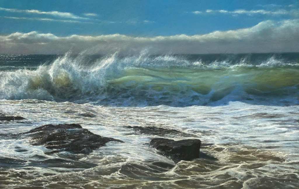
There is something about the way that Gareth paints the sea that takes my breath away. The capture of light in this one is masterful in different ways; as it catches the spray flying up into the air, as it comes through the wave, and as it reflects on the shallows in the foreground. Beautiful!
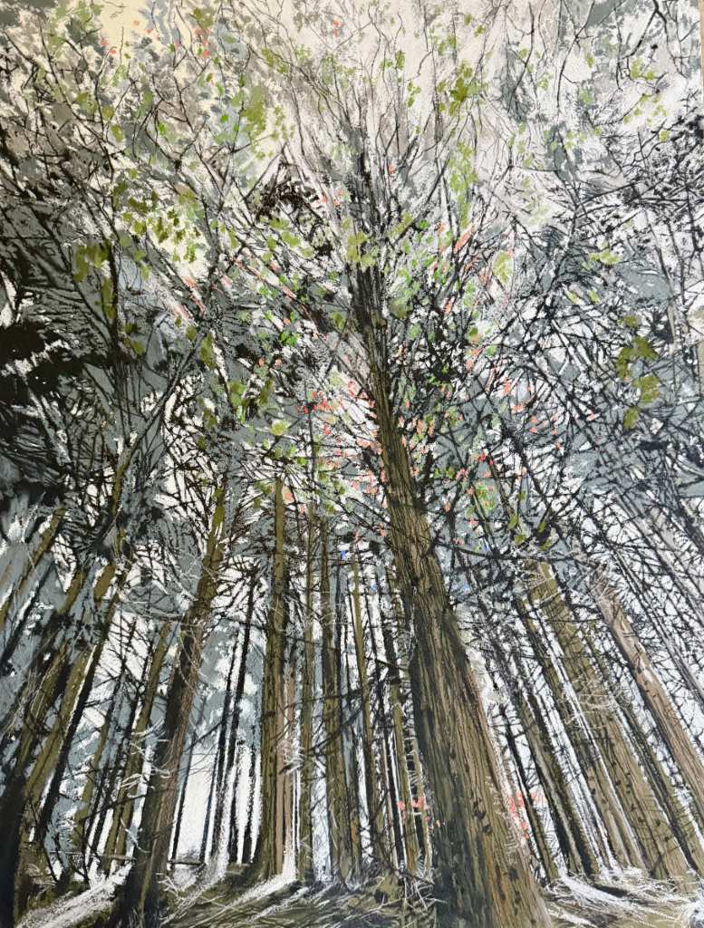
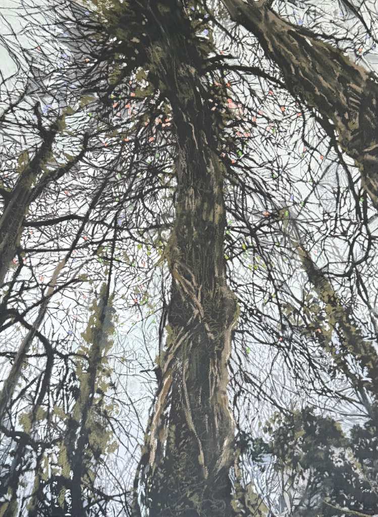
I chose this post because these two pastels are fascinating. I find branches of trees really difficult to draw and paint, and Katy has not only captured them with fabulous, expressive mark-making, but she has also used unusual viewpoints and compositions.
I am not at all surprised that they were selected for the Pastel Society exhibition!
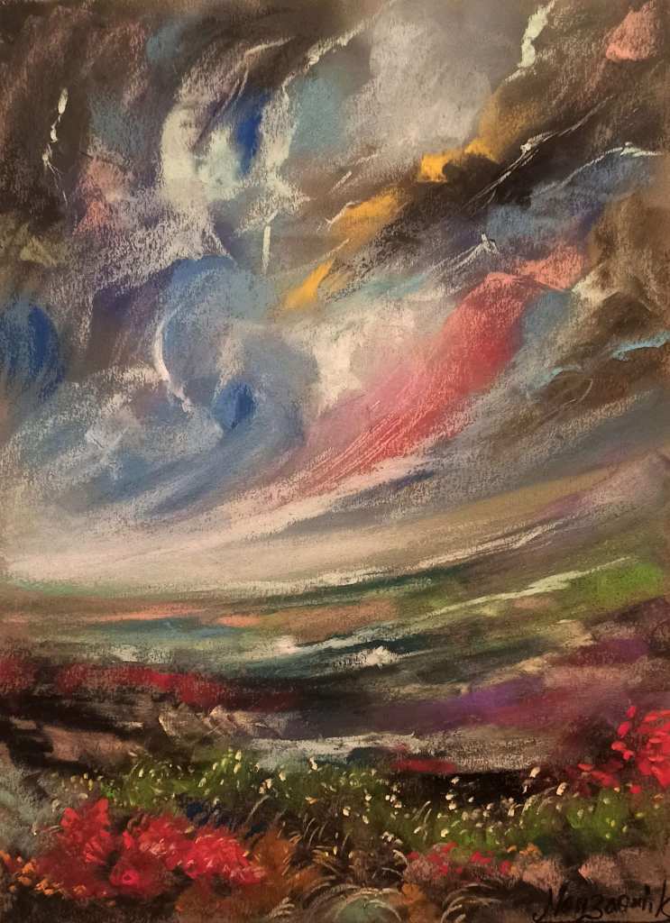
I love the freedom or mark-making in this, as well as the use of colour. The sky is full of energy and movement.
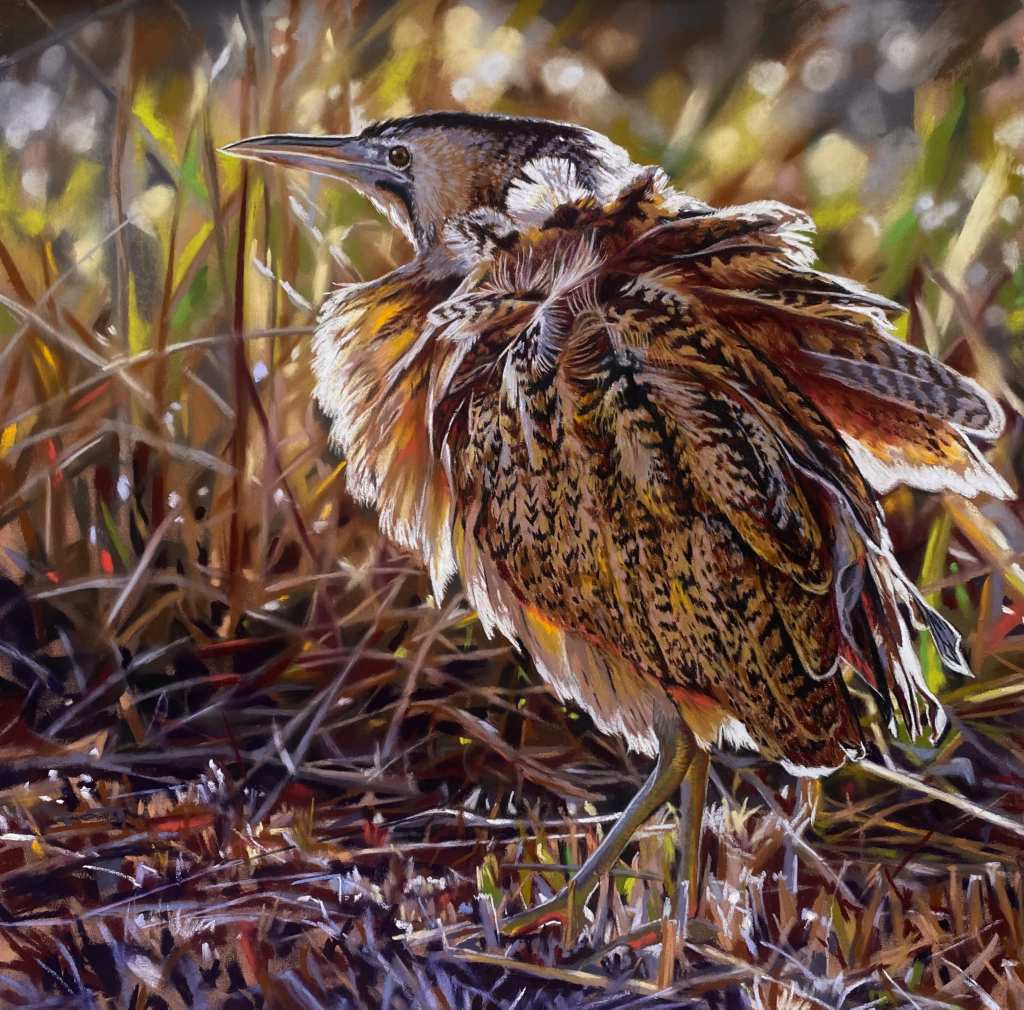
Hats off to Teresa for painting those feathers so beautifully and for the lovely light around the bird. There is some very skillful use of pastels here. I can’t wait to see this in the Pastel Society exhibition!

I love the way Sandra has painted this piece, it is so watery, with powerful rendering of the light reflection on the rippling surface, but also that depiction of the depth of the water as if we are looking down into it. Very clever indeed
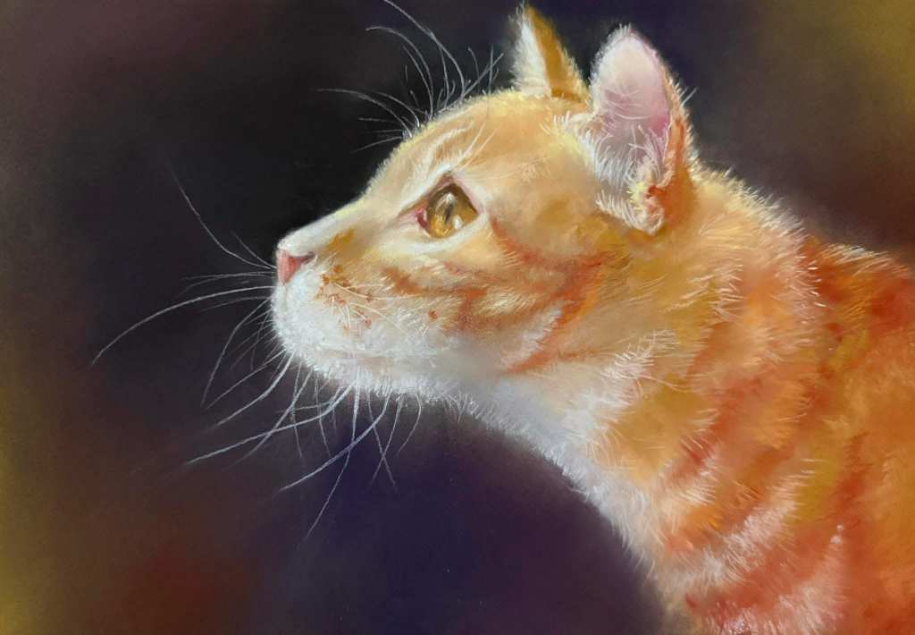
A beautiful study of a cat, which illustrates that simple can be powerful. I think the balance of mark-making is excellent and love the light catching the face and the whiskers, but what I like most about it is the variety of mark-making from sharp and detailed to soft and loose. It makes the cat seem more real to me.
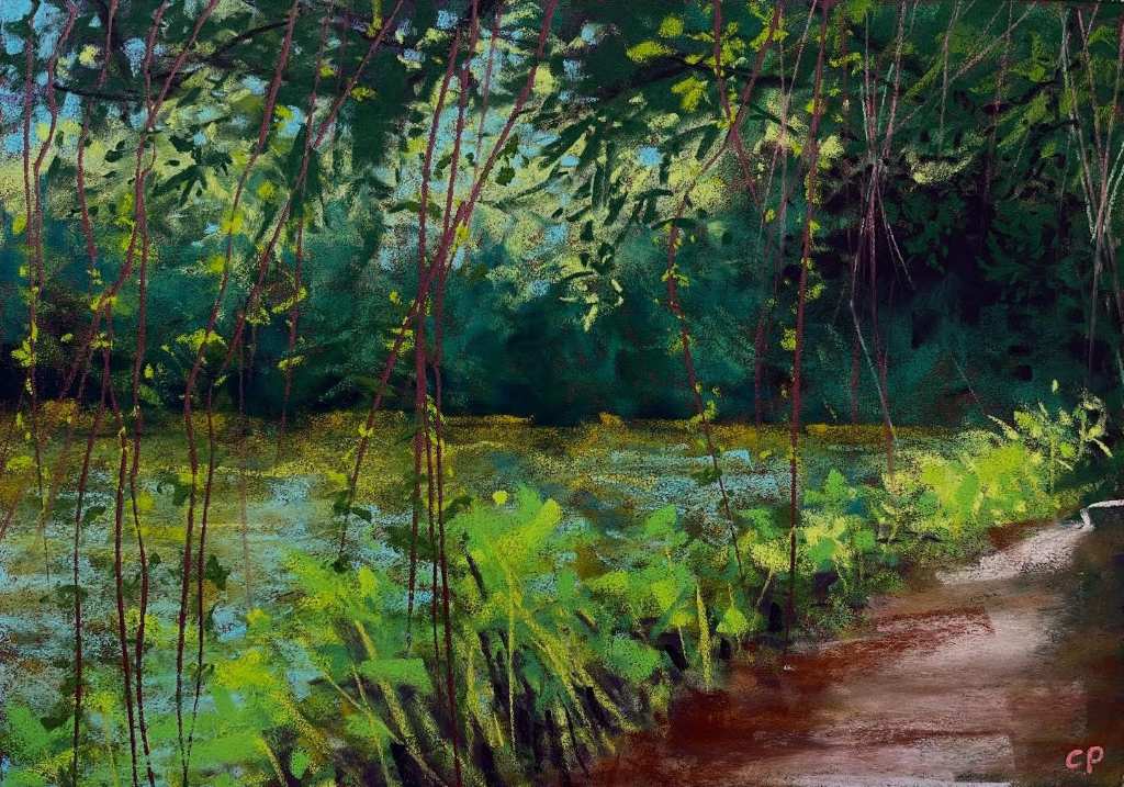
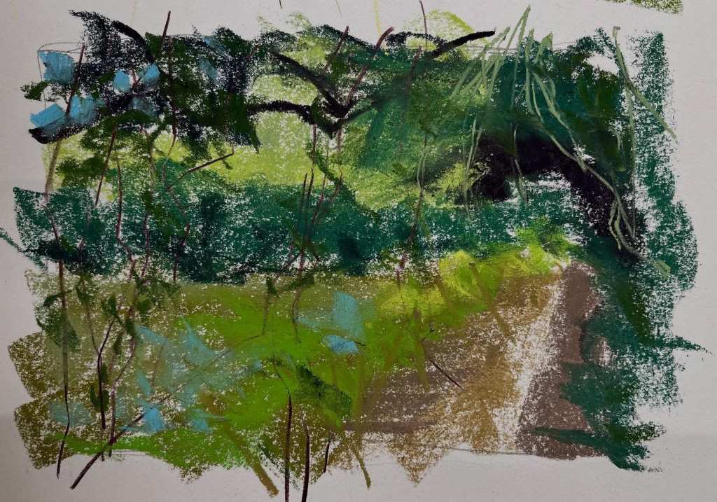
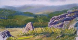
It is so interesting to see the way that Cathy shares her process and thinking, and to see how her pastel paintings develop. Her use of colour and mark-making is incredibly inspiring. Great to see how her skills are being honed by constantly observing and painting the landscape outdoors.
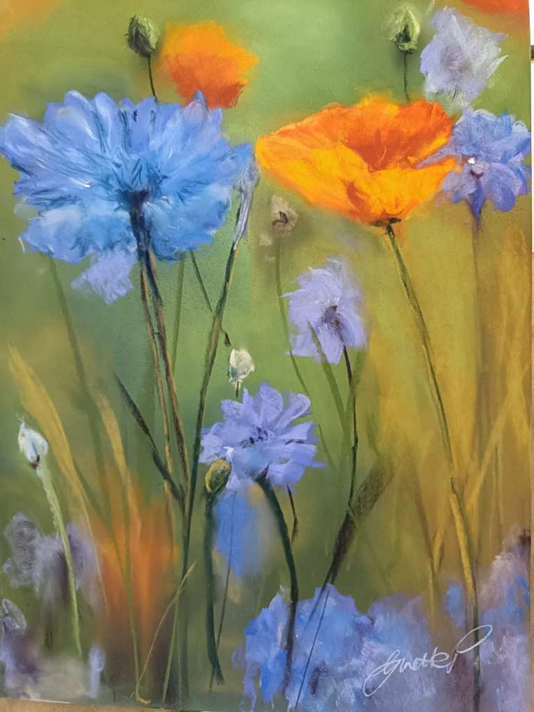
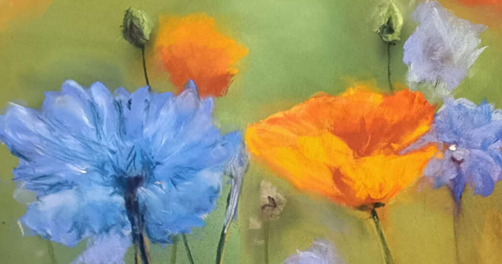
This is so soft, gentle and sensitive. I felt that I was outdoors in a field full of flowers on a warm sunny day. I love the fact that so much is conveyed with very little detail.
A huge thank you to Unison Colour for asking me to make my pick this month, and for giving us the opportunity to share our work in this Facebook group. It is always inspiring to look at the selection.