First of all, I would like to thank Unison Colour for the honour of having the opportunity to be a guest curator of Eye catchers, my selection of 10 images (accidentally 11! Our fault – UC) posted on the Unison Colour Soft Pastelling Community Facebook Group in September. It is not an easy task with so many great pastels to choose from, but it has been a great pleasure and very interesting to go in depth and see the quality of the different works. I have tried to look for artistic quality and pictures that have that little extra.
For Eye catchers October, I invite Unison colour Associate artist Emma Colbert to be a guest curator.
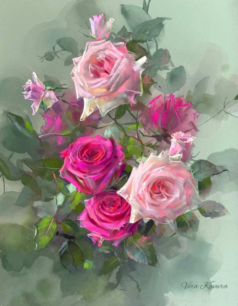
Vera’s pictures of flowers are lovely. Here she has chosen roses as the motif. I am impressed by the color combination and the harmony. The use and technique of pastel as a medium is amazing, just look at the light and loose strokes. The composition and depth of the image are also great.
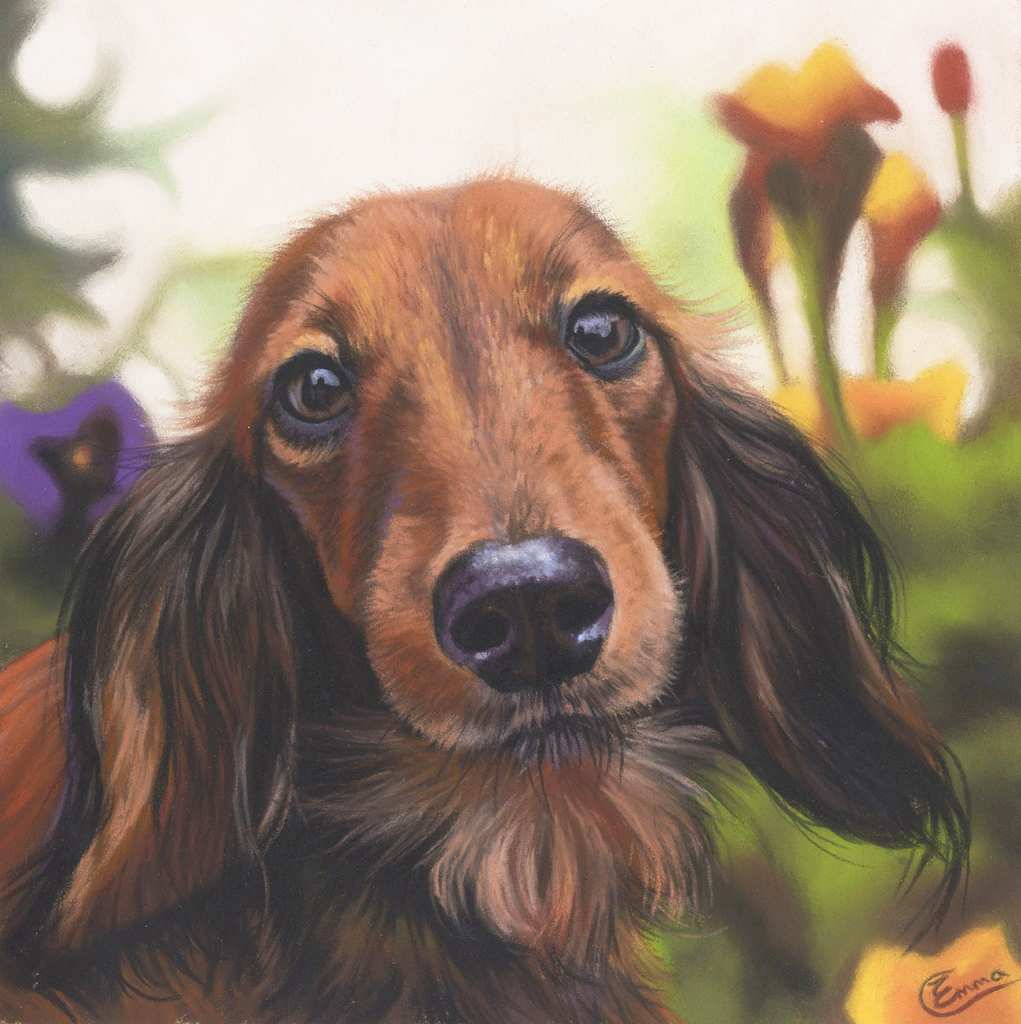
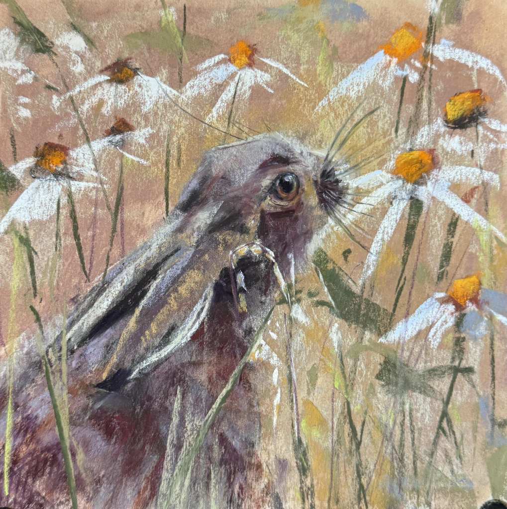
Emma Colbert is an experienced pastel painter as we can clearly see here in the motif of a lovely chap, I think it must be a Dachs. Excellent representation of the coat, beautifully executed eyes without too much white in the highlights. To highlight the portrait, Emma has blurred the background (Bokeh effect).
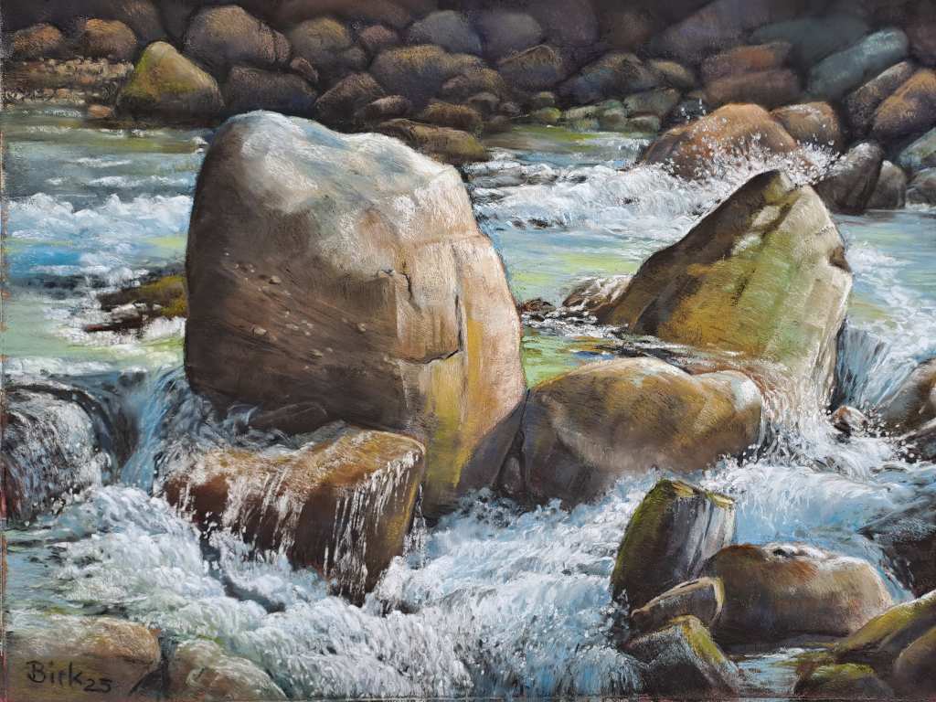
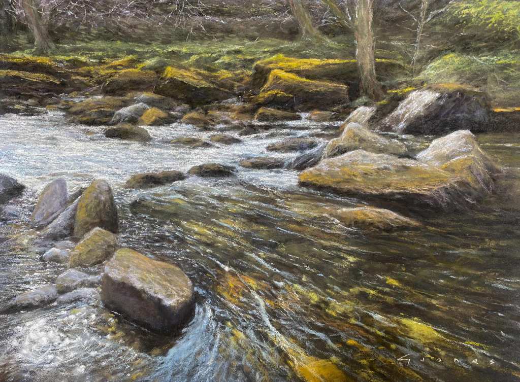
Kerstin has painted, as the title suggests, a small river. It is always difficult to achieve, but here she has succeeded with great result. The stones stand out with a beautiful structure and many colours. The image is darkened in the background to keep the focus on the main object which is the water and the two large stones. You can literally hear the water trickling here.
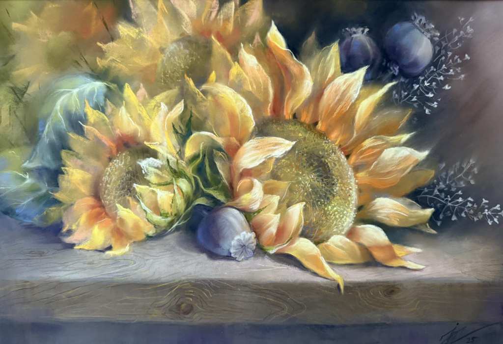
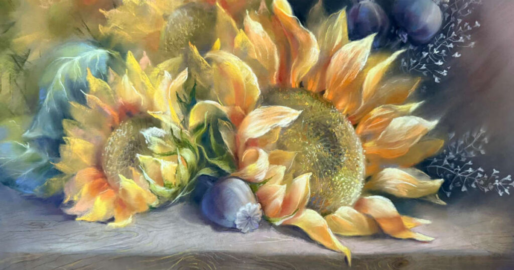
Sunflowers are widely used in the world of painting. I am very impressed with the use of the pastels’ properties here which has given the whole thing a blurred expression. Inne has used complementary colors aswell that help to make the motif glow.
Gareth is an expert on seascapes but shows here that he can paint running water as well. Beautiful motif that is close to my heart. The movements in the water and the transparency are very attractive, and you get the feeling of being present in the painting, which is a sign of good art.
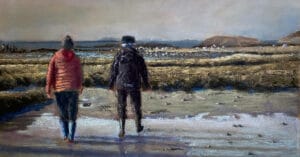
This picture attracted me right away. It has that little extra that is hard to put your finger on, but it has to do with the values and colors. Relatively loosely executed, but the values are right, and you immediately recognize the light and the mood.
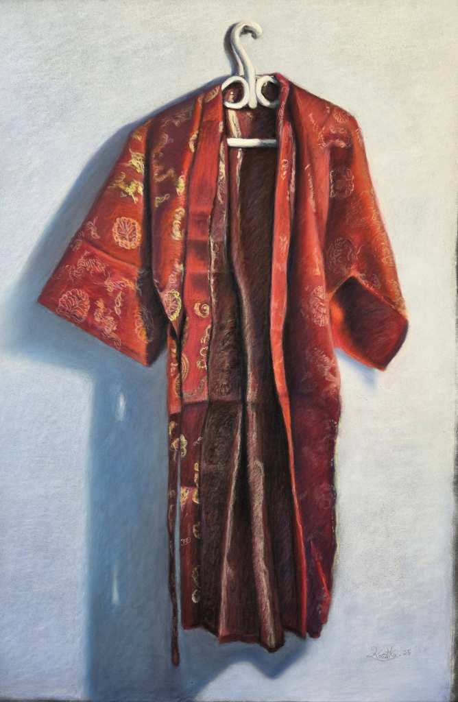
I was very fascinated by this image of a dressing gown. It shows, among other things, that you don’t have to go far to find great motifs. What caught my attention is how well it is done, notice the cross-hatching, and the use of broken colors.

Nel Whatmore has painted a beautiful sunset here. A beautiful sky that goes from greenish to violet. Very nice reflectors in the sea. Here, too, you feel that you are present in the picture.
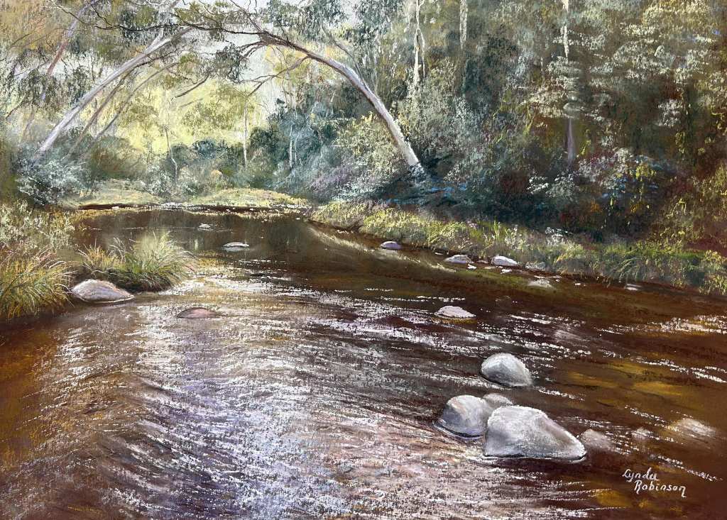
Lynda Robinson is particularly good at trees and water. Here, it is the water that is the main character. Great composition where the river leads you into the picture and under the portal made of 2 trees. I am impressed by her pastel technique and i am delighted by the transparency of the water to the right in the picture.
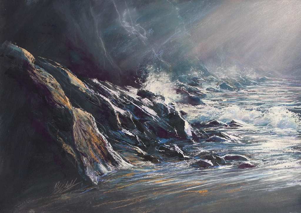
Rebecca is best known for her images of horses in different environments. But here she shows that she can paint landscapes as well. A dramatic sea scene painted in her familiar style. Here I think the rocks and the atmospheric perspective are particularly good. It gives the whole thing a dramatic touch.
Fantastic example of minimalistic use of pastel. I am impressed by David’s loose technique, sparingly use of the pastels and the paper show through. It makes the picture very vivid and expressive.

2 comments
Leone Madden
Absolutely brilliant and inspiring work Arild.. Your colours are so “alive”!!
Thank you for sharing 🙏
Arild Frisnes
Thank you very much, glad you liked it😃