As artists, like in lots of other aspects of life, it is good to have a number of tools in our toolbox. It is even better if we keep them nice and sharp through practice but, hey, we don’t always manage that – do we?
One such tool is the understanding and use of colour temperature. Colour temperature is an invaluable asset for landscape artists and their eternal quest for depth; indeed, if you use light at all in your work, an understanding of how colour temperature works will be that lovely sharp tool you can use to increase the impact of your pieces.
How Light works
Light is produced by vibrating atoms releasing their energy. Different types of atoms (different elements) have a preference for releasing this energy in different set amounts.
If you imagine our Sun as an “element factory”, it has a variety of types of atom all whizzing round at different speeds and bumping into each other. Once bumped into, atoms become energised – they don’t really like this and as soon as they can they lose this “energised” energy in little packets of light known as photons. Each element gives off photons in their preferred set amount (in reality atoms may have more than one preferred amount). Sometimes these photons (packets of energy) are absorbed by other atoms but eventually they escape from the surface of the sun and go off in all directions – some of which hit the Earth.
So, as you know the colours we see are:
Red – Orange – Yellow – Green – Blue – Indigo – Violet (the visible spectrum)
I should add at this point that we only see a small range of the photons that the sun produces – if you go past the red at one end you arrive in the world of infra-red and then microwaves. If you go past the violet at the other end you end up in the ultra violet and then into Xrays. Below is a diagram showing this.
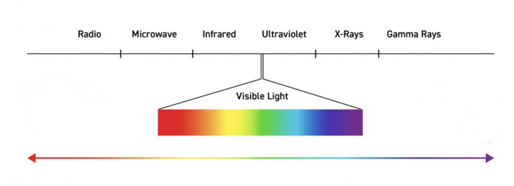
It is also worth mentioning that combinations of atoms (molecules) also absorb and emit photons with set energy amounts – one such molecule is water, consisting 2 hydrogen and one oxygen atom.
So, our eyes have evolved to absorb all of these photons and interpret them all added to gather as white light. Once the photons hit stuff around us some of the packets of energy get absorbed and some gets reflected (normally photons are absorbed by the same elements that they came from) – If you take away the absorbed photons from the white light, what’s left is what we perceive as colour. (So, a leaf absorbs all of the colours from white light except green which is reflected back to us). Our eyes are good at interpreting which photons have been absorbed and thus know what colour something is.
Let’s leave the science for a bit and have a chat about what colour temperature actually is.
What is colour temperature?
As you know – things that are redder tend to feel or be perceived as warmer and things that are bluer tend to feel or be perceived as cooler. In a nutshell that is what colour temperature it. If we look at a colour wheel and generally move towards the red side those colours we will perceive as warm. In contrast if we move towards the blue side, those colours we will perceive as cool. For a simple example – a red fire is warm, a blue iceberg is cool.
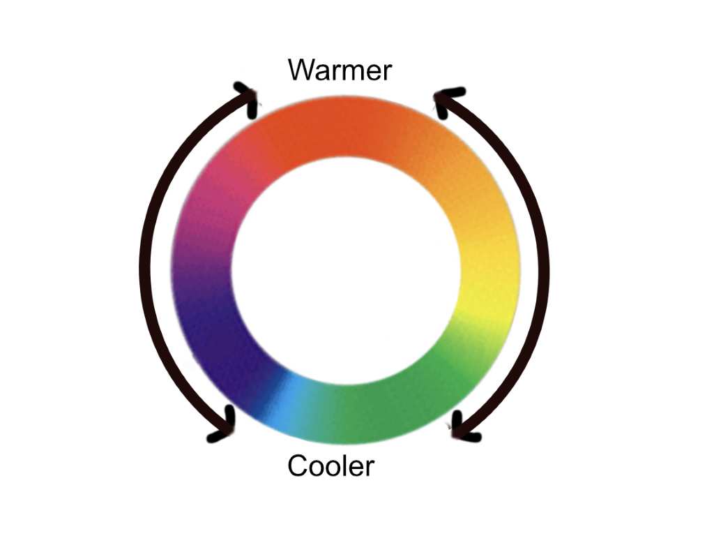
For an artist, colour temperature is a tool that is a lot more subtle – it is localised and relative. Now what does this mean? If we go back to our visible spectrum and take any colour (orange) if you move towards the red (reddy-orange) this is warmer than if you move towards the bluer side (yellowy-orange). Another example take green – yellow or yellowy green is warmer than blue green or blue. The diagram below shows this.
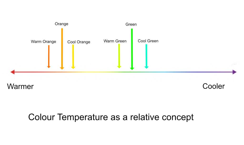
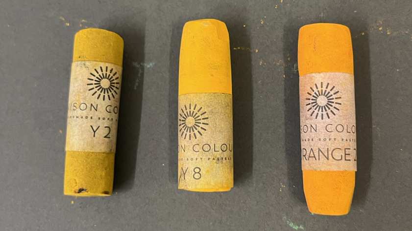
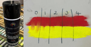
We now have the knowledge to work out what are warm and cool versions of any colour anywhere on the spectrum. There are two examples below (Unison Colour pastel numbers) – in each case it goes from cool, medium to warm, left to right.
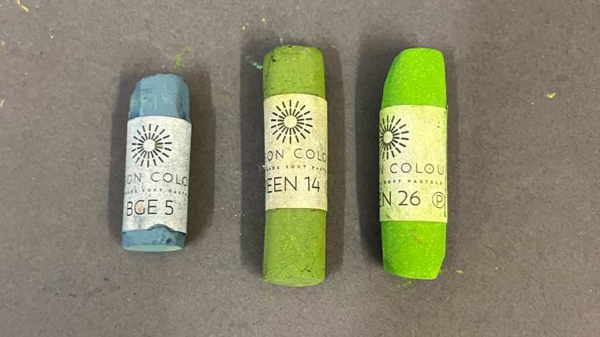
We now need to go back to some science to understand the reason behind our perception of warm and cool when it comes to colour.
Human perception of colour temperature
As I mentioned earlier – different atoms and other substances absorb different photons more or less readily. Bigger things (albeit still very small and on the atomic scale) tend to absorb photons towards the red end. Smaller things tend to absorb photons at the bluer end.
We are made of lots of water (2 hydrogen atoms and one oxygen as we discussed earlier), which is quite a big molecule so when light at the red end hits us it readily gets absorbed and feels warm (think of how standing in front of a glowing red fire feels). If you go past the visible red you already know that microwaves are very good at being absorbed by water molecules (this is how microwave ovens work to cook food).
Now at the blue end – these photons interact with much smaller things. Hence, if you go into the ultra violet area these photons aren’t absorbed by water molecules but are absorbed by the smaller components in our cells (much smaller than water) – hence it doesn’t make us felt warm but gives us sunburn and damages small components within our cells to give us cancer.
Here’s the interesting thing – photons at the blue end have much more energy and so are actually hotter – we just don’t feel that because we are mostly made of water. So red actually feels warmer than blue to us even though in reality it has less energy.
Red or redder colours are perceived as warmer purely because the water inside us absorbs them and we feel it.
Blue or bluer colours are perceived as cooler purely because the water in us doesn’t absorb them.
Now we know what colour temperature is and how it works let’s have a look at how it might be useful to us artists.
How to use Colour Temperature
The use of colour temperature is something of a gift to the landscape artist and it is all down to the atmosphere and the water molecules and dust within it.
We now know that photons from the red end of the spectrum get absorbed by water and ones from the blue end don’t (they are reflected or scattered by water molecules). We also now know that the local colour of an object is down to which parts of the spectrum are absorbed and which are reflected.
The further away an object is the greater distance the reflected light from an object travels through the atmosphere. As a result, there is more opportunity for the atmospheric water molecules to interact with these photons. As a result, more of the redder end photons get absorbed and our perception is that the colour of the object is moved in the bluer direction – yellow moves towards green, green moves towards turquoise etc.
This movement towards the blue is enhanced by another phenomenon. As we know the blue photons tend to get reflected by water molecules, so not only do our red photons get absorbed, some of the water molecules act like little mirrors to reflect blue photons towards us. This is also the reason that the sky is blue.
The net effect of these two interactions is that the local colour of an object is moved towards the blue as it moves further away. It is a relative effect so the perceived colour will depend on where you started on the colour wheel.
Considering our pastel landscapes, making things “cooler” or shifting things towards the blue end of the spectrum is an excellent way of moving objects away from you (adding depth) because this is what we see when we peer into the distance. Conversely, you can use warmer local colours to make objects appear closer.
Let’s look at some examples.
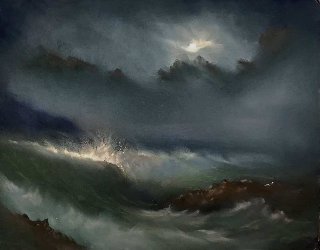
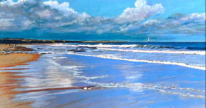
In “The Wave unseen” the strong lighting effect (Chiaroscuro) makes it difficult to use tone to put depth into the piece. As a result, I’ve tried to use colour temperature to achieve depth instead. The distant headland is blue (right at the cool end of the spectrum) in contrast to the brown of the right-hand rock, which is redder and hence at the warm end of the spectrum. The effect of this is to pull the rock towards us and push the headland back. Similarly, if you look at the main wave as it recedes to the right you’ll observe that I’ve added blue grey to the foam to try and push it backwards.
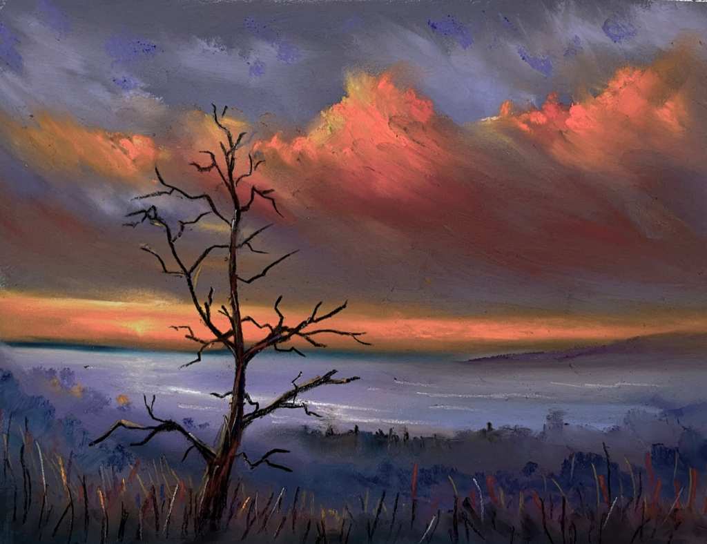
In “Transience” the foreground grasses and tree trunk are all in the warm (red) end of the spectrum, whereas the more distant items all sit in the indigo and violet areas. Indeed, right on the horizon there is an area of blue/green which is further away from red on the colour wheel than violet. The net result is that depth is added to the picture.
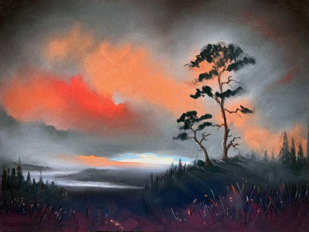
“Scots Pines – Distant Clyde” is a similar piece to the previous one but it is very useful at explaining the relative nature of colour temperature. We can see that the grasses (Indigo / Violet) are warmer than the mid-ground (cool green), which in turn is warmer than the cool blue grey of the distant land. All this works as before to introduce depth into the piece. The thing to note is that in “Transience” the recession worked red/orange to violet to blue/green whereas in “Scots Pines” the recession worked violet to cool green to blue/grey. The warmest colour in “Scots Pines” was the middle colour in “Transience”.
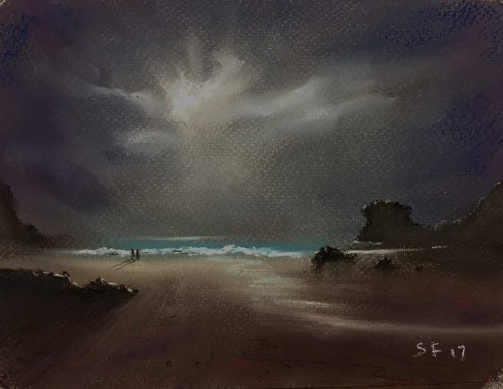
The effect of colour recession (colour temperature) is a lot more subtle in St Agnes moonlight due to it being a nocturn. Colours are a lot more subdued in moonlight. However, if you look closely you’ll spot the relatively warm colours (reds and violets) in the foreground sand area. These warm colours are being deliberately used to pull the beach closer to the viewer than the cooler turquoise of the ocean.
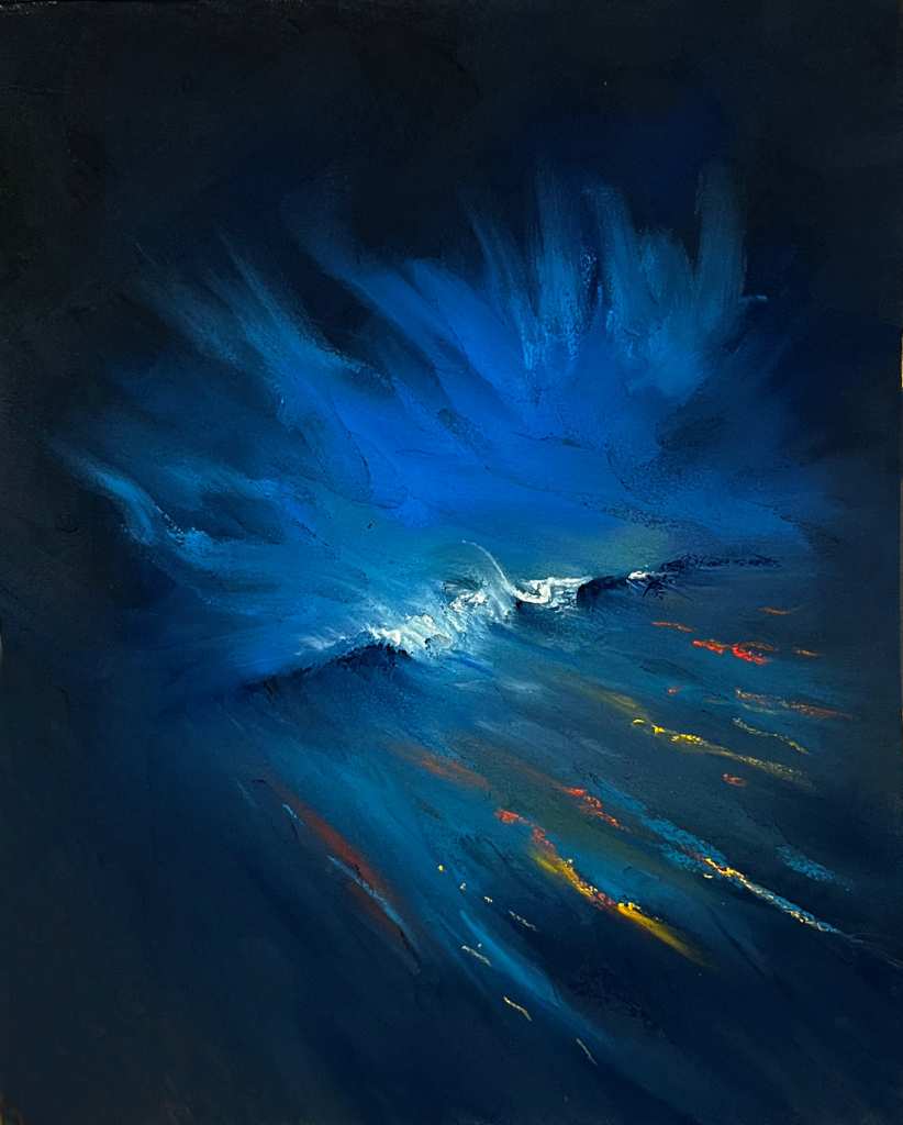
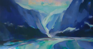
The use of colour temperature is much more overt in “The Ocean Whispers within”. The bright red, orange lines in the foreground are a device to pull the foreground towards the viewer in order to combat the possibility that the piece might appear relatively flat and 2D if it was completed in purely blue or blue green. They also add drama being complementary to the sea/sky and add the necessary perspective to make the odd angle of the wave work for the viewer.
Light Sources
A second use of colour temperature involves light sources (mainly the sun or moon) and colour coherency within your landscapes.
As we now know, the white colour of the sun at sunset and sunrise is modified due to atmospheric effects. The blue end photons are scattered by the water molecules more strongly than the red light photons are absorbed. As a result, sunsets and sunrises are shifted towards the warmer or red end of the spectrum. We’ve all sat there and watched nature’s glorious display as the sun sets and we are bathed in that red glow.
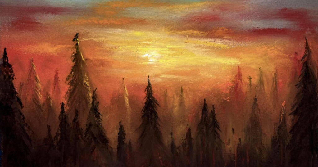
One of the things we love as artists is to add those sparkles and little points of reflected light as it can really bring our landscapes to life. If we use the same colour temperature as our light source it makes the landscape much more believable. If the sunset is red – use red as the highlights on wet rocks and grasses etc. Similarly, use the same colour as the light source in your “mists and vapours” and “the sublime” will follow. The same would apply to street lights – these are often orange due to the use of excited sodium gas (atoms) to generate the light. If your night time highlights from sodium lamps are “orangy” your piece is likely to be much more compelling.
Let’s look at some examples of this.
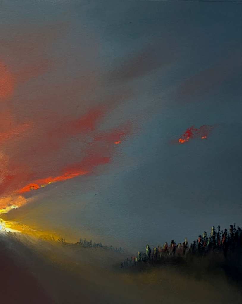
In “Last Light” the “sparkles” of the light hitting the foreground trees are the colour temperatures that are present in the sunset, which makes them much more believable and adds to the atmosphere of the piece. Similarly, that warm orange light streams into the foreground and highlights the mist in a similarly warm and coherent glow. You’ll also have noticed how the distant trees are bluer than the foreground ones which pushes them back (albeit with some of that warm orange scumbled over the top).
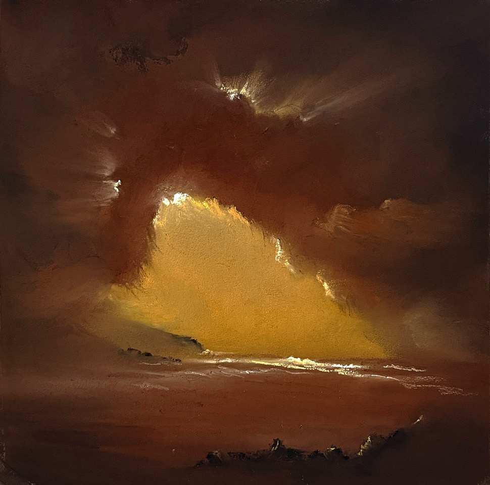
The first thing to note in “Clearing Skies” is that there is no white used. All the highlights (waves, rocks and clouds) are light tones of the same yellow/orange light that pervades the whole picture. This colour coherency plus the strong tonal differences used are the two engines that drive the atmosphere of this picture.
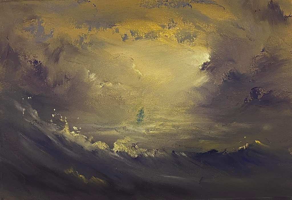
Just like the previous piece there is a muddy yellow/orange light creating the atmosphere “Storm”. One thing to particularly note is the colour coherency in the bright spray sparkles which really helps with the colour temperature coherency of the whole piece. Another noteworthy thing (outside of the thrust of this blog) is that violet / violet grey has been used for the darker tones which is the complementary of the yellow and adds drama.
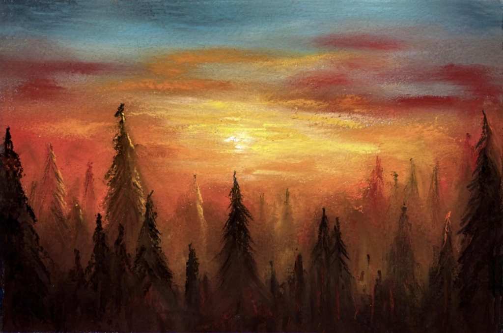
In “Do crows dream of more?” it is easy to see how the colour temperature of that sunset has been pulled through the mist and tree highlights to create a coherent, peaceful and thoughtful piece.
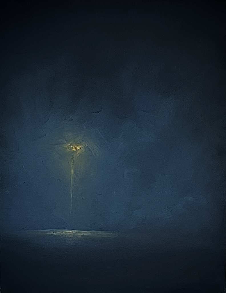
“The secrets..” shows a single sodium street light glowing in the darkness. The coherent orange glow from the mist, from the post’s reflection and from the ground glow ties it all together and allows the street light to take form with a minimum of information.
A word of warning
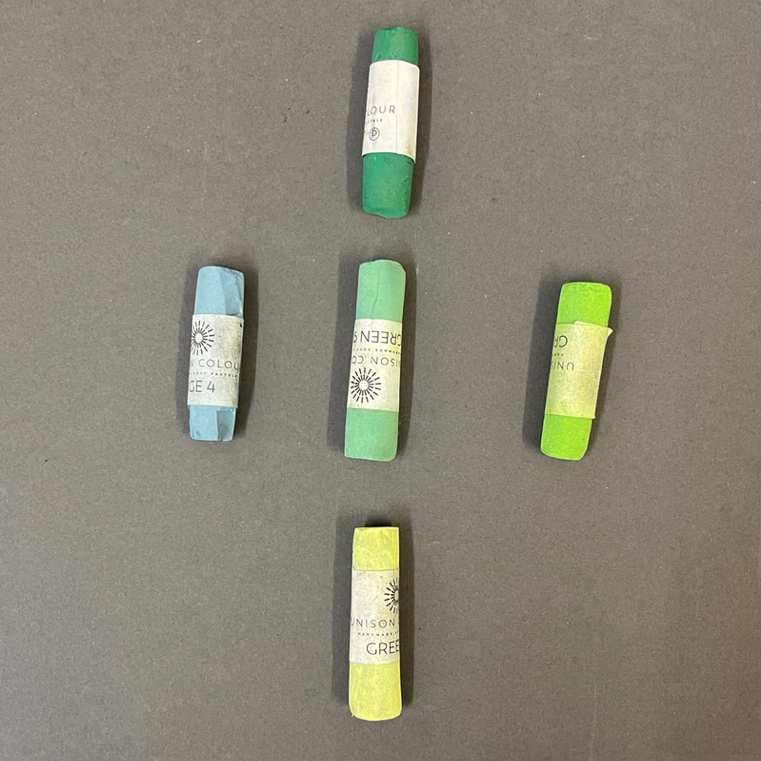
Colour temperature and tone (value) are not the same thing. Colour temperature is whereabouts a colour sits on the visible spectrum and tone is how light or dark that colour is – it is important to avoid mixing the 2 up (there are no warm tones just tones of a (relatively) warm colour.)
The picture below shows the difference – horizontally we have a cool, medium and warm green of the same tone (assuming the middle green as our relative starting point). Vertically we have three tones or values of the same medium green.
Summary
With regards to colour temperature, we have discussed the following key points:
- Colours from the red end of the visible spectrum are perceived as warmer and those from the blue end are perceived as cooler.
- Colour temperature in artistic works is relative (turquoise is a warm blue but is also a cool green).
- Due to atmospheric interactions with light, warm colours appear closer and cool colours appear more distant.
- Colour temperature is a useful tool for creating coherency in your work – particularly when considering your “sparkles”.
- Colour temperature is not the same as tone.


1 comment
Julie Campbell
Wonderful article, as usual Mr. Fuller, with fabulous reference paintings.
So, in the last image
– the tones/values appear the same when changed to grey scale
– the temperatures appear as different.
I have a lot of trouble recognizing similar tones of different colours and only seem to be able to see the differences when they are in grey scale.
Hopefully, this is easier with time – seems to be taking eons to learn.