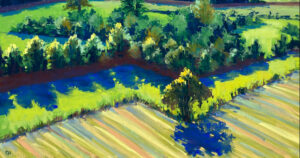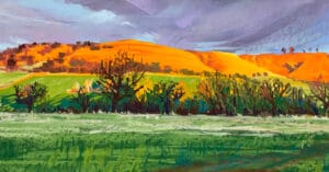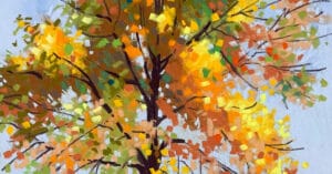
With a grin I sometimes introduce myself as the mad lady who paints the hill. Roundway Hill near Devizes in Wiltshire and the surrounding fields are my subject as I love to observe them every day. Unison Colour pastels are my chosen medium as they are extremely versatile, encourage expressive mark-making and have an immediacy of use which gives me a lot of pleasure whilst painting. Writing this blog in July coincides with both taking part in Marlborough Open Studios and the development of my August/September pastel workshops. Therefore, the timing is perfect to share with you the process I have employed in painting “Gold Splashes Through the Dark Oaks.”
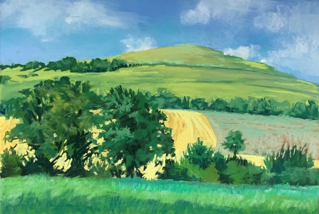
I chose a favourite spot a short walk into the fields. What really struck me was the contrast of the sun splashed field behind the dark green oaks and the way the gold filled the spaces between them. For a few minutes I absorb the scene, scribbling some notes to describe the sights and sounds of the moment. A very quick charcoal sketch came next to outline the composition I wanted, followed by a second sketch to focus on a bit of detail to include in the finished painting. A couple of photos always help as a colour reference.
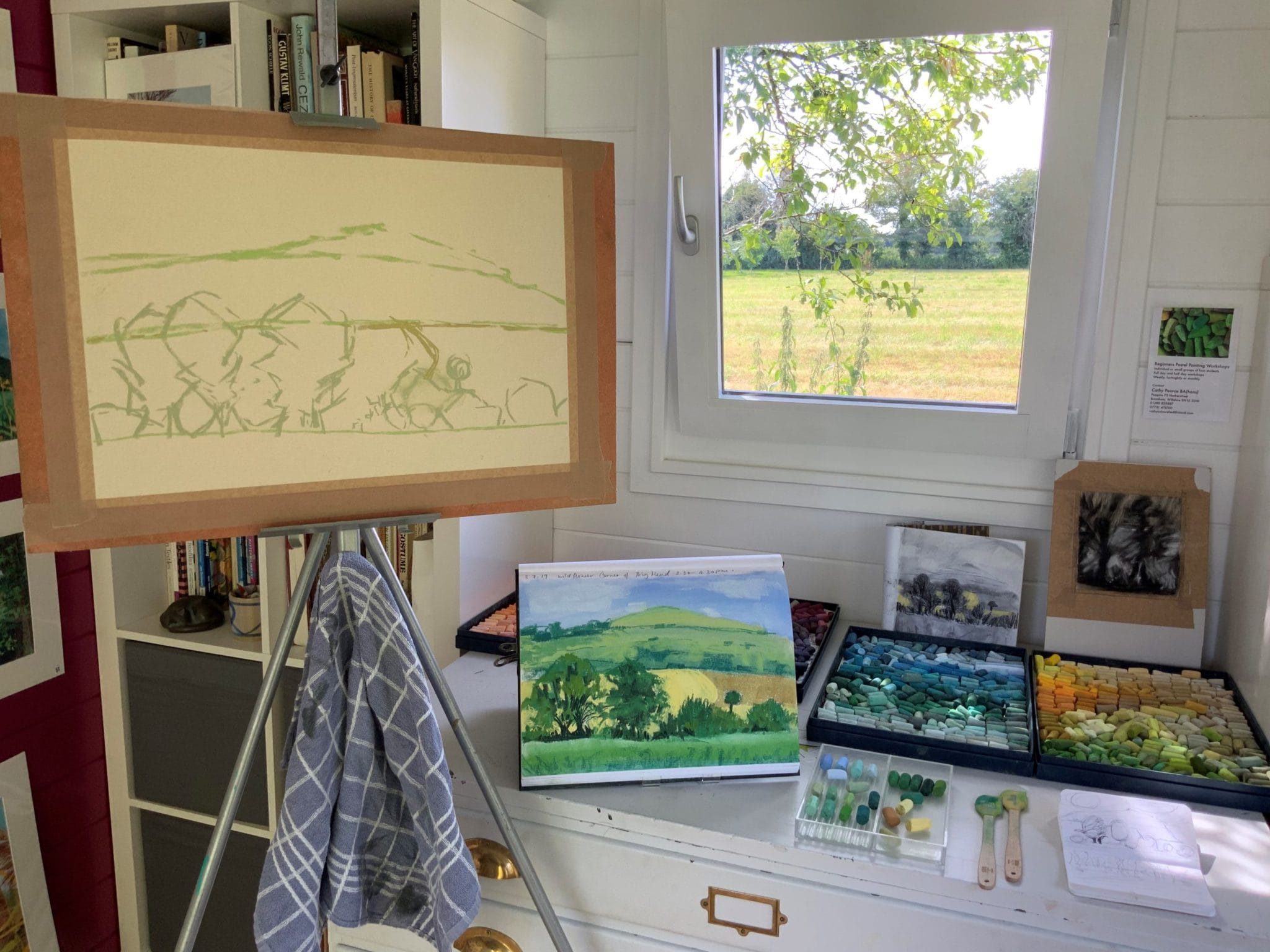
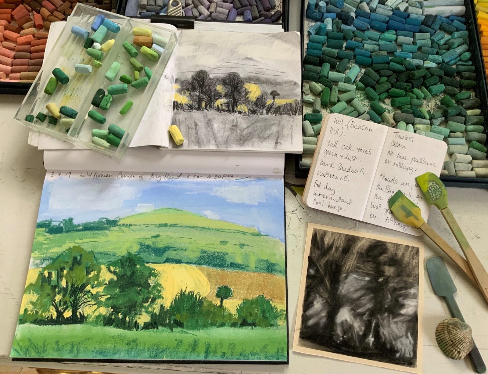
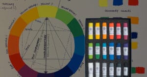
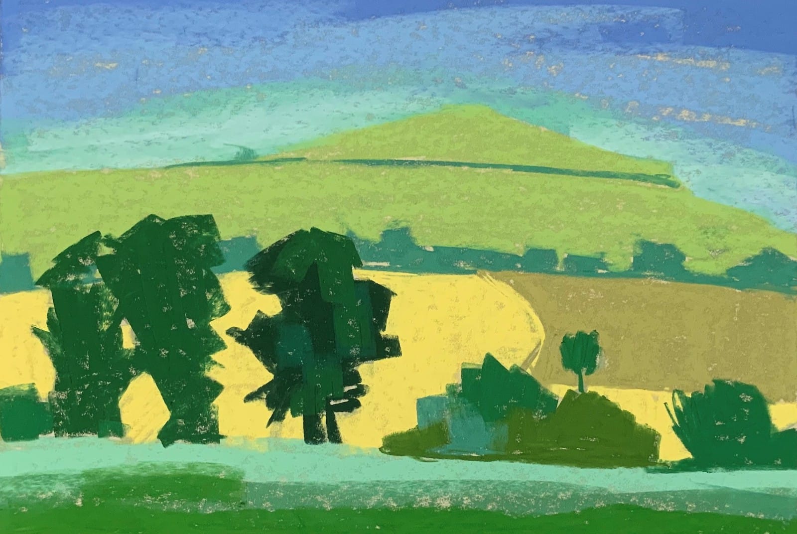
Back in my studio I lay my resource material of sketches, notes and photos around my sketchbook on the plan chest and begin the next and most exciting part in my painting process which is what I call the “quickie colour sketch.” I initially designed this exercise to reduce procrastination and to bring momentum into choosing my colours, encouraging expressive marks and to get an idea of my composition down on paper. A few sketchbooks later and this process has become a wonderful record of all my work.
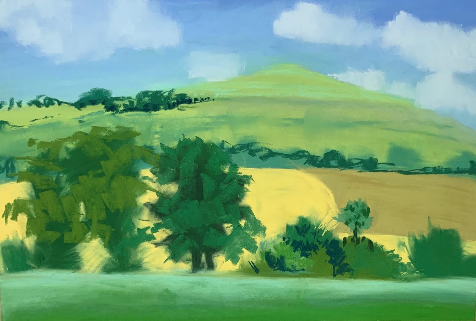
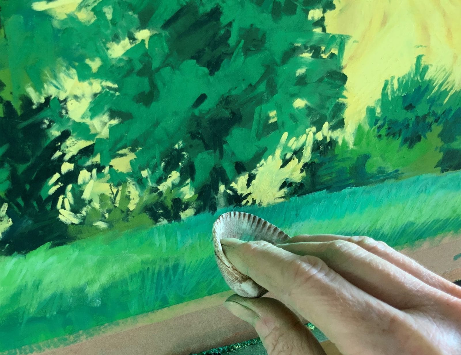
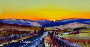
With the addition of my colour sketch to work from I roughly draw the composition using a light coloured pastel on sanded paper taped onto my easel. I then block in each area of colour, quite thickly so all the paper is covered, and once I have blended these using a mini silicone cooking spatula I have a smooth buttery surface on which to define colour and detail. I have quite a collection of blending and sgraffito tools. Here you will see me using a shell to scratch detail into the foreground to suggest grasses. When the painting is completed I initial a corner, give it a final spray with fixative and slip it into a basic mount.

Here I have briefly shown you one simple way to use your pastels, however, there are many different techniques to try. I recommend that you spend time researching and experimenting until you find a method which most suits your style and subject, then perfect the process until you really make it your own.