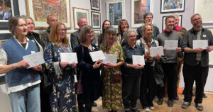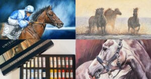
In 2024 Unison Colour continued to support the Society of Equestrian Artists annual ‘Horse in Art’ Exhibition, with the donation of a pastel prize.
And this year there were more pastel works in the show, making it even harder to win the Unison Colour Emma Colbert Set of 18 Pastels, which was awarded for the best work in a dry medium. The much-deserved winner was Maureen Prottey, with ‘Spartacys’.
Read on to find out more about Maureen’s inspiration for this beautiful pastel, and also an insight into how some of the other pastel artists in the Society of Equestrian Artists create their work.
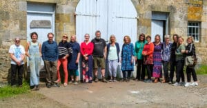
The exhibition, held at the Rose Paterson Gallery at Weston Park in Shropshire during September, featured the work of 65 members of the SEA, from the four corners of the UK and some from overseas too, with a spectacular 130 works on show. It was a wonderful celebration of equestrian art and you can view the online catalogue here (link now expired).
Let’s take a look at some of the pastel work on show…
The Unison Colour Award
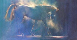
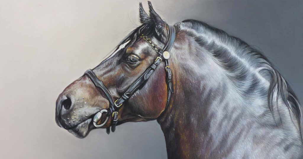
‘Spartacys’, by Maureen Prottey, was the winner of the Unison Colour pastel prize .

Maureen says;
“I was absolutely amazed and delighted to win the prize. It was so unexpected, particularly as the standard was so high. Thank you so much, it was such an honour.
I have a huge love of horses, particularly the Welsh ponies, and Arabians. This stallion had so much fire and presence and I wanted to capture that life! Also, the shine on him was amazing, and quite a challenge.
I use a selection of pastel types along with coloured pencils. For the backgrounds I use Unison Colour because of their wide colour range and blending ability. I very lightly spray the base layers which allows me to add the coloured pencils to add definition and fine detail. I use all makes of pastel pencils, but for the final details I like Caran D’ache. The coloured pencils are Faber-Castel Polychromos, and Caran D’Ache Pablos.
On a full body portrait, a head with a bridle on can be very small and the coloured pencils do help with this. I love the blending ability of pastels, and the level of detail I can achieve. They are also much quicker to produce than oils.”
You can see Maureen’s work on her Facebook page – @Maureen Prottey Equine and Wildlife Artist
The Visitors Choice Award
It was wonderful that the Visitors Choice award at the exhibition went to a pastel!
‘Are You Looking at Me?’ by Rebecca de Mendonça ASEA also won the ‘Best work by an Associate Member’ award, so it was great to see the pastel work really celebrated!
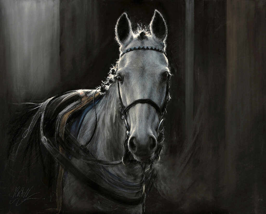
Rebecca has been a great fan of Unison Colour pastels for many years, and this piece was created on Art Spectrum Colourfix Primer, colour black. The under layers were created with Pan Pastel, creating a soft base for the main work done with Unison Colour pastels. Pastel pencils, Conte Carré crayons and charcoal were used for detail and subtle work on the fine coat. However, details that needed to be bright, such as the light catching around the head and plaits in the mane, had to be done with a broken shard of Unison Colour pastel Grey 28, as pastel pencil just wouldn’t ‘pop’ enough. Rebecca says, “There is nothing quite like the pigment power you get with a Unison Colour pastel when you want sharp, clear details and highlights.”

You can see more of Rebecca’s work and find out about her teaching on her website.
Rebecca will be creating a video workshop in the new year for Unison Colour showing how she captures horses in pastels. More news on that soon!
Dramatic Lighting
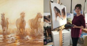
Another artist whose pastel work stood out was Nicola Eastell. Nicola had two pastels in the show, ‘Ouro’ and ‘Vento’.
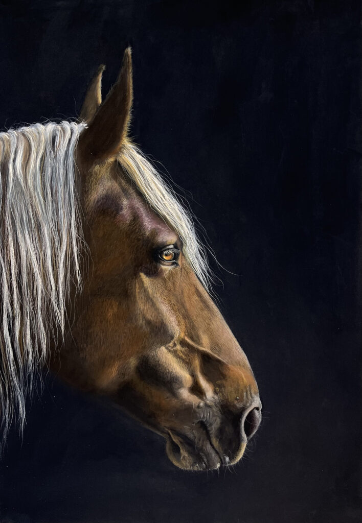
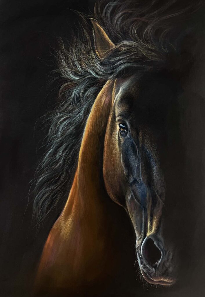
Nicola says; “For my work in the SEA show I used Unison Colour pastels and a mixture of Stabilo Carbothello and Pitt pastel pencils.
My inspiration always comes from the way the light falls on a subject and the mood that this creates, be it drama or absolute peace. The two ends of this scale can be seen in the two pieces that I showed at Weston Park, one being a dramatic windswept horse galloping, the other calm and quiet.
I find that I can convey this mood in a way with pastels that I can’t with any other medium.
All of my work now is done using soft pastels and pastel pencils. I mainly use Unison Colour because I can’t get the depth of colour and “glow’’ with any others.
With pastels I can build the layers by using soft pastel to mould the shapes of the horse and then, particularly with the head portraits, I go in with the pencils for the fine detail of the eye and many layers of hairs. With pencils I feel that I can get closer to the animal and feel my way through the portrait, something that I was never able to do with paint.
I always start with the eye which enables me to feel a connection to my subject.
I hope that this connection shows in my work and that people can see the love that I feel for these incredible beasts.”
You can see more of Nicola’s work on her website, or her Instagram account @nicolaeastellstudio.
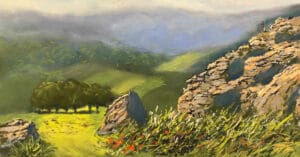
Fresh and expressive
The pastels in the exhibition showed a variety of styles, from traditional to more contemporary. Associate Member Alasdair Banks ASEA has a fantastic fresh and lively approach to his pastel work, shown here in his piece, ‘Out of the Blue.’
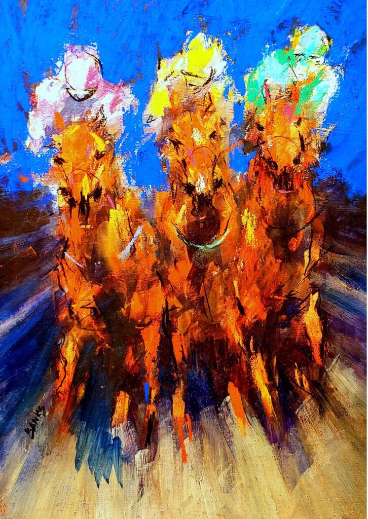
Alasdair often works in mixed media, but says; “‘Out of the Blue’ is in pure pastel and has a unity and continuity of surface that my more usual ‘mixed method’ pictures don’t have. The more incisive lines are in a harder Prussian Blue pastel.
It also allowed me to explore in more depth the many possibilities of pure pastel while still keeping my familiar expressive style. The first of many pastels perhaps…”
Let’s hope so as Alasdair’s work is full of energy and so inspiring!
Creating a story
Pastel artist Teresa Allen created two pieces for the exhibition, with the intention that they were hung together.
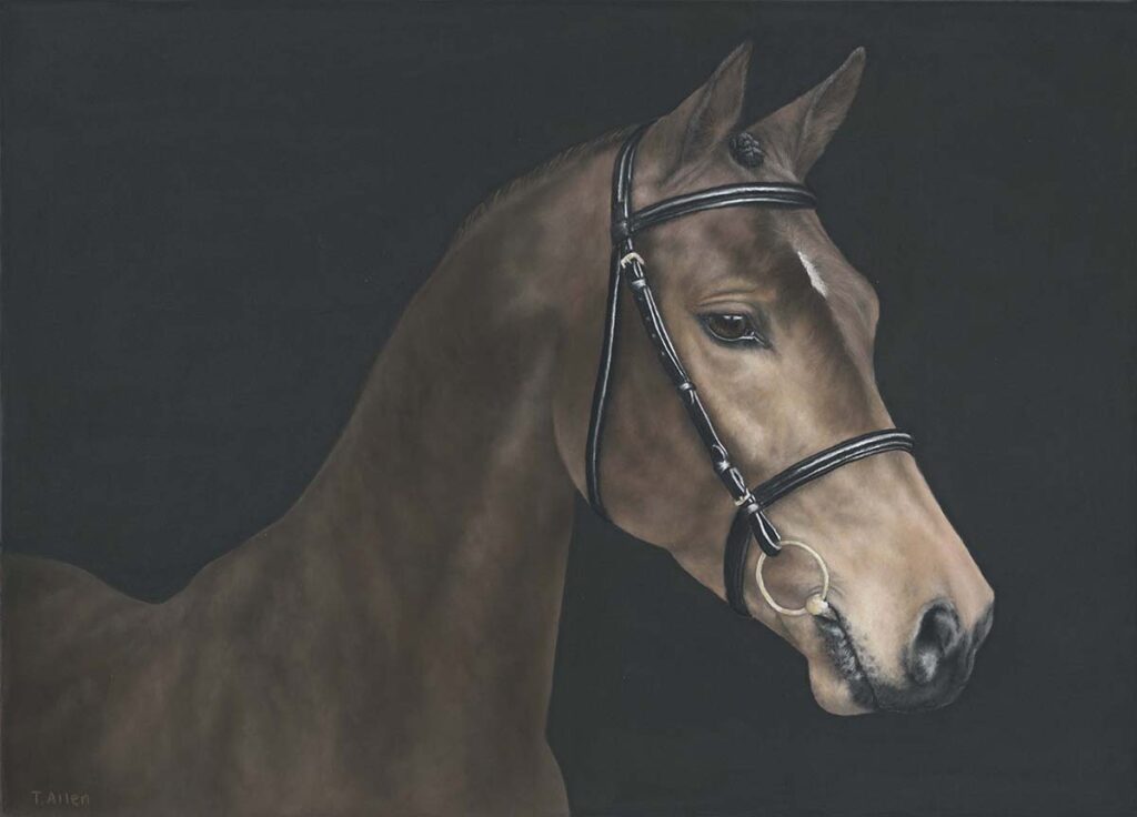
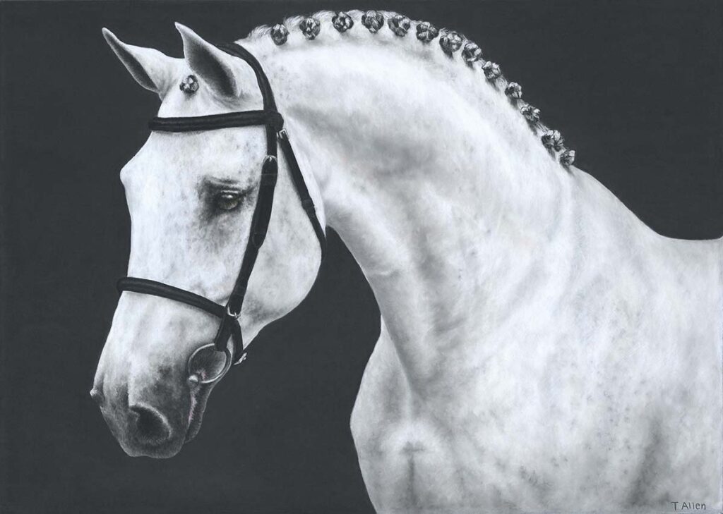
Teresa says; “The idea was for the two artworks, each exceptional in their own unique way, to come together as a pair and create a combined narrative. As the pieces hang side-by-side, I wanted to give a sense that they were ‘talking’ to each other as any mare and stallion would when meeting for the first time.
I used a mixture of soft pastels and pastel pencils for these pieces, plus charcoal for the background.
I love the tactile, textural nature of pastels and the ability to produce a piece of work that allows the viewer to really imagine what the real animal would be like to touch.
I also feel a deeper connection to my artwork because I have a direct link between the pastel in my fingers and the marks I make on the paper.”
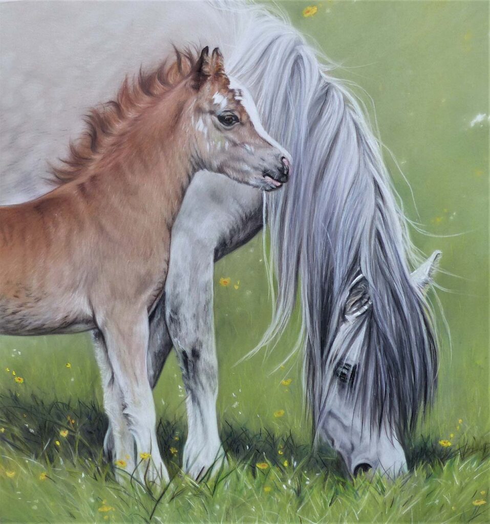
Different breeds of horses
Many of the artists in the show have an interest in a particular breed, and Catherine Averill, says; “I have decided to go down the route of rare breeds, particularly Shires and how they are a spectacle of their own with their flashy harnesses, braids and the enormity of the breed – they need preserving! So many people know the breed, yet do not realise they are an endangered breed along with many draft breeds in the UK.”

“I find the pastels forgiving, now I have established what set up works for me after coming away from coloured pencil.
I think pastel is a great medium that can be heavily overlooked by aspiring artists. There was a time I could not for the life of me get on with pastel and it did become a question of whether I could see myself continuing with it – but like most mediums, it’s about finding the right tools for the job, doing your research and persevering. Most importantly it’s about enjoyment.”
These are such wise words by Catherine! We really need to find ways of working that suit us, and then to remember to enjoy it!
You can see more of Catherine’s work on her website.
Capturing softness
Our last piece is ‘Whisper’ by Sharron Harrington.
Sharron says; “I used soft pastels, Unison Colour as well as Sennelier, and a few faber Castell pencils.
I crush some of the sticks and apply with a brush wet as well as dry for the base.
I prefer the versatility of pastels and the blending capabilities. I can create softness, texture and fine details. They are perfect for the way I like to view horses in my paintings.
Whisper…..capturing the inner softness and beauty of horses, they whisper, never shout, they teach me to listen.”
What a beautiful and fitting way to finish…
You can see more of Sharron’s work on Facebook, @Sharron Harrington Art
The Society of Equestrian Artists
Altogether the Society of Equestrian Artists ‘Horse is Art 2024’ exhibition was a fabulous show, and the SEA are very proud to be working with Unison Colour again this year.
They are a really friendly bunch of people with plein air workshops with horses held to draw and paint throughout the year, where Full Members share their skills.
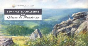
Online Unison Colour workshop coming soon
Rebecca de Mendonça will be sharing her pastel techniques for capturing horses in more detail soon in another blog here and also with a Unison Colour video workshop. More details early in 2025…
In the meantime, we hope this has inspired you to pick up your pastels to draw and paint horses!