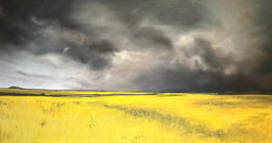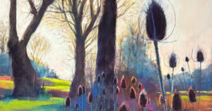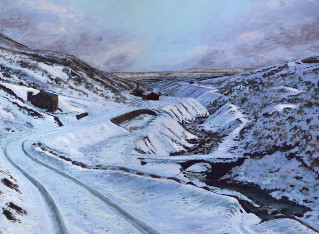
June isn’t the most obvious month for thinking about winter scenes – but for me it’s when I start to plan out my Christmas card designs (I know – too early!). The main focus of my work is wildlife and for some reason I have always struggled to get inspired by landscapes. If you are the same, then this exercise can be a good place to start. Choosing a winter scene limits your colour palette and creates strong contrasts. For this image, I used a palette of mainly blues and purples and then yellows at the end to add contrasting highlights. No black or white was used in producing this picture!

I began by mapping out my composition with a range of midtones in purples and blues, then adding lighter hues to create definition. I then focused on the distant hills and the sky, muting the colours slightly but keeping it cool and crisp. I chose pastels such as A32, A33, A34, A51, A55, Grey 8, Grey 9, Grey 10, BG5, BV10, BV8 throughout.

I then started to put in the really dark tones. For these the Unison darks are brilliant such as Dark 19, Dark 20 and A49. A snow scene can create really strong contrast and I accentuated this further with the darks colours as I feel it creates a more striking result.

When working on a picture I don’t focus on one ‘section’ at a time. I try to work on the picture as a whole which creates a stronger sense of unity. I keep going back to areas to add highlights, texture and detail (whatever it needs). I usually leave the contrasting highlights until the end as these are the points that can really lift and finish the picture. For those I used colours such as A7, Light 3 and A31. I also used a small amount of Orange 6 which really lifted certain areas.

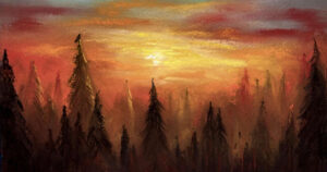
Limiting my colour palette was oddly liberating and therapeutic. It was easier to regain focus on tone and composition and I would recommend it to anyone. If snow scenes aren’t your thing then a sunset or a scene at dusk (below) can also work really well as a starting point.