Foreword from Stephen Fuller
Next in the series of ‘Me and My 5’ blogs is Unison Colour Associate Artist, Gareth Jones. Gareth is particularly known for his exquisite seascapes and landscapes, which combine exceptional pastelling talent with an ability to connect with the observer and engender real feeling when viewing his often-large-scale works.
Gareth: –
Firstly, I am very honoured and thankful to Stephen Fuller and Unison Colour for asking me to select 5 of my personal favourite paintings, and to write a little about each work.
Mine has been a comparatively short relationship with soft pastel, having been introduced to it belatedly, less than 10 years ago.
Although clearly familiar with the work of master pastelists such as Degas and Lautrec, I discovered that a whole new world of astounding contemporary art existed in this incredible medium, and I was amazed at the quality and diversity of work that could be achieved with these magical sticks of colour.
As an artist working primarily in acrylics at the time, I first experienced Unison Colour Pastels at a Tony Allain workshop, and it proved to be the catalyst for the most exciting, and unexpected, personal journey.
The moment I combined quality pastels with the right surface, it was a Eureka moment, I knew immediately that I had discovered my true medium. The direct application and tactile experience were thrilling, and the quality of mark making and depth of colour were outstanding.
Learning the intricacies of soft pastel has required patience, and is certainly an ongoing process, but I have been fortunate to have since become established in pastel circles, gaining many awards and achieving accreditation beyond my dreams. I now work exclusively in the medium, and I have become a pastel evangelist, sharing and teaching others of its qualities, across the UK and Europe.
I am naturally drawn to water, and I’m mainly inspired by the sea and the coastal fringes. When becoming a professional fine artist belatedly in life, I lived directly on the coast in South Wales, and the sea in all its wondrous moods, provided the perfect inspiration. There is a certain irony though, in producing convincing portrayals of water in a dry medium!
I rarely use a wet underpainting technique, preferring to work completely dry on my favourite surface of Sennelier LaCarte pastel card.
The effects of light in each of my selected pieces are evident, those fleeting moments where the ordinary is transformed into the magical. It is those moments that I strive to capture, to invite the viewer to stand in my footsteps and experience the thrill that compelled me to capture them forever.
For varying reasons, I have been far from prolific in my pastel career, but even so, the task of identifying 5 favourites was a daunting prospect, akin to choosing a favourite offspring!
What criteria should be applied?
Breakthrough pieces that marked strategic development? Paintings that have earned awards or been accepted into prestigious competitions?
Works that have proven to be the most favourably received across social media across the years.
Or just paintings that I personally considered to be my finest work?
Looking back at my portfolio, certain pieces still spoke to me more than others. They stirred emotions and elicited more pride than others, and they began to select themselves.
I have been very fortunate to have lived in some stunningly beautiful parts of the UK in the past 10 years and also to have travelled extensively across the world. As a lover of the outdoors and a painter of nature, I realised that these locations have been very influential to my work.
So, the five I have chosen, are not only paintings that I consider to be amongst my most accomplished, but also ones that represent places that I have a deep emotional connection for – and therefore I regard as fitting favourites.
Rest Bay, South Wales
South Wales was the place where my dreams of becoming a professional artist first began.
This was a view from the cliffs at Rest Bay, Porthcawl, on a stormy evening, the low sun emerged from cloud, casting dramatic violet shadows over a very lively sea. The contrast between the meeting of these powerful rugged elements, bathed in a soft, almost eerie light, was compelling.

‘Breaking the Shadows’ 18×14”
Holkham Bay, North Norfolk
I returned to live in North Norfolk, England, for the second time, in 2013. It holds a very special place in my heart, it’s my second home, and it’s where I painted my very first pastel.
The big skies are legendary, but the sea isn’t dramatic there, yet the beaches and marshes, fringed by pine woods are spectacular in their simple and expansive beauty.
Although it can be a very busy place these days, moments such as I captured here, can still be easily found. This particular morning was greeted by a warm early sunrise, with not another soul in sight, and only birdsong for company.
‘A Welcome Solitude’ 20×20”
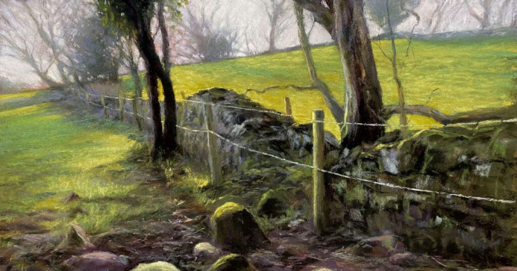
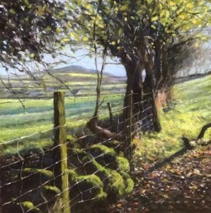
Clwydian Hills, North Wales
Following serious illness, I returned to my country of origin in 2018. It was an emotional homecoming that provided new challenges and entirely different inspiration. The rolling hills and the lush green pastures of home lifted my spirits and stirred my soul.
Challenging angles and shifts of light came together successfully here, in a painting that typifies the simple rural views that I encounter each day, on my morning dog walks.
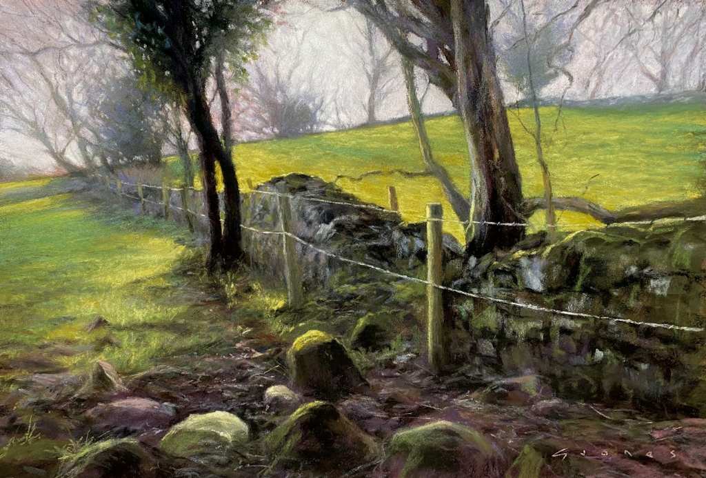
‘The Grass is Always Greener’ 12×18”
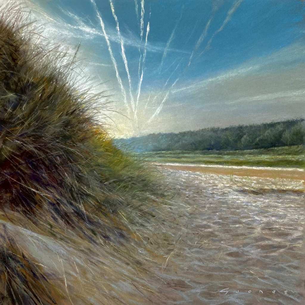
Rhosneigr, Anglesey, North Wales
North Wales provides infinite beauty and endless inspiration for the artist. In a relatively small geographical area, there is a wonderful variety of scenery. Mountains, waterfalls, rivers, castles and valleys galore, are all fringed by a spectacular coastline.
Anglesey is an island which has a special character and atmosphere all of its own, and from where many of my paintings originate.
The beauty, the quality of light and clarity of the water that can be found here, can literally take the breath away.
‘A Sea of Light’ 18×15”
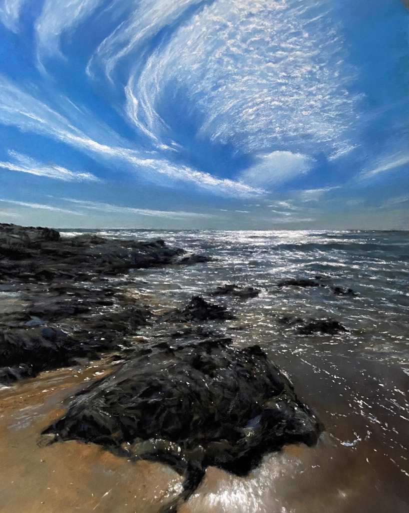
The edge of the sea… anywhere!
Not a specific location I know, but wherever I am in the world, being where land meets the sea, is where my pulse is set racing most.
I will never tire of the challenge that painting the moods of the oceans demands. The interplay of light and tide, as in the painting shown here, can portray nature at its bedazzling best.
From deep and perilous waters with dramatic crashing waves, to warm, translucent and tropical shallows, the majesty of the sea remains an endless source of awe and wonder.
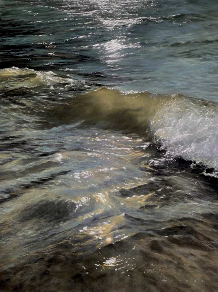
‘The Sway of Light’ 18×14”

4 comments
k.rawdon
Remarkable works! I would very much like to see these in person! Inspiring, thank you Unison for this series!
Leone Madden
Absolutely stunning work.. I can’t pick a favourite as they all have their unique style and features.. Really beautiful…
rgrager-8435
Beautiful work. If I had to choose a favorite? Impossible. Every one is my favorite!
RGRager
Bridget Derc
Beautiful paintings. I have never tried Sennelier LaCarte pastel card but seeing it is your favourite and how splendid your paintings are, I think I will give it a try.