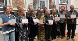
Michele is beyond delighted to have two pieces selected for the Pastel Society this year – as one is difficult enough to get chosen! Both pieces selected hold a very special place in her heart.
Firstly the staircase that Michele has drawn three times now.
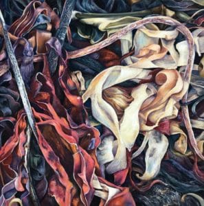
‘With my eye always being drawn to the light and shade, I had the title the minute the pastels touched the Pastelmat. The soft yet strong shadows of ‘When all you feel are shadows, turn your face to the light’ create a beautiful balance to the whole composition taking your eye away, even just for a moment from the slightly rusting, decaying feeling of this spiral structure with its peeling paint and weeds which force their way through determined to be noticed’.
‘This piece was drawn when my dear mum was herself in her decline having been diagnosed as terminally ill. I felt a need to create an artistic respond to her inner struggle with something beautiful from this strong, structure that has weathered many storms yet still remains’.

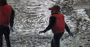
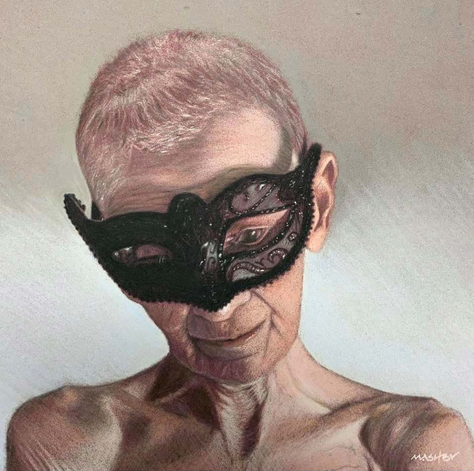
‘The second piece ‘Masquerade’ is a difficult drawing to look at in some ways and for some people. Again for me it was a piece where I didn’t want to shy away from the truth, a story that had to be told. Cancer affects so many of us and I was determined to visualise what was happening to all of us in our lives as a family. Life can be very cruel, particularly when you can see the end is near, but my mum never moaned, never pitied herself and never complained, she wore her mask with stoic pride;
She was brave to the very end. RIP mum’.

‘I love the immediacy and direct application of pastel, as well as the many different ways of working with this medium that allows freedom for drawing as well as painting. The versatility of pastels is huge and this is something I want to explore more this year’.