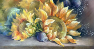
I know what you are all thinking – how can you choose just 10! It was a challenge, but here I have chosen 10(ish!) of my favourite Unison Colour pastels with a brief guide on how I use them.
Additional 34
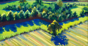
This is a colour I see everywhere, in everything and I probably use it the majority of my pictures. Whether painting wildlife, a landscape or an under painting for a picture it is one of my most used pastels. The 3 images show how I have used it within the under painting of a landscape; to build depth and tone within the feathers of the barn owl; and how I have used it throughout this horse portrait. It is definitely one of my most used pastels!

Additional 15
Sometimes a colour isn’t a favourite because you use a lot of it, but because it is the perfect colour for the job. These are the colours that a little will go a long way. I use A15 very sparingly but it has a big impact as you can see in the images below.

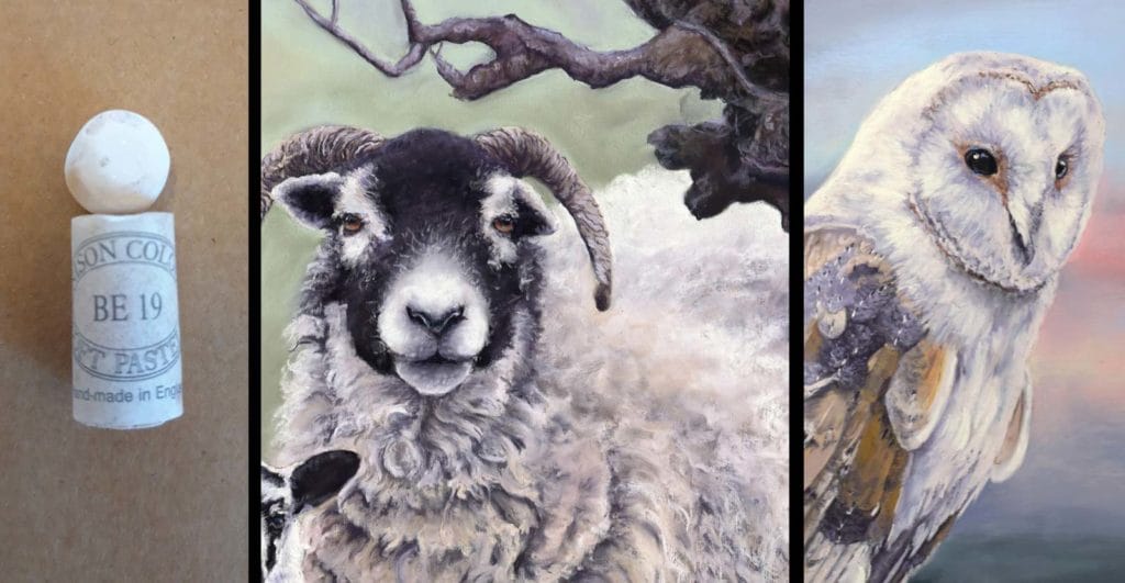
Brown Earth 19
Not one of the most obvious colours to pick but there are times when subtlety is needed. Living in North Yorkshire, sheep are a big inspiration for me and I find that this shade is ideal for the lighter areas of the wool. It has a warmth to it and is light but not too bright (as sheep really aren’t that clean!).

Grey 4
Not one of the most obvious colours to pick but there are times when subtlety is needed. Living in North Yorkshire, sheep are a big inspiration for me and I find that this shade is ideal for the lighter areas of the wool. It has a warmth to it and is light but not too bright (as sheep really aren’t that clean!).

Red Earth 17
A beautifully rich colour that is ideal to use within red or brown fur, hair or feathers. I have used it here on both the red grouse and French partridge. The richness of the colour helps to add a sense of luminosity to the feathers.

Green 34
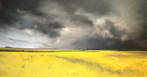
Bright greens can be difficult to use as they can end up looking very loud or a bit flat, but, used as highlights they can really lift areas of your picture. Often in landscapes, I will use this colour to help define the contours of the land as well as adding light. The example below shows how I have used small amounts for the young heather growth adding life and freshness to the image. And there are times when you just have to be bold as you can see in the background of this kingfisher picture.

Grey 9
Similar to A34 I cannot do without this pastel and I use it throughout most pictures. Ideal for landscape, wildlife and portraiture – my first introduction to this pastel was through the Portrait 36 set and I am so glad that I invested in it!

Natural Earth 11 and 12
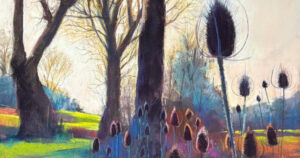
Ok, here I am cheating a bit because I am classing these two together but I really couldn’t decide between them. I use these two in unison (no pun intended!), where I see one I see the other because they complement each other so well. They work really well to create the tones and subtle differences within fur and feathers.

Additional 37
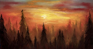
I love this colour and as you can see I am due a restock! This is such a great dark colour that gives real depth to foreground, background and landscape. There are so many darks within the Unison colour range, but this is definitely one of my favourites!

Blue Violet 10
Not the most obvious colour to use in wildlife pictures but it works brilliantly to create a sense of light. I generally use it on areas where light hits the subject, as you can see here on the cow’s nose and the feathers of the black grouse.

I found it very difficult to slim my list of favourite Unison colours down to just 10 as there are so many great colours to choose from. But it was also a really useful exercise and really made me think about how I use my pastels and how I choose colour – have a go at choosing your 10 favourites and see how you get on.
3 comments
John Slater
I have a complete set of Unison Pastels to me they are all favorites. I use them everyday in one way or another.
tomas valik
Great selection, Jo!
I just double checked and the only one I own from you list is BV10 and it is one of my favourite sky colors.
For me, I can choose one that I love and can’t paint without, the A29! Beautiful dark purple color, can be used anywhere.
Good luck to your painting endeavours!
Jo Garlick
Thank you Tomas!