We all know that travel can provide us with some amazing memories, yet how lucky we are as artists to create and relive some of those special moments through our art. To keep things simple and lightweight when travelling, I now mostly only bring my watercolour sketch kit with me and try to sketch at every opportunity as an addition to the many photographs that I also take. Just like any form of painting ‘plein air’, taking time to quickly sketch allows all my senses to soak up and remember more clearly what is around me — the light, temperature of the day, the stillness or activities nearby whether by people, birds, or animals, and sometimes that includes inquisitive onlookers. Rather than simply clicking with my camera and moving on, the sketches compel me to spend time at a location. Then later back in the studio, those sketches, together with any photo references, help me to recall the day, allowing me to tap into what I was feeling then as I develop my studio painting.
Last year, my husband and I travelled to the United States from Australia, spending two months touring that also included a couple of weeks finally meeting relatives who live in the State of Illinois. As an artist who particularly loves painting water and reflections and occasionally other light filled subjects, what inspired me the most during our travels as painting subjects was the coast along Cape Cod and Maine, and also when we visited down south, finishing up in New Orleans.
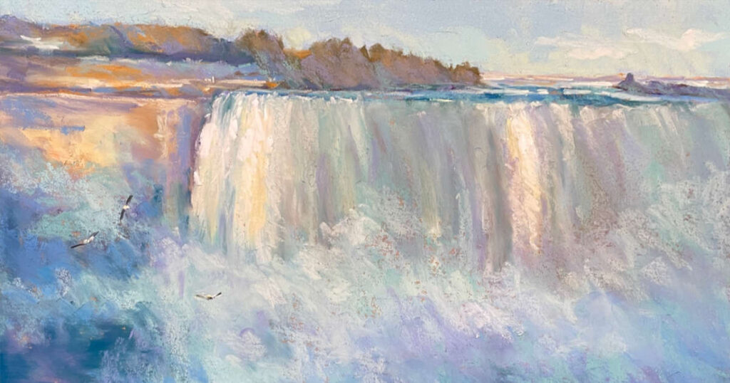
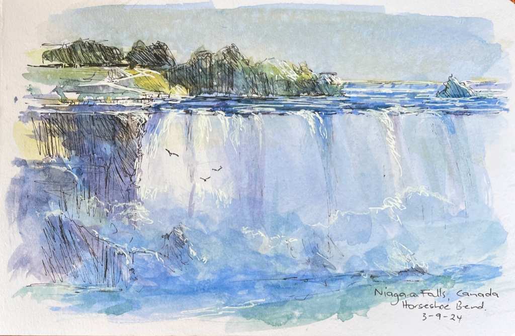
In the north, our travels initially included a visit to Niagara Falls. It’s the first subject I painted after our return to Australia and even now I can imagine and feel the thunderous water cascading over the broad expanse of Horseshoe Bend. The bottom is covered by the tumultuous water and spray, which rises and can float up high depending on the wind. I also pushed the colours to make them warmer which it had changed to as twilight started to descend. I have included here for you the original sketch I did when there, followed by my studio painting. These are the types of sketches that I do whilst travelling, although many are more simplified.
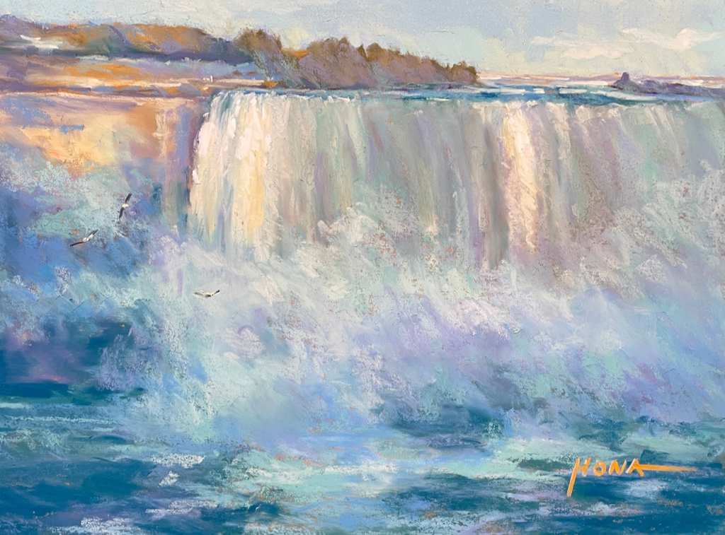
Pastelmat paper (sand) using mostly Unison Colour and some Terry Ludwig pastels.
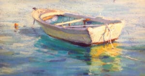
The towns along the coast of Maine are a painter’s dream, especially if you love boats. Luckily, we mostly had splendid weather which made it easy to explore and enjoy the wonderful coastal scenery. This next painting reminded me where my love of painting water and in particular, reflections, began. Over the years, I’ve painted many yachts and small boats and learnt ways to enhance water depth and movement to achieve a feeling of wetness. It’s important that boats appear as sitting in the water and not floating above it. In this piece, I discarded the surroundings of the boat, which was docked and instead painted it in the open water. Landscape perspective therefore needed to be applied throughout the water, and other elements included to make the subject come together.
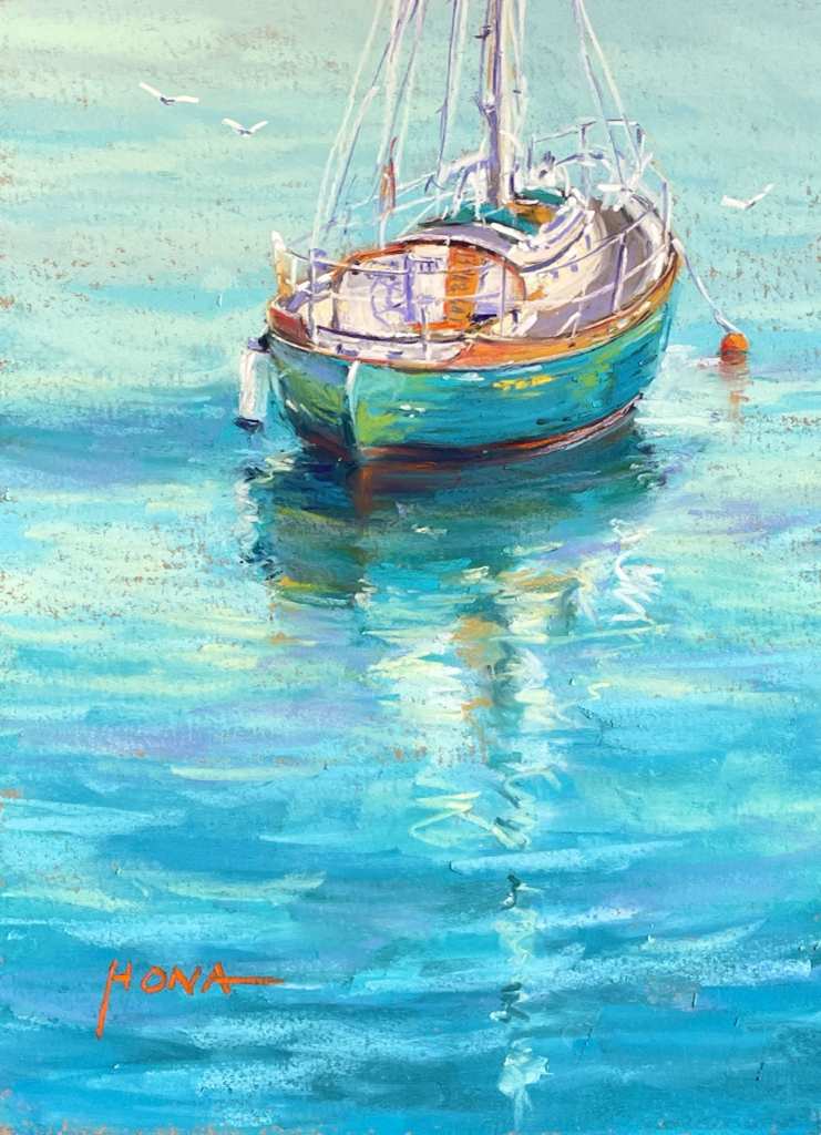
Pastelmat paper (sand) using Unison Colour pastels.
Now and then, I come across an inspirational subject that really captures my attention. Usually, it’s because of a strong play of light. In this case, it was vibrant coneflowers against a complementary backdrop of shadows and window darks, which I found whilst exploring the Camden township marina area. It was a delight to paint, and even now, every time I look at this painting, I feel joy. I’m lucky that I know the purchaser and can see it again every now and then. I’m considering another version for myself, perhaps in oils.
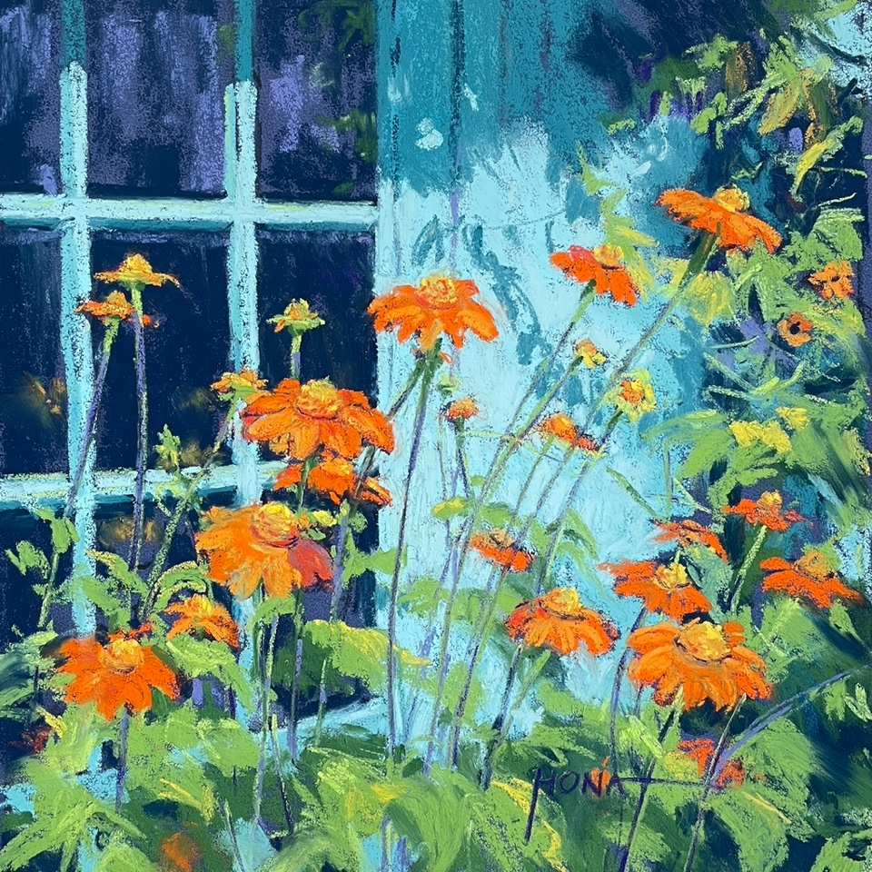
Unison Colour pastels on AS Colourfix original paper (dark blue).
The last stop on our travels through the States was New Orleans. We particularly loved the French Quarter which was full of character, colour, charm, music, and a bustling energy. As water is my go-to subject, we booked a bayou tour about an hour’s drive from the city. I remember sometimes seeing movies that included swamps and the eerie fascination I found with the light and reflections, so to me it was a no-brainer to want to witness this first-hand. Although our visit wasn’t during the night, we chose a tour on a small open boat that made it easy to take unobstructed photographs. We thankfully had a sunny day, and I was in heaven witnessing the water reflections, bird life, alligators and the raccoons that came to the water’s edge for food that was being thrown to them by our boat operator. Up until then, we unfortunately had only seen dead raccoons as roadkill.
Below is the first of my swamp paintings, with hopefully more to follow, yet I imagine that once I return from another of my painting tours, which is starting very soon — this time to the Italian Lakes, I’ll have even more inspiring vistas and water subjects to paint! I feel blessed to have these opportunities through Artemis Art Tours over the years, that has also made it possible to have extended travel afterwards, mostly in Europe, and which also provide an abundance of further inspiration, sketches and painting material.
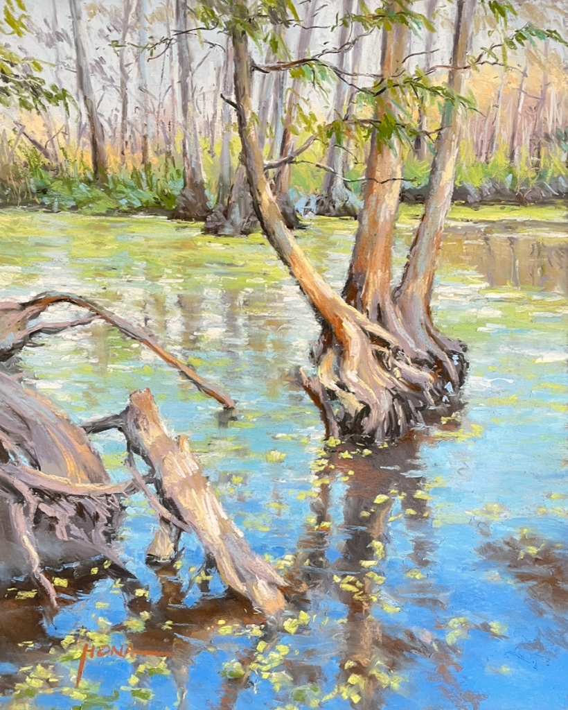
Pastelmat (grey) using Unison pastels.
I should perhaps mention that for three of the above paintings, I used Clairefontaine Pastelmat paper to fully experiment for the first time. I felt I needed to give it a decent try, especially as I teach. My go-to paper has always been Art Spectrum Colourfix in ‘original’ or ‘smooth’ and sometimes Canson Mi-Tientes Touch, all of which have some grit. I now understand why many animal painters use Pastelmat because of its ultra-smooth surface, which is not that dissimilar to the AS Suede paper that was once available. Canson have more recently produced a Mi-Tientes Velvet paper in competition to Pastelmat. They are very similar, although the Canson Velvet is cheaper. I can also see how suitable these smooth papers would be for charcoal work if wanting a coloured background, but I still prefer to use the AS Colourfix paper for my work, yet I will also need to use up the supply of Pastelmat paper that I have.
May you find inspiration all around you, and joy in all that you paint.

2 comments
Bonnie Kittredge
Thank you for sharing your BEAUTIFUL pastels from your travels. I am so eager to return to using pastels and your work has inspired me to order some UNISON pastels and investigate the pastel papers you suggested. I am eager to explore making water look wet. Thank you very much, Bonnie Kittredge from Maine, Alaska and Oregon.
Leone Madden
Thank you Regina.. such beautiful inspiring work.. best wishes .. Leone