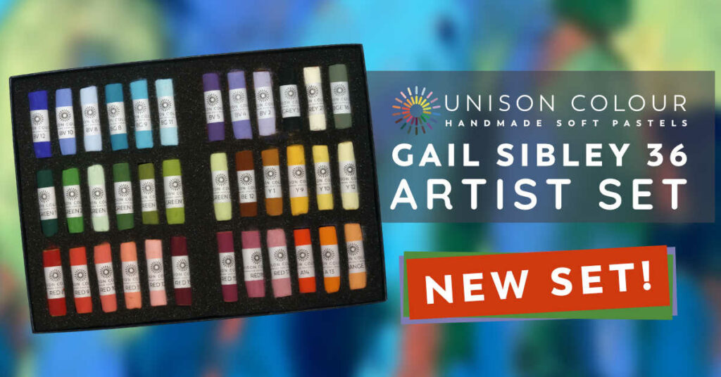

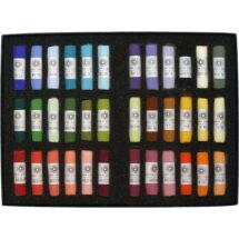
I’m a gal who loves bright colours. Brown and grey pastels?…I just can’t get excited about them. Give me a lipstick red, a canary yellow, an ocean blue, a plum purple, a sunset orange, a lime green, and I’m in heaven. Knowing this, you might understand why the browns and greys languish and remain unused in my pastel sets. I prefer making my neutrals by mixing saturated colours.
You may be asking, Sets? Why sets?
Along my pastel journey, I became enamoured with a limited palette. I could see the benefit of using it in my own work – colour harmony, less time spent trying to pick the perfect colour, more experimentation and possibility with a restricted palette, fewer pastels to travel with. Using a limited palette means making use of layering to create new colours and I love the qualities that layering bring to a piece – a sparkle, depth, and cohesion. So I started a project of trying out starter sets from different brands and seeing what I could do with them.
It was a fascinating exploration for sure, creating work solely with pastels out of the box. But I have to say, sometimes I was frustrated by the number of grey or brown pastels in some boxes. So I decided that one day, I would create my own set, one full of colourful pastels.
The opportunity arrived in the form of an invitation to join Unison Colour as an Associate Artist. I was honoured and happily accepted. I’d been a Unison Colour pastel fan and ‘user’ since the early 2000s when a local store started carrying them. (Sadly they no longer stock these pastels.) With the Unison Colour invitation came my chance to create my very own set!
I thought it would be all sorted within a year. Hah! My goal was to create a set with a selection of pastels with which a pastellist – using a bit of liberty with colour interpretation – could paint any subject. In order to reach this goal, I needed to select pastels that I knew, through my own work, could do just that.
From the start, I wanted pastels of primaries and secondaries, and where possible and appropriate, warm and cool versions of each. Each colour would then have a light, middle, and dark value/tone where applicable. So I made my initial selection and went to work. And then came the months and months and months of trial and error.
Along the way, I added colours. And I removed colours. And I added and removed more as I painted my way through various subjects (landscapes, portraits, figures, still life), making sure I had what I needed in the set. Last year, I made a chart to see which colours I was actually using. This was during our HowToPastel 31-pastels-in-31-days challenge when I painted something different each day. There were some surprises. For instance, there was a dark purple I didn’t use once. The same went for a cool bright white. Another discovery was that I kept wanting to reach for an orange that wasn’t in the set (but now is).
Finally, I thought, “Gail, you need to make a decision!” This project has already been two years in the making. And, like a painting, it could go on forever. I just had to decide that it was finished! And so here we are.
As scary as it was to make that final commitment, I’m delighted with the outcome and excited to see what others will create with the vibrant luscious Unison Colour pastel sticks in this box. Let’s celebrate by painting up a storm of colour!

24 comments
Наталья Николаевна
(Translated)Beautiful pastel colours! Beautiful Unison!
(Original)Прекрасные цвета пастели! Прекрасная Юнисон!
Lori
Congratulations Gail! I learn from your blog posts and enjoyed reading about how you chose your colors – very vibrant. You’ll find me in the shades of Browns and Greys, but I WILL make room for a pop of color, too!
Gail Sibley
Thanks Lori! Love hearing the blog posts over on HowToPastel.com are valuable to you.
And I do I love greys and browns too….I just prefer to create them myself using vibrant colours 😬
Geeta Menon
Congrats Gail! I love Unisons pastels, I too love bright pure colours and always struggled to get these. So I am absolutely thrilled with this set of colours!
Thank you!
Gail Sibley
Geeta, I LOVE hearing that. Thank you!!
Elena Yermolenko
I also love bright pure colors, and in the ready-made sets there are few orange and yellow for me, an excellent set, congratulations!
Sue Edwards
Gail!!! This is fantastic! I love my Unisons, and am fascinated by your process and goal! I will be paying much more attention about which colors I am reaching for and cannot find. I’ll also compare which colors you have chosen, with which I have chosen. I agree totally with the orange that I was looking for! Again, you continue to help me think and see differently! I will look forward to the 31 challenge with these thoughts!
Gail Sibley
Sue thanks so much for sharing your insights and thoughts! Going through the long process of selection really did have me looking more deeply at the colour and stick choices I make and why I make them. And what pastels I absolutely never use!!
See you in the HowToPastel 31in31 Challenge!
Helen Turner
I would love this in a half stick set, plein air to go! I prefer not having to break them myself, it feels like sacrilege! Good selections!
Gail Sibley
Helen…I know how it feels to break these babies but just do it! Run your fingernail around the pastel where you want the break and snap! The whole sticks mean you’ll have the colours for longer 😁
Susan Pernot
Such a lovely set of colors. I absolutely love the feel of Unison
Suzanne
This set is speaking to me,
Gail Sibley
Ohhhh that’s so good to hear Suzanne!
Jenny Price
Beautiful colours. Unison pastels are the best.
Oksana
WOW! Great set!!!
Kim Hood
Gorgeous colours. I’m totally with you in loving bright colours and this set looks fabulous. I’m going to start dropping leaden hints for ….. I can’t bear to say the word in September!
Gail Sibley
Hah hah. I hear you about the C word Kim! And thanks for putting my set on your wish list!
Ruth Burley
Gail!! I’m so excited for you!! The colors look luscious!!! I’ll be checking it out for sure!!! The best of success in all you do!!
Gail Sibley
Thanks so much Ruth!! You know the journey I’ve been on to make the selections!!
Laurence Smith
Could we have the codes for all the pastels in this selection please
Oliver
Hi Laurence. Good point! Colour chart now added to the product page. Thank you!
Theresa Rose
I am unable to find the price of these pastels. As a disabled pensioner with limited money, this is very important before considering purchasing anything these days. Thank you
Theresa Rose
Silvia Richardson
Theresa i found the price and send you the link here https://unisoncolour.com/shop/pastels/artist-sets/gail-sibley/gail-sibley-36-set/ hope it helps and wish you happy creative time. Silvia R. (a fan of unison colour)
michele
what a beautiful set of colors.