When you’re not a painter of trees and lakes, but you ARE a painter, you need to find what subject or subjects make you want to drop everything and head to your studio. I’ve been an illustrator and painter for as long as I can remember, and have never wanted to paint a landscape full of greens. We are all different and it’s a great thing to remember, especially if you are a beginning painter. I paint people, still lifes and interiors and find the thrill is in telling the story of each “object” to my viewer, whether it is a chair in the corner, a bunch of apples, or a woman in a coffee shop.
Find what thrills you.
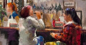
I cannot go into a restaurant without taking photos of the diners, the tablescapes, the hustle and bustle of the servers. I love painting real life scenes. Do you? I also like the silence of my studio with a still life setup on draped fabric under a spotlight. What will this still life tell my viewer and does it excite me to paint it? Usually yes.

INTENTION
Look at your blank piece of paper, and ask yourself, “what is my intention for this painting?”
Sometimes I have my students (and myself) write a word or two of that intention on a piece of white tape and stick in on the easel, as a constant reminder to (try) not deviate too much from that initial excitement or feeling. Right now, I am working on a painting of a woman that evokes sadness in me. But I am still enjoying the process of painting it, and the fact that it is saying what I intent it to say.

YOU vs YOU, vs THE VIEWER
Remember that you are painting for you, for the love of it.
Don’t worry what someone else may think when they look at it. Don’t stress yourself out with “is it good enough?”. (We all always feel the answer is no! LOL)
Step back while you’re working, look at your work with an honest eye. The reason we feel it’s not “perfect” is because we are all still learning, every day, every painting, and really with every stroke of the pastel. Every time I feel that I know what that stick can do, it surprises me. Depending on the pressure of my hand it can be as airy as a watercolor or as heavy as an oil paint mark. Many people that view my work are surprised by how many individual marks make up a painting. I love what I call “Broken Color” marks of colors next to each other, not on top of each other, to make the eye see a 3-dimensional plane.
Whether your painting is hanging on your studio wall or a gallery wall, remember that each viewer takes away their own thoughts about what that painting is saying. Make sure it is saying what you want it to say.

NOTHING IS ORDINARY
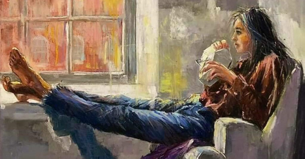
REMEMBER a lonely apple sitting on your countertop has a story to tell, the shoes by the door invokes a feeling and has a story to tell, and the woman staring into space while having a cup of tea is a painting with a story just waiting for you to tell it.


8 comments
Helen Turner
A very nice blog, just what I needed to hear right now! Thank you!!!
Lori O,
Love this post! I like painting landscapes BUT ONLY if they have wildlife in them. Then my heart just sings!
Marilynn
This is very thought-provoking. I love telling the story with my work. It reminds me I am on the right track!
Sofía
Love your suggestions, I feel the same. Even though I like landscapes I love painting people in different situations. Love your paintings.
jeri greenberg
thank you!
Kim Hood
A good reminder to choose subjects that excite you – not someone else.
Penny
Really helpful thoughts, which made me think about why I choose different subjects. Thank you.
jeri greenberg
thank you!