Reinterpreting a Photo

By RS Weinblatt
2nd April, 2020

Hey guys! I hope everyone is staying safe and using this time to get into their studios (or wherever you paint) and really use the time you have to go on that journey and give yourself permission to fly!
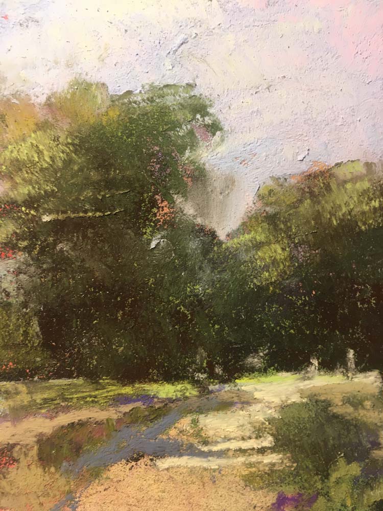
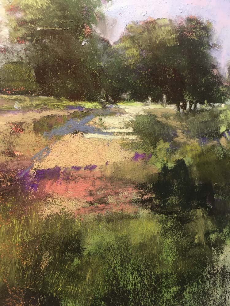
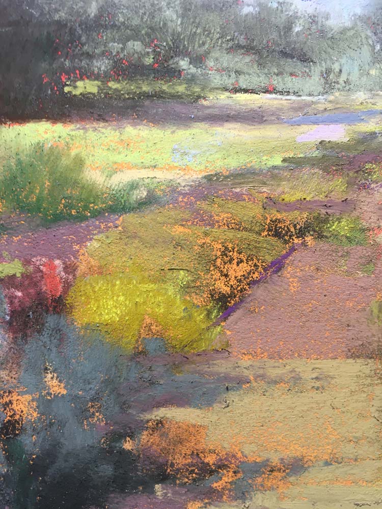
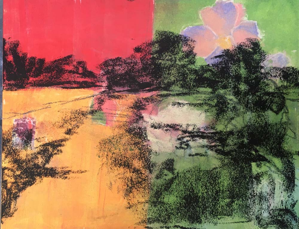
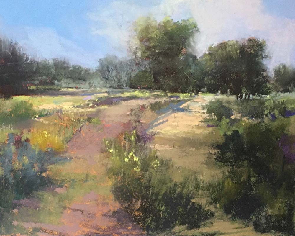
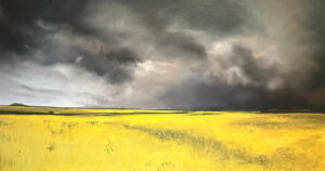
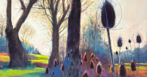
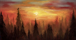
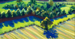
What I’d like to touch on is the use of photos in our work as a tool, not so much an end result! I like to use photos in my process to give me a start on my journey, not be my destination.

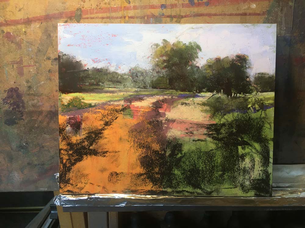
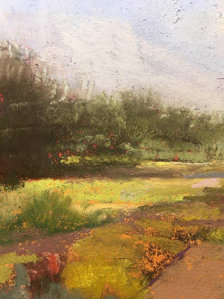
For me, a photo is a series of suggestions that I’m free to interpret and then put my own spin on. I will change the palette, the season, the time of day and maybe even the light! I want to show you some examples of how I take a photo and manipulate it to suit my need to turn it into a painting.

1st Photo…

2nd Photo…

Click to enlarge

RS Weinblatt

Unison Colour Associate Artist

rsweinblatt.weebly.com
RS Weinblatt giving a thumbs up to the camera, while standing infront of a gallery of his work.

Leave the first comment

Colour Chart Guidance

We believe the colours in our web based colour chart are a faithful representation of our pastel range. But with any colours portrayed on the internet, there’s a whole heap of variables which mean that what you see, may not be what we see. That said, there’s some things that can be done to mitigate some of the variance.

Mobile phone and tablet screens tend to be pretty good for colour, so they’re always worth using, when viewing our colour chart.

We hate to say it, but cheaper computer displays, including laptops, can be rather hit and miss, in both colour and contrast, so they might not reveal the depth of the colour, as well as the true tone.

If you’re really keen on getting your computer up to speed on colour representation, you can use a calibration device to reach your display's fullest potential.

With all that said, if you think we’re way off the mark with any of the colours then, by all means let us know, and we’ll give it another shot.