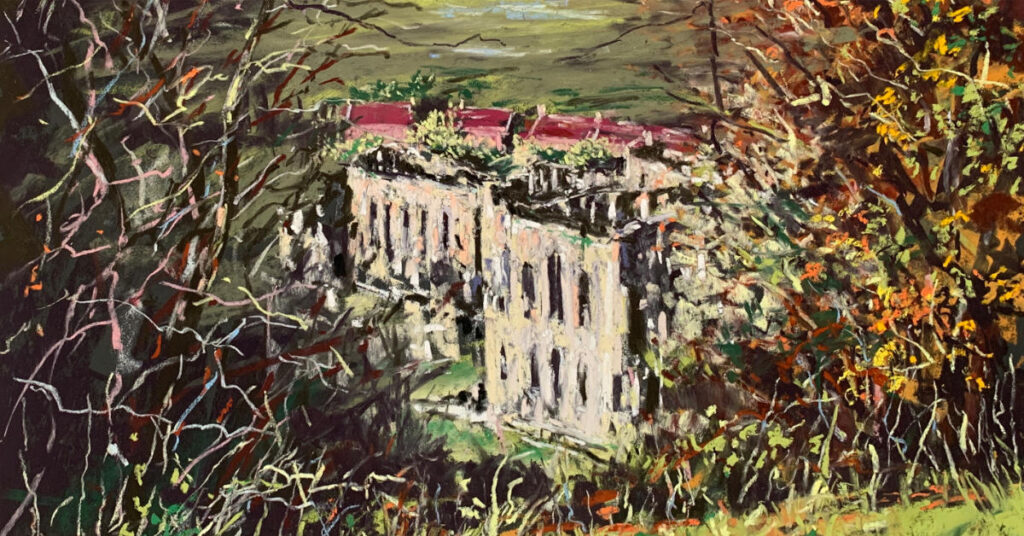
Rievaulx Abbey
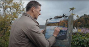
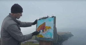
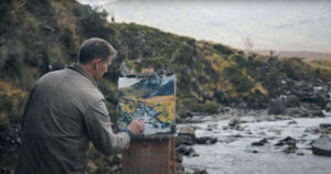
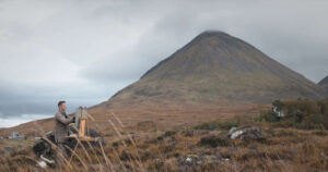
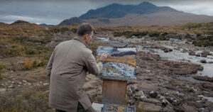
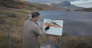
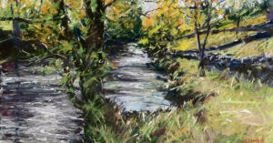
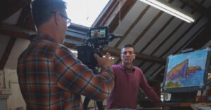
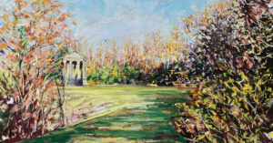
In this part 2 short video of my day at Rievaulx Terrace, a National Trust property in the North York Moors, I seek to capture the majesty and beauty of the view of Rievaulx Abbey (English Heritage) far below the Terrace, set in a late Autumn landscape. I am using Unison Colour pastels on SAIT P500 (not P400 as I mention in the video!) black sanded paper. Filming is by Tony Parkin of T.P. Visuals
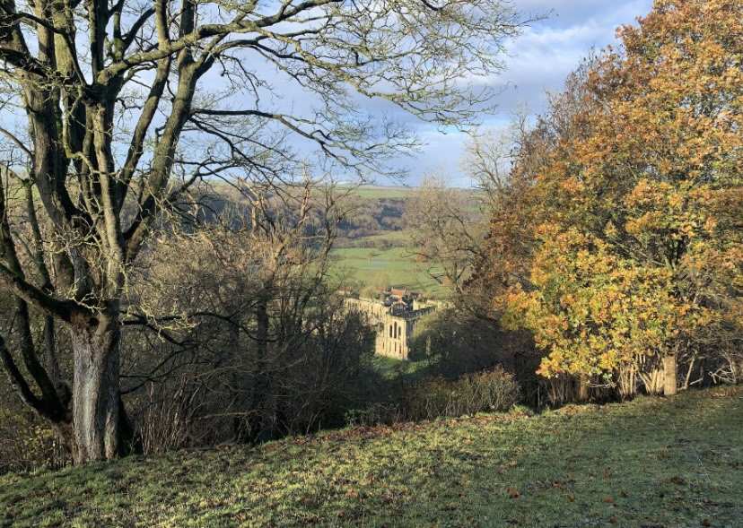
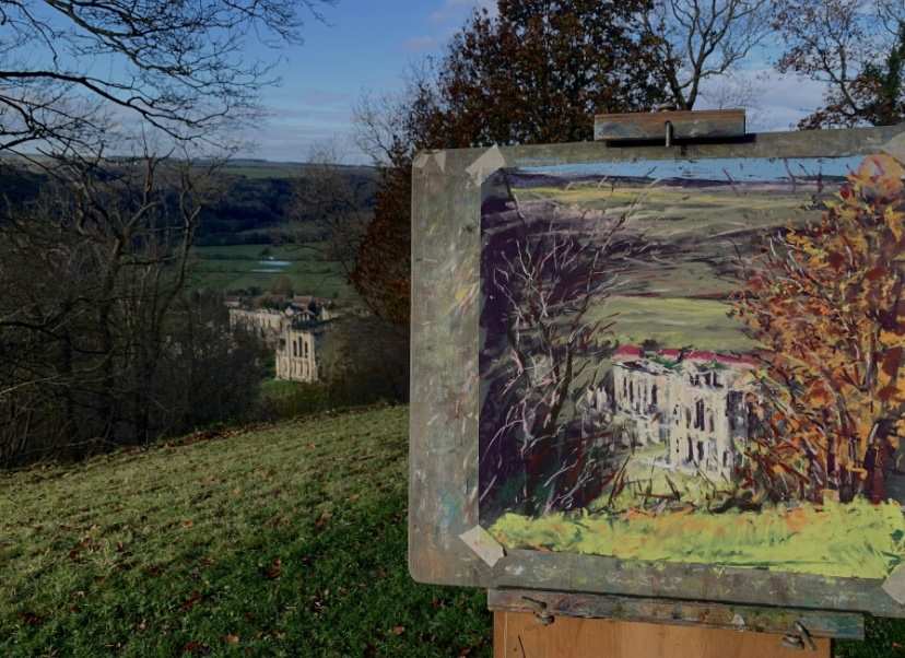
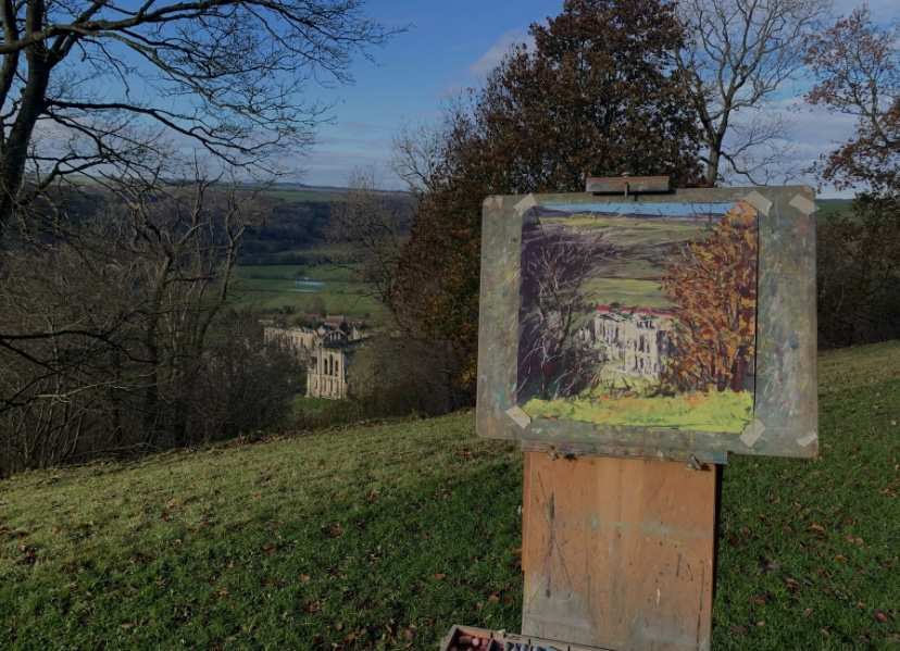
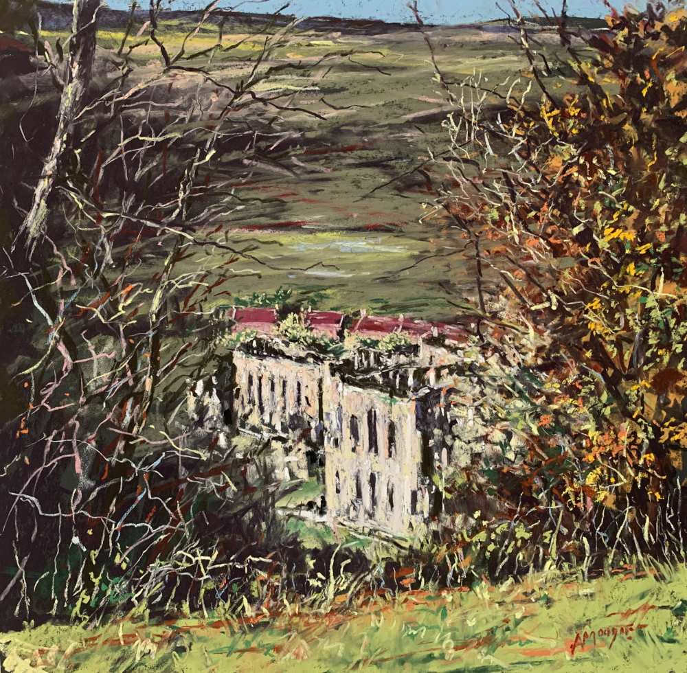
This was a very quick impressionistic rendition of this historic building, highlighting the immediacy and speed with which pastels can be used, making them ideal for plein air painting. I am seeking to capture the essence of the scene in an expressive way without getting embroiled too much in detail; the challenge is both to correctly represent the architecture of the Cistercian abbey in an impressionistic way and also to paint in near freezing temperatures!
SAIT paper can be purchased from Youdells Art Shop, Kendal. Tel: 01539 723728
4 comments
Kim Hood
Great to watch you working. The loose style is something I would like to try. I’m not sure I’m brave enough to work outdoors and not just because of the cold – the idea of anyone coming across me while I was working is terrifying!
Judy Turner
Hi Andy, two great pictures from your freezing cold day! Where you were standing painting the abbey is pretty much where we scattered my mum’s ashes back in 2013. Rievaulx Terrace was one of her favourite places. It was much warmer in the middle of August though!
Joy
Re: Pt. 1 Rievaulx and Pt. 2 Abbey – Lol, Maybe put a hat and scarf on and under-thermals for more warmth! I froze to death watching you!! {:)}
Andrew Moodie
Haha!! You’re so right! Think I had my thermals on tbf – I just need to be a bit more Scottish about the cold!!🥶🥶