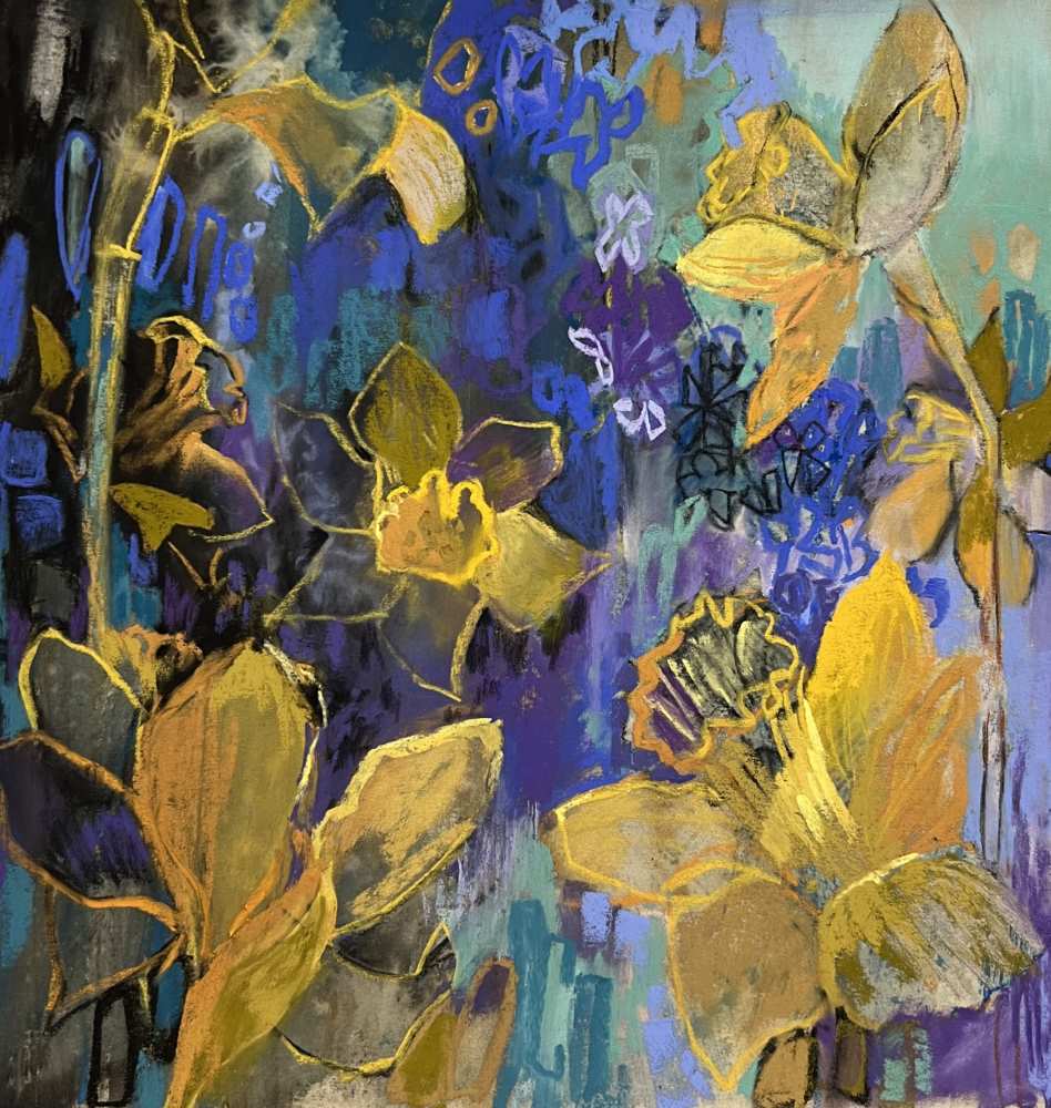
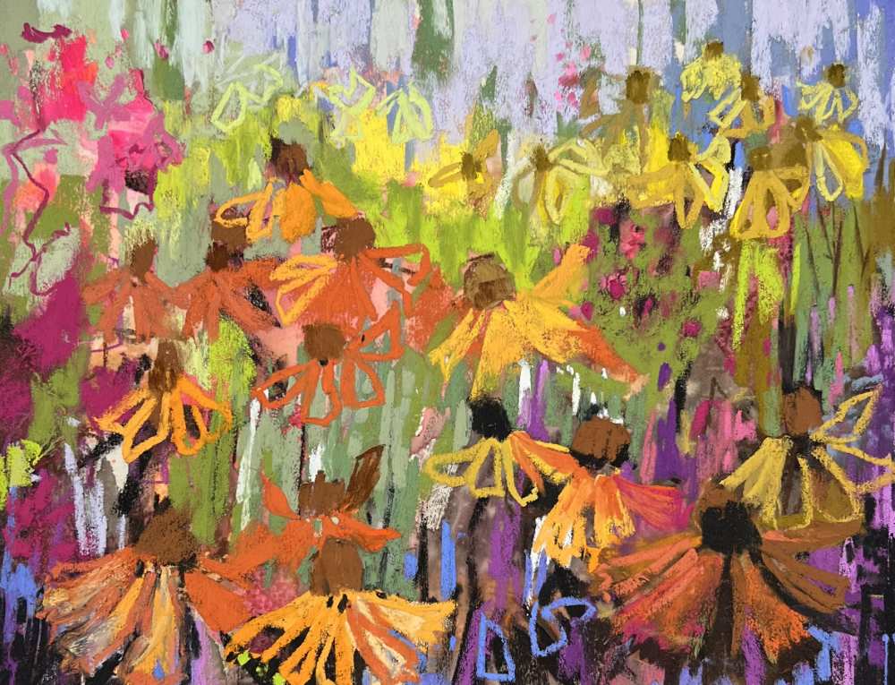
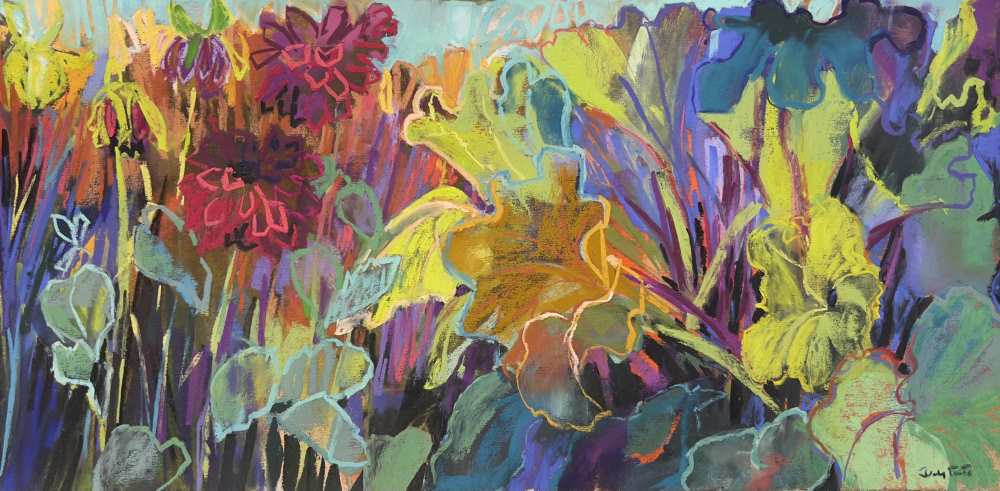
Colour is a wonderful thing, and for me, most of what I do creatively revolves around the initial spark that colour sends to my brain and how I go about trying to capture that spark in my soft pastel paintings. In my work practice today, my soft pastel paintings are deeply influenced by the natural flora I encounter, whether in my kitchen, gardens or the countryside.
Over the last 15 years I have gone through various periods concentrating on different aspects of how I apply myself to achieving an image that was in my mind’s eye. My work is certainly not everyone’s cup of tea but for those who appreciate it I believe it is because of a similar excitement towards the intensity of colour and the joy that, for me, comes from that.
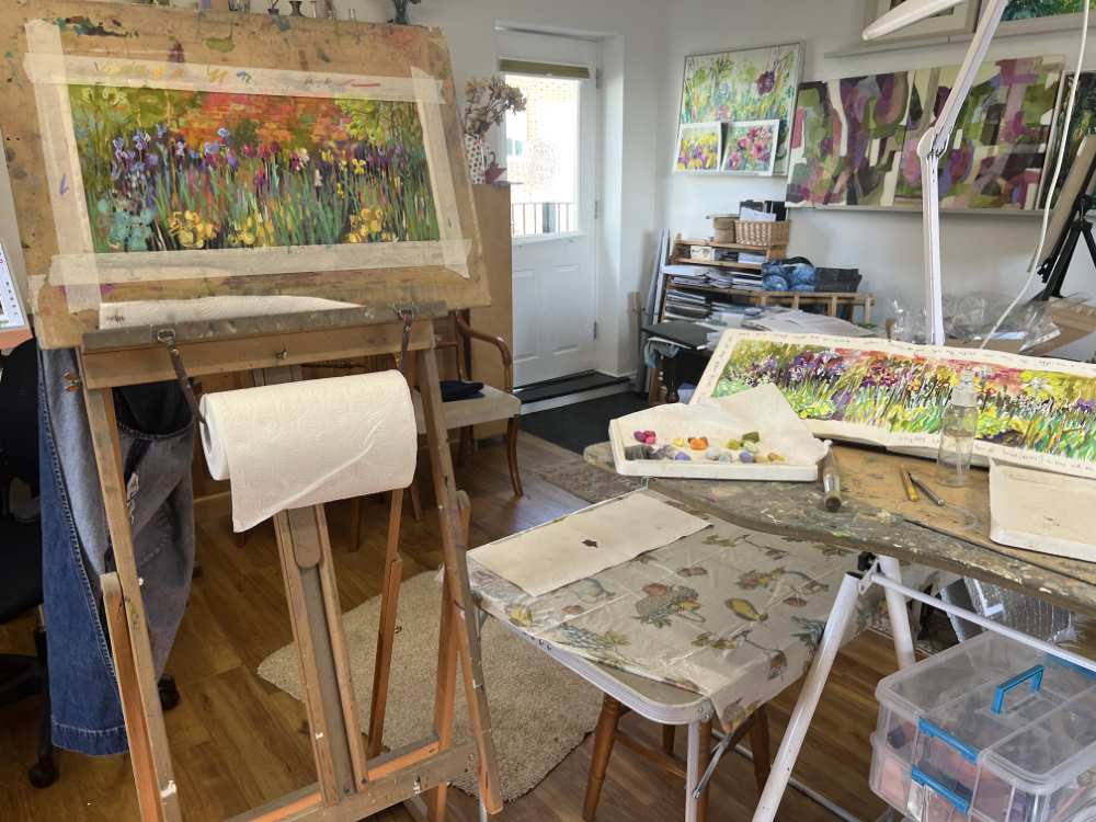
For many years I was primarily an en plein air painter, mostly in oils but, if the weather was kind, then in soft pastels. Studio (otherwise known as a bedroom!) work produced in the cooler months tended to be soft pastel. I did not fall out of love with painting outdoors but increasingly I found myself wanting to take what I had absorbed outdoors into the studio and develop it further, removed from the actuality of the scene in front of me. I also found myself more and more attracted to soft pastels as my medium of choice in the studio.
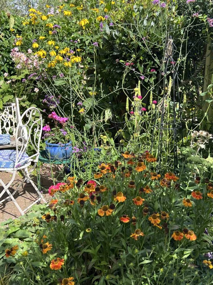
So, these days I have effectively combined all those practices into a way of working that seems to suit me. And 90% of my inspiration comes from our modest garden, so I don’t have far to travel!
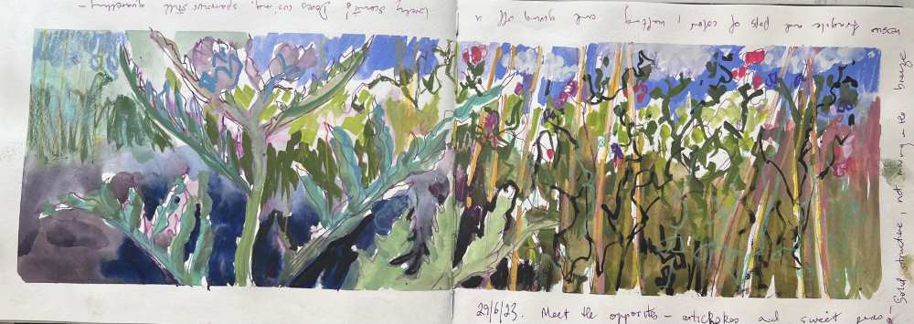
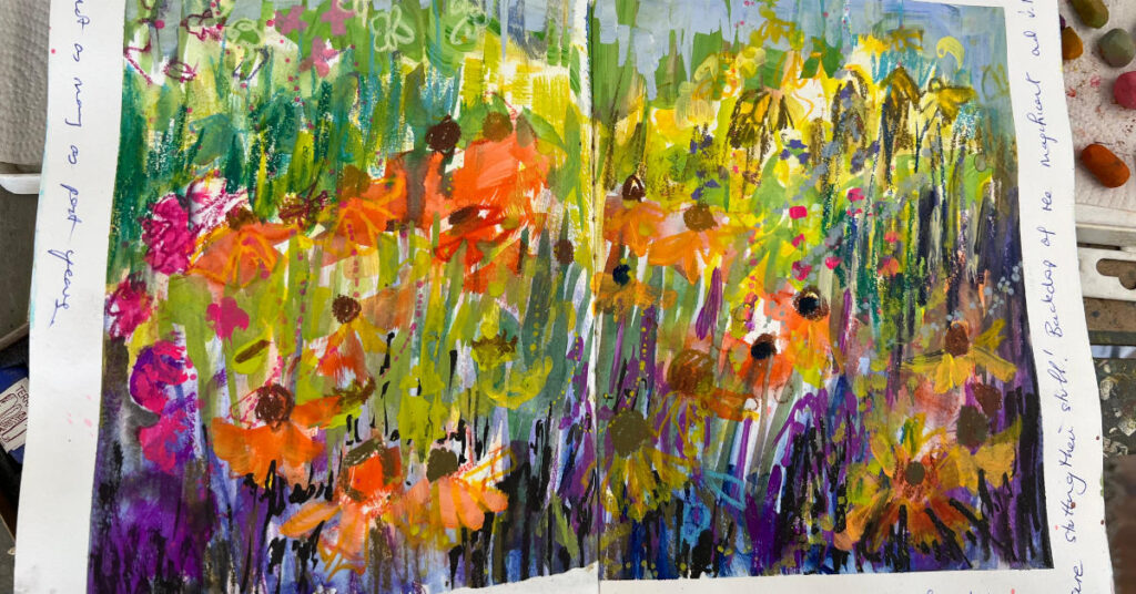
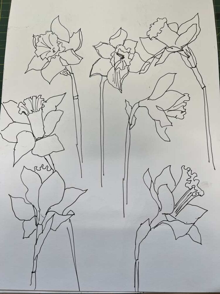
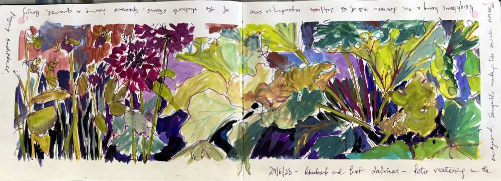
My many sketchbooks have become my ‘go to’ when I am looking for inspiration. These sketchbooks contain a variety of ways of sketching which can inspire me in different ways to create different paintings, usually on a larger scale, taking my prompts from the mark making, colour combinations and notes made ‘in the moment’ outdoors.
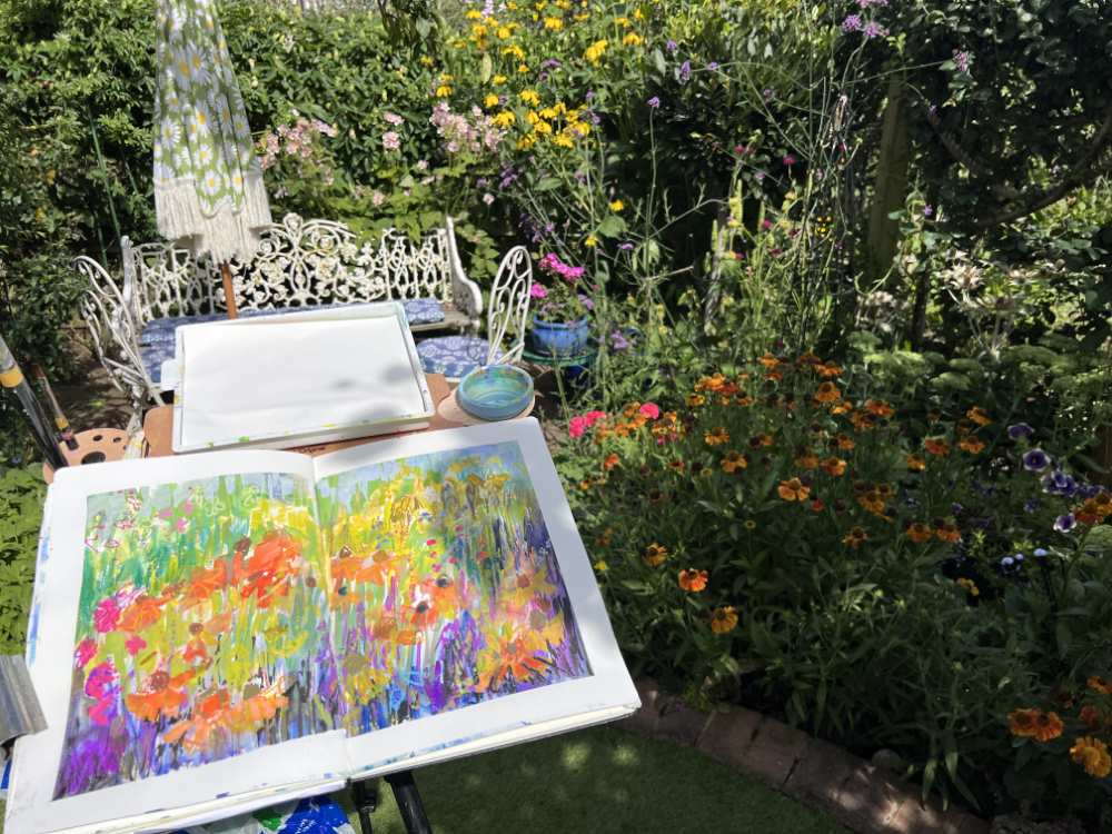
So full blown ‘en plein air’ painting has become sketching rapidly and freely outdoors, as and when, the moment and the weather allows. Or sketching indoors – pot plants, flower arrangements, a single bloom – it does not matter – it is all a resource for future soft pastel paintings.
Sometimes 2 or 3 sketches at a time – as loose and expressive as I can make them whilst making sure I have plenty of prompts for the subsequent paintings in the studio. I use whatever materials I have to hand, working in watercolour sketchbooks and often including gouache paints. The soft pastels come later. I make notes about the moment in time, around the sketch – whatever is going to jog my memory.
Do I take photographs? Yes, I do, BUT, once I have started working indoors I do not refer to them unless there is a detail I think might be important – for example – how many petals did that daffodil have? Yes, I want the painting to be loose, often semi abstract, but I don’t want to completely lose touch with reality – with enough detail that it is possible to understand what the subject is.
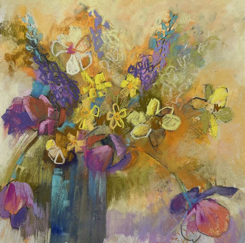
So, once I am in my happy place in the studio, out come the sketchbooks with their natural companion, the soft pastels. This, for me, is where it becomes exciting. The challenge of trying to achieve the same sense of gay abandon and synergy of colour that I have recorded in my sketchbook. I find this way of working encourages me to be experimental with the pastels in all sorts of ways.
In brief, the stages of my painting are often as follows: –
1. Get one of my sketchbooks out and think about what I want to achieve

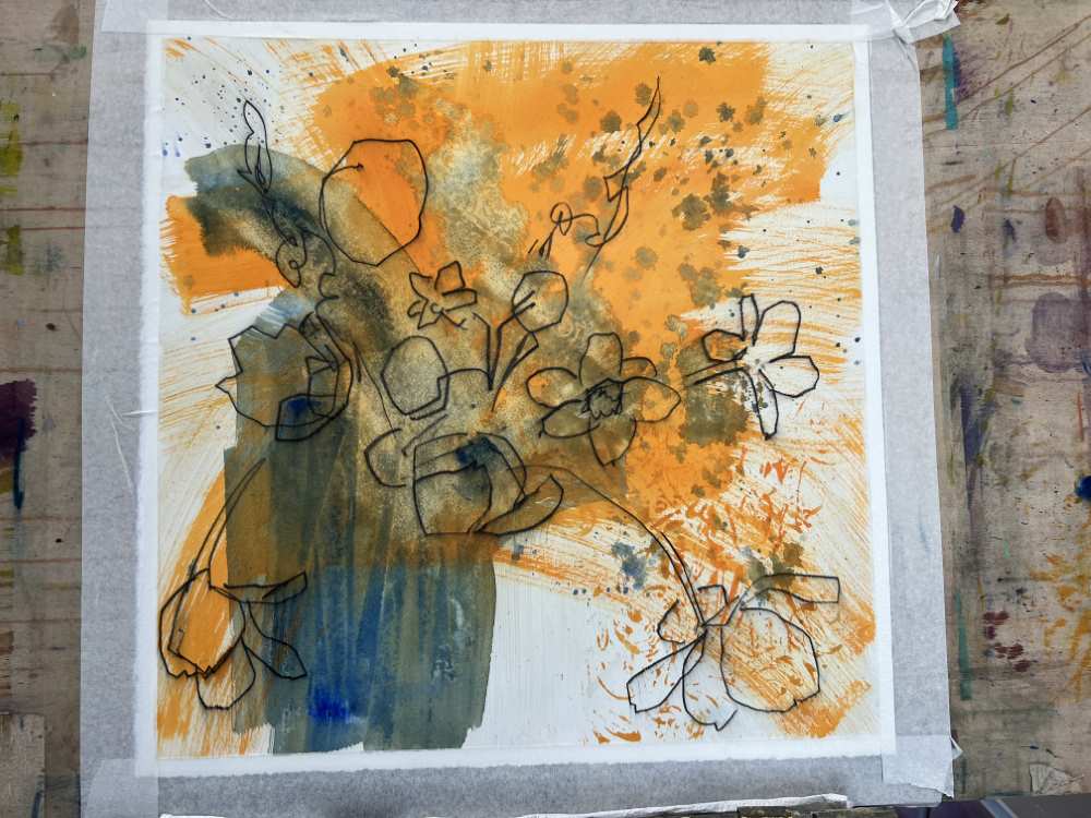
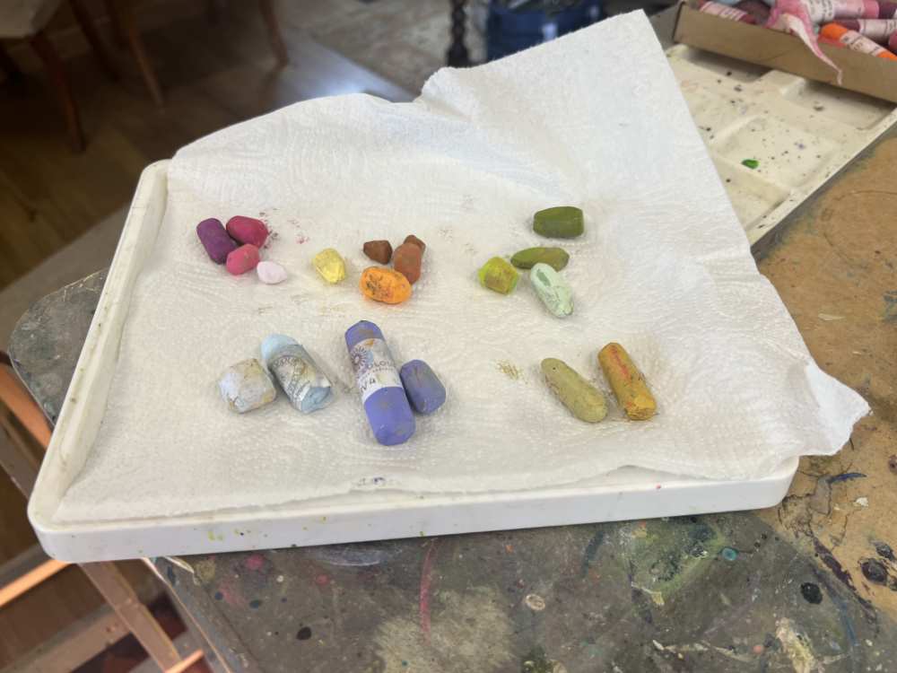
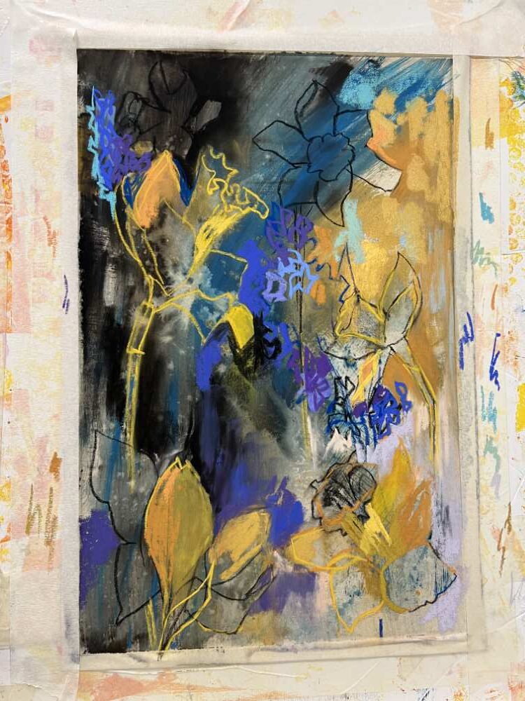
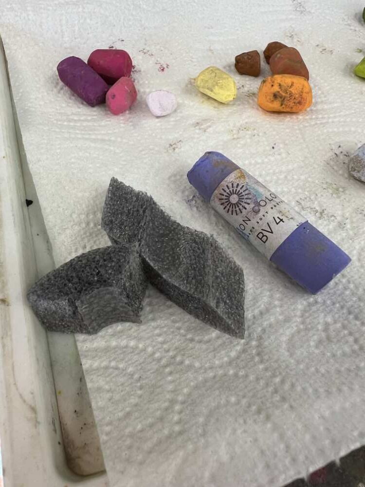
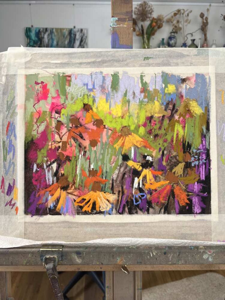
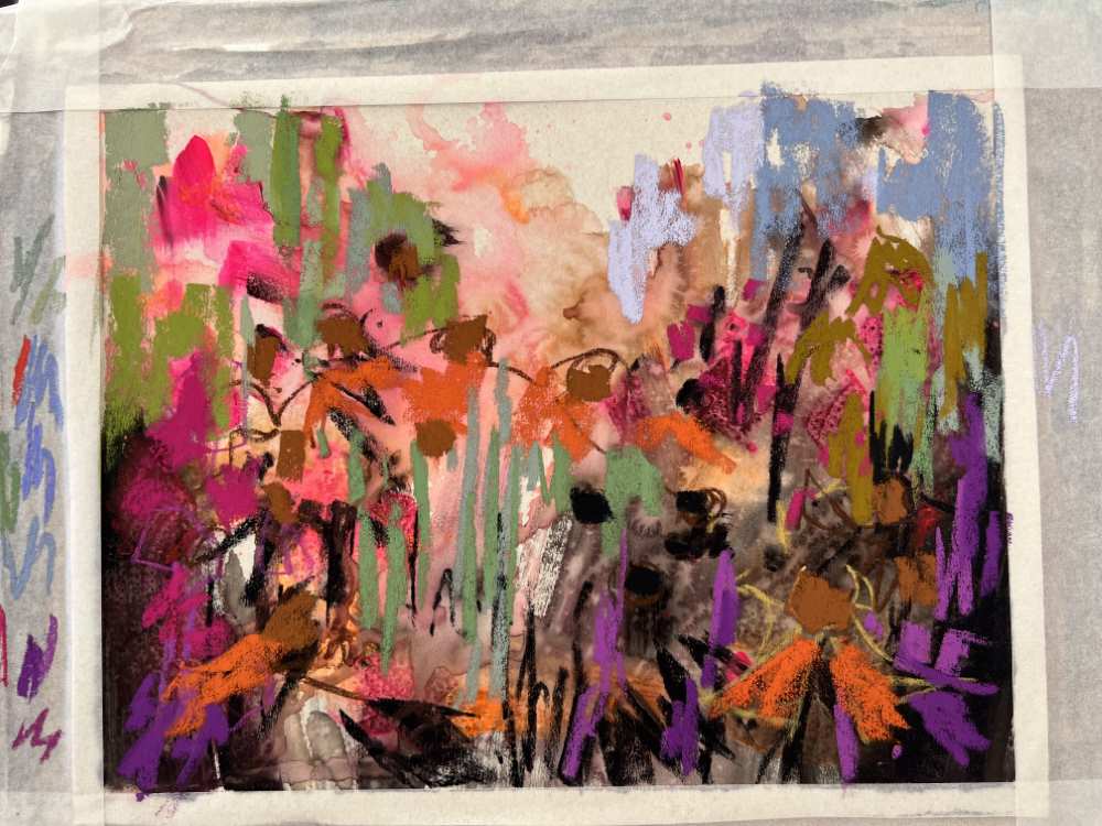
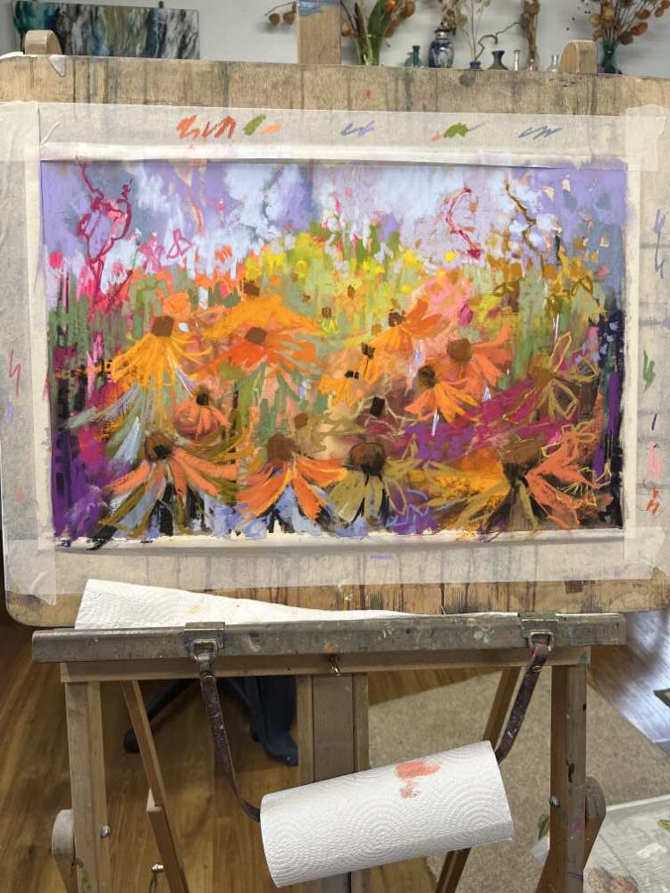
2. Prepare a drawing board ready with suitable water tolerant pastel paper (I use UArt400 or Colourfix mainly), mask onto the board, and do an energetic underpainting in gouache – maybe choose complementary colours or random colours – there are no rules. Bear in mind that once your soft pastels come into play, they offer me excellent coverage over my underpainting. Most of my pastels are Unison Colour – such good pigment and range of colours, coupled with their solubility, makes them hard to beat.
3. Create some lines with charcoal and/or pastel pencils. Try spraying these with pure alcohol or water and making more marks by moving the charcoal. Have fun and be bold.
4. Get your soft pastels out. I always start with a very limited range of colours – taking into consideration how dark and how light I plan to go and what main colour groups I want to start with. Although my paintings are always colourful I am very aware I need to control the range of colours I use until I get to my final couple of layers where I can let instinct take over from control.
5. Make some marks – go back in with a paint brush and some water (or alcohol) and move the pastel around, sometimes using some mark making tools – chopped up credit card, wrong end of paint brush, bubble wrap – be adventurous
6. Final layers for me tend to all be dry soft pastel
7. If I want to blend a bit, I use chopped up pipe insulation rather than my fingers
8. Have fun and know when to stop (always a tricky one!)
9. Put painting to one side and consider it for a few days
10. Minor adjustments or finished? Only you will know.
Other thoughts
I often work with 2 boards and 2 paintings at a time – it can be interesting to see how the same subject and materials can vary in the end product!
Try doing 2 versions of the same painting, working on them in parallel – one on light coloured paper one on black (or other dark paper).
Always have some old mounts to hand to give you a really good idea of how your painting is progressing.
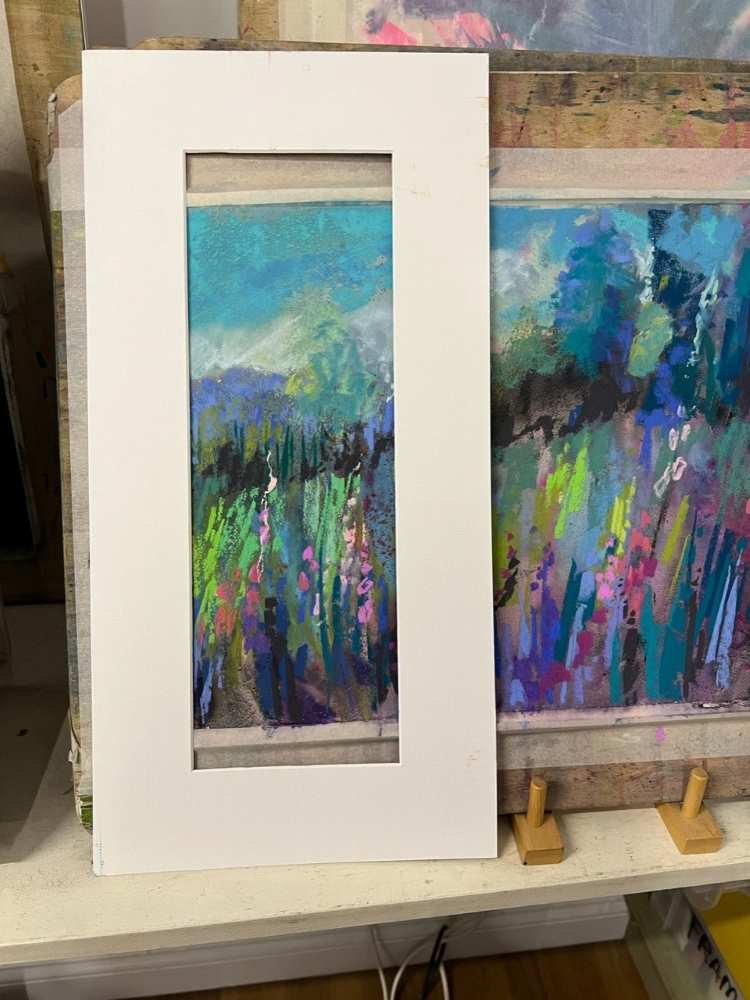
Consider the possibility of cropping your painting if it improves the composition – this is one of the big advantages of working on paper.
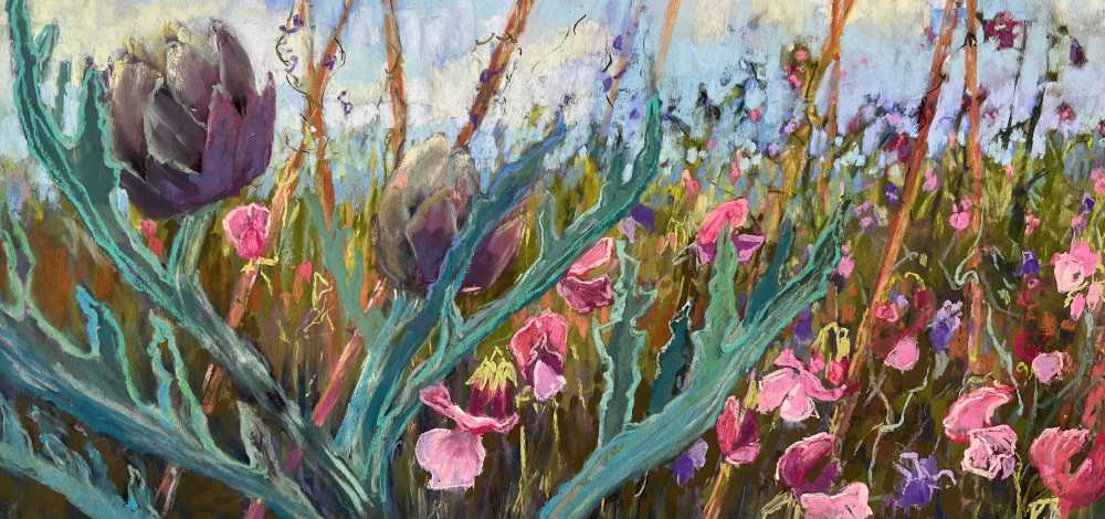
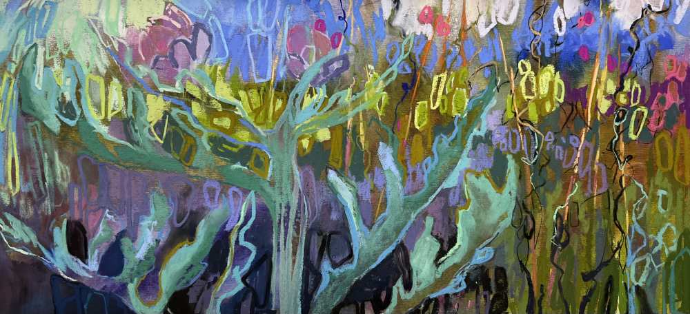
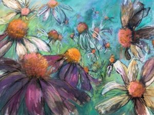
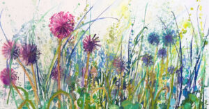
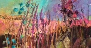
Other sketches and final paintings

3 comments
Helen Turner
Beautiful work Judy! You have reignited my passion for doing some floral work! Where I live, the flowers take a back seat to overwhelming green leaves that are beautiful yet subtle, so I think I will try your approach with an underpainting and maybe try two at once!!!
Thank you,
Helen
Susan Scott
Fantastic article,Judy. Love all your work. Part of your article has encouraged me to return to a pastel painting started in art club and I may be able to look at my garden in a different way now.
Mary Kathryn Van Kleunen
Love this! Thank you for sharing your process. Your work is amazing!