
Here’s a terrifying thought. Put away the reference photo, pick up a Unison Colour soft pastel and paint.
I can hear your pounding hearts from here. I get it, I like things to look like things too. I use reference photos all the time and I do a healthy little trade selling paintings of New Zealand native birds that look like birds but recently, I’ve found the whole ‘tethered to a photograph’ thing a bit limiting.
What if I painted without reference shots? It’s not only scary, it’s exposing. It’s like running down the high street in your undies. Maybe, art begins where the reference pics stop. It’s possible, right? That who I am as an artist might only be revealed if I abandon reference and go it alone.
I’m sorry Fido but from now on I’m painting you from memory. I’m no longer spending hours rendering your left eyelash perfectly. Instead, I’m going to capture the feeling I get when you curl up on the sofa with me at night. What colour is love? Red 8, Ocean Blue 12, Dark 21?
If you’re addicted to reference photos you don’t have to go cold turkey. Here’s what I did.
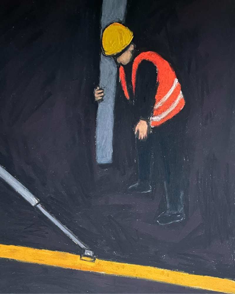
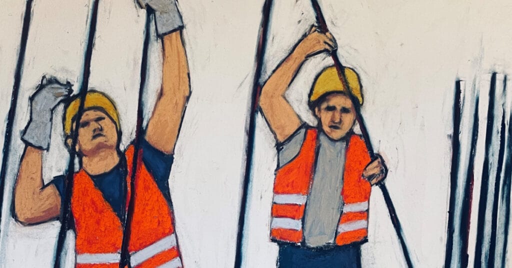
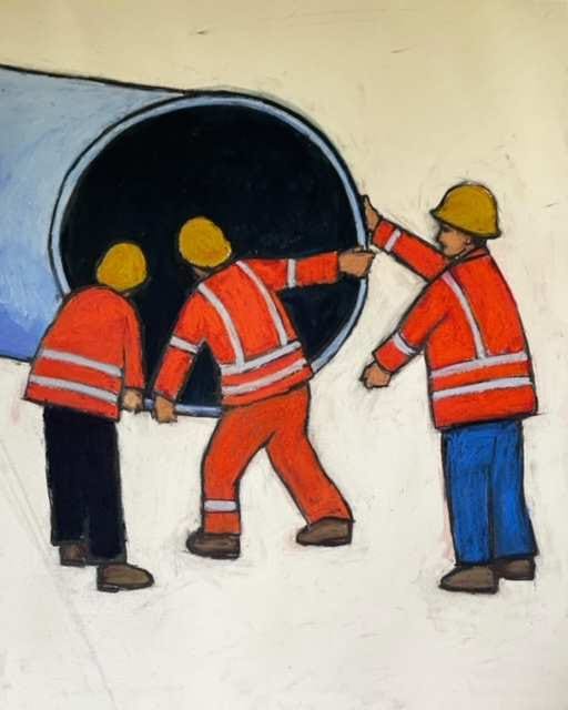
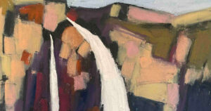
I drove past a construction site, noticed the guys working on it wore hi-visibilty vests and had an idea (I could write an entire blog post about ideas). The fluoro orange hi-vis vests pinged against the bland colours of the site. It was visually stunning but it also said something about the situation. These low paid invisible but visible workers.
I found some reference shots of workers in hi-vis vests (God bless you Google) but rather than print out a photograph and copy it, I did a rough sketch of it with pencil and then painted a soft pastel version of that sketch. It was far from perfect but I liked the imperfections; the poorly rendered faces, the pigeon toes, the metal poles thrusting through the scene, and well, the vibe.
Here’s the thing, it was liberating. I got to choose the colours, the shading, the perspective and what I left in and took out. And because I didn’t use a reference shot, I had nothing to compare it with, so I didn’t beat myself up.
Could you survive the death defying, no photo reference, stunt? Take the plunge and let me know how you get on.

4 comments
Kim Hood
Yes it sounds scary but also well worth trying. Though I might never show the results!
Helen Turner
Peter, I wholeheartedly concur! I paint landscapes here in Hawaii, and often do plein aire paintings on site. Since part of that time I am teaching, I never really complete a painting in it’s polished form like my studio pieces. Lately I’ve been sitting down and working on the half done pieces without a reference. It is different, and not as clean, but I think this is where I should go. Doing people and living things is much harder, but they say more this way!!!! Thank you for writing!!!
Helen
Yvie
Very liberating to have an idea and then to just get it on paper! Pastels have an immediacy which is ideal for doing just that. When I was growing up I drew most often from my memory and imagination. Later on you get told to draw what you see and you begin to judge your results on accuracy. This doesn’t mean that you don’t interpret form or that your work doesn’t have a meaning or a style. But it can mean that you rely on reference photos and think about “getting it right” meaning “getting it just like my reference”. Then the confidence to just draw something out of your imagination dwindles. A couple of ideas to get that confidence back: Anything goes in a sketchbook, so try out there. Or use a reference to get an accurate image in part of your work but go wild with patterns or abstract shapes or imaginary rooms/landscapes in the background.
pete
Thanks for the comment Yvie. I’m a big fan of sketchbooks.